Preview image. Unlock full-res
Black script on white canvas
Color palette
Primary text, headers, outlines, button backgrounds, interactive elements, input text. Functions as the foundational dark element against light surfaces
Main page background, default surface for cards, and primary content areas
Subtle borders, dividers, and ghost element outlines, offering a softer separation than pure black
Muted text for secondary information, light button text, and subtle borders
Secondary text, muted card borders, and less prominent information
Faint borders for inputs and subtle link underlines
Typography
- Weights
- 400, 500
- Sizes
- 10px, 12px, 13px, 15px, 16px, 18px, 20px, 22px, 26px
- Line height
- 1, 1.15, 1.18, 1.22, 1.27, 1.33, 1.35, 1.38
- Letter spacing
- -0.0100em, 0.0200em
- Fallback
- Inter
Primary typeface for body text, general UI elements, and some smaller headings. Its compact nature supports high information density without feeling crowded.
- Weights
- 400
- Sizes
- 11px, 12px, 13px
- Line height
- 1.17, 1.18, 1.2, 1.23
- Letter spacing
- 0.0500em
- Fallback
- Space Mono
Monospaced font used for data labels, technical details, and certain product information, providing a precise, almost code-like feel.
- Weights
- 200, 500
- Sizes
- 34px, 52px, 75px
- Line height
- 1
- Letter spacing
- -0.0150em, -0.0100em
- Fallback
- Cabinet Grotesk
Distinctive display typeface for main headings, where its light weight (200) creates an authoritative yet understated presence, contrasting with its bolder counterpart for emphasis. The tight letter-spacing adds to its modern feel.
Spacing & shape
Components
Transparent background, Ink (#000000) text color, no border or explicit padding, relies on natural text spacing. Used for top navigation and inline 'Shop' links.
Ink (#000000) background, Alabaster (#edede7) text color, 6px border-radius, with 24px horizontal padding. Example: 'Explore Collection' button.
Transparent background, Ink (#000000) text color, 1px Ink (#000000) border, 6px border-radius, with 23px horizontal padding. Example: 'Shop' links within content.
Paper White (#fafaf9) background, no border, no shadow, with 12px top, 8px right, 16px bottom, and 16px left padding.
Transparent background, Ink (#000000) text color, Ink (#000000) border, no border-radius. Features 16px right padding.
Transparent background, Ink (#000000) text color, no border-radius. Generous internal padding (160px vertical, 20px horizontal) creates visual separation.
Guidelines
- Prioritize Ink (#000000) for all primary text and interactive elements to maintain visual strength.
- Use Paper White (#fafaf9) as the canvas for all major page sections and card backgrounds, ensuring visual spaciousness.
- Apply subtle borders with Pebble Gray (#e5e2dc) or Stone Line (#d6d1c7) for non-essential dividers and input fields.
- Employ PP Right Grotesk with weight 200 for large headings (like 75px or 52px) to convey understated elegance.
- Maintain tight letter-spacing for display typography and slightly wider spacing for Söhne Mono to create distinct typographic textures.
- Utilize 6px border-radius consistently for all buttons and interactive link elements.
- Incorporate 20px as the default elementGap for horizontal and vertical spacing between most components.
- Avoid using highly saturated or vibrant colors; strictly adhere to the monochromatic palette with natural product images as the only color accents.
- Do not introduce heavy box-shadows or gradients; maintain a flat and minimal surface treatment to preserve the clean aesthetic.
- Never use generic system fonts; always specify Söhne, Söhne Mono, or PP Right Grotesk to maintain brand consistency.
- Do not vary border-radius arbitrarily; stick to 6px for interactive elements and 3px for subtle body text containers.
- Avoid dense, stacked layouts without sufficient breathing room; ensure generous use of vertical and horizontal spacing like 40px sectionGap.
- Do not apply excessive padding to text-based items; allow typography to breathe naturally without becoming overly spaced out.
- Do not use Alabaster (#edede7) for primary text where strong contrast is needed; reserve it for secondary information or light backgrounds.
About this system
ShowHide
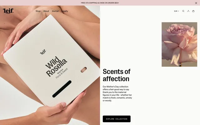
Leif Products embodies a refined, minimal aesthetic, utilizing a stark black and white palette punctuated by the natural hues of product photography. Typography is compact and precise, maintaining a high information density within a spacious layout. Components are presented with a lightweight touch, often appearing as outlines or subtle containers, allowing the product imagery to dominate the visual field.
The page structure is full-bleed, with content centered within an implied maximum width. The hero section often features a dominant, large-scale product image on one side, paired with a concise headline and description on the other, creating a split-panel composition. Section rhythm is driven by generous, consistent vertical spacing, creating an airy feel. Feature sections frequently employ a 3-column card grid or alternating text-left/image-right patterns for product presentation. Navigation is handled by a minimal top bar, featuring ghost links and functional icons, maintaining a low visual profile to emphasize content.
Imagery on Leif Products is central to its identity, featuring high-quality, product-focused photography. Photos are typically tightly cropped, showcasing products in isolation or with minimal, often human, interaction (hands holding products). There’s a preference for neutral or natural backgrounds that highlight the product's texture and form, rather than providing an elaborate lifestyle context. The visual treatment is raw and authentic, with natural lighting. Imagery is contained within defined areas, often with soft negative space around them, and serves both decorative atmosphere and direct product showcase roles. Icons are minimalist, outlined, and monochromatic, with a moderate stroke weight, serving purely functional purposes.
Reminiscent of Aesop, Byredo, Frama, Merci Handy.
# Leif Products — Style Reference
> Black script on white canvas

**Theme:** light

**Site:** https://leifproducts.com

Leif Products embodies a refined, minimal aesthetic, utilizing a stark black and white palette punctuated by the natural hues of product photography. Typography is compact and precise, maintaining a high information density within a spacious layout. Components are presented with a lightweight touch, often appearing as outlines or subtle containers, allowing the product imagery to dominate the visual field.

## Tokens — Colors

| Name | Value | Token | Role |
|------|------|------|------|
| Ink | `#000000` | `--color-ink` | Primary text, headers, outlines, button backgrounds, interactive elements, input text. Functions as the foundational dark element against light surfaces |
| Paper White | `#fafaf9` | `--color-paper-white` | Main page background, default surface for cards, and primary content areas |
| Pebble Gray | `#e5e2dc` | `--color-pebble-gray` | Subtle borders, dividers, and ghost element outlines, offering a softer separation than pure black |
| Alabaster | `#edede7` | `--color-alabaster` | Muted text for secondary information, light button text, and subtle borders |
| Shadow Tone | `#595959` | `--color-shadow-tone` | Secondary text, muted card borders, and less prominent information |
| Stone Line | `#d6d1c7` | `--color-stone-line` | Faint borders for inputs and subtle link underlines |

## Tokens — Typography

### Söhne
- **Substitute:** Inter
- **Weights:** 400, 500
- **Sizes:** 10px, 12px, 13px, 15px, 16px, 18px, 20px, 22px, 26px
- **Line height:** 1, 1.15, 1.18, 1.22, 1.27, 1.33, 1.35, 1.38
- **Letter spacing:** -0.0100em, 0.0200em
- **Role:** Primary typeface for body text, general UI elements, and some smaller headings. Its compact nature supports high information density without feeling crowded.

### Söhne Mono
- **Substitute:** Space Mono
- **Weights:** 400
- **Sizes:** 11px, 12px, 13px
- **Line height:** 1.17, 1.18, 1.2, 1.23
- **Letter spacing:** 0.0500em
- **Role:** Monospaced font used for data labels, technical details, and certain product information, providing a precise, almost code-like feel.

### PP Right Grotesk
- **Substitute:** Cabinet Grotesk
- **Weights:** 200, 500
- **Sizes:** 34px, 52px, 75px
- **Line height:** 1
- **Letter spacing:** -0.0150em, -0.0100em
- **Role:** Distinctive display typeface for main headings, where its light weight (200) creates an authoritative yet understated presence, contrasting with its bolder counterpart for emphasis. The tight letter-spacing adds to its modern feel.

## Tokens — Type Scale

Golden Ratio (1.618) from 18px base.

| Role | Size | Line height | Letter spacing |
|------|------|------|------|
| subheading | 18px | 1.22 | 0.36px |
| heading | 34px | 1 | -0.51px |
| heading-lg | 52px | 1 | -0.78px |
| display | 75px | 1 | -1.12px |

## Tokens — Spacing

- **Section gap:** 40px
- **Card padding:** 12px
- **Element gap:** 20px

## Tokens — Radius

- **Buttons:** 6px
- **bodyElements:** 3px
- **links:** 6px

## Layout

The page structure is full-bleed, with content centered within an implied maximum width. The hero section often features a dominant, large-scale product image on one side, paired with a concise headline and description on the other, creating a split-panel composition. Section rhythm is driven by generous, consistent vertical spacing, creating an airy feel. Feature sections frequently employ a 3-column card grid or alternating text-left/image-right patterns for product presentation. Navigation is handled by a minimal top bar, featuring ghost links and functional icons, maintaining a low visual profile to emphasize content.

## Imagery

Imagery on Leif Products is central to its identity, featuring high-quality, product-focused photography. Photos are typically tightly cropped, showcasing products in isolation or with minimal, often human, interaction (hands holding products). There’s a preference for neutral or natural backgrounds that highlight the product's texture and form, rather than providing an elaborate lifestyle context. The visual treatment is raw and authentic, with natural lighting. Imagery is contained within defined areas, often with soft negative space around them, and serves both decorative atmosphere and direct product showcase roles. Icons are minimalist, outlined, and monochromatic, with a moderate stroke weight, serving purely functional purposes.

## Components

### Ghost Navigation Link
*Primary navigation links and text-based buttons.*

Transparent background, Ink (#000000) text color, no border or explicit padding, relies on natural text spacing. Used for top navigation and inline 'Shop' links.

### Primary Filled Button
*Call-to-action buttons for key interactions.*

Ink (#000000) background, Alabaster (#edede7) text color, 6px border-radius, with 24px horizontal padding. Example: 'Explore Collection' button.

### Outlined Text Button
*Secondary action buttons with a visual emphasis without filling.*

Transparent background, Ink (#000000) text color, 1px Ink (#000000) border, 6px border-radius, with 23px horizontal padding. Example: 'Shop' links within content.

### Product Display Card
*Container for individual product listings.*

Paper White (#fafaf9) background, no border, no shadow, with 12px top, 8px right, 16px bottom, and 16px left padding.

### Transparent Input Field
*Form input elements.*

Transparent background, Ink (#000000) text color, Ink (#000000) border, no border-radius. Features 16px right padding.

### Info Badge
*Highlight specific product attributes or offers.*

Transparent background, Ink (#000000) text color, no border-radius. Generous internal padding (160px vertical, 20px horizontal) creates visual separation.

## Guidelines

### Do

- Prioritize Ink (#000000) for all primary text and interactive elements to maintain visual strength.
- Use Paper White (#fafaf9) as the canvas for all major page sections and card backgrounds, ensuring visual spaciousness.
- Apply subtle borders with Pebble Gray (#e5e2dc) or Stone Line (#d6d1c7) for non-essential dividers and input fields.
- Employ PP Right Grotesk with weight 200 for large headings (like 75px or 52px) to convey understated elegance.
- Maintain tight letter-spacing for display typography and slightly wider spacing for Söhne Mono to create distinct typographic textures.
- Utilize 6px border-radius consistently for all buttons and interactive link elements.
- Incorporate 20px as the default elementGap for horizontal and vertical spacing between most components.

### Don't

- Avoid using highly saturated or vibrant colors; strictly adhere to the monochromatic palette with natural product images as the only color accents.
- Do not introduce heavy box-shadows or gradients; maintain a flat and minimal surface treatment to preserve the clean aesthetic.
- Never use generic system fonts; always specify Söhne, Söhne Mono, or PP Right Grotesk to maintain brand consistency.
- Do not vary border-radius arbitrarily; stick to 6px for interactive elements and 3px for subtle body text containers.
- Avoid dense, stacked layouts without sufficient breathing room; ensure generous use of vertical and horizontal spacing like 40px sectionGap.
- Do not apply excessive padding to text-based items; allow typography to breathe naturally without becoming overly spaced out.
- Do not use Alabaster (#edede7) for primary text where strong contrast is needed; reserve it for secondary information or light backgrounds.

## Agent Prompt Guide

Quick Color Reference:
text: #000000
background: #fafaf9
border: #e5e2dc
accent: no distinct accent color
primary action: no distinct CTA color

Example Component Prompts:
No distinct primary action color was observed; use the extracted neutral button treatments instead of inventing a filled CTA color.

Create a product card: Paper White (#fafaf9) background, no border. Product name 'Buddha Wood Hand Wash' at 15px Söhne weight 400, Ink (#000000), letter-spacing -0.15px. Price '€29' at 12px Söhne Mono weight 400, Ink (#000000), letter-spacing 0.05em. Card padding: 12px top, 8px right, 16px bottom, 16px left.

Create a navigation element: 'Shop' ghost link with Ink (#000000) text at 13px Söhne weight 400, letter-spacing -0.13px, no background, no border, 6px radius. Text 'Journal' ghost link with Ink (#000000) text at 13px Söhne weight 400, letter-spacing -0.13px, no background, no border, 6px radius.
More like this









Keep what you find
A free account saves references to boards and can send you a weekly email of picks based on what you save.
To see every result, go Pro.