Preview image. Unlock full-res
Midnight atelier of digital craftsmanship
Color palette
Primary action backgrounds, brand accents, interactive highlights — a single, vivid color creating urgency and focus; Subtle background overlay for decorative hero sections or impactful visual elements, transitioning from red to transparent
Decorative highlights, large-scale heading accents, graphic elements
Page backgrounds, deepest surface layers, primary text on light backgrounds — creates a theatrical black canvas
Default interactive backgrounds, hover states on dark surfaces, secondary backgrounds — provides subtle relief from pure black
Footer backgrounds, deeper UI elements contrasting with Deep Space
Elevated card backgrounds, distinct content blocks
Subtle inset shadow on cards, minor UI accents
Primary text, prominent borders, high-contrast UI elements — essential for readability on dark backgrounds
Secondary text, muted text elements, alternative default text color
Muted icon fills, tertiary text, subtle borders
Helper text, legal text, disabled states
Fine line dividers, subtle visual separation for navigation elements
Typography
- Weights
- 300, 400, 700
- Sizes
- 10px, 12px, 14px, 24px, 32px, 42px, 64px, 80px, 160px
- Line height
- 0.9, 1, 1.05, 1.1, 1.2, 1.5
- Letter spacing
- -0.0800em, -0.0750em, -0.0500em, -0.0470em, -0.0380em, -0.0370em, -0.0170em, 0.0710em, 0.0800em, 0.3080em
- Fallback
- Montserrat
Primary typeface for headings, navigation, and key textual elements. Its variable weights and tight letter-spacing contribute to a deliberate, crafted feel, demanding attention without screaming.
- Weights
- 300, 400
- Sizes
- 12px, 14px
- Line height
- 1.2, 1.5
- Letter spacing
- normal
- Fallback
- Inter
System font used for utilitarian body text, icons, and supporting information, providing clarity and legibility without competing with the custom display fonts.
- Weights
- 300
- Sizes
- 14px, 20px, 32px
- Line height
- 1, 1.1, 1.5
- Letter spacing
- -0.0500em, -0.0200em
- Fallback
- Playfair Display
Supplementary display font for select body text and headings, offering a refined, slightly more traditional counterpoint, often with negative tracking to maintain a sleek density.
- Weights
- 400
- Sizes
- 24px, 64px, 80px
- Line height
- 0.9, 1.05, 1.1
- Letter spacing
- -0.1000em, -0.0370em, -0.0300em
- Fallback
- Oswald
Distinctive display font reserved for hero headlines and impactful, artistic typography, characterized by extremely tight tracking and condensed forms for a bold, almost sculptural presence.
Spacing & shape
Components
Filled with Inferno Red (#fe1e34), text in Cloud White (#fcfcfc), 8px border-radius, 32px padding on all sides. Tight letter-spacing for Kmr Waldenburg font.
Transparent background, 1px Cloud White (#fcfcfc) border, text in Cloud White (#fcfcfc), 8px border-radius, 32px padding on all sides.
Background color rgba(0, 0, 0, 0.2), 14.4px border-radius, with an rgba(255, 255, 255, 0.2) 0px 2px 5px 0px inset box-shadow. 11.52px padding on all sides.
Background Charcoal Surface (#373535), 8px border-radius, no shadow. 56px vertical padding, 32px horizontal padding.
Text in Glacial White (#f3efef), 3px border-radius for interactive states, no explicit padding, tight Kmr Waldenburg typography.
Guidelines
- Prioritize Kmr Waldenburg for all headings and navigational elements, applying negative letter-spacing for visual impact (e.g., -0.0800em at 80px, -0.0750em at 64px, -0.0380em at 42px).
- Maintain a stark contrast using Absolute Zero (#000000) for backgrounds and Cloud White (#fcfcfc) or Glacial White (#f3efef) for text.
- Use Inferno Red (#fe1e34) exclusively for primary calls to action or brand-specific interactive elements, limiting its usage to maintain its visual power.
- Apply 8px border-radius to all buttons and prominent cards, and 14.4px specifically for Textured Cards, to introduce a subtle softness to the otherwise hard-edged aesthetic.
- Employ consistent padding: 32px for button padding, 12px for card inner padding, and 24px for general element spacing.
- Incorporate the rgba(255, 255, 255, 0.2) 0px 2px 5px 0px inset shadow for Textured Cards to add depth while integrating into the dark theme.
- Utilize Dirtyline 36 Daysoftype 2022 for expressive, oversized hero text with extreme negative tracking (e.g., -0.1000em at 80px) to signify artistic branding.
- Avoid using bright or pastel colors; the palette is strictly monochrome with one primary red accent.
- Do not use generic system fonts for display text or navigational elements; always use the specified custom typefaces.
- Refrain from applying soft, external box-shadows; elevation is achieved through subtle inset shadows and variations in background darkness or textural overlays.
- Do not deviate from the aggressive letter-spacing defined for headings and prominent text; loose tracking will diminish the established aesthetic.
- Do not use the Inferno Red (#fe1e34) for decorative purposes or as a general UI color for elements other than primary actions; its impact relies on scarcity.
- Avoid using large blocks of pure white as backgrounds; the primary canvas is Absolute Zero (#000000).
- Do not use multiple contrasting accent colors; the visual system relies on the singular punch of Inferno Red.
About this system
ShowHide
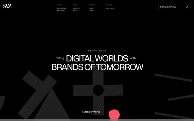
SVZ orchestrates a dramatic, high-contrast dark mode aesthetic, building 'digital worlds' with deep blacks and stark whites. Typography embraces expressive, bespoke typefaces with tight tracking, creating an impactful, almost architectural text presence. The system employs subtle textural overlays and an unexpected, vibrant red accent that pierces through the monochrome, signaling energy and action.
The page primarily uses a max-width contained layout, likely around 1440px, centered on a deep black canvas. Hero sections frequently feature full-bleed black backgrounds with large, centered, expressive typography and abstract graphics or stylized 3D elements. Vertical rhythm is established through consistent section gaps, often alternating between solid dark backgrounds and sections with subtle textural overlays. Content is typically arranged in centered stacks or alternating left/right text-image blocks where visuals are highly integrated. Card grids are present for features. A sticky top navigation bar with minimal elements and a prominent 'Discovery Call' button maintains constant access.
The visual language focuses on abstract, geometric shapes and bold typography. When photography or 3D renders are present (like the furry 'V' letter), they are highly stylized and often isolated against deep black backgrounds, serving as artistic statements rather than informative imagery. Images are full-bleed within sections, and occasionally masked or integrated with text. Iconography, when visible, is outlined and monochromatic, aligning with the stark aesthetic. The density is image-heavy in hero sections, but otherwise text-dominant with key visuals used sparingly for impact and atmosphere.
Reminiscent of Stripe, Huge Inc., Basic.Agency, Figma.
# Branding — Style Reference
> Midnight atelier of digital craftsmanship

**Theme:** dark

**Site:** https://www.svz.io

SVZ orchestrates a dramatic, high-contrast dark mode aesthetic, building 'digital worlds' with deep blacks and stark whites. Typography embraces expressive, bespoke typefaces with tight tracking, creating an impactful, almost architectural text presence. The system employs subtle textural overlays and an unexpected, vibrant red accent that pierces through the monochrome, signaling energy and action.

## Tokens — Colors

| Name | Value | Token | Role |
|------|------|------|------|
| Inferno Red | `#fe1e34` | `--color-inferno-red` | Primary action backgrounds, brand accents, interactive highlights — a single, vivid color creating urgency and focus; Subtle background overlay for decorative hero sections or impactful visual elements, transitioning from red to transparent |
| Vivid Crimson | `#ff0000` | `--color-vivid-crimson` | Decorative highlights, large-scale heading accents, graphic elements |
| Absolute Zero | `#000000` | `--color-absolute-zero` | Page backgrounds, deepest surface layers, primary text on light backgrounds — creates a theatrical black canvas |
| Deep Space | `#080808` | `--color-deep-space` | Default interactive backgrounds, hover states on dark surfaces, secondary backgrounds — provides subtle relief from pure black |
| Nightfall Gray | `#171617` | `--color-nightfall-gray` | Footer backgrounds, deeper UI elements contrasting with Deep Space |
| Charcoal Surface | `#262525` | `--color-charcoal-surface` | Elevated card backgrounds, distinct content blocks |
| Slate Highlight | `#393939` | `--color-slate-highlight` | Subtle inset shadow on cards, minor UI accents |
| Cloud White | `#fcfcfc` | `--color-cloud-white` | Primary text, prominent borders, high-contrast UI elements — essential for readability on dark backgrounds |
| Glacial White | `#f3efef` | `--color-glacial-white` | Secondary text, muted text elements, alternative default text color |
| Ash Accent | `#d4d2d2` | `--color-ash-accent` | Muted icon fills, tertiary text, subtle borders |
| Dim Gray | `#b5b2b2` | `--color-dim-gray` | Helper text, legal text, disabled states |
| Steel Border | `#525252` | `--color-steel-border` | Fine line dividers, subtle visual separation for navigation elements |

## Tokens — Typography

### Kmr Waldenburg
- **Substitute:** Montserrat
- **Weights:** 300, 400, 700
- **Sizes:** 10px, 12px, 14px, 24px, 32px, 42px, 64px, 80px, 160px
- **Line height:** 0.9, 1, 1.05, 1.1, 1.2, 1.5
- **Letter spacing:** -0.0800em, -0.0750em, -0.0500em, -0.0470em, -0.0380em, -0.0370em, -0.0170em, 0.0710em, 0.0800em, 0.3080em
- **Role:** Primary typeface for headings, navigation, and key textual elements. Its variable weights and tight letter-spacing contribute to a deliberate, crafted feel, demanding attention without screaming.

### system-ui
- **Substitute:** Inter
- **Weights:** 300, 400
- **Sizes:** 12px, 14px
- **Line height:** 1.2, 1.5
- **Letter spacing:** normal
- **Role:** System font used for utilitarian body text, icons, and supporting information, providing clarity and legibility without competing with the custom display fonts.

### Editorialnew
- **Substitute:** Playfair Display
- **Weights:** 300
- **Sizes:** 14px, 20px, 32px
- **Line height:** 1, 1.1, 1.5
- **Letter spacing:** -0.0500em, -0.0200em
- **Role:** Supplementary display font for select body text and headings, offering a refined, slightly more traditional counterpoint, often with negative tracking to maintain a sleek density.

### Dirtyline 36 Daysoftype 2022
- **Substitute:** Oswald
- **Weights:** 400
- **Sizes:** 24px, 64px, 80px
- **Line height:** 0.9, 1.05, 1.1
- **Letter spacing:** -0.1000em, -0.0370em, -0.0300em
- **Role:** Distinctive display font reserved for hero headlines and impactful, artistic typography, characterized by extremely tight tracking and condensed forms for a bold, almost sculptural presence.

## Tokens — Type Scale

Perfect Fifth (1.5) from 14px base.

| Role | Size | Line height | Letter spacing |
|------|------|------|------|
| caption | 10px | 1.5 | 0.308px |
| body | 14px | 1.5 | -0.02em |
| subheading | 24px | 1.2 | — |
| heading-sm | 32px | 1.1 | -0.047em |
| heading | 42px | 1.1 | -0.037em |
| heading-lg | 64px | 1.05 | -0.075em |
| display | 80px | 0.9 | -0.08em |
| editorial-display | 160px | 0.9 | -0.08em |

## Tokens — Spacing

- **Max width:** 1440px
- **Section gap:** 48px
- **Card padding:** 12px
- **Element gap:** 24px

## Tokens — Radius

- **Default:** 3px
- **Buttons:** 8px
- **Cards:** 8px
- **interactive:** 3px
- **texturedCard:** 14.4px

## Layout

The page primarily uses a max-width contained layout, likely around 1440px, centered on a deep black canvas. Hero sections frequently feature full-bleed black backgrounds with large, centered, expressive typography and abstract graphics or stylized 3D elements. Vertical rhythm is established through consistent section gaps, often alternating between solid dark backgrounds and sections with subtle textural overlays. Content is typically arranged in centered stacks or alternating left/right text-image blocks where visuals are highly integrated. Card grids are present for features. A sticky top navigation bar with minimal elements and a prominent 'Discovery Call' button maintains constant access.

## Imagery

The visual language focuses on abstract, geometric shapes and bold typography. When photography or 3D renders are present (like the furry 'V' letter), they are highly stylized and often isolated against deep black backgrounds, serving as artistic statements rather than informative imagery. Images are full-bleed within sections, and occasionally masked or integrated with text. Iconography, when visible, is outlined and monochromatic, aligning with the stark aesthetic. The density is image-heavy in hero sections, but otherwise text-dominant with key visuals used sparingly for impact and atmosphere.

## Components

### Primary Action Button
*Filled button for critical calls to action.*

Filled with Inferno Red (#fe1e34), text in Cloud White (#fcfcfc), 8px border-radius, 32px padding on all sides. Tight letter-spacing for Kmr Waldenburg font.

### Secondary Ghost Button
*Outlined button for secondary actions, blending into dark contexts.*

Transparent background, 1px Cloud White (#fcfcfc) border, text in Cloud White (#fcfcfc), 8px border-radius, 32px padding on all sides.

### Textured Card
*Card with subtle background texture and inset shadow.*

Background color rgba(0, 0, 0, 0.2), 14.4px border-radius, with an rgba(255, 255, 255, 0.2) 0px 2px 5px 0px inset box-shadow. 11.52px padding on all sides.

### Feature Content Card
*Solid background card for feature blocks.*

Background Charcoal Surface (#373535), 8px border-radius, no shadow. 56px vertical padding, 32px horizontal padding.

### Navigation Link
*Interactive text link within navigation menus.*

Text in Glacial White (#f3efef), 3px border-radius for interactive states, no explicit padding, tight Kmr Waldenburg typography.

## Guidelines

### Do

- Prioritize Kmr Waldenburg for all headings and navigational elements, applying negative letter-spacing for visual impact (e.g., -0.0800em at 80px, -0.0750em at 64px, -0.0380em at 42px).
- Maintain a stark contrast using Absolute Zero (#000000) for backgrounds and Cloud White (#fcfcfc) or Glacial White (#f3efef) for text.
- Use Inferno Red (#fe1e34) exclusively for primary calls to action or brand-specific interactive elements, limiting its usage to maintain its visual power.
- Apply 8px border-radius to all buttons and prominent cards, and 14.4px specifically for Textured Cards, to introduce a subtle softness to the otherwise hard-edged aesthetic.
- Employ consistent padding: 32px for button padding, 12px for card inner padding, and 24px for general element spacing.
- Incorporate the rgba(255, 255, 255, 0.2) 0px 2px 5px 0px inset shadow for Textured Cards to add depth while integrating into the dark theme.
- Utilize Dirtyline 36 Daysoftype 2022 for expressive, oversized hero text with extreme negative tracking (e.g., -0.1000em at 80px) to signify artistic branding.

### Don't

- Avoid using bright or pastel colors; the palette is strictly monochrome with one primary red accent.
- Do not use generic system fonts for display text or navigational elements; always use the specified custom typefaces.
- Refrain from applying soft, external box-shadows; elevation is achieved through subtle inset shadows and variations in background darkness or textural overlays.
- Do not deviate from the aggressive letter-spacing defined for headings and prominent text; loose tracking will diminish the established aesthetic.
- Do not use the Inferno Red (#fe1e34) for decorative purposes or as a general UI color for elements other than primary actions; its impact relies on scarcity.
- Avoid using large blocks of pure white as backgrounds; the primary canvas is Absolute Zero (#000000).
- Do not use multiple contrasting accent colors; the visual system relies on the singular punch of Inferno Red.

## Agent Prompt Guide

Quick Color Reference:
text: #fcfcfc
background: #000000
border: #fcfcfc
accent: #fe1e34
primary action: #fe1e34 (filled action)

Example Component Prompts:
1. Create a Hero Headline: Text 'DIGITAL WORLDS' in Dirtyline 36 Daysoftype 2022, 80px, weight 400, #fcfcfc, letter-spacing -0.1000em, line-height 0.9. Positioned centrally on an Absolute Zero (#000000) background.
2. Design a Primary Action Button: 'DISCOVERY CALL' label in Kmr Waldenburg, 14px, #fcfcfc, weight 400. Button background Inferno Red (#fe1e34), 8px border-radius, 32px padding all sides.
3. Implement a Feature Content Card: Charcoal Surface (#262525) background, 8px border-radius. Headline (Kmr Waldenburg, 32px, #fcfcfc, weight 700, line-height 1.1). Body text (system-ui, 14px, #f3efef, normal tracking). Padding 56px vertical, 32px horizontal.
4. Build a global navigation link: Text 'AGENCY' in Kmr Waldenburg, 12px, #fcfcfc, weight 400, letter-spacing 0.3080em. No background, transparent border.
More like this








Keep what you find
A free account saves references to boards and can send you a weekly email of picks based on what you save.
To see every result, go Pro.