Preview image. Unlock full-res
High-contrast cinematic dark
Color palette
Page backgrounds, card backgrounds, button backgrounds for ghost buttons — provides a deep, immersive dark theme
Hairline borders, dividers, input outlines, and card edges on light surfaces. Do not promote it to the primary CTA color
Secondary text, subtle navigation accents, muted informational text — offers a softer contrast than Ghostly White for less prominent content
Typography
- Weights
- 400
- Sizes
- 153px
- Fallback
- Anton
Primary display headlines — its large size and standard weight command attention, creating a bold, statement-making visual.
- Weights
- 400, 500
- Sizes
- 25px
- Line height
- 1
- Fallback
- Arial
Navigation, secondary headings, card titles — a versatile sans-serif used for structure and clear content labeling.
- Weights
- 400
- Sizes
- 19px, 22px
- Line height
- 1, 1.25, 1.5
- Fallback
- Open Sans
Body text, links, descriptions — used for general content, providing readability with classic proportions.
Spacing & shape
Components
Background: Midnight Canvas (#000000). Text: Ghostly White (#ffffff). Border: 1.5px solid Ghostly White (#ffffff). Radius: 0px. Padding: 17.51px vertical, 77.824px horizontal.
Text color: Muted Stone (#8e8e8e) for inactive, Ghostly White (#ffffff) for active/hover. Font: Helvetica Neue, 25px, weight 400.
Background: Midnight Canvas (#000000). Border: None. Box Shadow: None. Radius: 0px. Padding: 0px. Contains an image and text overlay.
Text: Ghostly White (#ffffff). Font: Martin, 153px, weight 400, letter-spacing normal. Displays without additional padding or background.
Guidelines
- Use Midnight Canvas (#000000) as the default background for all main sections and UI surfaces.
- Apply Ghostly White (#ffffff) for all primary text, headlines, and active states to maintain high contrast.
- Utilize the Martin font at 153px for primary page headings, leveraging its large size as a key visual element.
- Ensure all interactive elements, such as buttons and cards, maintain a 0px border-radius for a sharp, angular aesthetic.
- Implement a 1.5px solid Ghostly White (#ffffff) border for button outlines and subtle interactive element highlights.
- Employ a section gap of 43px to create distinct visual divisions between major content blocks.
- Use a comfortable element gap of 18px for spacing between most internal elements like text blocks or image captions.
- Avoid using saturated accent colors for primary interactive states; rely on Ghostly White (#ffffff) borders and text for feedback.
- Do not introduce rounded corners (border-radius > 0px) on any components or elements.
- Refrain from using drop shadows or complex elevation effects; the design is intentionally flat and high-contrast.
- Do not deviate from the specified font families; avoid system defaults unless explicitly defined.
- Minimize extraneous UI elements; the design prioritizes content and typography as primary visual drivers.
- Avoid mixing different background colors in adjacent sections; maintain a consistent Midnight Canvas (#000000) base.
- Do not use overly complex or busy imagery; opt for clean, focused product photography or stark graphics.
About this system
ShowHide
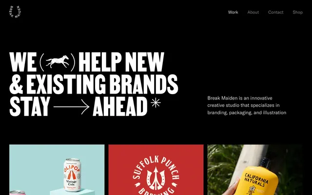
Break Maiden employs a high-contrast cinematic dark mode, characterized by stark black backgrounds and bold, expansive white typography. The design emphasizes content-first presentation, with large product imagery and minimal UI adornment. Typography is used as a primary design element, leveraging a custom, display-style sans-serif for striking headlines. Interaction is subtle, relying on ghost elements and border changes rather than saturated color for feedback, creating a focused and dramatic visual experience.
Reminiscent of Huge Inc., Work & Co, Basic/Dept, Pentagram.
# Break Maiden — Style Reference
> High-contrast cinematic dark

**Theme:** dark

**Site:** https://www.breakmaiden.co

Break Maiden employs a high-contrast cinematic dark mode, characterized by stark black backgrounds and bold, expansive white typography. The design emphasizes content-first presentation, with large product imagery and minimal UI adornment. Typography is used as a primary design element, leveraging a custom, display-style sans-serif for striking headlines. Interaction is subtle, relying on ghost elements and border changes rather than saturated color for feedback, creating a focused and dramatic visual experience.

## Tokens — Colors

| Name | Value | Token | Role |
|------|------|------|------|
| Midnight Canvas | `#000000` | `--color-midnight-canvas` | Page backgrounds, card backgrounds, button backgrounds for ghost buttons — provides a deep, immersive dark theme |
| Ghostly White | `#ffffff` | `--color-ghostly-white` | Hairline borders, dividers, input outlines, and card edges on light surfaces. Do not promote it to the primary CTA color |
| Muted Stone | `#8e8e8e` | `--color-muted-stone` | Secondary text, subtle navigation accents, muted informational text — offers a softer contrast than Ghostly White for less prominent content |

## Tokens — Typography

### Martin
- **Substitute:** Anton
- **Weights:** 400
- **Sizes:** 153px
- **Role:** Primary display headlines — its large size and standard weight command attention, creating a bold, statement-making visual.

### Helvetica Neue
- **Substitute:** Arial
- **Weights:** 400, 500
- **Sizes:** 25px
- **Line height:** 1
- **Role:** Navigation, secondary headings, card titles — a versatile sans-serif used for structure and clear content labeling.

### America
- **Substitute:** Open Sans
- **Weights:** 400
- **Sizes:** 19px, 22px
- **Line height:** 1, 1.25, 1.5
- **Role:** Body text, links, descriptions — used for general content, providing readability with classic proportions.

## Tokens — Spacing

- **Section gap:** 43px
- **Card padding:** 0px
- **Element gap:** 18px

## Tokens — Radius

- **none:** 0px

## Components

### Primary Ghost Button
*Subtle interactive element for primary actions.*

Background: Midnight Canvas (#000000). Text: Ghostly White (#ffffff). Border: 1.5px solid Ghostly White (#ffffff). Radius: 0px. Padding: 17.51px vertical, 77.824px horizontal.

### Navigation Link
*Top-level navigation items.*

Text color: Muted Stone (#8e8e8e) for inactive, Ghostly White (#ffffff) for active/hover. Font: Helvetica Neue, 25px, weight 400.

### Product Grid Card
*Container for showcasing product imagery.*

Background: Midnight Canvas (#000000). Border: None. Box Shadow: None. Radius: 0px. Padding: 0px. Contains an image and text overlay.

### Hero Headline
*Dominant text element at the top of the page.*

Text: Ghostly White (#ffffff). Font: Martin, 153px, weight 400, letter-spacing normal. Displays without additional padding or background.

## Guidelines

### Do

- Use Midnight Canvas (#000000) as the default background for all main sections and UI surfaces.
- Apply Ghostly White (#ffffff) for all primary text, headlines, and active states to maintain high contrast.
- Utilize the Martin font at 153px for primary page headings, leveraging its large size as a key visual element.
- Ensure all interactive elements, such as buttons and cards, maintain a 0px border-radius for a sharp, angular aesthetic.
- Implement a 1.5px solid Ghostly White (#ffffff) border for button outlines and subtle interactive element highlights.
- Employ a section gap of 43px to create distinct visual divisions between major content blocks.
- Use a comfortable element gap of 18px for spacing between most internal elements like text blocks or image captions.

### Don't

- Avoid using saturated accent colors for primary interactive states; rely on Ghostly White (#ffffff) borders and text for feedback.
- Do not introduce rounded corners (border-radius > 0px) on any components or elements.
- Refrain from using drop shadows or complex elevation effects; the design is intentionally flat and high-contrast.
- Do not deviate from the specified font families; avoid system defaults unless explicitly defined.
- Minimize extraneous UI elements; the design prioritizes content and typography as primary visual drivers.
- Avoid mixing different background colors in adjacent sections; maintain a consistent Midnight Canvas (#000000) base.
- Do not use overly complex or busy imagery; opt for clean, focused product photography or stark graphics.

## Agent Prompt Guide

Quick Color Reference:
text: #ffffff
background: #000000
border: #ffffff
accent: none observed
primary action: no distinct CTA color

Example Component Prompts:
Create a hero section: Midnight Canvas background (#000000). Headline 'WE HELP NEW & EXISTING BRANDS STAY AHEAD' using Martin font, 153px, weight 400, Ghostly White text (#ffffff), with an illustrative horse and arrow integrated. Subtext 'Break Maiden is an innovative creative studio that specializes in branding, packaging, and illustration' Using America font, 22px, weight 400, Ghostly White text (#ffffff). Overall padding 110px top.

Create a ghost button: 'Skip to Content' with Midnight Canvas background (#000000), Ghostly White text (#ffffff), a 1.5px solid Ghostly White (#ffffff) border, 0px radius, and 17.51px vertical / 77.824px horizontal padding. Font: Helvetica Neue 25px, Weight 500.

Create a product grid card: Background Midnight Canvas (#000000). No border or shadow. 0px radius. Contains a large product image with a caption 'Olipop' in Helvetica Neue, 25px, weight 500, Ghostly White text (#ffffff) and a subtitle 'A New Kind of Soda' in America, 19px, weight 400, Muted Stone text (#8e8e8e). Card has 0px padding.
More like this










Keep what you find
A free account saves references to boards and can send you a weekly email of picks based on what you save.
To see every result, go Pro.