
Preview image. Unlock full-res
midnight command center
Color palette
Page backgrounds, card surfaces, primary text on light backgrounds, ghost button borders
Primary text on dark backgrounds, interactive button fills, input backgrounds
Input border lines, secondary text
Subtle button backgrounds
Typography
- Weights
- 300, 400
- Sizes
- 8px, 16px, 24px, 40px, 63px
- Line height
- 1, 1.1, 1.3, 1.5
- Fallback
- system-ui, sans-serif
Primary typeface for all text elements. The use of lighter weights for headings brings an understated, modern authority, contrasting with the graphic nature of the hero section. Normal letter spacing across the board maintains clarity.
Spacing & shape
Components
backgroundColor: rgba(255, 255, 255, 0.6) transitioning to rgba(255, 255, 255, 1) on hover/active. color: #000000. borderRadius: 100%. No padding specified, implies content dictates size.
backgroundColor: rgba(0, 0, 0, 0) (transparent). color: #ffffff (text). borderTopColor: rgba(255, 255, 255, 0.5). borderRadius: 8px. padding: 32px top/bottom, 16px left/right. Placeholder text implicit in Ghost Gray.
backgroundColor: rgba(0, 0, 0, 0). borderRadius: 0px. boxShadow: none. padding: 0px. Presents logos without visual container, relying on layout for separation.
Guidelines
- Maintain a predominantly black background using #000000 for canvas and main surfaces.
- Use #ffffff for primary text content against dark backgrounds to ensure high contrast.
- Apply Aeonik at weight 400 for body text and 300 for headings to create an airy, authoritative feel.
- Use 8px border-radius generously for interactive elements like buttons and input fields.
- Delimit input fields with a subtle rgba(255,255,255,0.5) border for a 'ghost' UI effect.
- Employ sections with 120px vertical padding for clear content separation.
- Avoid using strong, saturated colors for UI elements; stick to the achromatic palette with minimal accent.
- Do not introduce heavy box shadows or elevation effects; the design relies on flatness and sharp contrast.
- Do not compromise on the high contrast between text and background; low contrast text is not part of this system.
- Avoid decorative borders on card elements; instead, use spacing to define content blocks.
- Do not vary line-height significantly from the defined font profiles, especially for headings, to preserve typographic rhythm.
- Do not apply padding to cards or grid items unless specifically requested; design expects zero-padded elements by default.
About this system
ShowHide
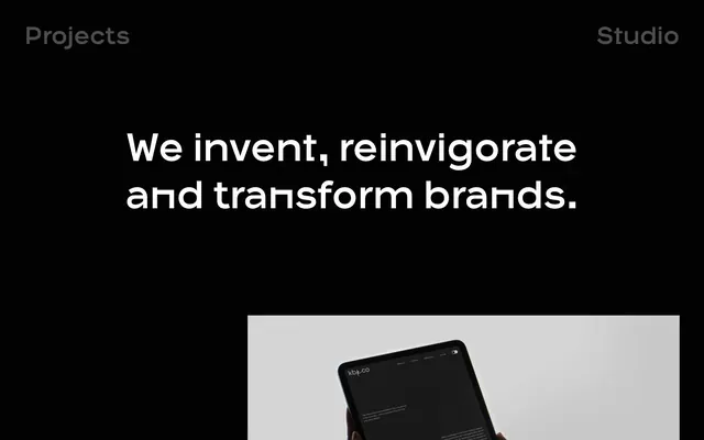
Tokyo Digital evokes a 'midnight command center' aesthetic, designed around a stark black canvas and crisp white typography. The system emphasizes clear information delivery through strong typographic hierarchy and minimal UI embellishments. Interactive elements are subtly delineated by outlines or slight opacity shifts, maintaining a low-key, professional atmosphere. Visual interest is primarily driven by dynamic hero content and the interplay of negative space.
This system features a mix of dynamic, full-bleed 3D rendered scenes (like the initial car interior) and abstract, colorful visuals for the hero section, contrasted with clean, product-focused logos for client showcases. Imagery is primarily decorative and atmospheric, acting as a backdrop or visual metaphor. Icons, if present, are minimal and likely outlined. The density is high in hero sections, with imagery dominating, while content sections are text-dominant with client logos serving as visual points. Photography is largely absent; the emphasis is on digital-native graphical elements.
Reminiscent of Huge Inc., Fantasy Interactive, AKQA, Studiometa.
# Tokyo Digital — Style Reference
> midnight command center

**Theme:** dark

**Site:** https://tokyo.uk

Tokyo Digital evokes a 'midnight command center' aesthetic, designed around a stark black canvas and crisp white typography. The system emphasizes clear information delivery through strong typographic hierarchy and minimal UI embellishments. Interactive elements are subtly delineated by outlines or slight opacity shifts, maintaining a low-key, professional atmosphere. Visual interest is primarily driven by dynamic hero content and the interplay of negative space.

## Tokens — Colors

| Name | Value | Token | Role |
|------|------|------|------|
| Absolute Zero | `#000000` | `--color-absolute-zero` | Page backgrounds, card surfaces, primary text on light backgrounds, ghost button borders |
| Canvas White | `#ffffff` | `--color-canvas-white` | Primary text on dark backgrounds, interactive button fills, input backgrounds |
| Ghost Gray | `#808080` | `--color-ghost-gray` | Input border lines, secondary text |
| Muted Action | `#999999` | `--color-muted-action` | Subtle button backgrounds |

## Tokens — Typography

### Aeonik
- **Substitute:** system-ui, sans-serif
- **Weights:** 300, 400
- **Sizes:** 8px, 16px, 24px, 40px, 63px
- **Line height:** 1, 1.1, 1.3, 1.5
- **Role:** Primary typeface for all text elements. The use of lighter weights for headings brings an understated, modern authority, contrasting with the graphic nature of the hero section. Normal letter spacing across the board maintains clarity.

## Tokens — Type Scale

Golden Ratio (1.618) from 16px base.

| Role | Size | Line height | Letter spacing |
|------|------|------|------|
| body | 16px | 1.5 | — |
| subheading | 24px | 1.3 | — |
| heading | 40px | 1.1 | — |
| display | 63px | 1.1 | — |

## Tokens — Spacing

- **Section gap:** 120px
- **Card padding:** 0px
- **Element gap:** 4px

## Tokens — Radius

- **Buttons:** 8px
- **Inputs:** 8px
- **Images:** 8px

## Imagery

This system features a mix of dynamic, full-bleed 3D rendered scenes (like the initial car interior) and abstract, colorful visuals for the hero section, contrasted with clean, product-focused logos for client showcases. Imagery is primarily decorative and atmospheric, acting as a backdrop or visual metaphor. Icons, if present, are minimal and likely outlined. The density is high in hero sections, with imagery dominating, while content sections are text-dominant with client logos serving as visual points. Photography is largely absent; the emphasis is on digital-native graphical elements.

## Components

### Primary Filled Button (Circular)
*Interactive element, often seen with zero padding for large click areas or icons.*

backgroundColor: rgba(255, 255, 255, 0.6) transitioning to rgba(255, 255, 255, 1) on hover/active. color: #000000. borderRadius: 100%. No padding specified, implies content dictates size.

### Text Input Field
*Standard form input for collecting user data.*

backgroundColor: rgba(0, 0, 0, 0) (transparent). color: #ffffff (text). borderTopColor: rgba(255, 255, 255, 0.5). borderRadius: 8px. padding: 32px top/bottom, 16px left/right. Placeholder text implicit in Ghost Gray.

### Client Logo Grid Item
*Displaying brand partners, often in a grid.*

backgroundColor: rgba(0, 0, 0, 0). borderRadius: 0px. boxShadow: none. padding: 0px. Presents logos without visual container, relying on layout for separation.

## Guidelines

### Do

- Maintain a predominantly black background using #000000 for canvas and main surfaces.
- Use #ffffff for primary text content against dark backgrounds to ensure high contrast.
- Apply Aeonik at weight 400 for body text and 300 for headings to create an airy, authoritative feel.
- Use 8px border-radius generously for interactive elements like buttons and input fields.
- Delimit input fields with a subtle rgba(255,255,255,0.5) border for a 'ghost' UI effect.
- Employ sections with 120px vertical padding for clear content separation.

### Don't

- Avoid using strong, saturated colors for UI elements; stick to the achromatic palette with minimal accent.
- Do not introduce heavy box shadows or elevation effects; the design relies on flatness and sharp contrast.
- Do not compromise on the high contrast between text and background; low contrast text is not part of this system.
- Avoid decorative borders on card elements; instead, use spacing to define content blocks.
- Do not vary line-height significantly from the defined font profiles, especially for headings, to preserve typographic rhythm.
- Do not apply padding to cards or grid items unless specifically requested; design expects zero-padded elements by default.

## Agent Prompt Guide

Quick Color Reference:
text: #ffffff
background: #000000
border: rgba(255, 255, 255, 0.5)
accent: none observed
primary action: #ffffff (filled action)

Example Component Prompts:
1. Create a hero text block: 'Creative and technical experts partnering...' using Aeonik weight 400 at 40px with #ffffff on a #000000 background.
2. Design a circular 'Menu' button: 100% border-radius, background rgba(255, 255, 255, 0.6), text #000000 (Aeonik weight 400 at 16px), no padding.
3. Build a contact form input for 'Email address': transparent background, text #ffffff (Aeonik weight 400 at 16px), border #808080, 8px border-radius, 32px vertical padding, 16px horizontal padding.
More like this









Keep what you find
A free account saves references to boards and can send you a weekly email of picks based on what you save.
To see every result, go Pro.