Preview image. Unlock full-res
sunny confident playground
Color palette
Primary background for sections and cards, badge backgrounds, key brand accents that brighten the overall experience. This bright, vivid yellow is the most prominent color, defining the brand's energetic and inviting atmosphere
Subtle card backgrounds, adding a lighter, softer variation of the primary brand yellow
Primary text color for headlines and body. Also used for button backgrounds for critical actions, navigation borders, and icon fills, providing strong contrast against both white and yellow surfaces
Page backgrounds, card backgrounds, and button text on Charcoal Ink buttons. Provides clean, open space and strong contrast
Secondary text color for descriptive body copy and subheadings, offering a slightly softer contrast than Charcoal Ink
Subtle secondary card backgrounds, adding a faint visual separation from pure white without heavy contrast
Text color for badges and less prominent interface elements
Helper text, navigation descriptions, and other subdued text elements
Typography
- Weights
- 400, 500, 600, 700
- Sizes
- 15px, 16px, 17px, 18px, 20px, 24px, 32px, 34px, 40px, 49px, 68px
- Line height
- 1, 1.1, 1.12, 1.18, 1.2, 1.25, 1.29, 1.33, 1.5
- Letter spacing
- 0.0070em, 0.0090em, 0.0120em, 0.0160em, 0.0180em, 0.0200em
- Fallback
- system-ui, sans-serif
Primary brand typeface. Its wide range of weights and sizes supports bold headlines and clear body text, establishing a confident and friendly tone. Letter spacing is slightly increased for smaller sizes and decreased for larger headlines.
Spacing & shape
Components
Background: Charcoal Ink (#202020), Text: Arctic White (#ffffff). Padding: 14px vertical, 24px horizontal. Radius: 16px or 25px (pill shape for prominent CTAs).
Background: None, Text: Charcoal Ink (#202020). Padding: 14px vertical, 22px horizontal. Radius: 0px.
Background: rgba(255, 255, 255, 0.8), Text: Subtle Slate (#575656). Padding: 12px vertical, 24px horizontal. Radius: 16px. Used for less prominent actions or filters.
Background: Bumble Yellow (#ffdb5b) or Amber Glow (#fff386). Radius: 9px or 24px. No box shadow. Padding varies by content, often 0px to allow content to dictate spacing.
Background: Arctic White (#ffffff) or Cloud Gray (#f3f3f3). Radius: 24px. No box shadow. Padding varies by content, often 0px to allow content to dictate spacing, occasionally 14px.
Background: Bumble Yellow (#ffdb5b), Text: Muted Stone (#343333). Padding: 20px vertical, 10px horizontal. Radius: 1000px (fully rounded).
Guidelines
- Use Bumble Yellow (#ffdb5b) as the dominant background color for sections or cards to immediately establish brand identity.
- Apply Charcoal Ink (#202020) for all primary body text and headlines to ensure high contrast and readability.
- Prefer large type sizes (e.g., 68px, 49px) and heavier weights (500, 600, 700) for headlines with the BumbleSans typeface.
- Utilize 16px and 24px border radii for buttons and cards respectively, creating a soft, approachable feel.
- Ensure generous internal padding for interactive elements; buttons typically use 14px vertical and 24px horizontal padding.
- Maintain minimal elevation; shadows should be subtle, such as rgba(32, 32, 32, 0.12) 0px 1px 8px 0px, predominantly for cards.
- Avoid using highly saturated colors other than Bumble Yellow or Amber Glow for major interface elements.
- Do not introduce strong, complex shadows, as the system favors a flatter, lighter aesthetic.
- Refrain from using thin body text weights that would visually conflict with the bold headline style.
- Do not deviate from the established rounded border radii for components; sharp corners are not part of this system.
- Avoid tight spacing around content; allow generous element and section gaps (e.g., 24px, 40px) to maintain an open feel.
- Do not use dark backgrounds for full sections unless a specific pattern (like the hero) dictates it, and even then, ensure a vibrant yellow accent or white text provides strong contrast.
About this system
ShowHide
Bumble's visual system evokes a playful confidence through its dominant bright yellow canvas and bold, heavy typography. Interaction is signaled by a shift from the signature brand yellow to crisp white and deep charcoal for actionable elements. Surfaces generally remain flat or minimally elevated with rounded corners, maintaining a light and open aesthetic that allows photographic content to take center stage.
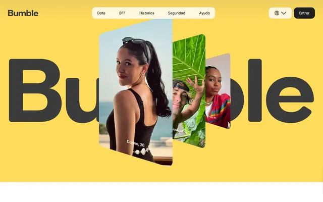
The page primarily employs a max-width contained layout, approximately 224px wide, centered on the screen, though the hero section breaks this constraint. The hero features a full-bleed vibrant Bumble Yellow background with large, centered brand typography and overlapping, angled photographic cards showcasing user profiles, creating a dynamic introduction. Subsequent sections alternate between vibrant yellow and clean white backgrounds, providing clear visual breaks. Content is often arranged in prominent centered stacks or two-column text-left/visual-right patterns. Navigation is handled by a sticky top bar with subtle ghost buttons and a prominent brand logo.
The site uses a mix of candid, lifestyle photography and product screenshots. Photography often features diverse individuals in engaging, active, and social scenarios, cropped and presented in a natural, unedited style within the UI. Product screenshots highlight the app interface directly, often placed within stylized device mockups or integrated into compositional elements like stacked, angled cards. Images are primarily contained within rounded card-like shapes or as background elements. Icons, though minimal, appear to be filled and monochrome, leveraging Charcoal Ink on Bumble Yellow.
Reminiscent of Tinder, Netflix, Spotify, Headspace.
# Bumble — Style Reference
> sunny confident playground

**Theme:** light

**Site:** https://bumble.com

Bumble's visual system evokes a playful confidence through its dominant bright yellow canvas and bold, heavy typography. Interaction is signaled by a shift from the signature brand yellow to crisp white and deep charcoal for actionable elements. Surfaces generally remain flat or minimally elevated with rounded corners, maintaining a light and open aesthetic that allows photographic content to take center stage.

## Tokens — Colors

| Name | Value | Token | Role |
|------|------|------|------|
| Bumble Yellow | `#ffdb5b` | `--color-bumble-yellow` | Primary background for sections and cards, badge backgrounds, key brand accents that brighten the overall experience. This bright, vivid yellow is the most prominent color, defining the brand's energetic and inviting atmosphere |
| Amber Glow | `#fff386` | `--color-amber-glow` | Subtle card backgrounds, adding a lighter, softer variation of the primary brand yellow |
| Charcoal Ink | `#202020` | `--color-charcoal-ink` | Primary text color for headlines and body. Also used for button backgrounds for critical actions, navigation borders, and icon fills, providing strong contrast against both white and yellow surfaces |
| Arctic White | `#ffffff` | `--color-arctic-white` | Page backgrounds, card backgrounds, and button text on Charcoal Ink buttons. Provides clean, open space and strong contrast |
| Deep Gray | `#3b3b3b` | `--color-deep-gray` | Secondary text color for descriptive body copy and subheadings, offering a slightly softer contrast than Charcoal Ink |
| Cloud Gray | `#f3f3f3` | `--color-cloud-gray` | Subtle secondary card backgrounds, adding a faint visual separation from pure white without heavy contrast |
| Muted Stone | `#343333` | `--color-muted-stone` | Text color for badges and less prominent interface elements |
| Subtle Slate | `#575656` | `--color-subtle-slate` | Helper text, navigation descriptions, and other subdued text elements |

## Tokens — Typography

### BumbleSans
- **Substitute:** system-ui, sans-serif
- **Weights:** 400, 500, 600, 700
- **Sizes:** 15px, 16px, 17px, 18px, 20px, 24px, 32px, 34px, 40px, 49px, 68px
- **Line height:** 1, 1.1, 1.12, 1.18, 1.2, 1.25, 1.29, 1.33, 1.5
- **Letter spacing:** 0.0070em, 0.0090em, 0.0120em, 0.0160em, 0.0180em, 0.0200em
- **Role:** Primary brand typeface. Its wide range of weights and sizes supports bold headlines and clear body text, establishing a confident and friendly tone. Letter spacing is slightly increased for smaller sizes and decreased for larger headlines.

## Tokens — Type Scale

Perfect Fourth (1.333) from 15px base.

| Role | Size | Line height | Letter spacing |
|------|------|------|------|
| body-sm | 15px | 1.25 | 0.007em |
| subheading | 20px | 1.25 | 0.012em |
| heading-sm | 24px | 1.2 | 0.016em |
| heading | 32px | 1.18 | 0.018em |
| heading-lg | 49px | 1.1 | 0.02em |
| display | 68px | 1 | 0.02em |

## Tokens — Spacing

- **Max width:** 224px
- **Section gap:** 40px
- **Card padding:** 40px
- **Element gap:** 24px

## Tokens — Radius

- **Buttons:** 16px
- **Cards:** 16px
- **badges:** 1000px
- **navigation:** 16px

## Layout

The page primarily employs a max-width contained layout, approximately 224px wide, centered on the screen, though the hero section breaks this constraint. The hero features a full-bleed vibrant Bumble Yellow background with large, centered brand typography and overlapping, angled photographic cards showcasing user profiles, creating a dynamic introduction. Subsequent sections alternate between vibrant yellow and clean white backgrounds, providing clear visual breaks. Content is often arranged in prominent centered stacks or two-column text-left/visual-right patterns. Navigation is handled by a sticky top bar with subtle ghost buttons and a prominent brand logo.

## Imagery

The site uses a mix of candid, lifestyle photography and product screenshots. Photography often features diverse individuals in engaging, active, and social scenarios, cropped and presented in a natural, unedited style within the UI. Product screenshots highlight the app interface directly, often placed within stylized device mockups or integrated into compositional elements like stacked, angled cards. Images are primarily contained within rounded card-like shapes or as background elements. Icons, though minimal, appear to be filled and monochrome, leveraging Charcoal Ink on Bumble Yellow.

## Components

### Primary Filled Button
*Call to action.*

Background: Charcoal Ink (#202020), Text: Arctic White (#ffffff). Padding: 14px vertical, 24px horizontal. Radius: 16px or 25px (pill shape for prominent CTAs).

### Ghost Navigation Button
*Secondary navigation or interactive text.*

Background: None, Text: Charcoal Ink (#202020). Padding: 14px vertical, 22px horizontal. Radius: 0px.

### Subtle Background Button
*Interactive elements with a softer visual presence.*

Background: rgba(255, 255, 255, 0.8), Text: Subtle Slate (#575656). Padding: 12px vertical, 24px horizontal. Radius: 16px. Used for less prominent actions or filters.

### Yellow Feature Card
*Highlights key features or content areas.*

Background: Bumble Yellow (#ffdb5b) or Amber Glow (#fff386). Radius: 9px or 24px. No box shadow. Padding varies by content, often 0px to allow content to dictate spacing.

### White Information Card
*Displays content on a neutral background.*

Background: Arctic White (#ffffff) or Cloud Gray (#f3f3f3). Radius: 24px. No box shadow. Padding varies by content, often 0px to allow content to dictate spacing, occasionally 14px.

### Pill Badge
*Labels categories or attributes.*

Background: Bumble Yellow (#ffdb5b), Text: Muted Stone (#343333). Padding: 20px vertical, 10px horizontal. Radius: 1000px (fully rounded).

## Guidelines

### Do

- Use Bumble Yellow (#ffdb5b) as the dominant background color for sections or cards to immediately establish brand identity.
- Apply Charcoal Ink (#202020) for all primary body text and headlines to ensure high contrast and readability.
- Prefer large type sizes (e.g., 68px, 49px) and heavier weights (500, 600, 700) for headlines with the BumbleSans typeface.
- Utilize 16px and 24px border radii for buttons and cards respectively, creating a soft, approachable feel.
- Ensure generous internal padding for interactive elements; buttons typically use 14px vertical and 24px horizontal padding.
- Maintain minimal elevation; shadows should be subtle, such as rgba(32, 32, 32, 0.12) 0px 1px 8px 0px, predominantly for cards.

### Don't

- Avoid using highly saturated colors other than Bumble Yellow or Amber Glow for major interface elements.
- Do not introduce strong, complex shadows, as the system favors a flatter, lighter aesthetic.
- Refrain from using thin body text weights that would visually conflict with the bold headline style.
- Do not deviate from the established rounded border radii for components; sharp corners are not part of this system.
- Avoid tight spacing around content; allow generous element and section gaps (e.g., 24px, 40px) to maintain an open feel.
- Do not use dark backgrounds for full sections unless a specific pattern (like the hero) dictates it, and even then, ensure a vibrant yellow accent or white text provides strong contrast.

## Agent Prompt Guide

Quick Color Reference:
- text: #202020
- background: #ffdb5b
- border: #202020 (often rgba(32, 32, 32, 0.12) for borders with transparency)
- accent: #ffdb5b
- primary action: #202020 (filled action)

Example Component Prompts:
1. Create a large hero banner with a Bumble Yellow (#ffdb5b) background. Include a large headline 'Existimos para acercar a las personas al amor.' using BumbleSans, weight 700, size 68px, Charcoal Ink (#202020). Below it, add a primary action button 'Descargar Bumble' with Charcoal Ink (#202020) background, Arctic White (#ffffff) text, 14px vertical and 24px horizontal padding, and 25px radius.
2. Design a feature card: Use Amber Glow (#fff386) background with 24px border-radius. Inside, place a heading 'Bumble Date' in BumbleSans, weight 600, size 32px, Deep Gray (#3b3b3b). Include a body paragraph in BumbleSans, weight 400, size 16px, Subtle Slate (#575656).
3. Create a navigation item 'Seguridad': Use an Arctic White (#ffffff) background with 16px border-radius, Padding: 12px vertical, 24px horizontal. Text: Charcoal Ink (#202020) at BumbleSans, weight 500, size 17px. Ensure elementGap of 24px between items.
More like this









Keep what you find
A free account saves references to boards and can send you a weekly email of picks based on what you save.
To see every result, go Pro.