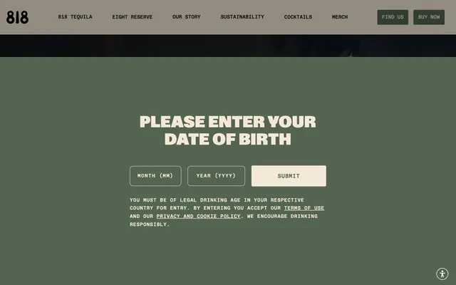
Preview image. Unlock full-res
earthy luxury parchment
Color palette
Primary background for age verification, main website canvas — a muted, sophisticated base that feels organic. Also used for solid button fills and borders
Decorative background sections and product highlights — a moderate, playful accent that stands out against the muted neutrals
Primary text color across dark backgrounds, input fields, subtle card surfaces, and button text on Agave Green backgrounds. Provides high contrast and a warm, aged feel
Primary text color on light backgrounds, navigational elements, and strong accent details
Secondary text, link borders, and card text — offers strong contrast against lighter surfaces
Background for specific content blocks, adding subtle variation to the natural palette
Strong contrast for text on very light backgrounds and button borders. Used sparingly to ensure maximum impact
Placeholder text in input fields, button text on light backgrounds, and subtle body text variations
Subtle card background, creating a light, elevated surface
Lightest card background, used for an almost white surface with a slight warmth
Button backgrounds for contrast, and occasional text against dark elements
Typography
- Weights
- 400, 600
- Sizes
- 15px, 18px, 20px, 24px
- Line height
- 1.5, 1.6
- Letter spacing
- 0.008em at 15px, 0.01em at 18px, 0.011em at 20px, 0.013em at 24px
- Fallback
- Georgia
Primary body and descriptive text, links, navigation items, and some button labels. Its classic serif quality lends a heritage feel, balanced by generous line height and precise tracking for readability.
- Weights
- 400, 500
- Sizes
- 11px, 14px, 16px, 18px, 20px, 24px, 25px
- Line height
- 1, 1.2, 1.6, 1.7, 1.82
- Letter spacing
- 0.01em at 11px, 0.011em at 14px, 0.013em at 16px, 0.063em at 18px, 0.1em at 20px, 0.113em at 24px, 0.164em at 25px
- Fallback
- Space Mono
Functional text for inputs, detailed lists, and small labels. Its condensed mono-spaced nature and wide letter-spacing create a distinct, modern, and precise tone, often indicating a technical or structured element.
- Weights
- 400, 500
- Sizes
- 20px, 24px, 32px, 34px, 50px, 60px, 72px
- Line height
- 0.9, 1, 1.05, 1.1, 1.4
- Letter spacing
- 0.02em at 20px, 0.008em at 24px, 0.005em at 32px, 0.004em at 34px, 0.003em at 50px, -0.01em at 60px, 0.01em at 72px
- Fallback
- Inter
Display headings and prominent calls to action. The variable weight and precise, sometimes negative, letter-spacing create a crisp, impactful, and modern headline presence that feels grounded yet refined.
- Weights
- 400
- Sizes
- 16px
- Line height
- 1.2
Times — detected in extracted data but not described by AI
Spacing & shape
Components
Solid Agave Green background (#536451) with Parchment White text (#f3e9d5). Padding is generous at 20px top/bottom, 80px right, 50px left, with a 4px border radius. Uses CaslonPro or GravityVariable for text. The deep padding communicates a substantial, deliberate action.
Agave Green background (#536451) with Parchment White text (#f3e9d5). Padding is 17px top, 15px bottom, 50px right/left. 4px border radius. Uses CaslonPro for text. Slightly less padding than primary buttons, indicating secondary interaction.
Parchment White (#f3e9d5) background with Ink Black text or icon (#000000). Full 50% border radius for a circular shape, with no explicit padding (content dictates size). Used for subtle interactive cues like close buttons or small controls.
Transparent background (rgba(255, 255, 255, 0.9)) with Ink Black text or icon (#000000). Full 50% border radius. Minimal 3px top and 2px right padding. Used for ghost-like interactions that should blend into the background.
Transparent background (rgba(0, 0, 0, 0)) with Parchment White text (#f3e9d5) and border (#f3e9d5). 10px border radius. 20px top/bottom padding, 10px right/left. Uses ABCFavoritMono for text. This ensures readability against a dark background, with a distinct, slightly rounded border.
Parchment White background (#f3e9d5) with Coal Gray text (#424547). 4px border radius. 16px top padding, no bottom padding, 56px right, 20px left. Uses ABCFavoritMono for text. A more traditional, lighter input style for brighter sections.
Transparent background (rgba(0, 0, 0, 0)), 20px border radius, no box shadow, with 533px top padding typically used for aspect ratio control for background images. This card type is meant to prominently feature visuals without heavy UI.
Warm Linen background (#faf7ef), 10px border radius, no box shadow, no padding. Used for containing content with subtle visual separation from the canvas.
Guidelines
- Prioritize Agave Green (#536451) as the primary background for full-screen overlays or prominent sections, and Parchment White (#f3e9d5) for text and interactive elements on these darker surfaces.
- Use CaslonPro for general body text and navigation, maintaining the provided size/line-height/letter-spacing combinations to ensure the classical, refined feel.
- Implement ABCFavoritMono for all input fields and dense data displays, ensuring generous letter-spacing to enhance its distinct monospace character.
- Apply 4px border-radius to all interactive buttons and navigational components for a subtle softening of edges, and 10-20px for larger content cards and input fields for a more prominent rounded aesthetic.
- Ensure headings use GravityVariable with its specific letter-spacing, particularly the negative tracking at larger sizes, to convey a crisp, modern presence.
- Leverage Ink Black (#0e1111) for primary text on Parchment White (#f3e9d5) or Warm Linen (#faf7ef) surfaces to maintain optimal contrast and readability.
- Maintain a comfortable density with element gaps typically around 10px and card padding at 16px to ensure visual breathability throughout the layout.
- Avoid arbitrary use of #bebc65 (Lemon Zest) as a UI element; reserve it strictly for decorative backgrounds or product highlights as an accent, not for functional components.
- Do not introduce sharp, unrounded corners for interactive elements such as buttons and inputs, as the system consistently uses 4px or 10px radii.
- Refrain from using heavily saturated colors for backgrounds or large UI areas, as the system relies on a muted, earthy palette for its primary identity.
- Do not deviate from the specified letter-spacing values for typefaces, especially the unique tracking of GravityVariable and ABCFavoritMono, as these are critical to the brand's typographic tone.
- Avoid excessive use of elevation or shadows, as the design system favors subtle surface changes and color separation for hierarchy.
- Do not create dense, text-heavy blocks without sufficient line-height or letter-spacing, which would compromise the airy and refined feel of the typography.
- Do not combine multiple contrasting background colors within a single section unless specifically designed as an accent feature, as the system prioritizes monolithic color blocks for clarity.
About this system
ShowHide
The drink818 brand design system evokes a sense of understated luxury, blending natural tones with classic typography. A dominant muted green-gray serves as a grounding canvas, while a creamy off-white provides a soft, warm counterpoint for text and interactive elements. Typography is a mix of heritage serif for display and modern sans-serif for functional text, often with generous letter-spacing for an airy, refined feel. Interface elements are generally subtle, favoring rounded shapes and a focus on content over heavy decoration, with interactivity indicated by color shifts and slight elevation.
The page primarily uses a full-bleed layout, particularly for hero sections and main content blocks, with internal content often contained within logical boundaries on a dominant Agave Green canvas. The hero section often features a large, impactful headline centered on a dark background. Section rhythm is created through alternating background colors, primarily the Agave Green base and lighter parchment-like surfaces, maintaining consistent vertical spacing. Content arrangement frequently alternates between text-left/visual-right patterns or centered stacks of information. Small card grids are used for features or product displays. The overall density feels comfortable, with generous breathing room around elements. Navigation is handled by a fixed top bar with understated text links and distinct 'Find Us' and 'Buy Now' buttons.
The visual language predominantly features product photography, specifically tightly cropped product bottles against neutral backgrounds or within minimal lifestyle contexts. Imagery is often contained within rounded rectangular cards (20px radius). There is minimal use of abstract graphics or illustrations; the focus is on showcasing the product itself. Icons are generally simple, outlined, and monochromatic, used functionally rather than decoratively. Overall, imagery is content-focused and supports the premium, understated brand narrative, appearing as showcases rather than atmospheric fillers. Density varies, with some sections being image-heavy product grids and others text-dominant informational blocks.
Reminiscent of Patagonia, Aesop, O'Neill, Jenni Kayne.
# drink818 — Style Reference
> earthy luxury parchment

**Theme:** light

**Site:** https://drink818.com

The drink818 brand design system evokes a sense of understated luxury, blending natural tones with classic typography. A dominant muted green-gray serves as a grounding canvas, while a creamy off-white provides a soft, warm counterpoint for text and interactive elements. Typography is a mix of heritage serif for display and modern sans-serif for functional text, often with generous letter-spacing for an airy, refined feel. Interface elements are generally subtle, favoring rounded shapes and a focus on content over heavy decoration, with interactivity indicated by color shifts and slight elevation.

## Tokens — Colors

| Name | Value | Token | Role |
|------|------|------|------|
| Agave Green | `#536451` | `--color-agave-green` | Primary background for age verification, main website canvas — a muted, sophisticated base that feels organic. Also used for solid button fills and borders |
| Lemon Zest | `#bebc65` | `--color-lemon-zest` | Decorative background sections and product highlights — a moderate, playful accent that stands out against the muted neutrals |
| Parchment White | `#f3e9d5` | `--color-parchment-white` | Primary text color across dark backgrounds, input fields, subtle card surfaces, and button text on Agave Green backgrounds. Provides high contrast and a warm, aged feel |
| Ink Black | `#0e1111` | `--color-ink-black` | Primary text color on light backgrounds, navigational elements, and strong accent details |
| Deep Gray | `#212121` | `--color-deep-gray` | Secondary text, link borders, and card text — offers strong contrast against lighter surfaces |
| Stone Gray | `#aa9580` | `--color-stone-gray` | Background for specific content blocks, adding subtle variation to the natural palette |
| True Black | `#000000` | `--color-true-black` | Strong contrast for text on very light backgrounds and button borders. Used sparingly to ensure maximum impact |
| Coal Gray | `#424547` | `--color-coal-gray` | Placeholder text in input fields, button text on light backgrounds, and subtle body text variations |
| Silver Mist | `#bbbbbb` | `--color-silver-mist` | Subtle card background, creating a light, elevated surface |
| Warm Linen | `#faf7ef` | `--color-warm-linen` | Lightest card background, used for an almost white surface with a slight warmth |
| Pure White | `#ffffff` | `--color-pure-white` | Button backgrounds for contrast, and occasional text against dark elements |

## Tokens — Typography

### CaslonPro
- **Substitute:** Georgia
- **Weights:** 400, 600
- **Sizes:** 15px, 18px, 20px, 24px
- **Line height:** 1.5, 1.6
- **Letter spacing:** 0.008em at 15px, 0.01em at 18px, 0.011em at 20px, 0.013em at 24px
- **Role:** Primary body and descriptive text, links, navigation items, and some button labels. Its classic serif quality lends a heritage feel, balanced by generous line height and precise tracking for readability.

### ABCFavoritMono
- **Substitute:** Space Mono
- **Weights:** 400, 500
- **Sizes:** 11px, 14px, 16px, 18px, 20px, 24px, 25px
- **Line height:** 1, 1.2, 1.6, 1.7, 1.82
- **Letter spacing:** 0.01em at 11px, 0.011em at 14px, 0.013em at 16px, 0.063em at 18px, 0.1em at 20px, 0.113em at 24px, 0.164em at 25px
- **Role:** Functional text for inputs, detailed lists, and small labels. Its condensed mono-spaced nature and wide letter-spacing create a distinct, modern, and precise tone, often indicating a technical or structured element.

### GravityVariable
- **Substitute:** Inter
- **Weights:** 400, 500
- **Sizes:** 20px, 24px, 32px, 34px, 50px, 60px, 72px
- **Line height:** 0.9, 1, 1.05, 1.1, 1.4
- **Letter spacing:** 0.02em at 20px, 0.008em at 24px, 0.005em at 32px, 0.004em at 34px, 0.003em at 50px, -0.01em at 60px, 0.01em at 72px
- **Role:** Display headings and prominent calls to action. The variable weight and precise, sometimes negative, letter-spacing create a crisp, impactful, and modern headline presence that feels grounded yet refined.

### Times
- **Weights:** 400
- **Sizes:** 16px
- **Line height:** 1.2
- **Role:** Times — detected in extracted data but not described by AI

## Tokens — Type Scale

| Role | Size | Line height | Letter spacing |
|------|------|------|------|
| caption | 11px | 1.7 | 1.1px |
| body-sm | 14px | 1.6 | 0.11px |
| subheading | 18px | 1.6 | 0.945px |
| heading-sm | 20px | 1.2 | 2px |
| heading | 24px | 1.05 | 0.192px |
| heading-lg | 32px | 1.1 | 0.16px |
| display | 72px | 0.9 | 0.72px |

## Tokens — Spacing

- **Section gap:** 55px
- **Card padding:** 16px
- **Element gap:** 10px

## Tokens — Radius

- **Buttons:** 4px
- **Inputs:** 10px
- **Cards:** 20px
- **Images:** 20px
- **body:** 4px
- **links:** 4px
- **nav:** 4px

## Layout

The page primarily uses a full-bleed layout, particularly for hero sections and main content blocks, with internal content often contained within logical boundaries on a dominant Agave Green canvas. The hero section often features a large, impactful headline centered on a dark background. Section rhythm is created through alternating background colors, primarily the Agave Green base and lighter parchment-like surfaces, maintaining consistent vertical spacing. Content arrangement frequently alternates between text-left/visual-right patterns or centered stacks of information. Small card grids are used for features or product displays. The overall density feels comfortable, with generous breathing room around elements. Navigation is handled by a fixed top bar with understated text links and distinct 'Find Us' and 'Buy Now' buttons.

## Imagery

The visual language predominantly features product photography, specifically tightly cropped product bottles against neutral backgrounds or within minimal lifestyle contexts. Imagery is often contained within rounded rectangular cards (20px radius). There is minimal use of abstract graphics or illustrations; the focus is on showcasing the product itself. Icons are generally simple, outlined, and monochromatic, used functionally rather than decoratively. Overall, imagery is content-focused and supports the premium, understated brand narrative, appearing as showcases rather than atmospheric fillers. Density varies, with some sections being image-heavy product grids and others text-dominant informational blocks.

## Components

### Primary Filled Button
*Main call to action*

Solid Agave Green background (#536451) with Parchment White text (#f3e9d5). Padding is generous at 20px top/bottom, 80px right, 50px left, with a 4px border radius. Uses CaslonPro or GravityVariable for text. The deep padding communicates a substantial, deliberate action.

### Navigation Button
*Subtle UI element for navigation*

Agave Green background (#536451) with Parchment White text (#f3e9d5). Padding is 17px top, 15px bottom, 50px right/left. 4px border radius. Uses CaslonPro for text. Slightly less padding than primary buttons, indicating secondary interaction.

### Circular Icon Button (Light)
*Small interactive elements*

Parchment White (#f3e9d5) background with Ink Black text or icon (#000000). Full 50% border radius for a circular shape, with no explicit padding (content dictates size). Used for subtle interactive cues like close buttons or small controls.

### Circular Icon Button (Transparent)
*Subtle interactive elements*

Transparent background (rgba(255, 255, 255, 0.9)) with Ink Black text or icon (#000000). Full 50% border radius. Minimal 3px top and 2px right padding. Used for ghost-like interactions that should blend into the background.

### Primary Input Field
*User data entry*

Transparent background (rgba(0, 0, 0, 0)) with Parchment White text (#f3e9d5) and border (#f3e9d5). 10px border radius. 20px top/bottom padding, 10px right/left. Uses ABCFavoritMono for text. This ensures readability against a dark background, with a distinct, slightly rounded border.

### Secondary Input Field
*Alternate user data entry*

Parchment White background (#f3e9d5) with Coal Gray text (#424547). 4px border radius. 16px top padding, no bottom padding, 56px right, 20px left. Uses ABCFavoritMono for text. A more traditional, lighter input style for brighter sections.

### Image Card
*Displaying product images or visuals*

Transparent background (rgba(0, 0, 0, 0)), 20px border radius, no box shadow, with 533px top padding typically used for aspect ratio control for background images. This card type is meant to prominently feature visuals without heavy UI.

### Warm Linen Card
*Content container on lighter backgrounds*

Warm Linen background (#faf7ef), 10px border radius, no box shadow, no padding. Used for containing content with subtle visual separation from the canvas.

## Guidelines

### Do

- Prioritize Agave Green (#536451) as the primary background for full-screen overlays or prominent sections, and Parchment White (#f3e9d5) for text and interactive elements on these darker surfaces.
- Use CaslonPro for general body text and navigation, maintaining the provided size/line-height/letter-spacing combinations to ensure the classical, refined feel.
- Implement ABCFavoritMono for all input fields and dense data displays, ensuring generous letter-spacing to enhance its distinct monospace character.
- Apply 4px border-radius to all interactive buttons and navigational components for a subtle softening of edges, and 10-20px for larger content cards and input fields for a more prominent rounded aesthetic.
- Ensure headings use GravityVariable with its specific letter-spacing, particularly the negative tracking at larger sizes, to convey a crisp, modern presence.
- Leverage Ink Black (#0e1111) for primary text on Parchment White (#f3e9d5) or Warm Linen (#faf7ef) surfaces to maintain optimal contrast and readability.
- Maintain a comfortable density with element gaps typically around 10px and card padding at 16px to ensure visual breathability throughout the layout.

### Don't

- Avoid arbitrary use of #bebc65 (Lemon Zest) as a UI element; reserve it strictly for decorative backgrounds or product highlights as an accent, not for functional components.
- Do not introduce sharp, unrounded corners for interactive elements such as buttons and inputs, as the system consistently uses 4px or 10px radii.
- Refrain from using heavily saturated colors for backgrounds or large UI areas, as the system relies on a muted, earthy palette for its primary identity.
- Do not deviate from the specified letter-spacing values for typefaces, especially the unique tracking of GravityVariable and ABCFavoritMono, as these are critical to the brand's typographic tone.
- Avoid excessive use of elevation or shadows, as the design system favors subtle surface changes and color separation for hierarchy.
- Do not create dense, text-heavy blocks without sufficient line-height or letter-spacing, which would compromise the airy and refined feel of the typography.
- Do not combine multiple contrasting background colors within a single section unless specifically designed as an accent feature, as the system prioritizes monolithic color blocks for clarity.

## Agent Prompt Guide

**Quick Color Reference**
- text: #f3e9d5 (on dark), #0e1111 (on light)
- background: #536451 (primary canvas)
- border: #f3e9d5 (light inputs), #0e1111 (dark text elements)
- accent: #bebc65 (highlights)
- primary action: #536451 (filled action)

**3-5 Example Component Prompts**
1. Create an age verification input field: transparent background, Parchment White (#f3e9d5) text and border, 10px radius, 20px top/bottom, 10px right/left padding, ABCFavoritMono font, 18px size, 0.063em letter-spacing.
2. Create a primary call to action button: Agave Green (#536451) background, Parchment White (#f3e9d5) text, 4px border radius, 20px top/bottom padding, 80px right padding, 50px left padding, CaslonPro font, 18px size, 0.01em letter-spacing.
3. Create a secondary navigation link: Parchment White (#f3e9d5) text, no background, CaslonPro font, 15px size, 0.008em letter-spacing.
4. Create a prominent page heading: Ink Black (#0e1111) text, GravityVariable font, 72px size, 0.01em letter-spacing, line-height 0.9.
More like this









Keep what you find
A free account saves references to boards and can send you a weekly email of picks based on what you save.
To see every result, go Pro.