Preview image. Unlock full-res
Sun-drenched architectural drafting
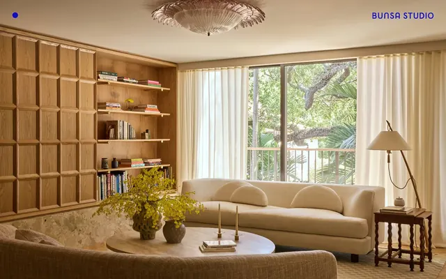
Bunsa Studio employs a 'sun-drenched architectural drafting' aesthetic, primarily using a stark achromatic palette of crisp white and deep black. A single, vibrant blue serves as the sole accent, appearing as sharp-edged navigation elements and subtle interactive cues. Typography is minimal and bold, favoring strong contrasts. The overall impression is one of confident restraint, with design elements serving a clear functional purpose rather than decorative flourish. Prioritize Canvas White (#fcfaf7) as the dominant background color for all page sections. Use Midnight Black (#000000) for all primary text content to ensure maximum contrast. Reserve Electric Blue (#0b0bca) exclusively for interactive elements like buttons, links, and subtle icon accents. Maintain a sharp, unrounded aesthetic by using a 0px border-radius for all interactive components and containers. Employ the Ghost Accent Button style for all primary actions: Electric Blue text, Electric Blue border, and no background fill. Utilize HelveticaNowDisplay in varied weights (400, 700) and sizes (20px, 60px) for all text elements to establish hierarchy. Implement generous vertical spacing between major sections, with a default section gap of 160px. Avoid using any colors other than Canvas White, Midnight Black, and Electric Blue in the interface, except within imagery or content. Do not use filled buttons as primary actions; always favor the outlined/ghost style with Electric Blue. Resist adding any shadow effects or elevation; the design system relies on flat surfaces and high contrast. Never introduce rounded corners on any UI element; all shapes should be angular and sharp. Do not vary line-height unless explicitly specified for a text size; usually, 1.1 for large headings and 1.3 for body text. Avoid decorative gradients or background images in UI elements; maintain a clean, flat aesthetic. Do not introduce extensive padding within UI elements; apply minimal padding to controls like 5px on buttons.