Preview image. Unlock full-res
Parchment and Cobalt
Color palette
Primary accent color for interactive elements, links, and outlines. This vivid blue makes actions feel charged and draws immediate attention
Page background, primary surface
Primary body text, borders for most UI elements, subtle dividers
Strongest text contrast, prominent link text, navigation items
Implicit background for some overlaid elements, very subtle borders
Typography
- Weights
- 400
- Sizes
- 16px, 18px, 22px
- Line height
- 1, 1.67
- Fallback
- system-ui
Primary body text, descriptive labels, and general UI. Its neutrality provides a stable foundation for the more expressive display font.
- Weights
- 400
- Sizes
- 16px, 18px
- Line height
- 1, 1.67
- Letter spacing
- 0.0190em
- Fallback
- SF Mono, Monaco, Menlo, Consolas
Secondary text, navigation items, and helper text. The slightly wider tracking and distinct character give it a subtle, technical personality without being overwhelming.
- Weights
- 400
- Sizes
- 55px
- Line height
- 1
- Fallback
- Playfair Display
Display headlines and hero text. This custom decorative serif brings a unique, artistic flourish, contrasting with the more functional body text.
Spacing & shape
Components
Text in Calling Code Regular, color Deepest Ink (#000000) or Luminous Blue (#283cff) for active/hover states. Underlined by a 1px Midnight Charcoal (#292a2c) border-bottom on hover, or 1px Luminous Blue (#283cff) for active state. Padding-bottom 4px.
Luminous Blue (#283cff) text. No explicit underline, color shift is the primary indicator. Padding 5px top/bottom, 9px left/right.
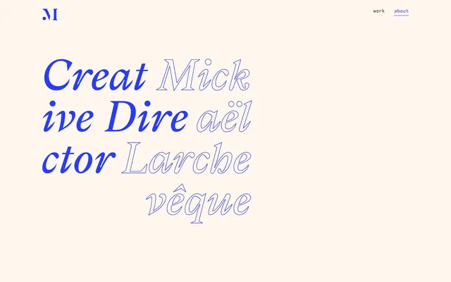
Gza font, 55px size, 400 weight, line-height 1.0, color Luminous Blue (#283cff) for prominent words, and Midnight Charcoal (#292a2c) for outlined words. Normal letter spacing.
Open Sans font, 16px size, 400 weight, line-height 1.67, color Midnight Charcoal (#292a2c). Top and bottom margin of 30px.
The 'M' monogram uses Luminous Blue (#283cff) for the letter and may include an outlined box. Placed in the top-left corner, with a 98px margin to the right.
Guidelines
- Prioritize 'Gza' font for all large, expressive headlines to maintain the unique artistic tone.
- Use Luminous Blue (#283cff) exclusively for interactive elements like links, buttons (outlined), and active navigation states.
- Maintain a clear visual hierarchy by contrasting Luminous Blue (#283cff) accents against the Parchment (#fff6ed) background and Midnight Charcoal (#292a2c) text.
- Apply 1px solid borders in Midnight Charcoal (#292a2c) or Luminous Blue (#283cff) for subtle definition of interactive elements or content blocks.
- Ensure generous spacing: a 98px section gap for vertical rhythm and 30px element gaps for internal content separation.
- Use Open Sans (400) for all body copy to ensure legibility and a consistent textual voice at 16px or 18px.
- Outline secondary typographic elements in Midnight Charcoal (#292a2c) or Luminous Blue (#283cff) to provide visual variation without adding new colors.
- Avoid introducing new primary colors; the system relies on Parchment (#fff6ed) as background and Luminous Blue (#283cff) as the primary accent.
- Do not use box shadows or excessive border-radius; the design maintains a flat, crisp aesthetic.
- Refrain from using heavily saturated images or illustrations; the visual language leans towards minimalist graphics or outlined typography.
- Do not create filled buttons or primary actions; the design consistently uses outlined or text-based interactive elements.
- Avoid dense, text-heavy sections; break content with generous white space and the distinct typographic hierarchy.
- Do not use default browser link styles; always apply Luminous Blue (#283cff) for links and ensure clear hover states.
About this system
ShowHide
Mickael Larcheveque's portfolio establishes an atmosphere of understated elegance and intellectual curiosity. It pairs a warm, almost parchment-like background with a single intense primary blue for highlights and active states, creating a high-contrast but refined visual tension. The typography mixes a modern sans-serif with a more expressive, almost calligraphic display serif for headlines, emphasizing creativity. The layout feels spacious, with clear hierarchy and minimal embellishment.
The page operates on a contained layout with a maximum width of 1230px, centered on a Parchment (#fff6ed) background. The hero section features large, expressive outlined typography (Gza font) with Luminous Blue (#283cff) highlights, presented simply against the background. Sections maintain a consistent vertical rhythm with generous 98px gaps, creating ample breathing room. Content arrangement is primarily vertical stacking of typographic elements and links, with clear visual separation. Navigation is a minimalist top-right header with two text links that subtly outline on hover/active, complemented by a simple logo in the top-left.
The site primarily uses expressive, outlined typography as its main 'imagery'. When visuals are present, they are either abstract graphical elements (like the upward-sweeping arrow) or highly stylized, almost iconographic representations. There is an absence of photography or complex illustrations, keeping the focus on typography and interaction. Iconography, when present, adheres to an outlined, minimalist style. Imagery serves a decorative and illustrative purpose through typographic art, rather than showcasing products or lifestyle.
Reminiscent of AIGA Journal, The New York Times (digital), Frank Digital.
# Mickael Larcheveque — Style Reference
> Parchment and Cobalt

**Theme:** light

**Site:** https://www.dotmick.com

Mickael Larcheveque's portfolio establishes an atmosphere of understated elegance and intellectual curiosity. It pairs a warm, almost parchment-like background with a single intense primary blue for highlights and active states, creating a high-contrast but refined visual tension. The typography mixes a modern sans-serif with a more expressive, almost calligraphic display serif for headlines, emphasizing creativity. The layout feels spacious, with clear hierarchy and minimal embellishment.

## Tokens — Colors

| Name | Value | Token | Role |
|------|------|------|------|
| Luminous Blue | `#283cff` | `--color-luminous-blue` | Primary accent color for interactive elements, links, and outlines. This vivid blue makes actions feel charged and draws immediate attention |
| Parchment | `#fff6ed` | `--color-parchment` | Page background, primary surface |
| Midnight Charcoal | `#292a2c` | `--color-midnight-charcoal` | Primary body text, borders for most UI elements, subtle dividers |
| Deepest Ink | `#000000` | `--color-deepest-ink` | Strongest text contrast, prominent link text, navigation items |
| Canvas White | `#ffffff` | `--color-canvas-white` | Implicit background for some overlaid elements, very subtle borders |

## Tokens — Typography

### Open Sans
- **Substitute:** system-ui
- **Weights:** 400
- **Sizes:** 16px, 18px, 22px
- **Line height:** 1, 1.67
- **Role:** Primary body text, descriptive labels, and general UI. Its neutrality provides a stable foundation for the more expressive display font.

### Calling Code Regular
- **Substitute:** SF Mono, Monaco, Menlo, Consolas
- **Weights:** 400
- **Sizes:** 16px, 18px
- **Line height:** 1, 1.67
- **Letter spacing:** 0.0190em
- **Role:** Secondary text, navigation items, and helper text. The slightly wider tracking and distinct character give it a subtle, technical personality without being overwhelming.

### Gza
- **Substitute:** Playfair Display
- **Weights:** 400
- **Sizes:** 55px
- **Line height:** 1
- **Role:** Display headlines and hero text. This custom decorative serif brings a unique, artistic flourish, contrasting with the more functional body text.

## Tokens — Type Scale

Perfect Fifth (1.5) from 16px base.

| Role | Size | Line height | Letter spacing |
|------|------|------|------|
| body | 16px | 1.67 | — |
| body-lg | 18px | 1.67 | — |
| subheading | 22px | 1 | — |
| display | 55px | 1 | — |

## Tokens — Spacing

- **Max width:** 1230px
- **Section gap:** 98px
- **Card padding:** 15px
- **Element gap:** 30px

## Tokens — Radius

- **Default:** 0px

## Layout

The page operates on a contained layout with a maximum width of 1230px, centered on a Parchment (#fff6ed) background. The hero section features large, expressive outlined typography (Gza font) with Luminous Blue (#283cff) highlights, presented simply against the background. Sections maintain a consistent vertical rhythm with generous 98px gaps, creating ample breathing room. Content arrangement is primarily vertical stacking of typographic elements and links, with clear visual separation. Navigation is a minimalist top-right header with two text links that subtly outline on hover/active, complemented by a simple logo in the top-left.

## Imagery

The site primarily uses expressive, outlined typography as its main 'imagery'. When visuals are present, they are either abstract graphical elements (like the upward-sweeping arrow) or highly stylized, almost iconographic representations. There is an absence of photography or complex illustrations, keeping the focus on typography and interaction. Iconography, when present, adheres to an outlined, minimalist style. Imagery serves a decorative and illustrative purpose through typographic art, rather than showcasing products or lifestyle.

## Components

### Navigation Link
*Top-level navigation items.*

Text in Calling Code Regular, color Deepest Ink (#000000) or Luminous Blue (#283cff) for active/hover states. Underlined by a 1px Midnight Charcoal (#292a2c) border-bottom on hover, or 1px Luminous Blue (#283cff) for active state. Padding-bottom 4px.

### Primary Link
*Inline textual links and interactive elements within content.*

Luminous Blue (#283cff) text. No explicit underline, color shift is the primary indicator. Padding 5px top/bottom, 9px left/right.

### Hero Headline
*Large, expressive text for main page titles.*

Gza font, 55px size, 400 weight, line-height 1.0, color Luminous Blue (#283cff) for prominent words, and Midnight Charcoal (#292a2c) for outlined words. Normal letter spacing.

### Body Paragraph
*Standard informational text blocks.*

Open Sans font, 16px size, 400 weight, line-height 1.67, color Midnight Charcoal (#292a2c). Top and bottom margin of 30px.

### Logo
*Brand identity mark.*

The 'M' monogram uses Luminous Blue (#283cff) for the letter and may include an outlined box. Placed in the top-left corner, with a 98px margin to the right.

## Guidelines

### Do

- Prioritize 'Gza' font for all large, expressive headlines to maintain the unique artistic tone.
- Use Luminous Blue (#283cff) exclusively for interactive elements like links, buttons (outlined), and active navigation states.
- Maintain a clear visual hierarchy by contrasting Luminous Blue (#283cff) accents against the Parchment (#fff6ed) background and Midnight Charcoal (#292a2c) text.
- Apply 1px solid borders in Midnight Charcoal (#292a2c) or Luminous Blue (#283cff) for subtle definition of interactive elements or content blocks.
- Ensure generous spacing: a 98px section gap for vertical rhythm and 30px element gaps for internal content separation.
- Use Open Sans (400) for all body copy to ensure legibility and a consistent textual voice at 16px or 18px.
- Outline secondary typographic elements in Midnight Charcoal (#292a2c) or Luminous Blue (#283cff) to provide visual variation without adding new colors.

### Don't

- Avoid introducing new primary colors; the system relies on Parchment (#fff6ed) as background and Luminous Blue (#283cff) as the primary accent.
- Do not use box shadows or excessive border-radius; the design maintains a flat, crisp aesthetic.
- Refrain from using heavily saturated images or illustrations; the visual language leans towards minimalist graphics or outlined typography.
- Do not create filled buttons or primary actions; the design consistently uses outlined or text-based interactive elements.
- Avoid dense, text-heavy sections; break content with generous white space and the distinct typographic hierarchy.
- Do not use default browser link styles; always apply Luminous Blue (#283cff) for links and ensure clear hover states.

## Agent Prompt Guide

**Quick Color Reference**
text: #292a2c
background: #fff6ed
border: #292a2c
accent: #283cff
primary action: #283cff (outlined action border)

**3-5 Example Component Prompts**
1. Create a hero section: Parchment background (#fff6ed). Main headline 'Creative' in Gza font 55px (weight 400, color #283cff). Sub-headline 'Studio' in Gza font 55px (weight 400, color #292a2c, outlined style). Below, a brief descriptive paragraph in Open Sans 16px (weight 400, color #292a2c), line-height 1.67.
2. Create a navigation bar: Parchment background (#fff6ed). Nav links 'work' and 'about' in Calling Code Regular 16px (weight 400, color #000000, letter-spacing 0.0190em). On hover, add a 1px bottom border in #292a2c, 4px padding-bottom. Logo (placeholder for 'M') in #283cff on the left.
3. Create a listing item: Text link 'Sailor Moon Handheld Console' in Luminous Blue (#283cff), Open Sans 18px (weight 400). Add a slight hover effect that changes border-color to Luminous Blue (#283cff).
More like this









Keep what you find
A free account saves references to boards and can send you a weekly email of picks based on what you save.
To see every result, go Pro.