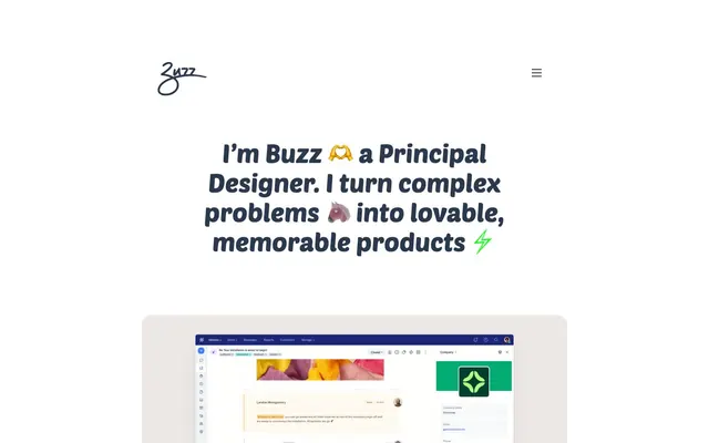
Preview image. Unlock full-res
Clean slate, playful voice
Color palette
Primary text across headings and body, accent for selected interactive elements, primary button fills
Outlined button borders, subtle interactive accents
Page backgrounds, card surfaces, ghost button backgrounds
Secondary text for body content, text on filled primary buttons
Typography
- Weights
- 400
- Sizes
- 52px
- Line height
- 1.15
- Fallback
- Bebas Neue
Display headlines and primary section titles — gives a distinctive, friendly, and bold presence to key statements, ensuring immediate personality.
- Weights
- 400, 500
- Sizes
- 13px, 14px, 15px, 16px, 22px
- Line height
- 1, 1.71, 1.87, 2.09
- Fallback
- Open Sans
Body copy, navigation, buttons, and supplemental text — a highly legible sans-serif for all functional and supportive text, providing a reliable baseline.
Spacing & shape
Components
Filled with Graphite Ink background (#2a394e), Muted Midnight text (#14243c), and a generous 30px border radius. Padding of 15px vertical and 25px horizontal creates ample touch targets and a soft, approachable pill shape.
Appears as a simple 'Menu' icon with a transparent background, implicitly using Canvas White (#ffffff) as its background. No visible border, text color defaults to browser standard for links before hovering/interaction.
Guidelines
- Prioritize Canvas White (#ffffff) for all large background areas and card surfaces, creating a clean base.
- Use Graphite Ink (#2a394e) for all primary headline and body text, establishing a strong, readable dark neutral.
- Apply Poetsen One at 52px, weight 400, for section headlines or hero text to introduce branding personality.
- For interactive elements, use the 30px border-radius, creating a consistent pill shape for buttons.
- Maintain a spacious environment, utilizing 50px as the primary vertical separation between major sections.
- For primary call-to-action buttons, use a Graphite Ink (#2a394e) fill with Muted Midnight (#14243c) text, with 15px vertical and 25px horizontal padding, and 30px radius.
- Avoid using multiple vibrant chromatic colors; restrict accent colors primarily to Vivid Violet (#4700d8) for subtle highlights.
- Do not deviate from Roboto for body text and functional UI elements where immediate readability is key.
- Avoid tight element groupings; ensure a minimum of 10px spacing between elements to preserve visual breathability.
- Do not introduce complex shadows or excessive borders; surfaces should feel lightweight and minimally elevated.
- Refrain from using strong background patterns or textures; surfaces are intended to be clean and understated.
About this system
ShowHide
Buzz Usborne's design system presents as a clean, spacious canvas with a playful, yet strong typographic voice. The visual identity relies on a dominant dark gray for text and primary interactive elements, accented by a single vivid violet for subtle button detailing, creating a sense of understated vibrancy. Component surfaces and backgrounds are kept pristine white, emphasizing content and a lightweight feel. Overall, the system projects an approachable, content-focused atmosphere, leaning on personality in typography rather than complex color schemes or heavy ornamentation.
The page maintains a centered max-width layout, approximately 950-1000px wide, creating clear content boundaries on a Canvas White background. The hero section is a centered stack of a playful headline over a contained product image. Vertical rhythm is established through consistent 50px section gaps and ample side padding of 150px or more on text blocks. Content often appears in single-column stacks, emphasizing direct communication rather than complex multi-column grids or visual fragmentation. Navigation is minimal, consisting of a sticky top header with a brand logo and a simple 'Menu' button.
This system primarily uses product screenshots and illustrative emojis rather than traditional photography. Product screenshots are contained within soft-rectangular cards with 20px radius. Emojis are used directly within heading text, adding a playful, approachable, and personalized tone to the communication. Icons are minimal, likely linear or mono-color, serving purely functional roles like the 'Menu' button.
Reminiscent of Figma, Linear, Miro, Notion.
# Buzz Usborne — Style Reference
> Clean slate, playful voice

**Theme:** light

**Site:** https://buzzusborne.com

Buzz Usborne's design system presents as a clean, spacious canvas with a playful, yet strong typographic voice. The visual identity relies on a dominant dark gray for text and primary interactive elements, accented by a single vivid violet for subtle button detailing, creating a sense of understated vibrancy. Component surfaces and backgrounds are kept pristine white, emphasizing content and a lightweight feel. Overall, the system projects an approachable, content-focused atmosphere, leaning on personality in typography rather than complex color schemes or heavy ornamentation.

## Tokens — Colors

| Name | Value | Token | Role |
|------|------|------|------|
| Graphite Ink | `#2a394e` | `--color-graphite-ink` | Primary text across headings and body, accent for selected interactive elements, primary button fills |
| Vivid Violet | `#4700d8` | `--color-vivid-violet` | Outlined button borders, subtle interactive accents |
| Canvas White | `#ffffff` | `--color-canvas-white` | Page backgrounds, card surfaces, ghost button backgrounds |
| Muted Midnight | `#14243c` | `--color-muted-midnight` | Secondary text for body content, text on filled primary buttons |

## Tokens — Typography

### Poetsen One
- **Substitute:** Bebas Neue
- **Weights:** 400
- **Sizes:** 52px
- **Line height:** 1.15
- **Role:** Display headlines and primary section titles — gives a distinctive, friendly, and bold presence to key statements, ensuring immediate personality.

### Roboto
- **Substitute:** Open Sans
- **Weights:** 400, 500
- **Sizes:** 13px, 14px, 15px, 16px, 22px
- **Line height:** 1, 1.71, 1.87, 2.09
- **Role:** Body copy, navigation, buttons, and supplemental text — a highly legible sans-serif for all functional and supportive text, providing a reliable baseline.

## Tokens — Type Scale

| Role | Size | Line height | Letter spacing |
|------|------|------|------|
| body-lg | 16px | 1.87 | — |
| subheading | 22px | 1 | — |
| display | 52px | 1.15 | — |

## Tokens — Spacing

- **Section gap:** 50px
- **Card padding:** 25px
- **Element gap:** 10px

## Tokens — Radius

- **Buttons:** 30px
- **Images:** 20px
- **other:** 20px

## Layout

The page maintains a centered max-width layout, approximately 950-1000px wide, creating clear content boundaries on a Canvas White background. The hero section is a centered stack of a playful headline over a contained product image. Vertical rhythm is established through consistent 50px section gaps and ample side padding of 150px or more on text blocks. Content often appears in single-column stacks, emphasizing direct communication rather than complex multi-column grids or visual fragmentation. Navigation is minimal, consisting of a sticky top header with a brand logo and a simple 'Menu' button.

## Imagery

This system primarily uses product screenshots and illustrative emojis rather than traditional photography. Product screenshots are contained within soft-rectangular cards with 20px radius. Emojis are used directly within heading text, adding a playful, approachable, and personalized tone to the communication. Icons are minimal, likely linear or mono-color, serving purely functional roles like the 'Menu' button.

## Components

### Primary Filled Button
*Call to action button*

Filled with Graphite Ink background (#2a394e), Muted Midnight text (#14243c), and a generous 30px border radius. Padding of 15px vertical and 25px horizontal creates ample touch targets and a soft, approachable pill shape.

### Ghost Header Button
*Navigation menu button*

Appears as a simple 'Menu' icon with a transparent background, implicitly using Canvas White (#ffffff) as its background. No visible border, text color defaults to browser standard for links before hovering/interaction.

## Guidelines

### Do

- Prioritize Canvas White (#ffffff) for all large background areas and card surfaces, creating a clean base.
- Use Graphite Ink (#2a394e) for all primary headline and body text, establishing a strong, readable dark neutral.
- Apply Poetsen One at 52px, weight 400, for section headlines or hero text to introduce branding personality.
- For interactive elements, use the 30px border-radius, creating a consistent pill shape for buttons.
- Maintain a spacious environment, utilizing 50px as the primary vertical separation between major sections.
- For primary call-to-action buttons, use a Graphite Ink (#2a394e) fill with Muted Midnight (#14243c) text, with 15px vertical and 25px horizontal padding, and 30px radius.

### Don't

- Avoid using multiple vibrant chromatic colors; restrict accent colors primarily to Vivid Violet (#4700d8) for subtle highlights.
- Do not deviate from Roboto for body text and functional UI elements where immediate readability is key.
- Avoid tight element groupings; ensure a minimum of 10px spacing between elements to preserve visual breathability.
- Do not introduce complex shadows or excessive borders; surfaces should feel lightweight and minimally elevated.
- Refrain from using strong background patterns or textures; surfaces are intended to be clean and understated.

## Agent Prompt Guide

### Quick Color Reference
- text: #2a394e
- background: #ffffff
- border: no distinct border color
- accent: #4700d8
- primary action: #2a394e (outlined action border)

### 3-5 Example Component Prompts
- Create a hero section with a centered headline: 'I’m Buzz 🫶 a Principal Designer' using Poetsen One at 52px, weight 400, color #2a394e. Below it, add a section description in Roboto at 16px, weight 400, color #2a394e. Ensure generous vertical spacing (50px).
- Create an Outlined Primary Action: Transparent background, #2a394e border and text, 9999px radius, compact pill padding. Use it for the main CTA instead of a filled button.
- Construct a header navigation bar: Use Canvas White (#ffffff) background. On the left, place a brand logo (text 'Buzz Usborne' in a custom font, color #2a394e). On the right, include a 'Menu' ghost button (no background fill or border, text in #14243c; apply 20px padding).
- Lay out a product feature card: Use Canvas White (#ffffff) background, 20px border-radius, 25px padding. Include a product screenshot with 20px corner radius.
More like this









Keep what you find
A free account saves references to boards and can send you a weekly email of picks based on what you save.
To see every result, go Pro.