Preview image. Unlock full-res
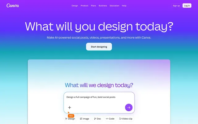
Vibrant creative toolkit on a clean canvas.
Color palette
Primary action background, links, accents for interactive states.
Primary hero section background, providing a dynamic and inviting visual entry point.
Complex background fills for large marketing areas, representing creative diversity.
Decorative borders, secondary link accents.
Fills for icons and decorative elements, borders in specific UI contexts.
Accent for status indicators, small icons, highlight elements.
Accent for status indicators, small icons, highlight elements.
Accent for status indicators, small icons, highlight elements.
Page backgrounds, default foreground for most UI components, card backgrounds for feature cards.
Primary text, critical headings, borders for ghost buttons and text links.
Darkest card backgrounds, background for various UI elements in feature sections, text on light backgrounds.
Secondary text, muted interactive elements, button text on lighter backgrounds, borders for some interactive components.
Subtle border accents, box shadows for elevated elements.
Typography
- Weights
- 400
- Sizes
- 10px
- Line height
- 1.2
- Fallback
- serif
System fallback text. Used for very small labels or browser-default elements when Canva Sans is unavailable or explicitly overridden.
- Weights
- 400, 500, 600
- Sizes
- 14px, 16px, 18px, 21px, 24px, 28px, 32px, 36px, 56px, 64px, 84px
- Line height
- 1.06, 1.1, 1.25, 1.33, 1.38, 1.4, 1.5, 1.57
- Letter spacing
- -1.512, -1.008, -0.648, -0.576, -0.504, -0.432, -0.378, -0.324, -0.16, -0.14
- Fallback
- ui-sans-serif, system-ui
Primary brand typeface for all headings, body text, and UI elements. Its strong yet approachable geometric forms convey professionalism without being overly formal, especially at larger sizes.
- Weights
- 400
- Sizes
- 13px
- Line height
- 1.2
- Fallback
- sans-serif
System fallback or context-specific UI text. Appears in some button and body contexts, ensuring readability on a variety of systems.
Spacing & shape
Elevation
Components
backgroundColor: rgba(255, 255, 255, 0.898), color: rgb(15, 16, 21), borderColor: rgb(15, 16, 21), borderRadius: 8px, padding: 0px 12px.
backgroundColor: rgba(255, 255, 255, 0), color: rgb(255, 255, 255), borderColor: rgb(255, 255, 255), borderRadius: 8px, padding: 4px 8px.
backgroundColor: rgba(0, 0, 0, 0), color: rgb(0, 0, 0), borderColor: rgb(0, 0, 0), borderRadius: 9999px, padding: 16px 24px.
backgroundColor: rgba(15, 16, 21, 0), color: rgb(15, 16, 21), borderColor: rgb(15, 16, 21), borderRadius: 8px, padding: 0px 16px.
backgroundColor: rgb(15, 16, 21), borderRadius: 8px, boxShadow: none, padding: 0px.
backgroundColor: #8b3dff, color: #ffffff, borderRadius: 8px, padding: 16px 24px.
backgroundColor: #ffffff, color: #0f1015, borderRadius: 9999px, padding: 4px 12px; with interior icons often using accent colors like #E950F7.
Guidelines
- Use Canva Sans for all typographic elements, prioritizing weight 400 for body text, 500 for subheadings, and 600 for main headings.
- Apply a default border-radius of 8px to cards and most interactive elements to maintain visual consistency.
- Utilize '#8b3dff' (Canva Violet) exclusively for primary calls to action, ensuring prominence and brand recognition.
- Pair text on '#0f1015' (Midnight Graphite) backgrounds with '#ffffff' (Canvas White) for optimal contrast and readability.
- Employ the Hero Aqua-Violet Gradient (`linear-gradient(135deg, rgb(0, 196, 204), rgb(125, 42, 232))`) for impactful hero sections or large graphical backgrounds.
- Use 4px as the base unit for all spacing, ensuring consistent gaps between small elements and padding within components.
- Apply the letterSpacing from Canva Sans where specified, such as -0.018em for larger headlines, to fine-tune visual flow.
- Avoid using Times or Arial as primary display fonts; they are for system fallback only and do not match the brand's expressive aesthetic.
- Do not deviate from the specified vibrant accent colors (#ff6105, #ff3d4d, #e950f7) for small icons or highlighted elements, to prevent visual dissonance.
- Do not introduce new shadow patterns; adhere to the established box-shadow values like `rgba(64, 79, 109, 0.06) 0px 0px 0px 0.5px, rgba(24, 44, 89, 0.137) 0px 2px 4px 0px, rgba(24, 44, 89, 0.07) 0px 6px 12px 0px` for subtle elevation.
- Do not use '#0f1015' (Midnight Graphite) for primary calls to action; reserve it for card backgrounds and secondary interactive states.
- Do not use generic pill shapes; reserve `9999px` radius specifically for filter chips and distinct interactive elements labeled as pill buttons.
- Do not introduce arbitrary color choices; all colors for interactive elements, backgrounds, and text must derive from the defined palette.
- Avoid excessive use of vivid chromatic colors outside of designated gradients or small accent elements, to maintain a balanced and clean interface.
About this system
ShowHide
Canva's design language feels like a playful yet precise creative toolkit, balancing vibrant gradients with a clean, functional interface. The primary visual tension arises from the geometric purity of most elements against the expressive, colorful gradients used for marketing sections and hero backgrounds. A crisp achromatic base palette allows the vivid, multi-hued gradients to act as focal points, signaling creative potential. This is reinforced by the consistent use of a custom sans-serif typeface, Canva Sans, which maintains readability even across diverse backgrounds.
The page model is primarily a max-width contained layout, with content centered within a clear horizontal boundary. However, the hero section utilizes a full-bleed gradient background that extends edge-to-edge, drawing the user in immediately. Sections below the hero frequently feature alternating patterns: a centered headline followed by a horizontal array of cards or a split text-left/image-right (or gradient-graphic-right) arrangement. Card grids are prominent for showcasing features or templates, primarily using 2 or 3 columns. The layout balances spacious breathing room, especially around major headlines and section breaks, with denser information blocks presented in cards. Navigation is a sticky top bar with a clear brand logo and prominent 'Sign up' and 'Log in' calls to action.
The visual language for imagery is a mix of product screenshots, stylized illustrations, and abstract gradient graphics. Product screens are often tightly cropped on pure white or contained within dark cards, showcasing the UI directly without much context. Illustrations and abstract graphics lean into a vivid, multi-hued gradient palette, often featuring organic or softly geometric shapes. Icons are typically filled, utilizing the brand's accent colors or a neutral achromatic palette, and serve both decorative and functional roles. The overall density is balanced, allowing prominent imagery or gradients to capture attention while text remains readable, contributing to an inviting and creative atmosphere.
Reminiscent of Figma, Adobe Express, Notion, Mailchimp.
# Canva — Style Reference
> Vibrant creative toolkit on a clean canvas.

**Theme:** light

**Site:** https://www.canva.com

Canva's design language feels like a playful yet precise creative toolkit, balancing vibrant gradients with a clean, functional interface. The primary visual tension arises from the geometric purity of most elements against the expressive, colorful gradients used for marketing sections and hero backgrounds. A crisp achromatic base palette allows the vivid, multi-hued gradients to act as focal points, signaling creative potential. This is reinforced by the consistent use of a custom sans-serif typeface, Canva Sans, which maintains readability even across diverse backgrounds.

## Tokens — Colors

| Name | Value | Token | Role |
|------|------|------|------|
| Canva Violet | `#8b3dff` | `--color-canva-violet` | Primary action background, links, accents for interactive states. |
| Hero Aqua-Violet Gradient | `#00c4cc` | `--color-hero-aqua-violet-gradient` | Primary hero section background, providing a dynamic and inviting visual entry point. |
| Multi-Spectrum Gradient | `#992bff` | `--color-multi-spectrum-gradient` | Complex background fills for large marketing areas, representing creative diversity. |
| Subtle Violet | `#a370fc` | `--color-subtle-violet` | Decorative borders, secondary link accents. |
| Deep Violet | `#9729ff` | `--color-deep-violet` | Fills for icons and decorative elements, borders in specific UI contexts. |
| Coral Glow | `#ff6105` | `--color-coral-glow` | Accent for status indicators, small icons, highlight elements. |
| Passion Red | `#ff3d4d` | `--color-passion-red` | Accent for status indicators, small icons, highlight elements. |
| Fuchsia Pop | `#e950f7` | `--color-fuchsia-pop` | Accent for status indicators, small icons, highlight elements. |
| Canvas White | `#ffffff` | `--color-canvas-white` | Page backgrounds, default foreground for most UI components, card backgrounds for feature cards. |
| Ink Black | `#000000` | `--color-ink-black` | Primary text, critical headings, borders for ghost buttons and text links. |
| Midnight Graphite | `#0f1015` | `--color-midnight-graphite` | Darkest card backgrounds, background for various UI elements in feature sections, text on light backgrounds. |
| Storm Gray | `#575a5f` | `--color-storm-gray` | Secondary text, muted interactive elements, button text on lighter backgrounds, borders for some interactive components. |
| Porcelain Accent | `#d7d9de` | `--color-porcelain-accent` | Subtle border accents, box shadows for elevated elements. |

## Tokens — Typography

### Times
- **Substitute:** serif
- **Weights:** 400
- **Sizes:** 10px
- **Line height:** 1.2
- **Role:** System fallback text. Used for very small labels or browser-default elements when Canva Sans is unavailable or explicitly overridden.

### Canva Sans
- **Substitute:** ui-sans-serif, system-ui
- **Weights:** 400, 500, 600
- **Sizes:** 14px, 16px, 18px, 21px, 24px, 28px, 32px, 36px, 56px, 64px, 84px
- **Line height:** 1.06, 1.1, 1.25, 1.33, 1.38, 1.4, 1.5, 1.57
- **Letter spacing:** -1.512, -1.008, -0.648, -0.576, -0.504, -0.432, -0.378, -0.324, -0.16, -0.14
- **Role:** Primary brand typeface for all headings, body text, and UI elements. Its strong yet approachable geometric forms convey professionalism without being overly formal, especially at larger sizes.

### Arial
- **Substitute:** sans-serif
- **Weights:** 400
- **Sizes:** 13px
- **Line height:** 1.2
- **Role:** System fallback or context-specific UI text. Appears in some button and body contexts, ensuring readability on a variety of systems.

## Tokens — Type Scale

Minor Third (1.2) from 16px base.

| Role | Size | Line height | Letter spacing |
|------|------|------|------|
| body-sm | 14px | 1.57 | -0.14px |
| body | 16px | 1.5 | -0.16px |
| subheading | 18px | 1.4 | -0.324px |
| heading-sm | 21px | 1.38 | -0.378px |
| heading | 24px | 1.33 | -0.432px |
| display-md | 32px | 1.1 | -0.576px |
| display-lg | 36px | 1.06 | -0.648px |
| display-xl | 56px | 1.06 | -1.008px |
| display-2xl | 64px | 1.06 | -1.152px |
| display-3xl | 84px | 1.06 | -1.512px |

## Tokens — Spacing

- **Section gap:** 54px
- **Card padding:** 12px
- **Element gap:** 4px

## Tokens — Radius

- **Default:** 8px
- **Cards:** 8px
- **buttonsIcon:** 48px
- **buttonsLarge:** 9999px
- **buttonsSmall:** 8px
- **interactiveElements:** 16px

## Tokens — Elevation

- **Card/UI Component:** `rgba(64, 79, 109, 0.06) 0px 0px 0px 0.5px, rgba(24, 44, 89, 0.137) 0px 2px 4px 0px, rgba(24, 44, 89, 0.07) 0px 6px 12px 0px`
- **Button (Inset Focus):** `rgba(53, 65, 90, 0.2) 0px 0px 0px 1px inset`
- **Button (Inset Light Focus):** `rgba(255, 255, 255, 0.2) 0px 0px 0px 1px inset`

## Layout

The page model is primarily a max-width contained layout, with content centered within a clear horizontal boundary. However, the hero section utilizes a full-bleed gradient background that extends edge-to-edge, drawing the user in immediately. Sections below the hero frequently feature alternating patterns: a centered headline followed by a horizontal array of cards or a split text-left/image-right (or gradient-graphic-right) arrangement. Card grids are prominent for showcasing features or templates, primarily using 2 or 3 columns. The layout balances spacious breathing room, especially around major headlines and section breaks, with denser information blocks presented in cards. Navigation is a sticky top bar with a clear brand logo and prominent 'Sign up' and 'Log in' calls to action.

## Imagery

The visual language for imagery is a mix of product screenshots, stylized illustrations, and abstract gradient graphics. Product screens are often tightly cropped on pure white or contained within dark cards, showcasing the UI directly without much context. Illustrations and abstract graphics lean into a vivid, multi-hued gradient palette, often featuring organic or softly geometric shapes. Icons are typically filled, utilizing the brand's accent colors or a neutral achromatic palette, and serve both decorative and functional roles. The overall density is balanced, allowing prominent imagery or gradients to capture attention while text remains readable, contributing to an inviting and creative atmosphere.

## Components

### Filled White Button
*Call to action, primary navigation elements.*

backgroundColor: rgba(255, 255, 255, 0.898), color: rgb(15, 16, 21), borderColor: rgb(15, 16, 21), borderRadius: 8px, padding: 0px 12px.

### Ghost White Button
*Secondary calls to action, navigation overlays.*

backgroundColor: rgba(255, 255, 255, 0), color: rgb(255, 255, 255), borderColor: rgb(255, 255, 255), borderRadius: 8px, padding: 4px 8px.

### Pill Ghost Black Button
*Subtle interactive elements, filter chips, category selectors.*

backgroundColor: rgba(0, 0, 0, 0), color: rgb(0, 0, 0), borderColor: rgb(0, 0, 0), borderRadius: 9999px, padding: 16px 24px.

### Ghost Dark Button
*Secondary interactive elements, internal navigation in dark sections.*

backgroundColor: rgba(15, 16, 21, 0), color: rgb(15, 16, 21), borderColor: rgb(15, 16, 21), borderRadius: 8px, padding: 0px 16px.

### Dark Feature Card
*Content containers for prominent features or sections.*

backgroundColor: rgb(15, 16, 21), borderRadius: 8px, boxShadow: none, padding: 0px.

### Call to Action Button (Canva Violet)
*Primary action button across the site.*

backgroundColor: #8b3dff, color: #ffffff, borderRadius: 8px, padding: 16px 24px.

### Tool Selector Chip
*Categorization or feature selection within a section.*

backgroundColor: #ffffff, color: #0f1015, borderRadius: 9999px, padding: 4px 12px; with interior icons often using accent colors like #E950F7.

## Guidelines

### Do

- Use Canva Sans for all typographic elements, prioritizing weight 400 for body text, 500 for subheadings, and 600 for main headings.
- Apply a default border-radius of 8px to cards and most interactive elements to maintain visual consistency.
- Utilize '#8b3dff' (Canva Violet) exclusively for primary calls to action, ensuring prominence and brand recognition.
- Pair text on '#0f1015' (Midnight Graphite) backgrounds with '#ffffff' (Canvas White) for optimal contrast and readability.
- Employ the Hero Aqua-Violet Gradient (`linear-gradient(135deg, rgb(0, 196, 204), rgb(125, 42, 232))`) for impactful hero sections or large graphical backgrounds.
- Use 4px as the base unit for all spacing, ensuring consistent gaps between small elements and padding within components.
- Apply the letterSpacing from Canva Sans where specified, such as -0.018em for larger headlines, to fine-tune visual flow.

### Don't

- Avoid using Times or Arial as primary display fonts; they are for system fallback only and do not match the brand's expressive aesthetic.
- Do not deviate from the specified vibrant accent colors (#ff6105, #ff3d4d, #e950f7) for small icons or highlighted elements, to prevent visual dissonance.
- Do not introduce new shadow patterns; adhere to the established box-shadow values like `rgba(64, 79, 109, 0.06) 0px 0px 0px 0.5px, rgba(24, 44, 89, 0.137) 0px 2px 4px 0px, rgba(24, 44, 89, 0.07) 0px 6px 12px 0px` for subtle elevation.
- Do not use '#0f1015' (Midnight Graphite) for primary calls to action; reserve it for card backgrounds and secondary interactive states.
- Do not use generic pill shapes; reserve `9999px` radius specifically for filter chips and distinct interactive elements labeled as pill buttons.
- Do not introduce arbitrary color choices; all colors for interactive elements, backgrounds, and text must derive from the defined palette.
- Avoid excessive use of vivid chromatic colors outside of designated gradients or small accent elements, to maintain a balanced and clean interface.

## Agent Prompt Guide

Quick Color Reference:
text: #000000
background: #ffffff
border: #d7d9de
accent: #8b3dff
primary action: #8b3dff (filled action)

Example Component Prompts:
1. Create a Call to Action Button: 'Start designing' text, font Canva Sans weight 400, #ffffff color. Background #8b3dff, 8px radius, 16px 24px padding.
2. Create a Hero Headline: 'What will you design today?' text, font Canva Sans weight 600, #ffffff color, 64px size, 1.06 lineHeight, letter-spacing -1.152px. Set against Hero Aqua-Violet Gradient background (linear-gradient(135deg, rgb(0, 196, 204), rgb(125, 42, 232))).
3. Create a Dark Feature Card: 'Turn conversation into creation with Canva AI 2.0' as a display-lg heading at top, font Canva Sans weight 600, #ffffff color. Background #0f1015, 8px radius, 12px padding. Include a 'Explore Canva AI' button (Ghost White Button variant) within, font Canva Sans 14px, #ffffff color, 4px 8px padding, 8px radius, 1px white border.
4. Create a Tool Selector Chip: 'AI' text, font Canva Sans 14px, #0f1015 color. Background #ffffff, 9999px radius, 4px 12px padding. Include a small icon to its left using the Fuchsia Pop color (#e950f7) as fill.
More like this









Keep what you find
A free account saves references to boards and can send you a weekly email of picks based on what you save.
To see every result, go Pro.