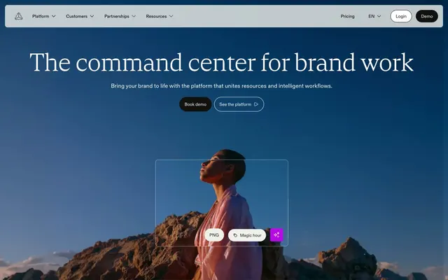
Preview image. Unlock full-res
Architectural blueprint on soft linen
Color palette
Decorative background fills on cards, certain icon elements, dark text elements
Accent for highlighted text categories, decorative icon fills, active border states
Decorative accent for internal elements, button border hover state; Decorative gradient for overlays or highlighted zones, providing a soft, shifting visual anchor
Primary text, button backgrounds, strong borders, dark surface elements, primary action, footer background
Main page background, secondary text, subtle borders, UI element backgrounds
Button text on dark backgrounds, selected interactive states, icon fills
Card backgrounds, subtle surface elevations, tertiary backgrounds
Section backgrounds, subtle graphical elements, body backgrounds
Muted body text, secondary borders
Input borders, decorative fills, some icon fills
Subtle border strokes
Placeholder text, secondary icon colors, subtle lines
Card text, muted link hover states
Typography
- Weights
- 400, 500
- Sizes
- 14px, 18px
- Line height
- 1, 1.3, 1.35, 1.5
- Letter spacing
- 0.0100em
- Fallback
- Inter
General body text, navigation elements, buttons, input fields, and all other functional UI text. Its compact shape ensures efficiency while maintaining legibility.
- Weights
- 300, 400
- Sizes
- 16px, 18px, 20px, 24px, 28px, 32px, 40px, 61px, 80px, 96px
- Line height
- 0.91, 1, 1.1, 1.3, 1.5
- Letter spacing
- -0.0070em (at larger sizes), 0.0080em, 0.0100em
- Fallback
- Playfair Display
Headlines and prominent display text that convey a sense of elegance and sophistication. The lighter weights at large sizes create impact through restraint rather than volume. Its slightly wider tracking at smaller sizes improves legibility, while negative tracking at large sizes compacts headlines.
- Weights
- 400
- Sizes
- 14px
- Line height
- 1.3
- Letter spacing
- 0.0100em
- Fallback
- Inter
Monospaced text, code snippets, and small utility text for technical precision and content differentiation.
- Weights
- 500, 700
- Sizes
- 16px, 40px
- Line height
- 1, 1.2
- Letter spacing
- 0.0100em
- Fallback
- Archivo
Used for specific emphasis in body copy or for short, impactful statements. Its heavier weight provides a robust counterpoint to the delicacy of Cranny and the functional clarity of ABC Diatype.
Spacing & shape
Components
Solid Inkwell Black background (#111110) with True White text (#ffffff), 24px border-radius, and 12px vertical | 16px horizontal padding. A substantial, clear action button.
Transparent background with an Inkwell Black (#111110) 1px border and Inkwell Black text (#111110). Uses 24px border-radius, and 12px vertical | 16px horizontal padding. Provides a clear alternative without demanding primary attention.
Transparent background with a True White (#ffffff) 1px border and True White text (#ffffff). Uses 24px border-radius, and 12px vertical | 16px horizontal padding. Maintains visibility on dark canvas areas.
Canvas Muted background (#e1e1db) with an 8px border-radius, no shadow, and no internal padding. Designed to blend softly into the background while defining content areas.
Fully transparent background, 0px border-radius, no shadow, and no internal padding. Used when content itself defines its boundaries or for underlying visual effects.
Fully transparent background, 4px border-radius, no shadow, and no internal padding. For smaller, more integrated components.
Canvas Muted background (#e1e1db) with Inkwell Black text (#111110). Uses a 40px border-radius and 0px vertical | 40px horizontal padding. Used for distinct, often larger, button areas that don't need the prominence of a primary button.
Transparent background, Inkwell Black (#111110) text, with only a 1px bottom border of Charcoal Grey (#000000). Placeholder text uses Dusty Sage (#bfbfb8). Focus state likely changes the border color to an accent.
Guidelines
- Always use Paper White (#f0f0eb) as the default page canvas, creating a consistent light background.
- Apply ABC Diatype for all body text and UI labels, ensuring clarity and efficiency with its 0.0100em letter spacing.
- Reserve Cranny font for headlines and display text, leveraging its elegant weight 300 or 400 with size-dependent letter spacing for sophisticated visual hierarchy.
- Button corners should consistently have a 24px border-radius for primary and outlined buttons, and 40px for larger tertiary buttons, maintaining a soft, approachable feel.
- Utilize Inkwell Black (#111110) for primary button backgrounds and primary text, creating high contrast and clear calls to action.
- Implement a default element gap of 8px for vertical and horizontal spacing between small UI elements, establishing a comfortable density.
- Card backgrounds should default to Canvas Muted (#e1e1db) with an 8px border-radius, providing subtle visual separation without heavy borders or shadows.
- Avoid using multiple chromatic colors for interactive elements; stick to Flame Orange (#ff3b00) or Violet Streak (#b60ae3) for accents, never for full button fills.
- Do not use heavy shadows or multi-layered elevation; surfaces are defined by subtle background changes and light borders, not Z-axis depth.
- Do not use default system fonts; ABC Diatype, Cranny, Satoshi, and Cabinetgrotesk are the only approved typefaces.
- Avoid arbitrary letter spacing; use the defined -0.007em (for large Cranny) or 0.010em (for ABC Diatype) for precise type rendering.
- Do not introduce new border-radius values; adhere strictly to 4px, 8px, 18px, 24px, 32px, and 40px for components as specified.
- Never use less than 48px vertical spacing between major page sections to maintain a spacious and breathable layout.
- Do not introduce new accent gradients. The 'Gradient Aura' provides a controlled, decorative element that should not be replicated or modified.
About this system
ShowHide
Frontify employs a sophisticated, clean, brand-centric aesthetic, combining a calm, off-white canvas with sharp black typography and deliberate, functional infusions of color. The system balances highly compact, precise type with generous negative space, creating an impression of clarity and efficiency. A muted, almost monochrome palette ensures focus on content, with specific, vivid accents used strategically for highlighting interactive elements or brand punctuation. Components are lightweight with softened corners, contributing to a modern, approachable feel.
The page structure employs a mix of full-bleed and contained sections. The hero typically features a full-bleed visual or background with text meticulously centered. Content flows in distinct blocks with consistent vertical spacing of 48px between sections, often presented as alternating light and muted background bands. Content arrangement frequently uses centered stacks for headlines and subtext, transitioning into alternating text-left/image-right or vertical features. Card grids, where present, are typically 3-column. The design emphasizes spaciousness, allowing elements to breathe. Navigation is handled by a sticky top bar with a centered logo and right-aligned actions, providing persistent access without intruding on content.
Imagery on Frontify prioritizes clean, conceptual visuals, favoring product-focused photography and abstract graphics over lifestyle shots. Photography, when used, features high-key lighting with subjects often isolated or in calm, desaturated environments, reinforcing a focused and composed atmosphere. Illustrations are minimal and abstract, often using subtle gradients or geometric forms for decorative or atmospheric effect, without heavy outlines or bold color blocks. Icons are primarily outlined, showcasing a light stroke weight, and are monochromatic in Inkwell Black, maintaining the system's clean, functional aesthetic. Imagery serves primarily as decorative atmosphere or explanatory context rather than product showcases or social proof, maintaining a text-dominant layout with generous negative space.
Reminiscent of Figma, Linear, Notion, Webflow.
# Frontify — Style Reference
> Architectural blueprint on soft linen

**Theme:** light

**Site:** https://www.frontify.com/en

Frontify employs a sophisticated, clean, brand-centric aesthetic, combining a calm, off-white canvas with sharp black typography and deliberate, functional infusions of color. The system balances highly compact, precise type with generous negative space, creating an impression of clarity and efficiency. A muted, almost monochrome palette ensures focus on content, with specific, vivid accents used strategically for highlighting interactive elements or brand punctuation. Components are lightweight with softened corners, contributing to a modern, approachable feel.

## Tokens — Colors

| Name | Value | Token | Role |
|------|------|------|------|
| Forest Tint | `#042a2b` | `--color-forest-tint` | Decorative background fills on cards, certain icon elements, dark text elements |
| Flame Orange | `#ff3b00` | `--color-flame-orange` | Accent for highlighted text categories, decorative icon fills, active border states |
| Violet Streak | `#b60ae3` | `--color-violet-streak` | Decorative accent for internal elements, button border hover state; Decorative gradient for overlays or highlighted zones, providing a soft, shifting visual anchor |
| Inkwell Black | `#111110` | `--color-inkwell-black` | Primary text, button backgrounds, strong borders, dark surface elements, primary action, footer background |
| Paper White | `#f0f0eb` | `--color-paper-white` | Main page background, secondary text, subtle borders, UI element backgrounds |
| True White | `#ffffff` | `--color-true-white` | Button text on dark backgrounds, selected interactive states, icon fills |
| Canvas Muted | `#e1e1db` | `--color-canvas-muted` | Card backgrounds, subtle surface elevations, tertiary backgrounds |
| Stone Whisper | `#d7d7cf` | `--color-stone-whisper` | Section backgrounds, subtle graphical elements, body backgrounds |
| Deep Pewter | `#464643` | `--color-deep-pewter` | Muted body text, secondary borders |
| Charcoal Grey | `#000000` | `--color-charcoal-grey` | Input borders, decorative fills, some icon fills |
| Pale Granite | `#cbcbc5` | `--color-pale-granite` | Subtle border strokes |
| Dusty Sage | `#bfbfb8` | `--color-dusty-sage` | Placeholder text, secondary icon colors, subtle lines |
| Slate Echo | `#575753` | `--color-slate-echo` | Card text, muted link hover states |

## Tokens — Typography

### ABC Diatype
- **Substitute:** Inter
- **Weights:** 400, 500
- **Sizes:** 14px, 18px
- **Line height:** 1, 1.3, 1.35, 1.5
- **Letter spacing:** 0.0100em
- **Role:** General body text, navigation elements, buttons, input fields, and all other functional UI text. Its compact shape ensures efficiency while maintaining legibility.

### Cranny
- **Substitute:** Playfair Display
- **Weights:** 300, 400
- **Sizes:** 16px, 18px, 20px, 24px, 28px, 32px, 40px, 61px, 80px, 96px
- **Line height:** 0.91, 1, 1.1, 1.3, 1.5
- **Letter spacing:** -0.0070em (at larger sizes), 0.0080em, 0.0100em
- **Role:** Headlines and prominent display text that convey a sense of elegance and sophistication. The lighter weights at large sizes create impact through restraint rather than volume. Its slightly wider tracking at smaller sizes improves legibility, while negative tracking at large sizes compacts headlines.

### Satoshi
- **Substitute:** Inter
- **Weights:** 400
- **Sizes:** 14px
- **Line height:** 1.3
- **Letter spacing:** 0.0100em
- **Role:** Monospaced text, code snippets, and small utility text for technical precision and content differentiation.

### Cabinetgrotesk
- **Substitute:** Archivo
- **Weights:** 500, 700
- **Sizes:** 16px, 40px
- **Line height:** 1, 1.2
- **Letter spacing:** 0.0100em
- **Role:** Used for specific emphasis in body copy or for short, impactful statements. Its heavier weight provides a robust counterpoint to the delicacy of Cranny and the functional clarity of ABC Diatype.

## Tokens — Type Scale

| Role | Size | Line height | Letter spacing |
|------|------|------|------|
| caption | 14px | 1.5 | 0.14px |
| body | 18px | 1.5 | 0.18px |
| subheading | 24px | 1.3 | 0.24px |
| heading-sm | 28px | 1.1 | 0.22px |
| heading | 40px | 1.1 | 0.4px |
| heading-lg | 61px | 1 | -0.427px |
| display | 96px | 0.91 | -0.672px |

## Tokens — Spacing

- **Section gap:** 48px
- **Card padding:** 32px
- **Element gap:** 8px

## Tokens — Radius

- **Buttons:** 24px
- **Inputs:** 0px
- **Cards:** 8px
- **Images:** 18px
- **navItems:** 32px
- **smallComponents:** 4px

## Layout

The page structure employs a mix of full-bleed and contained sections. The hero typically features a full-bleed visual or background with text meticulously centered. Content flows in distinct blocks with consistent vertical spacing of 48px between sections, often presented as alternating light and muted background bands. Content arrangement frequently uses centered stacks for headlines and subtext, transitioning into alternating text-left/image-right or vertical features. Card grids, where present, are typically 3-column. The design emphasizes spaciousness, allowing elements to breathe. Navigation is handled by a sticky top bar with a centered logo and right-aligned actions, providing persistent access without intruding on content.

## Imagery

Imagery on Frontify prioritizes clean, conceptual visuals, favoring product-focused photography and abstract graphics over lifestyle shots. Photography, when used, features high-key lighting with subjects often isolated or in calm, desaturated environments, reinforcing a focused and composed atmosphere. Illustrations are minimal and abstract, often using subtle gradients or geometric forms for decorative or atmospheric effect, without heavy outlines or bold color blocks. Icons are primarily outlined, showcasing a light stroke weight, and are monochromatic in Inkwell Black, maintaining the system's clean, functional aesthetic. Imagery serves primarily as decorative atmosphere or explanatory context rather than product showcases or social proof, maintaining a text-dominant layout with generous negative space.

## Components

### Primary Filled Button
*Call to action, main navigation buttons*

Solid Inkwell Black background (#111110) with True White text (#ffffff), 24px border-radius, and 12px vertical | 16px horizontal padding. A substantial, clear action button.

### Outlined Button (Dark border)
*Secondary actions, ghost buttons, calls to explore*

Transparent background with an Inkwell Black (#111110) 1px border and Inkwell Black text (#111110). Uses 24px border-radius, and 12px vertical | 16px horizontal padding. Provides a clear alternative without demanding primary attention.

### Outlined Button (Light border)
*Ghost buttons on dark backgrounds*

Transparent background with a True White (#ffffff) 1px border and True White text (#ffffff). Uses 24px border-radius, and 12px vertical | 16px horizontal padding. Maintains visibility on dark canvas areas.

### Subtle Card
*Content containers, feature blocks on light backgrounds*

Canvas Muted background (#e1e1db) with an 8px border-radius, no shadow, and no internal padding. Designed to blend softly into the background while defining content areas.

### Ghost Card
*Decorative or transparent content groupings*

Fully transparent background, 0px border-radius, no shadow, and no internal padding. Used when content itself defines its boundaries or for underlying visual effects.

### Small Radius Card
*Tight content groupings, embedded UI elements*

Fully transparent background, 4px border-radius, no shadow, and no internal padding. For smaller, more integrated components.

### Tertiary Button
*Subtle calls to action or embedded buttons*

Canvas Muted background (#e1e1db) with Inkwell Black text (#111110). Uses a 40px border-radius and 0px vertical | 40px horizontal padding. Used for distinct, often larger, button areas that don't need the prominence of a primary button.

### Underline Input
*Form input fields*

Transparent background, Inkwell Black (#111110) text, with only a 1px bottom border of Charcoal Grey (#000000). Placeholder text uses Dusty Sage (#bfbfb8). Focus state likely changes the border color to an accent.

## Guidelines

### Do

- Always use Paper White (#f0f0eb) as the default page canvas, creating a consistent light background.
- Apply ABC Diatype for all body text and UI labels, ensuring clarity and efficiency with its 0.0100em letter spacing.
- Reserve Cranny font for headlines and display text, leveraging its elegant weight 300 or 400 with size-dependent letter spacing for sophisticated visual hierarchy.
- Button corners should consistently have a 24px border-radius for primary and outlined buttons, and 40px for larger tertiary buttons, maintaining a soft, approachable feel.
- Utilize Inkwell Black (#111110) for primary button backgrounds and primary text, creating high contrast and clear calls to action.
- Implement a default element gap of 8px for vertical and horizontal spacing between small UI elements, establishing a comfortable density.
- Card backgrounds should default to Canvas Muted (#e1e1db) with an 8px border-radius, providing subtle visual separation without heavy borders or shadows.

### Don't

- Avoid using multiple chromatic colors for interactive elements; stick to Flame Orange (#ff3b00) or Violet Streak (#b60ae3) for accents, never for full button fills.
- Do not use heavy shadows or multi-layered elevation; surfaces are defined by subtle background changes and light borders, not Z-axis depth.
- Do not use default system fonts; ABC Diatype, Cranny, Satoshi, and Cabinetgrotesk are the only approved typefaces.
- Avoid arbitrary letter spacing; use the defined -0.007em (for large Cranny) or 0.010em (for ABC Diatype) for precise type rendering.
- Do not introduce new border-radius values; adhere strictly to 4px, 8px, 18px, 24px, 32px, and 40px for components as specified.
- Never use less than 48px vertical spacing between major page sections to maintain a spacious and breathable layout.
- Do not introduce new accent gradients. The 'Gradient Aura' provides a controlled, decorative element that should not be replicated or modified.

## Agent Prompt Guide

Quick Color Reference:
text: #111110
background: #f0f0eb
border: #111110
accent: #ff3b00
primary action: #111110 (filled action)

Example Component Prompts:
Create a Primary Action Button: #111110 background, #ffffff text, 9999px radius, compact pill padding. Use this filled treatment for the main CTA.

Create a feature card: Canvas Muted background (#e1e1db), 8px border-radius, no shadow. Card title in Cranny weight 400 at 24px, #111110. Body text in ABC Diatype weight 400 at 14px, #111110. Padding of 32px.
More like this









Keep what you find
A free account saves references to boards and can send you a weekly email of picks based on what you save.
To see every result, go Pro.