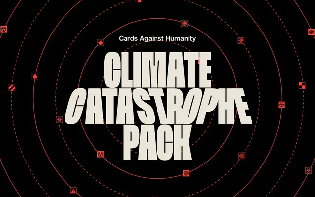
Preview image. Unlock full-res
Irreverent, Urgent Distress: High-contrast black and off-white with a jarring red accent, like a bold, distressed propaganda poster.
Color palette
Brand accent, highlighting urgent text, interactive borders, and key atmospheric elements like flames — a vivid, almost alarming splash of color
Dominant background, primary text color, button backgrounds, and strong borders — forms the high-contrast foundation of the design
Primary surface color for text blocks, card backgrounds, and button text when on dark backgrounds — a soft, slightly off-white that softens the stark black
Subtle button box shadow that provides minimal elevation without adding strong depth
Typography
- Weights
- 400
- Sizes
- 32px, 40px, 100px, 202px
- Line height
- 0.82, 0.88, 1, 2
- Letter spacing
- normal
- Fallback
- Abril Fatface, or Public Sans Black
Display headlines and impactful calls to action — its distinctive, distressed character immediately communicates the brand's unique voice and satirical intent.
- Weights
- 400, 800
- Sizes
- 14px, 16px, 28px, 30px
- Line height
- 1.27, 1.29, 1.5
- Letter spacing
- normal
- Fallback
- Arial, or Inter
Body copy, links, and supporting text — provides a clear, utilitarian contrast to the expressive display font, ensuring readability for longer content blocks.
Spacing & shape
Components
Filled Pitch Black background with Aged Paper text. Features extremely rounded corners at 120px for a soft, almost pill-like shape. Padding: 7px vertical, 7px horizontal.
Filled Pitch Black background with Aged Paper text. Employs a 80px border-radius, creating an elongated oval. Padding: 0px vertical, 60px horizontal.
Ghost button with 48px border-radius, no background fill, and black text. Used for less prominent actions.
Pitch Black background with a 100% border-radius, creating a perfect circle. No padding or shadow, used for visual accents or small, contained content.
Aged Paper background, Pitch Black text, and a 10px border-radius for rounded corners. Generous horizontal padding of 20px with 6px bottom padding, implying text entry.
Guidelines
- Use Spektra for all headlines and impactful short text to leverage its unique character, prioritizing visual impact over conventional readability.
- Maintain a stark contrast by pairing Pitch Black (#000000) for backgrounds and text with Aged Paper (#ebe4d8) for supporting surfaces and inverted text.
- Implement Catastrophe Red (#ff4034) sparingly, primarily as an urgent accent for borders, interactive elements, or key text, emphasizing its high saturation.
- Apply extremely high border-radii (80px, 120px, 48px) to buttons to convey a playful, almost blob-like or pill aesthetic.
- Utilize Helvetica Neue LT for all body copy and instructional text, ensuring clarity and contrast against the expressive display font.
- Maintain a spacious rhythm between content blocks with a section gap of 30px to prevent visual clutter and allow design elements breathing room.
- Avoid using gradients or subtle shadows, as the system relies on high contrast and flat surfaces, except for the subtle Charcoal Haze button shadow.
- Do not introduce additional color hues; restrict the palette strictly to Pitch Black, Aged Paper, and Catastrophe Red to maintain visual integrity.
- Refrain from complex component structures; components should be simple, high-contrast shapes, often with extreme roundedness.
- Do not use subtle spacing values; prefer clear, distinct gaps like 20px for elements and 30px for sections to reinforce the bold aesthetic.
- Avoid decorative imagery that dilutes the stark, graphic, and text-heavy nature of the design.
- Do not use traditional, corporate typography or unrounded shapes, which would contradict the brand's irreverent and distressed visual language.
About this system
ShowHide
Cards Against Humanity Climate Catastrophe Pack projects an urgent, confrontational aesthetic: stark black and off-white surfaces, punctuated by a vibrant, almost aggressive red, and an eclectic, distressed display typography. The design leans into a deliberately unpolished, DIY feel, using basic geometric shapes, high-contrast text, and a loose rhythm of concentric circles and scattered warning icons. This visual system aims to grab attention and provoke, mirroring the brand's irreverent tone with bold, no-nonsense presentation.
The page primarily uses a full-bleed layout, particularly for hero and atmospheric sections, allowing large graphic elements to span the full viewport width. Content sections are centrally aligned, but with a flexible max-width, allowing for long-form text blocks on an Aged Paper background. The hero section prominently features a centered, oversized headline (Spektra font) over a dark, graphically rich background. Section rhythm is irregular, creating an almost chaotic, collage-like feel, underscored by a dense, circular graphic pattern rather than consistent spacing. Content stacks are generally simple, centered text blocks, occasionally broken by decorative elements.
The site uses a mix of scattered, minimalistic, and somewhat distressed iconography/geometric shapes (concentric red circles, abstract warning symbols) for decorative atmosphere, rather than photography or complex illustrations. These are often outlined in Catastrophe Red. There's also striking, full-bleed imagery like the 'flames' graphic, which serves as a decorative, high-impact background element, purely for atmosphere. Imagery is dense in selective areas to create visual intensity, contrasting with text-dominant sections.
Reminiscent of Cards Against Humanity (main site), Oatly, VICE Media.
# Cards Against Humanity — Style Reference
> Irreverent, Urgent Distress: High-contrast black and off-white with a jarring red accent, like a bold, distressed propaganda poster.

**Theme:** dark

**Site:** https://www.climatecatastrophepack.com

Cards Against Humanity Climate Catastrophe Pack projects an urgent, confrontational aesthetic: stark black and off-white surfaces, punctuated by a vibrant, almost aggressive red, and an eclectic, distressed display typography. The design leans into a deliberately unpolished, DIY feel, using basic geometric shapes, high-contrast text, and a loose rhythm of concentric circles and scattered warning icons. This visual system aims to grab attention and provoke, mirroring the brand's irreverent tone with bold, no-nonsense presentation.

## Tokens — Colors

| Name | Value | Token | Role |
|------|------|------|------|
| Catastrophe Red | `#ff4034` | `--color-catastrophe-red` | Brand accent, highlighting urgent text, interactive borders, and key atmospheric elements like flames — a vivid, almost alarming splash of color |
| Pitch Black | `#000000` | `--color-pitch-black` | Dominant background, primary text color, button backgrounds, and strong borders — forms the high-contrast foundation of the design |
| Aged Paper | `#ebe4d8` | `--color-aged-paper` | Primary surface color for text blocks, card backgrounds, and button text when on dark backgrounds — a soft, slightly off-white that softens the stark black |
| Charcoal Haze | `#c3bdb3` | `--color-charcoal-haze` | Subtle button box shadow that provides minimal elevation without adding strong depth |

## Tokens — Typography

### Spektra
- **Substitute:** Abril Fatface, or Public Sans Black
- **Weights:** 400
- **Sizes:** 32px, 40px, 100px, 202px
- **Line height:** 0.82, 0.88, 1, 2
- **Letter spacing:** normal
- **Role:** Display headlines and impactful calls to action — its distinctive, distressed character immediately communicates the brand's unique voice and satirical intent.

### Helvetica Neue LT
- **Substitute:** Arial, or Inter
- **Weights:** 400, 800
- **Sizes:** 14px, 16px, 28px, 30px
- **Line height:** 1.27, 1.29, 1.5
- **Letter spacing:** normal
- **Role:** Body copy, links, and supporting text — provides a clear, utilitarian contrast to the expressive display font, ensuring readability for longer content blocks.

## Tokens — Type Scale

| Role | Size | Line height | Letter spacing |
|------|------|------|------|
| caption | 14px | 1.29 | — |
| body | 16px | 1.27 | — |
| subheading | 28px | 1.5 | — |
| heading | 30px | 1.29 | — |
| heading-lg | 32px | 1 | — |
| display | 202px | 0.82 | — |

## Tokens — Spacing

- **Section gap:** 30px
- **Card padding:** 20px
- **Element gap:** 20px

## Tokens — Radius

- **Buttons:** 80px
- **Inputs:** 10px
- **Cards:** 2520px

## Layout

The page primarily uses a full-bleed layout, particularly for hero and atmospheric sections, allowing large graphic elements to span the full viewport width. Content sections are centrally aligned, but with a flexible max-width, allowing for long-form text blocks on an Aged Paper background. The hero section prominently features a centered, oversized headline (Spektra font) over a dark, graphically rich background. Section rhythm is irregular, creating an almost chaotic, collage-like feel, underscored by a dense, circular graphic pattern rather than consistent spacing. Content stacks are generally simple, centered text blocks, occasionally broken by decorative elements.

## Imagery

The site uses a mix of scattered, minimalistic, and somewhat distressed iconography/geometric shapes (concentric red circles, abstract warning symbols) for decorative atmosphere, rather than photography or complex illustrations. These are often outlined in Catastrophe Red. There's also striking, full-bleed imagery like the 'flames' graphic, which serves as a decorative, high-impact background element, purely for atmosphere. Imagery is dense in selective areas to create visual intensity, contrasting with text-dominant sections.

## Components

### Rounded Primary Button
*Call to action*

Filled Pitch Black background with Aged Paper text. Features extremely rounded corners at 120px for a soft, almost pill-like shape. Padding: 7px vertical, 7px horizontal.

### Elongated Primary Button
*Large call to action*

Filled Pitch Black background with Aged Paper text. Employs a 80px border-radius, creating an elongated oval. Padding: 0px vertical, 60px horizontal.

### Pill Outline Button
*Subtle action*

Ghost button with 48px border-radius, no background fill, and black text. Used for less prominent actions.

### Circular Card
*Decorative content container*

Pitch Black background with a 100% border-radius, creating a perfect circle. No padding or shadow, used for visual accents or small, contained content.

### Input Field
*User entry field*

Aged Paper background, Pitch Black text, and a 10px border-radius for rounded corners. Generous horizontal padding of 20px with 6px bottom padding, implying text entry.

## Guidelines

### Do

- Use Spektra for all headlines and impactful short text to leverage its unique character, prioritizing visual impact over conventional readability.
- Maintain a stark contrast by pairing Pitch Black (#000000) for backgrounds and text with Aged Paper (#ebe4d8) for supporting surfaces and inverted text.
- Implement Catastrophe Red (#ff4034) sparingly, primarily as an urgent accent for borders, interactive elements, or key text, emphasizing its high saturation.
- Apply extremely high border-radii (80px, 120px, 48px) to buttons to convey a playful, almost blob-like or pill aesthetic.
- Utilize Helvetica Neue LT for all body copy and instructional text, ensuring clarity and contrast against the expressive display font.
- Maintain a spacious rhythm between content blocks with a section gap of 30px to prevent visual clutter and allow design elements breathing room.

### Don't

- Avoid using gradients or subtle shadows, as the system relies on high contrast and flat surfaces, except for the subtle Charcoal Haze button shadow.
- Do not introduce additional color hues; restrict the palette strictly to Pitch Black, Aged Paper, and Catastrophe Red to maintain visual integrity.
- Refrain from complex component structures; components should be simple, high-contrast shapes, often with extreme roundedness.
- Do not use subtle spacing values; prefer clear, distinct gaps like 20px for elements and 30px for sections to reinforce the bold aesthetic.
- Avoid decorative imagery that dilutes the stark, graphic, and text-heavy nature of the design.
- Do not use traditional, corporate typography or unrounded shapes, which would contradict the brand's irreverent and distressed visual language.

## Agent Prompt Guide

Quick Color Reference:
text: #000000
background: #000000
border: #ff4034
accent: #ff4034
primary action: #000000 (filled action)

Example Component Prompts:
1. Create a Primary Action Button: #000000 background, #ebe4d8 text, 9999px radius, compact pill padding. Use this filled treatment for the main CTA.
2. Design a central text card: Aged Paper background, Helvetica Neue LT body text at 16px weight 400, Pitch Black color, with 20px padding.
3. Build a large headline section: Spektra font, size 202px weight 400, Pitch Black text, on an Aged Paper background.
4. Produce an input field: Aged Paper background, 10px border-radius, Pitch Black text, 20px horizontal padding, 6px bottom padding, Helvetica Neue LT font.
More like this









Keep what you find
A free account saves references to boards and can send you a weekly email of picks based on what you save.
To see every result, go Pro.