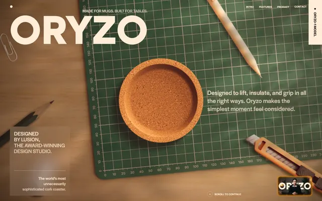
Preview image. Unlock full-res
Cork-textured midnight laboratory
Color palette
Important accent details, button backgrounds for primary actions, decorative borders, active state indicators. A warm, vivid focal point
Subtle background accents, decorative text. A muted, organic highlight
Minor decorative details, secondary green accents
A distinct background gradient for hero sections or prominent visual statements, featuring a vibrant multi-color blend
Dark borders and separators for elevated surfaces and inverted UI. Do not promote it to the primary CTA color
Primary text across dark backgrounds, light button backgrounds, input text and borders. Provides high contrast
Button backgrounds for secondary actions, subtle surface distinction. A warmer, slightly lighter neutral than Pitch Darkness
Secondary text, muted helper text, subtle outlines
Subtle background surfaces, highlights. A very light, near-neutral tone
Tertiary text, decorative elements with reduced prominence
Table borders, general neutral separators
Used sparingly for icon fills
Darker, almost black borders
Typography
- Weights
- 400, 500, 600, 700
- Sizes
- 10px, 12px, 14px, 15px, 16px, 17px, 18px, 23px, 24px, 29px, 34px, 41px, 49px, 51px, 64px, 123px, 147px, 227px, 410px
- Line height
- 0.9, 1, 1.09, 1.1, 1.2, 1.26, 1.33, 1.5, 1.78, 2.5, 3
- Letter spacing
- -0.0450em at large sizes (410px), -0.0180em at smaller text, otherwise normal
- Fallback
- Inter
Primary UI text for headings, body, buttons, navigation, and badges. Its variable weights and precise tracking create a dense, modern feel.
- Weights
- 200, 300, 500
- Sizes
- 10px, 13px, 37px, 44px
- Line height
- 1, 1.2, 1.5, 2.36
- Fallback
- Merriweather
Sub-headings and decorative text. Its lighter weights provide an elegant contrast to the primary typeface, hinting at a handcrafted quality.
- Weights
- 400
- Sizes
- 14px
- Line height
- 1.33
- Fallback
- ui-monospace
Monospaced text for code snippets or technical details.
- Weights
- 400, 500
- Sizes
- 8px, 12px
- Line height
- 1, 1.1, 1.2
- Fallback
- sans-serif
Fallback and utilitarian text, typically for small annotations or less prominent captions. Avoid direct usage when custom fonts are loaded.
Spacing & shape
Components
Background: Rust Accent (#dc5000), text: Pitch Darkness (#100904). Padding: 14.4px vertical, 24px horizontal. Full pill shape with 36px radius.
Background: Faded Bark (#382416), text: Cork Dust (#ffedd7). Padding: 18px vertical, 36px horizontal. Full pill shape with 36px radius.
Background: Faded Bark (#382416), text: Cork Dust (#ffedd7), border: 1px solid Rust Accent (#dc5000). Padding: 18px vertical, 36px horizontal. Full pill shape with 36px radius.
Background: Cork Dust (#ffedd7), text: Pitch Darkness (#100904), border: 1px solid Pitch Darkness (#100904). Padding: 14.4px vertical, 24px horizontal. Full pill shape with 36px radius.
Background: transparent, text & border: Cork Dust (#ffedd7). Padding: 12px vertical, 18px horizontal. No border radius, sharp corners. Placeholder text uses Cork Dust (#ffedd7).
Transparent background, text: Cork Dust (#ffedd7). No padding or border radius. Used for minimal, content-adjacent labels.
Guidelines
- Prioritize Pitch Darkness (#100904) for all background surfaces to maintain a deep, rich foundation.
- Use Cork Dust (#ffedd7) extensively for primary text and highlights against dark backgrounds, ensuring readability and contrast.
- Employ Rust Accent (#dc5000) sparingly as a functional highlight for primary actions and key interactive elements.
- Apply halyard-display-variable for all main headings and body text, varying weights for hierarchy and using negative letter-spacing for density.
- Ensure all buttons have a 36px border-radius to consistently achieve a full pill shape.
- Maintain an 18px elementGap for consistent spacing between distinct UI elements.
- Leverage the gradients, particularly the Rainbow Spectrum, exclusively for hero sections or large, impactful visual backgrounds to create a sense of wonder and depth.
- Avoid using Rust Accent (#dc5000) for large blocks of text or decorative elements, as its vibrance should be reserved for actionable focus.
- Do not introduce additional bold, saturated colors beyond Rust Accent and Olive Green; the palette relies on controlled chromatic accents.
- Do not deviate from the full pill 36px button radius; inconsistent radii will break the tactile and rounded component aesthetic.
- Avoid excessive spacing or empty canvases; the design maintains a comfortable density, particularly with tight text alignment.
- Do not use generic system fonts when halyard-display-variable and Literata are available; the custom typography is crucial to the brand's identity.
- Do not apply shadows or complex elevation to UI elements; the system prioritizes flat surfaces and subtle texture over layered depth cues.
About this system
ShowHide
ORYZO AI embraces a deep, textural aesthetic, contrasting rich, dark surfaces with a warm, desaturated highlight palette. Textures and a muted orange accent color punctuate the composition, creating a refined yet tactile experience. The typography, primarily a custom variable font, leans into density and slight tracking, reinforcing a sense of engineered precision. This system feels grounded and thoughtfully constructed with a focus on core product detail.
The page primarily uses a full-bleed, dark background model that creates an immersive canvas. The hero section often features large, centered product renders over a dark gradient background, setting an immediate, dramatic tone. Content sections beneath follow a structured, often two-column layout with text-dominant blocks offset by product visuals, maintaining a comfortable density. Vertical section spacing is consistent, without hard dividers, relying on shifts in background tone or large product imagery to delineate new content areas. Navigation is minimal: a sticky top-right menu for primary links, and a small, fixed vertical 'ORYZO + MODEL' slider on the right edge, emphasizing product exploration.
The site uses a mix of high-fidelity 3D product renders and abstract visual textures. Product imagery features the cork coaster as the central element, often floating or subtly angled against dark, minimal backgrounds, emphasizing its form and material. Photography is limited, focusing on high-key abstract shots of materials like cork or production-related tools, often with a slight yellow-orange tint. Iconography is minimal, using simple fills in Pitch Darkness or Cork Dust, contributing less to visual density and more to functional clarity. There are no lifestyle photos or complex illustrations; the imagery is precise, object-focused, and plays a supportive role to the core product narrative.
Reminiscent of Apple (Product Pages), Stripe, Linear, Figma (dark mode), Master & Dynamic (product marketing).
# ORYZO AI — Style Reference
> Cork-textured midnight laboratory

**Theme:** dark

**Site:** https://oryzo.ai

ORYZO AI embraces a deep, textural aesthetic, contrasting rich, dark surfaces with a warm, desaturated highlight palette. Textures and a muted orange accent color punctuate the composition, creating a refined yet tactile experience. The typography, primarily a custom variable font, leans into density and slight tracking, reinforcing a sense of engineered precision. This system feels grounded and thoughtfully constructed with a focus on core product detail.

## Tokens — Colors

| Name | Value | Token | Role |
|------|------|------|------|
| Rust Accent | `#dc5000` | `--color-rust-accent` | Important accent details, button backgrounds for primary actions, decorative borders, active state indicators. A warm, vivid focal point |
| Olive Green | `#445231` | `--color-olive-green` | Subtle background accents, decorative text. A muted, organic highlight |
| Subtle Moss | `#5d6c49` | `--color-subtle-moss` | Minor decorative details, secondary green accents |
| Rainbow Spectrum | `#e95000` | `--color-rainbow-spectrum` | A distinct background gradient for hero sections or prominent visual statements, featuring a vibrant multi-color blend |
| Pitch Darkness | `#100904` | `--color-pitch-darkness` | Dark borders and separators for elevated surfaces and inverted UI. Do not promote it to the primary CTA color |
| Cork Dust | `#ffedd7` | `--color-cork-dust` | Primary text across dark backgrounds, light button backgrounds, input text and borders. Provides high contrast |
| Faded Bark | `#382416` | `--color-faded-bark` | Button backgrounds for secondary actions, subtle surface distinction. A warmer, slightly lighter neutral than Pitch Darkness |
| Aged Stone | `#887b6d` | `--color-aged-stone` | Secondary text, muted helper text, subtle outlines |
| Light Cork | `#f6e0c6` | `--color-light-cork` | Subtle background surfaces, highlights. A very light, near-neutral tone |
| Faint Hazel | `#bbac97` | `--color-faint-hazel` | Tertiary text, decorative elements with reduced prominence |
| Grayscale Gray | `#808080` | `--color-grayscale-gray` | Table borders, general neutral separators |
| Chalkboard Black | `#000000` | `--color-chalkboard-black` | Used sparingly for icon fills |
| Deep Mocha | `#40372e` | `--color-deep-mocha` | Darker, almost black borders |

## Tokens — Typography

### halyard-display-variable
- **Substitute:** Inter
- **Weights:** 400, 500, 600, 700
- **Sizes:** 10px, 12px, 14px, 15px, 16px, 17px, 18px, 23px, 24px, 29px, 34px, 41px, 49px, 51px, 64px, 123px, 147px, 227px, 410px
- **Line height:** 0.9, 1, 1.09, 1.1, 1.2, 1.26, 1.33, 1.5, 1.78, 2.5, 3
- **Letter spacing:** -0.0450em at large sizes (410px), -0.0180em at smaller text, otherwise normal
- **Role:** Primary UI text for headings, body, buttons, navigation, and badges. Its variable weights and precise tracking create a dense, modern feel.

### Literata
- **Substitute:** Merriweather
- **Weights:** 200, 300, 500
- **Sizes:** 10px, 13px, 37px, 44px
- **Line height:** 1, 1.2, 1.5, 2.36
- **Role:** Sub-headings and decorative text. Its lighter weights provide an elegant contrast to the primary typeface, hinting at a handcrafted quality.

### DM Mono
- **Substitute:** ui-monospace
- **Weights:** 400
- **Sizes:** 14px
- **Line height:** 1.33
- **Role:** Monospaced text for code snippets or technical details.

### Arial
- **Substitute:** sans-serif
- **Weights:** 400, 500
- **Sizes:** 8px, 12px
- **Line height:** 1, 1.1, 1.2
- **Role:** Fallback and utilitarian text, typically for small annotations or less prominent captions. Avoid direct usage when custom fonts are loaded.

## Tokens — Type Scale

Perfect Fifth (1.5) from 14px base.

| Role | Size | Line height | Letter spacing |
|------|------|------|------|
| caption | 10px | 1.5 | — |
| body | 14px | 1.33 | — |
| body-lg | 16px | 1.26 | — |
| subheading | 18px | 1.2 | — |
| heading | 23px | 1.09 | -0.018em |
| heading-lg | 34px | 1.09 | -0.018em |
| display-sm | 49px | 1 | -0.018em |
| display | 64px | 0.9 | -0.045em |
| display-xl | 147px | 0.9 | -0.045em |
| display-hero | 410px | 0.9 | -0.045em |

## Tokens — Spacing

- **Section gap:** 45px
- **Card padding:** 18px
- **Element gap:** 18px

## Tokens — Radius

- **Buttons:** 36px
- **Cards:** 12px
- **badges:** 36px

## Layout

The page primarily uses a full-bleed, dark background model that creates an immersive canvas. The hero section often features large, centered product renders over a dark gradient background, setting an immediate, dramatic tone. Content sections beneath follow a structured, often two-column layout with text-dominant blocks offset by product visuals, maintaining a comfortable density. Vertical section spacing is consistent, without hard dividers, relying on shifts in background tone or large product imagery to delineate new content areas. Navigation is minimal: a sticky top-right menu for primary links, and a small, fixed vertical 'ORYZO + MODEL' slider on the right edge, emphasizing product exploration.

## Imagery

The site uses a mix of high-fidelity 3D product renders and abstract visual textures. Product imagery features the cork coaster as the central element, often floating or subtly angled against dark, minimal backgrounds, emphasizing its form and material. Photography is limited, focusing on high-key abstract shots of materials like cork or production-related tools, often with a slight yellow-orange tint. Iconography is minimal, using simple fills in Pitch Darkness or Cork Dust, contributing less to visual density and more to functional clarity. There are no lifestyle photos or complex illustrations; the imagery is precise, object-focused, and plays a supportive role to the core product narrative.

## Components

### Primary Action Button
*Filled button*

Background: Rust Accent (#dc5000), text: Pitch Darkness (#100904). Padding: 14.4px vertical, 24px horizontal. Full pill shape with 36px radius.

### Secondary Action Button
*Filled button*

Background: Faded Bark (#382416), text: Cork Dust (#ffedd7). Padding: 18px vertical, 36px horizontal. Full pill shape with 36px radius.

### Ghost Button (Orange Border)
*Outlined button*

Background: Faded Bark (#382416), text: Cork Dust (#ffedd7), border: 1px solid Rust Accent (#dc5000). Padding: 18px vertical, 36px horizontal. Full pill shape with 36px radius.

### Light Ghost Button
*Outlined button*

Background: Cork Dust (#ffedd7), text: Pitch Darkness (#100904), border: 1px solid Pitch Darkness (#100904). Padding: 14.4px vertical, 24px horizontal. Full pill shape with 36px radius.

### Form Input Field
*Input element*

Background: transparent, text & border: Cork Dust (#ffedd7). Padding: 12px vertical, 18px horizontal. No border radius, sharp corners. Placeholder text uses Cork Dust (#ffedd7).

### Invisible Badge
*Informational tag*

Transparent background, text: Cork Dust (#ffedd7). No padding or border radius. Used for minimal, content-adjacent labels.

## Guidelines

### Do

- Prioritize Pitch Darkness (#100904) for all background surfaces to maintain a deep, rich foundation.
- Use Cork Dust (#ffedd7) extensively for primary text and highlights against dark backgrounds, ensuring readability and contrast.
- Employ Rust Accent (#dc5000) sparingly as a functional highlight for primary actions and key interactive elements.
- Apply halyard-display-variable for all main headings and body text, varying weights for hierarchy and using negative letter-spacing for density.
- Ensure all buttons have a 36px border-radius to consistently achieve a full pill shape.
- Maintain an 18px elementGap for consistent spacing between distinct UI elements.
- Leverage the gradients, particularly the Rainbow Spectrum, exclusively for hero sections or large, impactful visual backgrounds to create a sense of wonder and depth.

### Don't

- Avoid using Rust Accent (#dc5000) for large blocks of text or decorative elements, as its vibrance should be reserved for actionable focus.
- Do not introduce additional bold, saturated colors beyond Rust Accent and Olive Green; the palette relies on controlled chromatic accents.
- Do not deviate from the full pill 36px button radius; inconsistent radii will break the tactile and rounded component aesthetic.
- Avoid excessive spacing or empty canvases; the design maintains a comfortable density, particularly with tight text alignment.
- Do not use generic system fonts when halyard-display-variable and Literata are available; the custom typography is crucial to the brand's identity.
- Do not apply shadows or complex elevation to UI elements; the system prioritizes flat surfaces and subtle texture over layered depth cues.

## Agent Prompt Guide

Quick Color Reference:
text: #ffedd7
background: #100904
border: #100904
accent: #dc5000
primary action: #dc5000 (filled action)

Example Component Prompts:
Create a Primary Action Button: #dc5000 background, #ffedd7 text, 9999px radius, compact pill padding. Use this filled treatment for the main CTA.
Create a secondary action button: Background #382416, text #ffedd7, 36px radius, 18px vertical padding, 36px horizontal padding, 'halyard-display-variable' font, weight 400.
Create a ghost button: Background #382416, text #ffedd7, 1px solid border #dc5000, 36px radius, 18px vertical padding, 36px horizontal padding, 'halyard-display-variable' font, weight 400.
Create an input field: Transparent background, text #ffedd7, 1px solid border #ffedd7, 0px radius, 12px vertical padding, 18px horizontal padding, 'halyard-display-variable' font, weight 400.
Create a hero headline: Text 'Cork Dust' (#ffedd7), 410px size, 'halyard-display-variable' font, weight 700, line-height 0.9, letter-spacing -0.045em on a 'Pitch Darkness' (#100904) background.
More like this








Keep what you find
A free account saves references to boards and can send you a weekly email of picks based on what you save.
To see every result, go Pro.