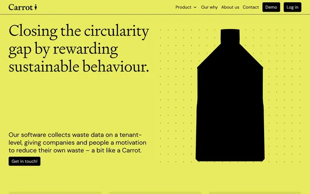
Preview image. Unlock full-res
High-contrast lime canvas
Color palette
Brand accent, primary highlight for important sections, backgrounds for key marketing blocks — infusing energy and distinctiveness
Muted text or decorative borders, secondary information when subtler contrast is desired — a subdued green that hints at the brand's identity without overpowering
Primary text, core branding, button backgrounds, strong borders — establishing a high-contrast and authoritative presence
Page backgrounds, button text, foreground elements — providing a bright, clean canvas for content and interaction
Typography
- Weights
- 300
- Sizes
- 50px, 72px
- Line height
- 1.15
- Letter spacing
- -0.0100em
- Fallback
- Georgia
Serif headlines — weight 300 for headlines is anti-convention; most sites use 600-700, this whisper-weight creates authority through restraint. Its classic form provides gravitas.
- Weights
- 400, 500
- Sizes
- 16px, 17px, 20px, 24px, 29px
- Line height
- 1.25, 1.4
- Letter spacing
- -0.0100em
- Fallback
- Inter
Primary body and UI text — a highly legible, modern sans-serif delivering clarity and directness across all interactive and informational elements.
Spacing & shape
Components
Solid Black Ink background with Paper White text, 0px border-radius, and generous horizontal padding (14px). Emphasizes direct action. DM Sans, weight 400.
Transparent background with Ash Tint on hover, Black Ink text and a 0px border-radius. Provides a secondary, less prominent action. DM Sans, weight 400.
Black Ink text. No specific hover state detected, but a subtle underline or slight text dimming is implied by typical interaction patterns. DM Sans, weight 400.
DM Sans, weight 400, Black Ink color. Hover state for dropdowns or active state may involve a subtle underline or border, as implied by 'Product' dropdown.
Ash Tint background, Black Ink text, 0px border-radius, and 24px left padding. Suggests a clean, unobtrusive input experience. DM Sans, weight 400.
Uses Signifier font at 72px, weight 300, Black Ink. Sets a bold yet restrained tone for the page. Letter-spacing -0.72px.
Guidelines
- Always use the 0px border-radius for all interactive elements and containers, maintaining a sharp and angular aesthetic.
- Pair Signifier (weight 300) for all headings with DM Sans (weights 400, 500) for all body copy and UI elements to maintain clear typographic hierarchy.
- Apply Lime Zing (#E7EB5D) as the primary background for hero sections or prominent feature blocks, juxtaposing it with Black Ink for text and buttons.
- Ensure all buttons use Black Ink (#000000) for solid fills with Paper White (#ffffff) text, or Ash Tint (rgba(0,0,0,0.08)) for ghost states with Black Ink text.
- Maintain high contrast between text and background, specifically using Black Ink on Paper White or Lime Zing backgrounds.
- Implement consistent internal padding of 8px vertically and 14px horizontally for buttons to provide comfortable click targets.
- Use 120px vertical spacing to separate major content sections, creating clear hierarchical breaks across the page.
- Avoid using rounded corners or soft edges for any components or imagery; stick to the strict 0px radius.
- Do not introduce gradients or shadows into the primary UI elements; surfaces should remain flat and colors solid.
- Refrain from using thin typefaces for body copy or UI controls; DM Sans weights 400 and 500 are the lightest acceptable weights for body text.
- Do not deviate from the core palette of Lime Zing, Black Ink, Paper White, and Forest Whisper; avoid introducing new chromatic colors.
- Do not use generic system fonts; always utilize DM Sans or Signifier as specified.
- Avoid large blocks of plain white without context, always consider the contrast with Black Ink text or the energetic presence of Lime Zing.
- Do not use internal padding for card bodies; cards should use 0px padding, allowing content to bleed to the edges.
About this system
ShowHide
Carrot's design system combines a striking, saturated lime green with high-contrast black and white, creating an energetic and direct visual identity. Typographically, it pairs the classic, weighty serifs of Signifier for headlines with the modern, adaptable sans-serif of DM Sans for body text. Components are sharp and unadorned, reflecting a focus on clear information and straightforward interaction rather than soft or ornamental aesthetics. The overall impression is bold, assertive, and highly functional, leveraging strong color blocking and crisp typography.
The page model is a full-bleed layout for background color blocks, but content is largely contained within a comfortable max-width, though not strictly constrained. The hero section is full-bleed Lime Zing with a significant split layout: a large, confident headline (Signifier 72px) on the left, an abstract graphic on the right, and a concise supporting paragraph with a call to action below the headline on the left. Section rhythm is driven by alternating background colors (Lime Zing and Paper White), creating distinct visual bands. Content arrangement often utilizes two-column layouts, particularly for feature explanations, alternating text and product visuals. There's a subtle three-column card-like grid for displaying features without explicit card borders, relying on visual separation. Overall density feels comfortable, with generous vertical spacing between sections, enabling content to breathe.
This system employs a mix of highly graphic, abstract imagery and clean product mockups. Abstract elements, like the large black bottle on the lime background, are bold and illustrative with solid, blocky forms. Product screenshots are presented in polished, contained mockups (laptops, tablets, phones) on white or subtle neutral backgrounds, highlighting the UI without lifestyle context. Icons, if present, are likely solid, filled shapes matching the Black Ink aesthetic. Imagery is decorative and explanatory rather than immersive, focused on conveying concepts or showcasing the product directly with high clarity and contrast.
Reminiscent of Blinkist, Rive, Figma, Linear.
# Carrot — Style Reference
> High-contrast lime canvas

**Theme:** light

**Site:** https://carrot.tech

Carrot's design system combines a striking, saturated lime green with high-contrast black and white, creating an energetic and direct visual identity. Typographically, it pairs the classic, weighty serifs of Signifier for headlines with the modern, adaptable sans-serif of DM Sans for body text. Components are sharp and unadorned, reflecting a focus on clear information and straightforward interaction rather than soft or ornamental aesthetics. The overall impression is bold, assertive, and highly functional, leveraging strong color blocking and crisp typography.

## Tokens — Colors

| Name | Value | Token | Role |
|------|------|------|------|
| Lime Zing | `#E7EB5D` | `--color-lime-zing` | Brand accent, primary highlight for important sections, backgrounds for key marketing blocks — infusing energy and distinctiveness |
| Forest Whisper | `#535521` | `--color-forest-whisper` | Muted text or decorative borders, secondary information when subtler contrast is desired — a subdued green that hints at the brand's identity without overpowering |
| Black Ink | `#000000` | `--color-black-ink` | Primary text, core branding, button backgrounds, strong borders — establishing a high-contrast and authoritative presence |
| Paper White | `#ffffff` | `--color-paper-white` | Page backgrounds, button text, foreground elements — providing a bright, clean canvas for content and interaction |

## Tokens — Typography

### Signifier
- **Substitute:** Georgia
- **Weights:** 300
- **Sizes:** 50px, 72px
- **Line height:** 1.15
- **Letter spacing:** -0.0100em
- **Role:** Serif headlines — weight 300 for headlines is anti-convention; most sites use 600-700, this whisper-weight creates authority through restraint. Its classic form provides gravitas.

### DM Sans
- **Substitute:** Inter
- **Weights:** 400, 500
- **Sizes:** 16px, 17px, 20px, 24px, 29px
- **Line height:** 1.25, 1.4
- **Letter spacing:** -0.0100em
- **Role:** Primary body and UI text — a highly legible, modern sans-serif delivering clarity and directness across all interactive and informational elements.

## Tokens — Type Scale

Perfect Fourth (1.333) from 16px base.

| Role | Size | Line height | Letter spacing |
|------|------|------|------|
| body-sm | 16px | 1.25 | -0.16px |
| subheading | 20px | 1.25 | -0.2px |
| heading-sm | 24px | 1.25 | -0.24px |
| heading | 29px | 1.25 | -0.29px |
| heading-lg | 50px | 1.15 | -0.5px |
| display | 72px | 1.15 | -0.72px |

## Tokens — Spacing

- **Section gap:** 120px
- **Card padding:** 24px
- **Element gap:** 10px

## Tokens — Radius

- **all:** 0px

## Layout

The page model is a full-bleed layout for background color blocks, but content is largely contained within a comfortable max-width, though not strictly constrained. The hero section is full-bleed Lime Zing with a significant split layout: a large, confident headline (Signifier 72px) on the left, an abstract graphic on the right, and a concise supporting paragraph with a call to action below the headline on the left. Section rhythm is driven by alternating background colors (Lime Zing and Paper White), creating distinct visual bands. Content arrangement often utilizes two-column layouts, particularly for feature explanations, alternating text and product visuals. There's a subtle three-column card-like grid for displaying features without explicit card borders, relying on visual separation. Overall density feels comfortable, with generous vertical spacing between sections, enabling content to breathe.

## Imagery

This system employs a mix of highly graphic, abstract imagery and clean product mockups. Abstract elements, like the large black bottle on the lime background, are bold and illustrative with solid, blocky forms. Product screenshots are presented in polished, contained mockups (laptops, tablets, phones) on white or subtle neutral backgrounds, highlighting the UI without lifestyle context. Icons, if present, are likely solid, filled shapes matching the Black Ink aesthetic. Imagery is decorative and explanatory rather than immersive, focused on conveying concepts or showcasing the product directly with high clarity and contrast.

## Components

### Primary Filled Button
*Call to action*

Solid Black Ink background with Paper White text, 0px border-radius, and generous horizontal padding (14px). Emphasizes direct action. DM Sans, weight 400.

### Ghost Button
*Secondary action*

Transparent background with Ash Tint on hover, Black Ink text and a 0px border-radius. Provides a secondary, less prominent action. DM Sans, weight 400.

### Text Link
*Navigation and inline links*

Black Ink text. No specific hover state detected, but a subtle underline or slight text dimming is implied by typical interaction patterns. DM Sans, weight 400.

### Navigation Item
*Header and footer navigation*

DM Sans, weight 400, Black Ink color. Hover state for dropdowns or active state may involve a subtle underline or border, as implied by 'Product' dropdown.

### Input Field
*Data entry*

Ash Tint background, Black Ink text, 0px border-radius, and 24px left padding. Suggests a clean, unobtrusive input experience. DM Sans, weight 400.

### Hero Headline
*Primary page title*

Uses Signifier font at 72px, weight 300, Black Ink. Sets a bold yet restrained tone for the page. Letter-spacing -0.72px.

## Guidelines

### Do

- Always use the 0px border-radius for all interactive elements and containers, maintaining a sharp and angular aesthetic.
- Pair Signifier (weight 300) for all headings with DM Sans (weights 400, 500) for all body copy and UI elements to maintain clear typographic hierarchy.
- Apply Lime Zing (#E7EB5D) as the primary background for hero sections or prominent feature blocks, juxtaposing it with Black Ink for text and buttons.
- Ensure all buttons use Black Ink (#000000) for solid fills with Paper White (#ffffff) text, or Ash Tint (rgba(0,0,0,0.08)) for ghost states with Black Ink text.
- Maintain high contrast between text and background, specifically using Black Ink on Paper White or Lime Zing backgrounds.
- Implement consistent internal padding of 8px vertically and 14px horizontally for buttons to provide comfortable click targets.
- Use 120px vertical spacing to separate major content sections, creating clear hierarchical breaks across the page.

### Don't

- Avoid using rounded corners or soft edges for any components or imagery; stick to the strict 0px radius.
- Do not introduce gradients or shadows into the primary UI elements; surfaces should remain flat and colors solid.
- Refrain from using thin typefaces for body copy or UI controls; DM Sans weights 400 and 500 are the lightest acceptable weights for body text.
- Do not deviate from the core palette of Lime Zing, Black Ink, Paper White, and Forest Whisper; avoid introducing new chromatic colors.
- Do not use generic system fonts; always utilize DM Sans or Signifier as specified.
- Avoid large blocks of plain white without context, always consider the contrast with Black Ink text or the energetic presence of Lime Zing.
- Do not use internal padding for card bodies; cards should use 0px padding, allowing content to bleed to the edges.

## Agent Prompt Guide

Quick Color Reference:
- text: #000000
- background: #ffffff
- border: #000000
- accent: #E7EB5D
- primary action: #000000 (filled action)

Example Component Prompts:
- Create a hero section: Lime Zing background (#E7EB5D). Headline 'Closing the circularity gap' in Signifier, 72px, weight 300, #000000, letter-spacing -0.72px. Body text 'Our software collects waste data...' in DM Sans, 17px, weight 400, #000000, letter-spacing -0.17px. Button 'Get in touch!' with #000000 background, #ffffff text, 0px radius, 8px vertical padding, 14px horizontal padding.
- Create a feature card block: Paper White background (#ffffff). Main title 'Flexible data collection' in DM Sans, 29px, weight 500, #000000, letter-spacing -0.29px. Body text below in DM Sans, 16px, weight 400, #000000, letter-spacing -0.16px. Ensure 10px element gap between title and body, and 120px section gap before and after the block.
- Create a navigation bar: Paper White background. Brand logo 'Carrot' in DM Sans, 20px, weight 500, #000000. Navigation links 'Product', 'Our why', 'About us', 'Contact' in DM Sans, 16px, weight 400, #000000. Include a 'Demo' button (#000000 background, #ffffff text, 0px radius, 8px vertical padding, 14px horizontal padding) and a 'Log in' button (#000000 background, #ffffff text, 0px radius, 8px vertical padding, 14px horizontal padding).
- Create an input field: Ash Tint background (rgba(0,0,0,0.08)), #000000 text, 0px radius, 8px vertical padding, 24px horizontal padding. Placeholder text in DM Sans, 16px, weight 400, #000000.
More like this









Keep what you find
A free account saves references to boards and can send you a weekly email of picks based on what you save.
To see every result, go Pro.