Preview image. Unlock full-res
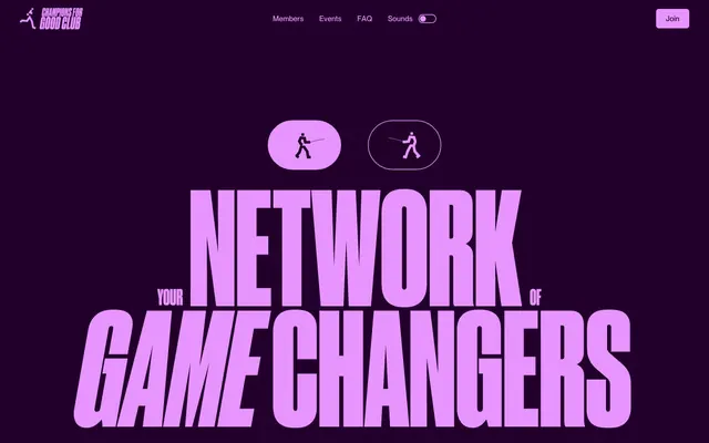
Electric purple, condensed statements. A punchy, digital-neon aesthetic on a dark, rich canvas.
Color palette
Page background, significant content blocks — establishes the primary dark theme with a distinct chromatic depth.
Specific card backgrounds, alternate content areas — introduces a very dark, desaturated teal as a subtle variation in background texture.
Specific card backgrounds, alternate content areas — a very dark, desaturated brown providing another distinct tonal background.
Interactive elements like buttons and toggles, highlighted text, card backgrounds — provides a high-contrast accent that feels dynamic and modern.
Decorative text, subtle accents, highlighting — a vivid, cool counterpoint to the warm pink and deep purple.
Alternative decorative text, secondary highlights — adds another layer of vivid chromatic energy, often seen in headlines.
Stroke color for outlined elements, subtle graphical details.
Primary body text, headers on light backgrounds — provides strong contrast while avoiding absolute #000.
Text on dark backgrounds, icons — ensures maximum readability against the brand's deep chromatic backgrounds.
Secondary text, subtle borders, some UI elements in light contexts.
Typography
- Weights
- 400, 500
- Sizes
- 24px, 29px, 32px, 43px, 44px, 151px, 187px, 317px
- Line height
- 0.78, 0.85, 1
- Letter spacing
- 0.005em, 0.008em
- Fallback
- Anton
Display headlines and hero text — its condensed, heavy-set nature screams attention and is the primary driver of the system's bold, declarative tone.
- Weights
- 400, 500, 600
- Sizes
- 12px, 14px, 15px, 16px, 58px
- Line height
- 1, 1.1, 1.2, 1.3, 1.4, 1.43
- Letter spacing
- -0.022em
- Fallback
- Inter
Body text, navigation, and input labels — a modern, geometric sans-serif that provides clarity and a modern edge, contrasting with the loudness of Druk. Negative letter-spacing keeps it tight and contemporary.
- Weights
- 400
- Sizes
- 14px
- Line height
- 1.43
- Letter spacing
- normal
- Fallback
- Arial
Fallback and minimal UI elements — for high readability in small contexts or as a general system fallback.
Spacing & shape
Components
Text in Pure White, no background, no borders. Uses Neue Montreal, weight 400 at 14px size for navigation items. On hover or active, it likely changes to Hot Pink or a similar accent color for emphasis.
Background transparent, text in Hot Pink (#e894ff). No padding, no border radius. Typography uses Neue Montreal, weight 400.
Background color Forest Shard (#002629), border radius 14px, no box shadow. Padding is internal to content, not intrinsic to the card background.
Background color Espresso Chip (#291900), border radius 14px, no box shadow. Padding is internal to content, not intrinsic to the card background.
Background color Hot Pink (#e894ff), border radius 14px, no box shadow. Padding is internal to content, not intrinsic to the card background.
Background transparent, border is Deep Plum with 1px width. Inside, there's a circular element with a dot. Border radius appears to be fully rounded or pill-shaped to differentiate it from other UI elements.
Guidelines
- Prioritize Druk Condensed Super Desktop for all headlines and marketing text, leveraging its condensed forms and ultra-heavy weights for maximum impact.
- Use Royal Plum (#23002b) as the dominant background color for most sections, establishing the primary visual identity.
- Accent interactive elements and key information with Hot Pink (#e894ff) for high visibility and vibrant contrast.
- Maintain a tight, modern aesthetic by applying -0.022em letter spacing to Neue Montreal text.
- Apply 14px border radius to all card-like containers, establishing a consistent subtle softness against the generally sharp aesthetic.
- Ensure textual contrast: use Pure White (#ffffff) text on Royal Plum (#23002b) backgrounds and Ink Black (#121212) on Pure White (#ffffff) sections.
- Utilize specific background colors (Forest Shard #002629, Espresso Chip #291900) for distinct content blocks or cards to create visual segmentation without relying on shadows.
- Avoid using box shadows for elevation; define hierarchy and distinction purely through color and border radius variations.
- Do not introduce soft, pasty, or muted colors; maintain the high vibrance and contrast of the established palette.
- Refrain from using rounded borders on buttons or primary CTA elements; maintain sharp, rectangular framing.
- Do not break up sections with subtle dividers or thin lines; instead, use full-bleed background color changes between content blocks.
- Avoid generic system fonts for prominent text; Neue Montreal and Druk Condensed Super Desktop define the typographic identity.
- Do not use letter spacing values for Druk Condensed Super Desktop below 0.005em, as this will hinder readability.
About this system
ShowHide
This design system conjures a vibrant, high-energy atmosphere through its daring color palette and bold typography. A deep, almost regal purple dominates as the primary background, punctuated by electric pink and sharp neon green accents. Type is a declarative, almost industrial statement, mixing a condensed, extra-bold display font with a more understated sans-serif for body text, creating a strong contrast between commanding headlines and informational support. Rectangular shapes are favored, with only subtle rounding, reinforcing a sense of precise, deliberate construction.
The page primarily employs a full-bleed layout, where background colors extend to the edges of the viewport. Content appears to be centered within this full-bleed canvas. The hero section is characterized by massive, centered display typography (Druk Condensed Super Desktop) over a Royal Plum background, creating an immediate, bold statement. Sections are defined by alternating full-bleed background colors (e.g., Royal Plum, then a lighter color in the secondary screenshot), creating a rhythmic flow down the page without explicit dividers. Content arrangement within these sections is fluid, often featuring large stacked text blocks. There's a subtle grid for some feature blocks, such as the colored cards for Forest Shard, Espresso Chip, and Hot Pink, which have a 14px border radius but no padding on the card itself, suggesting padding is applied to internal content.
The site's visual language is minimal but impactful, focusing on outlined vector graphics. These are primarily monochrome human silhouettes, acting as abstract representations of 'champions.' They are used decoratively and iconographically rather than photographically or illustratively. The treatment is clean and isolated, providing visual cues without adding photographic noise. The density is low, making the typography and color the primary visual drivers, with icons serving as supporting visual metaphor.
Reminiscent of Awwwards-winning portfolio sites, Web3/Crypto landing pages, Athletic apparel brands (certain campaigns), Digital art/event platforms.
# Champions4good — Style Reference
> Electric purple, condensed statements. A punchy, digital-neon aesthetic on a dark, rich canvas.

**Theme:** dark

**Site:** https://www.champions4good.club

This design system conjures a vibrant, high-energy atmosphere through its daring color palette and bold typography. A deep, almost regal purple dominates as the primary background, punctuated by electric pink and sharp neon green accents. Type is a declarative, almost industrial statement, mixing a condensed, extra-bold display font with a more understated sans-serif for body text, creating a strong contrast between commanding headlines and informational support. Rectangular shapes are favored, with only subtle rounding, reinforcing a sense of precise, deliberate construction.

## Tokens — Colors

| Name | Value | Token | Role |
|------|------|------|------|
| Royal Plum | `#23002b` | `--color-royal-plum` | Page background, significant content blocks — establishes the primary dark theme with a distinct chromatic depth. |
| Forest Shard | `#002629` | `--color-forest-shard` | Specific card backgrounds, alternate content areas — introduces a very dark, desaturated teal as a subtle variation in background texture. |
| Espresso Chip | `#291900` | `--color-espresso-chip` | Specific card backgrounds, alternate content areas — a very dark, desaturated brown providing another distinct tonal background. |
| Hot Pink | `#e894ff` | `--color-hot-pink` | Interactive elements like buttons and toggles, highlighted text, card backgrounds — provides a high-contrast accent that feels dynamic and modern. |
| Neon Green | `#93ffe4` | `--color-neon-green` | Decorative text, subtle accents, highlighting — a vivid, cool counterpoint to the warm pink and deep purple. |
| Sunburst Orange | `#ffac47` | `--color-sunburst-orange` | Alternative decorative text, secondary highlights — adds another layer of vivid chromatic energy, often seen in headlines. |
| Deep Plum | `#db99f7` | `--color-deep-plum` | Stroke color for outlined elements, subtle graphical details. |
| Ink Black | `#121212` | `--color-ink-black` | Primary body text, headers on light backgrounds — provides strong contrast while avoiding absolute #000. |
| Pure White | `#ffffff` | `--color-pure-white` | Text on dark backgrounds, icons — ensures maximum readability against the brand's deep chromatic backgrounds. |
| Graphite | `#333333` | `--color-graphite` | Secondary text, subtle borders, some UI elements in light contexts. |

## Tokens — Typography

### Druk Condensed Super Desktop
- **Substitute:** Anton
- **Weights:** 400, 500
- **Sizes:** 24px, 29px, 32px, 43px, 44px, 151px, 187px, 317px
- **Line height:** 0.78, 0.85, 1
- **Letter spacing:** 0.005em, 0.008em
- **Role:** Display headlines and hero text — its condensed, heavy-set nature screams attention and is the primary driver of the system's bold, declarative tone.

### Neue Montreal
- **Substitute:** Inter
- **Weights:** 400, 500, 600
- **Sizes:** 12px, 14px, 15px, 16px, 58px
- **Line height:** 1, 1.1, 1.2, 1.3, 1.4, 1.43
- **Letter spacing:** -0.022em
- **Role:** Body text, navigation, and input labels — a modern, geometric sans-serif that provides clarity and a modern edge, contrasting with the loudness of Druk. Negative letter-spacing keeps it tight and contemporary.

### Arial
- **Substitute:** Arial
- **Weights:** 400
- **Sizes:** 14px
- **Line height:** 1.43
- **Letter spacing:** normal
- **Role:** Fallback and minimal UI elements — for high readability in small contexts or as a general system fallback.

## Tokens — Type Scale

| Role | Size | Line height | Letter spacing |
|------|------|------|------|
| heading-sm | 24px | 0.85 | — |
| heading | 44px | 0.85 | 0.005em |
| heading-lg | 58px | 1.1 | -0.48px |
| display | 317px | 0.78 | 0.008em |

## Tokens — Spacing

- **Section gap:** 40px
- **Card padding:** 0px
- **Element gap:** 8px

## Tokens — Radius

- **Default:** 6px
- **Buttons:** 0px
- **Cards:** 14px

## Layout

The page primarily employs a full-bleed layout, where background colors extend to the edges of the viewport. Content appears to be centered within this full-bleed canvas. The hero section is characterized by massive, centered display typography (Druk Condensed Super Desktop) over a Royal Plum background, creating an immediate, bold statement. Sections are defined by alternating full-bleed background colors (e.g., Royal Plum, then a lighter color in the secondary screenshot), creating a rhythmic flow down the page without explicit dividers. Content arrangement within these sections is fluid, often featuring large stacked text blocks. There's a subtle grid for some feature blocks, such as the colored cards for Forest Shard, Espresso Chip, and Hot Pink, which have a 14px border radius but no padding on the card itself, suggesting padding is applied to internal content.

## Imagery

The site's visual language is minimal but impactful, focusing on outlined vector graphics. These are primarily monochrome human silhouettes, acting as abstract representations of 'champions.' They are used decoratively and iconographically rather than photographically or illustratively. The treatment is clean and isolated, providing visual cues without adding photographic noise. The density is low, making the typography and color the primary visual drivers, with icons serving as supporting visual metaphor.

## Components

### Join CTA Button Group

### Feature Cards — Triptych

### Sound Toggle + Navigation Pills

### Ghost Navigation Link
*Primary navigation links*

Text in Pure White, no background, no borders. Uses Neue Montreal, weight 400 at 14px size for navigation items. On hover or active, it likely changes to Hot Pink or a similar accent color for emphasis.

### Hero Text Button
*Call to action in hero*

Background transparent, text in Hot Pink (#e894ff). No padding, no border radius. Typography uses Neue Montreal, weight 400.

### Standard Card (Forest Green)
*Content container*

Background color Forest Shard (#002629), border radius 14px, no box shadow. Padding is internal to content, not intrinsic to the card background.

### Standard Card (Espresso Chip)
*Content container*

Background color Espresso Chip (#291900), border radius 14px, no box shadow. Padding is internal to content, not intrinsic to the card background.

### Standard Card (Hot Pink)
*Content container*

Background color Hot Pink (#e894ff), border radius 14px, no box shadow. Padding is internal to content, not intrinsic to the card background.

### Sound Toggle (Outline)
*Toggle button for sound*

Background transparent, border is Deep Plum with 1px width. Inside, there's a circular element with a dot. Border radius appears to be fully rounded or pill-shaped to differentiate it from other UI elements.

## Guidelines

### Do

- Prioritize Druk Condensed Super Desktop for all headlines and marketing text, leveraging its condensed forms and ultra-heavy weights for maximum impact.
- Use Royal Plum (#23002b) as the dominant background color for most sections, establishing the primary visual identity.
- Accent interactive elements and key information with Hot Pink (#e894ff) for high visibility and vibrant contrast.
- Maintain a tight, modern aesthetic by applying -0.022em letter spacing to Neue Montreal text.
- Apply 14px border radius to all card-like containers, establishing a consistent subtle softness against the generally sharp aesthetic.
- Ensure textual contrast: use Pure White (#ffffff) text on Royal Plum (#23002b) backgrounds and Ink Black (#121212) on Pure White (#ffffff) sections.
- Utilize specific background colors (Forest Shard #002629, Espresso Chip #291900) for distinct content blocks or cards to create visual segmentation without relying on shadows.

### Don't

- Avoid using box shadows for elevation; define hierarchy and distinction purely through color and border radius variations.
- Do not introduce soft, pasty, or muted colors; maintain the high vibrance and contrast of the established palette.
- Refrain from using rounded borders on buttons or primary CTA elements; maintain sharp, rectangular framing.
- Do not break up sections with subtle dividers or thin lines; instead, use full-bleed background color changes between content blocks.
- Avoid generic system fonts for prominent text; Neue Montreal and Druk Condensed Super Desktop define the typographic identity.
- Do not use letter spacing values for Druk Condensed Super Desktop below 0.005em, as this will hinder readability.

## Agent Prompt Guide

### Quick Color Reference
- Text (dark bg): #ffffff (Pure White)
- Text (light bg): #121212 (Ink Black)
- Background (primary): #23002b (Royal Plum)
- CTA/Accent: #e894ff (Hot Pink)
- Border/Outline: #db99f7 (Deep Plum)

### 3-5 Example Component Prompts
1. Create a hero section: Full-bleed Royal Plum (#23002b) background. Main headline: 'NETWORK YOUR GAME CHANGERS' using Druk Condensed Super Desktop, size 317px, weight 400, line-height 0.78, letter-spacing 0.008em, color Pure White (#ffffff), centered. Below it, a line of subtext in Hot Pink (#e894ff), Neue Montreal, size 16px, weight 500.
2. Create a navigation bar: Full-width top bar, Pure White (#ffffff) text for 'Members', 'Events', 'FAQ' using Neue Montreal, size 14px, weight 400, letter-spacing -0.022em. On the far right, a 'Join' button with transparent background, Hot Pink (#e894ff) text (Neue Montreal, size 14px, weight 400), no border radius.
3. Create a feature card: Background is Forest Shard (#002629), border radius 14px. Inside, a headline using Druk Condensed Super Desktop, size 44px, weight 500, color Pure White (#ffffff). Body text below it using Neue Montreal, size 16px, weight 400, color Pure White (#ffffff). No external padding on the card itself.
4. Create a sound toggle component: An outlined pill-shaped button with a transparent background and a 1px Deep Plum (#db99f7) border. It contains a small circular element that internally uses Hot Pink (#e894ff) for its fill when active. The text 'Sounds' next to it is Pure White (#ffffff), Neue Montreal, size 14px, weight 400.
More like this









Keep what you find
A free account saves references to boards and can send you a weekly email of picks based on what you save.
To see every result, go Pro.