Preview image. Unlock full-res
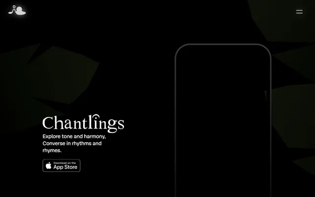
Moonlit Forest Floor: glowing forms in the deep dark
Color palette
Filled action buttons, interactive elements — a warm, vivid orange that provides a focused point of interaction
Outlined action borders, decorative link accents — a slightly softer orange, suggesting a secondary interactive state or highlight
Page background, primary surface for most elements — creates a deep, infinite canvas
Muted text, inactive borders, general UI elements and ghost button text
Primary text color, background for outlined buttons, secondary borders — creates sharp contrast against the dark canvas
Subtle borders and muted accents, lighter than Ghostly Gray
Typography
- Weights
- 100, 300
- Sizes
- 14px, 20px, 24px, 25px, 32px
- Line height
- 0.8, 0.83, 1, 1.06, 1.33, 1.42, 1.43, 1.5
- Letter spacing
- normal
- Fallback
- Lora, Playfair Display
All text: headlines use weight 300 for a distinguished, unassertive presence; body text and links are also from this family to maintain a consistent, refined voice.
Spacing & shape
Components
Transparent background, Ghostly Gray (#333333) text and 1px border, 0px border radius, 18px padding for a minimalist, integrated look. Font is Mija, weight is not explicitly stated but inherits body style.
Active Fire (#ff8800) background, Canvas White (#ffffff) text, 50px border radius for a distinctive pill shape, 18px vertical and 23px horizontal padding. Font is Mija.
Transparent background, Subtle Glow (#ffaa20) text and 1px border, 0px border radius, with 100px horizontal padding, often used in decorative contexts. Font is Mija.
Features a transparent background with a Canvas White (#ffffff) border, text, and icon. Uses an 18px vertical and 23px horizontal padding, with a 50px radius to match the primary button's pill shape. Font is Mija.
Guidelines
- Prioritize deep Midnight Noir (#000000) for all main backgrounds to maintain the dark, atmospheric tone.
- Use Mija webfont weight 300 for all headlines and significant text at larger sizes (24px, 32px) to convey understated elegance.
- Apply a 50px border-radius to all primary action buttons for a consistent pill-shaped aesthetic.
- Use Active Fire (#ff8800) exclusively for filled primary calls to action to ensure visual hierarchy and warmth.
- Maintain generous sectionGap of 100px between major content blocks to create ample breathing room in the dark layout.
- Use Canvas White (#ffffff) for primary text and Ghostly Gray (#333333) for muted text and subtle UI elements, ensuring readability against the dark background.
- Avoid using bright or light backgrounds for main content sections; the system relies on a dark theme.
- Do not introduce sharp, angular shapes for interactive elements; prefer soft curves or pill shapes for buttons.
- Refrain from heavy drop shadows or excessive elevation; the design system favors a flat, subtle luminescence.
- Do not clutter layouts; aim for comfortable density with 100px section gaps and clear, isolated element placement.
- Avoid generic sans-serif fonts; Mija's distinct serif style is central to the brand's sophisticated visual identity.
- Do not use multiple accent colors; concentrate on the Active Fire (#ff8800) and Subtle Glow (#ffaa20) palette for all interactive highlights.
About this system
ShowHide
Chantlings uses a nocturnal, atmospheric design language, evoking a digital instrument in a dark, quiet room. The canvas is deep black, allowing subtle gradients and glowing elements to emerge. Typography is highly refined, with an elegant serif for headlines that whispers rather than shouts. Interactive elements are minimal, often ghosted, with one vivid orange accent color for fills, giving a sense of warmth and focused interactivity.
The page uses a full-bleed, dark layout without a fixed max-width, allowing background elements to extend edge-to-edge. The hero section features a centered headline and description over a dark, atmospheric visual. Content sections maintain consistent vertical spacing of 100px, although specific internal content structures are minimal, mainly focusing on centered text blocks and a single mobile device visual. Navigation is handled by a minimal top-left logo and a hamburger menu icon on the top right, with no visible sticky header.
This site uses minimal, abstract, and stylized 3D graphics that seem to pulsate with a soft internal glow. The 'Chantlings' themselves appear as dark, bulbous, vaguely organic shapes with glowing orange internal elements, contained within a dark, almost sculptural environment. Imagery serves an atmospheric and symbolic role rather than explanatory content, blending seamlessly into the dark UI without sharp edges or heavy outlines. The iconography focuses on simple, outlined white forms against the dark background, maintaining a light footprint.
Reminiscent of Calm, Endel, Headspace (dark mode), Arc Browser.
# Chantlings — Style Reference
> Moonlit Forest Floor: glowing forms in the deep dark

**Theme:** dark

**Site:** https://www.iorama.studio/chantlings

Chantlings uses a nocturnal, atmospheric design language, evoking a digital instrument in a dark, quiet room. The canvas is deep black, allowing subtle gradients and glowing elements to emerge. Typography is highly refined, with an elegant serif for headlines that whispers rather than shouts. Interactive elements are minimal, often ghosted, with one vivid orange accent color for fills, giving a sense of warmth and focused interactivity.

## Tokens — Colors

| Name | Value | Token | Role |
|------|------|------|------|
| Active Fire | `#ff8800` | `--color-active-fire` | Filled action buttons, interactive elements — a warm, vivid orange that provides a focused point of interaction |
| Subtle Glow | `#ffaa20` | `--color-subtle-glow` | Outlined action borders, decorative link accents — a slightly softer orange, suggesting a secondary interactive state or highlight |
| Midnight Noir | `#000000` | `--color-midnight-noir` | Page background, primary surface for most elements — creates a deep, infinite canvas |
| Ghostly Gray | `#333333` | `--color-ghostly-gray` | Muted text, inactive borders, general UI elements and ghost button text |
| Canvas White | `#ffffff` | `--color-canvas-white` | Primary text color, background for outlined buttons, secondary borders — creates sharp contrast against the dark canvas |
| Shadow Tint | `#222222` | `--color-shadow-tint` | Subtle borders and muted accents, lighter than Ghostly Gray |

## Tokens — Typography

### Mija webfont
- **Substitute:** Lora, Playfair Display
- **Weights:** 100, 300
- **Sizes:** 14px, 20px, 24px, 25px, 32px
- **Line height:** 0.8, 0.83, 1, 1.06, 1.33, 1.42, 1.43, 1.5
- **Letter spacing:** normal
- **Role:** All text: headlines use weight 300 for a distinguished, unassertive presence; body text and links are also from this family to maintain a consistent, refined voice.

## Tokens — Type Scale

Perfect Fourth (1.333) from 20px base.

| Role | Size | Line height | Letter spacing |
|------|------|------|------|
| caption | 14px | 1.43 | — |
| body | 20px | 1.42 | — |
| subheading | 24px | 1.06 | — |
| display | 32px | 0.8 | — |

## Tokens — Spacing

- **Section gap:** 100px
- **Card padding:** 18px
- **Element gap:** 10px

## Tokens — Radius

- **Default:** 0px
- **Buttons:** 50px

## Layout

The page uses a full-bleed, dark layout without a fixed max-width, allowing background elements to extend edge-to-edge. The hero section features a centered headline and description over a dark, atmospheric visual. Content sections maintain consistent vertical spacing of 100px, although specific internal content structures are minimal, mainly focusing on centered text blocks and a single mobile device visual. Navigation is handled by a minimal top-left logo and a hamburger menu icon on the top right, with no visible sticky header.

## Imagery

This site uses minimal, abstract, and stylized 3D graphics that seem to pulsate with a soft internal glow. The 'Chantlings' themselves appear as dark, bulbous, vaguely organic shapes with glowing orange internal elements, contained within a dark, almost sculptural environment. Imagery serves an atmospheric and symbolic role rather than explanatory content, blending seamlessly into the dark UI without sharp edges or heavy outlines. The iconography focuses on simple, outlined white forms against the dark background, maintaining a light footprint.

## Components

### Ghost Navigation Button
*Header navigation, secondary actions*

Transparent background, Ghostly Gray (#333333) text and 1px border, 0px border radius, 18px padding for a minimalist, integrated look. Font is Mija, weight is not explicitly stated but inherits body style.

### Primary Action Button
*Main calls to action*

Active Fire (#ff8800) background, Canvas White (#ffffff) text, 50px border radius for a distinctive pill shape, 18px vertical and 23px horizontal padding. Font is Mija.

### Outlined Accent Link
*Secondary links with visual emphasis*

Transparent background, Subtle Glow (#ffaa20) text and 1px border, 0px border radius, with 100px horizontal padding, often used in decorative contexts. Font is Mija.

### App Store Download Button
*Directing users to download the app*

Features a transparent background with a Canvas White (#ffffff) border, text, and icon. Uses an 18px vertical and 23px horizontal padding, with a 50px radius to match the primary button's pill shape. Font is Mija.

## Guidelines

### Do

- Prioritize deep Midnight Noir (#000000) for all main backgrounds to maintain the dark, atmospheric tone.
- Use Mija webfont weight 300 for all headlines and significant text at larger sizes (24px, 32px) to convey understated elegance.
- Apply a 50px border-radius to all primary action buttons for a consistent pill-shaped aesthetic.
- Use Active Fire (#ff8800) exclusively for filled primary calls to action to ensure visual hierarchy and warmth.
- Maintain generous sectionGap of 100px between major content blocks to create ample breathing room in the dark layout.
- Use Canvas White (#ffffff) for primary text and Ghostly Gray (#333333) for muted text and subtle UI elements, ensuring readability against the dark background.

### Don't

- Avoid using bright or light backgrounds for main content sections; the system relies on a dark theme.
- Do not introduce sharp, angular shapes for interactive elements; prefer soft curves or pill shapes for buttons.
- Refrain from heavy drop shadows or excessive elevation; the design system favors a flat, subtle luminescence.
- Do not clutter layouts; aim for comfortable density with 100px section gaps and clear, isolated element placement.
- Avoid generic sans-serif fonts; Mija's distinct serif style is central to the brand's sophisticated visual identity.
- Do not use multiple accent colors; concentrate on the Active Fire (#ff8800) and Subtle Glow (#ffaa20) palette for all interactive highlights.

## Agent Prompt Guide

Quick Color Reference:
text: #ffffff
background: #000000
border: #333333
accent: #ffaa20
primary action: #ff8800 (filled action)

3-5 Example Component Prompts:
1. Create a hero section: Midnight Noir (#000000) background. Headline 'Chantlings' at 32px Mija weight 300, Canvas White (#ffffff). Subtext 'Explore tone and harmony...' at 20px Mija, Canvas White (#ffffff). Position prominently centered.
2. Create a Primary Action Button: #ff8800 background, #222222 text, 9999px radius, compact pill padding. Use this filled treatment for the main CTA.
3. Create a ghost navigation button: Transparent background, Ghostly Gray (#333333) text, 1px Ghostly Gray (#333333) border, 0px border-radius, 18px padding, Mija font. Text 'Heart of Noise'.
4. Create a minimal text link: Canvas White (#ffffff) text using Mija font at 20px, with no explicit background or border, against a Midnight Noir (#000000) canvas. Text 'Press'.
More like this









Keep what you find
A free account saves references to boards and can send you a weekly email of picks based on what you save.
To see every result, go Pro.