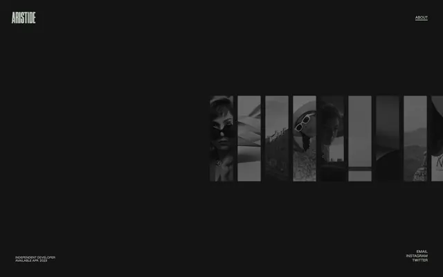
Preview image. Unlock full-res
Monochromatic minimalist stage
Color palette
Yellow outline accent for tags, dividers, and focused UI edges. Do not promote it to the primary CTA color
Page backgrounds, deeply recessed surfaces, primary text color for high contrast elements
Card surfaces, secondary background elements, subtle dividers
Medium-contrast borders, control outlines, and structural separators. Do not promote it to the primary CTA color
Typography
- Weights
- 400
- Sizes
- 10px, 11px, 12px, 16px
- Line height
- 0.91, 1, 1.17, 1.2, 2, 2.83
- Letter spacing
- -0.0200em at 10px, 0.0200em at 11px, 0.0330em at 12px, -0.0200em at 16px
- Fallback
- Arial
Body text, links, navigation items, and descriptive labels. Its tight tracking and condensed impression maintain visual density.
- Weights
- 400
- Sizes
- 50px, 258px, 338px
- Line height
- 0.75, 0.88
- Letter spacing
- -0.0240em at 258px, -0.0200em at 338px, -0.0100em at 50px
- Fallback
- Georgia
Dominant display headlines and hero text. The extremely large sizes and negative letter-spacing create an architectural, almost sculptural presence, defining key sections with minimal words.
Spacing & shape
Components
Text in jws 400 at 16px (0.0200em letter-spacing) with Mist Gray (#bac4b8). Active state signaled by Goldenrod Accent (#cc9933) text.
Text in jws 400 at 10px (0.0200em letter-spacing) with Mist Gray (#bac4b8). Interacts visually with the overall minimalist theme.
1px solid line using Mist Gray (#bac4b8) or Goldenrod Accent (#cc9933) for active/focused elements.
TNY 400, sizes like 258px or 338px with very tight negative letter-spacing (-0.024em or -0.020em). Color is Midnight Ink (#000000) or Mist Gray (#bac4b8), depending on background contrast.
jws 400 font at 16px, with Mist Gray (#bac4b8) color, providing comfortable legibility against dark backgrounds.
Guidelines
- Prioritize Midnight Ink (#000000) for primary page canvas and Storm Gray (#1e1e1e) for secondary background surfaces, emphasizing depth through subtle tonal shifts.
- Use Mist Gray (#bac4b8) for all body text, default links, and inactive navigation items.
- Reserve Goldenrod Accent (#cc9933) for active element borders, focused states, and selected interactive text to maximize its impact.
- Apply jws 400 font with a consistent 1.0 line height for all body copy and interactive text elements.
- Utilize TNY 400 with its extremely large sizes and negative letter-spacing for all primary headlines, treating text as a dominant visual element.
- Maintain a clear visual hierarchy with high contrast between text and background, adhering to AAA accessibility standards for critical information.
- Implement 1px solid borders using Mist Gray (#bac4b8) for subtle content separation and interactive feedback.
- Avoid using multiple chromatic colors; limit the accent palette exclusively to Goldenrod Accent (#cc9933).
- Do not introduce rounded corners; maintain sharp, crisp edges for all UI elements and imagery.
- Refrain from using shadows or elevation; the design system relies on flat surfaces and color contrast for visual hierarchy.
- Do not use generic system fonts; stick to the specified jws and TNY fonts to preserve brand identity.
- Avoid decorative gradients; surfaces should be flat and uniform in color.
- Do not use letter-spacing outside the specified values for jws and TNY fonts; precise tracking is a key brand identifier.
- Circumvent any large gaps or excessive padding that would disrupt the dense, content-focused layout.
About this system
ShowHide
Aristide Benoist employs a stark, high-contrast dark theme, creating a minimalist canvas for showcasing visual work. Typography plays a central role, utilizing custom fonts with distinct letter-spacing and compact line heights to establish a deliberate, almost architectural tone. Subtle use of a vivid yellow accent provides a critical but restrained counterpoint to the monochromatic surfaces, drawing attention to interactive elements without visual clutter. The overall presentation is sparse and content-focused, emphasizing precision and interaction.
Reminiscent of Awwwards, Figma, Linear, Stripe.
# Aristide Benoist — Style Reference
> Monochromatic minimalist stage

**Theme:** dark

**Site:** https://www.aristidebenoist.com

Aristide Benoist employs a stark, high-contrast dark theme, creating a minimalist canvas for showcasing visual work. Typography plays a central role, utilizing custom fonts with distinct letter-spacing and compact line heights to establish a deliberate, almost architectural tone. Subtle use of a vivid yellow accent provides a critical but restrained counterpoint to the monochromatic surfaces, drawing attention to interactive elements without visual clutter. The overall presentation is sparse and content-focused, emphasizing precision and interaction.

## Tokens — Colors

| Name | Value | Token | Role |
|------|------|------|------|
| Goldenrod Accent | `#cc9933` | `--color-goldenrod-accent` | Yellow outline accent for tags, dividers, and focused UI edges. Do not promote it to the primary CTA color |
| Midnight Ink | `#000000` | `--color-midnight-ink` | Page backgrounds, deeply recessed surfaces, primary text color for high contrast elements |
| Storm Gray | `#1e1e1e` | `--color-storm-gray` | Card surfaces, secondary background elements, subtle dividers |
| Mist Gray | `#bac4b8` | `--color-mist-gray` | Medium-contrast borders, control outlines, and structural separators. Do not promote it to the primary CTA color |

## Tokens — Typography

### jws
- **Substitute:** Arial
- **Weights:** 400
- **Sizes:** 10px, 11px, 12px, 16px
- **Line height:** 0.91, 1, 1.17, 1.2, 2, 2.83
- **Letter spacing:** -0.0200em at 10px, 0.0200em at 11px, 0.0330em at 12px, -0.0200em at 16px
- **Role:** Body text, links, navigation items, and descriptive labels. Its tight tracking and condensed impression maintain visual density.

### TNY
- **Substitute:** Georgia
- **Weights:** 400
- **Sizes:** 50px, 258px, 338px
- **Line height:** 0.75, 0.88
- **Letter spacing:** -0.0240em at 258px, -0.0200em at 338px, -0.0100em at 50px
- **Role:** Dominant display headlines and hero text. The extremely large sizes and negative letter-spacing create an architectural, almost sculptural presence, defining key sections with minimal words.

## Tokens — Type Scale

| Role | Size | Line height | Letter spacing |
|------|------|------|------|
| caption | 10px | 1.2 | — |
| body-sm | 11px | 1.2 | — |
| body | 12px | 1.2 | — |
| body-lg | 16px | 1.2 | — |

## Tokens — Spacing

- **Section gap:** 48px
- **Card padding:** 24px
- **Element gap:** 24px

## Tokens — Radius

- **Default:** 0px

## Components

### Primary Navigation Link
*Top-level navigation element*

Text in jws 400 at 16px (0.0200em letter-spacing) with Mist Gray (#bac4b8). Active state signaled by Goldenrod Accent (#cc9933) text.

### Secondary Footer Link
*Utility links in the footer*

Text in jws 400 at 10px (0.0200em letter-spacing) with Mist Gray (#bac4b8). Interacts visually with the overall minimalist theme.

### Horizontal Divider
*Visual separation within lists or sections*

1px solid line using Mist Gray (#bac4b8) or Goldenrod Accent (#cc9933) for active/focused elements.

### Hero Display Text
*Large, impactful headlines for hero sections*

TNY 400, sizes like 258px or 338px with very tight negative letter-spacing (-0.024em or -0.020em). Color is Midnight Ink (#000000) or Mist Gray (#bac4b8), depending on background contrast.

### Body Paragraph
*Standard informational text blocks*

jws 400 font at 16px, with Mist Gray (#bac4b8) color, providing comfortable legibility against dark backgrounds.

## Guidelines

### Do

- Prioritize Midnight Ink (#000000) for primary page canvas and Storm Gray (#1e1e1e) for secondary background surfaces, emphasizing depth through subtle tonal shifts.
- Use Mist Gray (#bac4b8) for all body text, default links, and inactive navigation items.
- Reserve Goldenrod Accent (#cc9933) for active element borders, focused states, and selected interactive text to maximize its impact.
- Apply jws 400 font with a consistent 1.0 line height for all body copy and interactive text elements.
- Utilize TNY 400 with its extremely large sizes and negative letter-spacing for all primary headlines, treating text as a dominant visual element.
- Maintain a clear visual hierarchy with high contrast between text and background, adhering to AAA accessibility standards for critical information.
- Implement 1px solid borders using Mist Gray (#bac4b8) for subtle content separation and interactive feedback.

### Don't

- Avoid using multiple chromatic colors; limit the accent palette exclusively to Goldenrod Accent (#cc9933).
- Do not introduce rounded corners; maintain sharp, crisp edges for all UI elements and imagery.
- Refrain from using shadows or elevation; the design system relies on flat surfaces and color contrast for visual hierarchy.
- Do not use generic system fonts; stick to the specified jws and TNY fonts to preserve brand identity.
- Avoid decorative gradients; surfaces should be flat and uniform in color.
- Do not use letter-spacing outside the specified values for jws and TNY fonts; precise tracking is a key brand identifier.
- Circumvent any large gaps or excessive padding that would disrupt the dense, content-focused layout.

## Type Scale

**role:** caption
**size:** 10
**lineHeight:** 1
**letterSpacing:** -0.01

**role:** body-sm
**size:** 11
**lineHeight:** 1
**letterSpacing:** 0.02

**role:** body
**size:** 12
**lineHeight:** 1
**letterSpacing:** 0.033

**role:** subheading
**size:** 16
**lineHeight:** 1
**letterSpacing:** -0.02

**role:** heading
**size:** 50
**lineHeight:** 0.88
**letterSpacing:** -0.01

**role:** display-sm
**size:** 258
**lineHeight:** 0.88
**letterSpacing:** -0.024

**role:** display
**size:** 338
**lineHeight:** 0.88
**letterSpacing:** -0.02

## Agent Prompt Guide

Quick Color Reference: text: #bac4b8, background: #000000, border: #bac4b8, accent: #cc9933, primary action: no distinct CTA color

Create a footer section: Background Midnight Ink (#000000). Text 'INDEPENDENT DEVELOPER' in jws 400 at 10px, Mist Gray (#bac4b8). Social links 'EMAIL', 'INSTAGRAM', 'TWITTER' in jws 400 at 10px, Mist Gray (#bac4b8), with 1px Goldenrod Accent (#cc9933) underline on hover. Element gap for vertical stacking is 13px, horizontal gap for text within links is 2px.

Create a navigation bar: Background Midnight Ink (#000000). Nav link 'ABOUT' in jws 400 at 16px, Mist Gray (#bac4b8), with a 1px Mist Gray (#bac4b8) bottom border 2px below on hover. The main brand logo 'ARISTIDE' is also in jws 400 at 16px, Mist Gray (#bac4b8).

Create a hero display title: Set on a Midnight Ink (#000000) background. Headline text 'MOTION AND INTERACTION' in TNY 400 at 50px, Mist Gray (#bac4b8), letter-spacing -0.010em, line-height 0.88. Use a total section gap of 48px from surrounding elements.
More like this








Keep what you find
A free account saves references to boards and can send you a weekly email of picks based on what you save.
To see every result, go Pro.