Preview image. Unlock full-res
Typographer's proof sheet — a composited page where precision of letterform carries the entire visual weight, color is an intrusion, and the grid is the design.
Color palette
Dark borders and separators for elevated surfaces and inverted UI. Do not promote it to the primary CTA color
Filled action button backgrounds (Try Chronicle, Talk to sales, Try for free); icon fills; strongest contrast anchor
Navigation link text and active nav states
Footer fine print and copyright text
Body text, UI borders, ghost button borders and text — the workhorse mid-tone
Secondary body copy and captions
Disabled or inactive button text and borders
Subtle background dividers and muted separators
Card borders, image borders, input borders — the hairline rule color
Alternating section backgrounds, testimonial section canvas, muted surface fills
Primary page canvas, card surfaces, link text on filled black buttons
Typography
- Weights
- 400, 500
- Sizes
- 12px, 14px, 16px, 20px, 32px, 48px, 54px
- Line height
- 1, 1.05, 1.1, 1.4
- Letter spacing
- -0.030em at 54px and 48px; -0.023em at 32px; -0.020em at 20px; 0 at 16px and below
- Fallback
- Inter, Helvetica Neue
Single typeface for the entire system — headings, body, nav, buttons. Weight 400 for body and secondary text; weight 500 for prominent headings and CTAs. Negative tracking of -0.03em at display sizes creates mechanical compression uncommon in SaaS type — the letterforms feel pressed into the page rather than set on it. No serif, no decorative fallback: if Diatype is absent, the design loses its primary identity marker.
Spacing & shape
Elevation
Components
Background #000000, text #ffffff, Diatype 14-16px weight 500, 4px border-radius, 10px top/bottom padding, 24px left/right padding. No border. On hover, color and background transition at 0.2s ease.
Background transparent, text rgba(0,0,0,0.56), no horizontal padding, 10px vertical padding, 0px border-radius. Border appears only on bottom as a 1px underline in rgba(0,0,0,0.56). Used for secondary actions that sit beside a filled CTA.
Background transparent, text rgba(0,0,0,0.4), border-color rgba(0,0,0,0.4), 0px border-radius. No padding. Lowest visual weight in the button hierarchy.
Background #e2e2e2, text rgba(0,0,0,0.56), 2px border-radius, no padding in default state. Active tab uses a bottom underline or filled state. Sits in a horizontal scrollable row with 8px gap.
Background #ffffff, 8px border-radius, shadow rgba(5,5,5,0.08) 0px 2px 24px 0px, 3px inner padding on all sides. Internal content padding ~24-30px. Quote text Diatype 16px weight 400 #050505, attribution name 14px weight 500 #050505, role 12px #6b6b6b. Company logo at top-left 14px weight 500 with small brand icon.
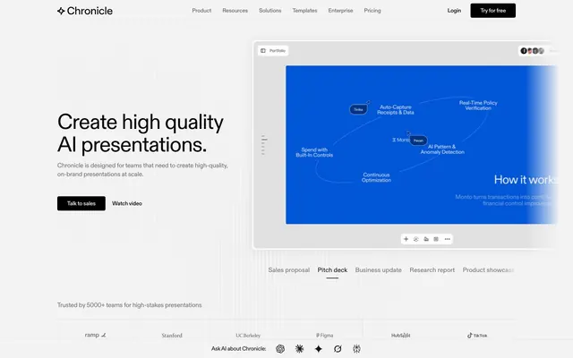
Contained in a bordered frame with 1px solid #e2e2e2 border, 8px border-radius, 3px padding. Interior renders the product UI (bright blue canvas). Frame sits on white canvas with browser-chrome-like top bar showing tab labels.
Horizontal row of company logos in #6b6b6b or #151515, Diatype 14px weight 400, spaced evenly with 24px column gaps. Set on white or #f3f3f3 surface. No borders, no cards.
White background, max-width 1212px centered, height ~54px. Logo left-aligned. Nav links Diatype 14px weight 400 #151515, 12px column gap. Right side: 'Login' ghost text link and 'Try for free' filled black button with 4px radius, 10px vertical / 16px horizontal padding.
Horizontal scrollable row of text buttons (Diatype 14px weight 400) with bottom-border underline on active state, rgba(0,0,0,0.56) inactive text, #050505 active text. 8px gap between tabs. No background, no card.
Background #ffffff, 8px border-radius, shadow rgba(5,5,5,0.08) 0px 2px 24px 0px. Contains file attachment chips with #e2e2e2 border and 4px radius. Submit arrow button in filled black circle. Diatype 14px weight 400 for prompt text.
Guidelines
- Use #000000 or #050505 as the filled button background — never use a chromatic color for any interactive element
- Apply Diatype with letter-spacing -0.030em at 54px display and -0.023em at 32px headings; body text at 16px uses 0 tracking
- Alternate page sections between #ffffff and #f3f3f3 backgrounds to create rhythm without decorative elements
- Use 4px border-radius for all buttons, inputs, and tags; 8px for cards and image frames only
- Maintain 1px solid #e2e2e2 hairline borders on image frames and card edges — never use thicker strokes
- Reserve electric blue and any chromatic color strictly for rendered product UI content inside frames, never in navigation, buttons, or backgrounds
- Use the single shadow token (rgba(5,5,5,0.08) 0px 2px 24px 0px) only for white cards sitting on gray surfaces — no shadow on white-on-white
- Never introduce a brand color (blue, purple, green) into navigation, buttons, section backgrounds, or typography — the UI is intentionally achromatic
- Never round buttons or inputs beyond 4px — pill-shaped buttons would break the editorial typographic register
- Never use font weights above 500 — Diatype at 400/500 is the full weight range; heavier weights crush the mechanical letterform quality
- Never stack more than two type sizes within a single content block without re-establishing hierarchy through #6b6b6b muted color rather than additional size steps
- Never apply more than one shadow elevation level — the system uses a single subtle card shadow; adding layered shadows introduces unwanted depth
- Never center-align body paragraphs or subheadings — all text below headline level is left-aligned
- Never use #b3b3b3 or #929292 as text colors for meaningful content — these tones exist only for disabled states and decorative separators
About this system
ShowHide
Chronicle runs on a strict achromatic foundation: white canvas, near-black ink, and a structured gray scale — no brand color, no decorative hue, zero saturation. The product UI (rendered in electric blue inside presentation previews) is the only color that appears on the page, framed as content rather than interface chrome. Typography is a single custom variable font, Diatype, at tight negative tracking — headlines compress letterforms so aggressively at large sizes that the text feels mechanically engraved rather than set. Buttons are either filled black or ghost-outlined, both with hairline 4px radius corners, keeping the interface sharp and editorial rather than app-friendly. The overall rhythm is generous white space punctuated by 1px borders and one subtle card shadow, with sections separated by alternating white and warm-gray (#f3f3f3) bands.
Max-width 1212px centered on a white canvas. Hero is a two-column split: large left-aligned headline stack (Diatype 54px) with two buttons below, and a right-aligned product preview frame occupying roughly 55% of the viewport width. Below the hero, horizontal tab row switches between presentation type previews. Sections alternate between white (#ffffff) and warm gray (#f3f3f3) bands with 80-128px vertical separation — no decorative dividers, just background color shifts. Feature sections use a 50/50 split (photo or product UI left, stepped text list right) with left-to-right reading flow. Testimonials appear in a horizontal 3-column card grid on the gray surface. Footer CTA is a centered stack on white with a single filled black pill button. Navigation is a top sticky bar with logo-left / links-center / actions-right pattern.
Imagery is sparse and purposeful: the hero features a product screenshot (the Chronicle editor) rendered inside a browser/application frame with a vivid electric-blue slide canvas — this is the only color on the entire page and functions as proof-of-product rather than decoration. Below the fold, a full-bleed photograph of an urban street scene (San Francisco neighborhood) appears as a muted, journalistic background behind a product UI overlay card, creating a contrast between raw real-world context and the polished editor interface. Testimonial cards show small circular headshots (natural photography, tight crops, no stylization). Icons are monochrome filled symbols at ~16px, single-weight, achromatic. The overall density is text-dominant — imagery occupies roughly 30% of screen real estate and always frames the product rather than evoking lifestyle.
Reminiscent of Linear, Notion, Pitch, Vercel, Basement Studio.
# Chronicle — Style Reference
> Typographer's proof sheet — a composited page where precision of letterform carries the entire visual weight, color is an intrusion, and the grid is the design.

**Theme:** light

**Site:** https://chroniclehq.com

Chronicle runs on a strict achromatic foundation: white canvas, near-black ink, and a structured gray scale — no brand color, no decorative hue, zero saturation. The product UI (rendered in electric blue inside presentation previews) is the only color that appears on the page, framed as content rather than interface chrome. Typography is a single custom variable font, Diatype, at tight negative tracking — headlines compress letterforms so aggressively at large sizes that the text feels mechanically engraved rather than set. Buttons are either filled black or ghost-outlined, both with hairline 4px radius corners, keeping the interface sharp and editorial rather than app-friendly. The overall rhythm is generous white space punctuated by 1px borders and one subtle card shadow, with sections separated by alternating white and warm-gray (#f3f3f3) bands.

## Tokens — Colors

| Name | Value | Token | Role |
|------|------|------|------|
| Pitch Black | `#050505` | `--color-pitch-black` | Dark borders and separators for elevated surfaces and inverted UI. Do not promote it to the primary CTA color |
| Midnight | `#000000` | `--color-midnight` | Filled action button backgrounds (Try Chronicle, Talk to sales, Try for free); icon fills; strongest contrast anchor |
| Charcoal | `#151515` | `--color-charcoal` | Navigation link text and active nav states |
| Obsidian | `#292929` | `--color-obsidian` | Footer fine print and copyright text |
| Graphite | `#6b6b6b` | `--color-graphite` | Body text, UI borders, ghost button borders and text — the workhorse mid-tone |
| Pewter | `#7e7e7e` | `--color-pewter` | Secondary body copy and captions |
| Ash | `#929292` | `--color-ash` | Disabled or inactive button text and borders |
| Silver | `#b3b3b3` | `--color-silver` | Subtle background dividers and muted separators |
| Fog | `#e2e2e2` | `--color-fog` | Card borders, image borders, input borders — the hairline rule color |
| Limestone | `#f3f3f3` | `--color-limestone` | Alternating section backgrounds, testimonial section canvas, muted surface fills |
| Cloud | `#ffffff` | `--color-cloud` | Primary page canvas, card surfaces, link text on filled black buttons |

## Tokens — Typography

### Diatype
- **Substitute:** Inter, Helvetica Neue
- **Weights:** 400, 500
- **Sizes:** 12px, 14px, 16px, 20px, 32px, 48px, 54px
- **Line height:** 1, 1.05, 1.1, 1.4
- **Letter spacing:** -0.030em at 54px and 48px; -0.023em at 32px; -0.020em at 20px; 0 at 16px and below
- **Role:** Single typeface for the entire system — headings, body, nav, buttons. Weight 400 for body and secondary text; weight 500 for prominent headings and CTAs. Negative tracking of -0.03em at display sizes creates mechanical compression uncommon in SaaS type — the letterforms feel pressed into the page rather than set on it. No serif, no decorative fallback: if Diatype is absent, the design loses its primary identity marker.

## Tokens — Type Scale

| Role | Size | Line height | Letter spacing |
|------|------|------|------|
| caption | 12px | 1.4 | — |
| body-sm | 14px | 1.4 | — |
| body | 16px | 1.4 | — |
| subheading | 20px | 1.2 | -0.4px |
| heading-sm | 32px | 1.1 | -0.74px |
| heading | 48px | 1.05 | -1.44px |
| display | 54px | 1 | -1.62px |

## Tokens — Spacing

- **Max width:** 1212px
- **Section gap:** 80-128px
- **Card padding:** 24-30px
- **Element gap:** 8px

## Tokens — Radius

- **Buttons:** 4px
- **Inputs:** 4px
- **Cards:** 8px
- **Images:** 4px
- **tags:** 4px

## Tokens — Elevation

- **Content Card:** `rgba(5, 5, 5, 0.08) 0px 2px 24px 0px`

## Layout

Max-width 1212px centered on a white canvas. Hero is a two-column split: large left-aligned headline stack (Diatype 54px) with two buttons below, and a right-aligned product preview frame occupying roughly 55% of the viewport width. Below the hero, horizontal tab row switches between presentation type previews. Sections alternate between white (#ffffff) and warm gray (#f3f3f3) bands with 80-128px vertical separation — no decorative dividers, just background color shifts. Feature sections use a 50/50 split (photo or product UI left, stepped text list right) with left-to-right reading flow. Testimonials appear in a horizontal 3-column card grid on the gray surface. Footer CTA is a centered stack on white with a single filled black pill button. Navigation is a top sticky bar with logo-left / links-center / actions-right pattern.

## Imagery

Imagery is sparse and purposeful: the hero features a product screenshot (the Chronicle editor) rendered inside a browser/application frame with a vivid electric-blue slide canvas — this is the only color on the entire page and functions as proof-of-product rather than decoration. Below the fold, a full-bleed photograph of an urban street scene (San Francisco neighborhood) appears as a muted, journalistic background behind a product UI overlay card, creating a contrast between raw real-world context and the polished editor interface. Testimonial cards show small circular headshots (natural photography, tight crops, no stylization). Icons are monochrome filled symbols at ~16px, single-weight, achromatic. The overall density is text-dominant — imagery occupies roughly 30% of screen real estate and always frames the product rather than evoking lifestyle.

## Components

### Filled Black CTA Button
*Primary call-to-action — 'Try for free', 'Try Chronicle'*

Background #000000, text #ffffff, Diatype 14-16px weight 500, 4px border-radius, 10px top/bottom padding, 24px left/right padding. No border. On hover, color and background transition at 0.2s ease.

### Ghost Underline Button
*Secondary text action — 'Watch video', tab-style navigation items*

Background transparent, text rgba(0,0,0,0.56), no horizontal padding, 10px vertical padding, 0px border-radius. Border appears only on bottom as a 1px underline in rgba(0,0,0,0.56). Used for secondary actions that sit beside a filled CTA.

### Muted Ghost Button
*Inactive or de-emphasized action*

Background transparent, text rgba(0,0,0,0.4), border-color rgba(0,0,0,0.4), 0px border-radius. No padding. Lowest visual weight in the button hierarchy.

### Pill Tab Button
*Horizontal tab navigation — presentation type selectors (Sales proposal, Pitch deck, etc.)*

Background #e2e2e2, text rgba(0,0,0,0.56), 2px border-radius, no padding in default state. Active tab uses a bottom underline or filled state. Sits in a horizontal scrollable row with 8px gap.

### Testimonial Card
*Social proof — customer quote with logo, name, role*

Background #ffffff, 8px border-radius, shadow rgba(5,5,5,0.08) 0px 2px 24px 0px, 3px inner padding on all sides. Internal content padding ~24-30px. Quote text Diatype 16px weight 400 #050505, attribution name 14px weight 500 #050505, role 12px #6b6b6b. Company logo at top-left 14px weight 500 with small brand icon.

### Product Preview Frame
*In-page presentation screenshot / app preview*

Contained in a bordered frame with 1px solid #e2e2e2 border, 8px border-radius, 3px padding. Interior renders the product UI (bright blue canvas). Frame sits on white canvas with browser-chrome-like top bar showing tab labels.

### Logo Trust Bar
*Social proof partner / customer logos*

Horizontal row of company logos in #6b6b6b or #151515, Diatype 14px weight 400, spaced evenly with 24px column gaps. Set on white or #f3f3f3 surface. No borders, no cards.

### Navigation Bar
*Primary site header*

White background, max-width 1212px centered, height ~54px. Logo left-aligned. Nav links Diatype 14px weight 400 #151515, 12px column gap. Right side: 'Login' ghost text link and 'Try for free' filled black button with 4px radius, 10px vertical / 16px horizontal padding.

### Section Divider Tab Row
*Tabbed content switcher above the hero product preview*

Horizontal scrollable row of text buttons (Diatype 14px weight 400) with bottom-border underline on active state, rgba(0,0,0,0.56) inactive text, #050505 active text. 8px gap between tabs. No background, no card.

### AI Prompt Input Card
*Product UI element — chat/prompt card visible in feature section*

Background #ffffff, 8px border-radius, shadow rgba(5,5,5,0.08) 0px 2px 24px 0px. Contains file attachment chips with #e2e2e2 border and 4px radius. Submit arrow button in filled black circle. Diatype 14px weight 400 for prompt text.

## Guidelines

### Do

- Use #000000 or #050505 as the filled button background — never use a chromatic color for any interactive element
- Apply Diatype with letter-spacing -0.030em at 54px display and -0.023em at 32px headings; body text at 16px uses 0 tracking
- Alternate page sections between #ffffff and #f3f3f3 backgrounds to create rhythm without decorative elements
- Use 4px border-radius for all buttons, inputs, and tags; 8px for cards and image frames only
- Maintain 1px solid #e2e2e2 hairline borders on image frames and card edges — never use thicker strokes
- Reserve electric blue and any chromatic color strictly for rendered product UI content inside frames, never in navigation, buttons, or backgrounds
- Use the single shadow token (rgba(5,5,5,0.08) 0px 2px 24px 0px) only for white cards sitting on gray surfaces — no shadow on white-on-white

### Don't

- Never introduce a brand color (blue, purple, green) into navigation, buttons, section backgrounds, or typography — the UI is intentionally achromatic
- Never round buttons or inputs beyond 4px — pill-shaped buttons would break the editorial typographic register
- Never use font weights above 500 — Diatype at 400/500 is the full weight range; heavier weights crush the mechanical letterform quality
- Never stack more than two type sizes within a single content block without re-establishing hierarchy through #6b6b6b muted color rather than additional size steps
- Never apply more than one shadow elevation level — the system uses a single subtle card shadow; adding layered shadows introduces unwanted depth
- Never center-align body paragraphs or subheadings — all text below headline level is left-aligned
- Never use #b3b3b3 or #929292 as text colors for meaningful content — these tones exist only for disabled states and decorative separators

## Agent Prompt Guide

**Quick Color Reference**
- text (primary): #050505
- text (secondary): #6b6b6b
- background (canvas): #ffffff
- background (tinted section): #f3f3f3
- border: #e2e2e2
- primary action: no distinct CTA color

**Example Component Prompts**

1. **Hero Section**: White (#ffffff) background, max-width 1212px. Left column: headline Diatype 54px weight 500, #050505, letter-spacing -1.62px, line-height 1.00. Subheading body 16px weight 400, #6b6b6b, line-height 1.40. Two buttons: filled (#000000 bg, #ffffff text, Diatype 14px weight 500, 4px radius, 10px/24px padding) and ghost underline (transparent bg, rgba(0,0,0,0.56) text and border, no radius, 10px vertical padding). Right column: product preview in a #e2e2e2 bordered 8px radius frame.

2. **Testimonial Card**: Background #ffffff, 8px border-radius, shadow rgba(5,5,5,0.08) 0px 2px 24px 0px, 24px internal padding. Top: company name Diatype 14px weight 500 #050505 with small icon left. Middle: quote text 16px weight 400 #050505 line-height 1.40. Bottom: circular photo 32px, name 14px weight 500 #050505, role 12px #6b6b6b.

3. **Navigation Bar**: White background, height 54px, 24px horizontal padding, max-width 1212px centered. Logo left (Diatype 14px weight 500 #050505 + diamond icon). Center nav links: Diatype 14px weight 400 #151515, 24px column gap. Right: 'Login' ghost text (#151515, no border, no bg) + 'Try for free' filled black button (4px radius, 10px/16px padding, #ffffff text).

4. **Tab Row**: Horizontal flex row, 8px gap. Each tab: Diatype 14px weight 400, inactive rgba(0,0,0,0.4), active #050505 with 1px bottom border #050505. No background, no border-radius, 10px vertical padding, 0 horizontal padding.

5. **Feature Section (Split Layout)**: #f3f3f3 background band, 80px vertical padding, 1212px max-width. Left 50%: product screenshot or photo with 8px radius and #e2e2e2 1px border. Right 50%: stacked text list — items at Diatype 20px weight 500 #050505 (active) and 20px weight 400 #6b6b6b (inactive). Body description 16px weight 400 #6b6b6b line-height 1.40 below active item.

## Motion System

Transitions default to 0.2s ease for color and border changes, 0.3s ease for transforms (hover lifts, tab slides). A slower 0.4s ease is used for layout-level reveals. The system avoids spring physics or bounce — cubic-bezier(0.41, 0.66, 0.36, 0.86) appears for deliberate deceleration on feature animations. Progress fill animations (e.g. in product previews) run at 5s linear. Never use transitions longer than 0.4s for interactive UI states — the design register is precise and responsive, not theatrical.

## Achromatic Philosophy

Chronicle uses zero chromatic color in its interface shell. No brand blue, no accent green, no state orange. This is a deliberate editorial stance: the product (presentations) is the only thing allowed to be vivid. Electric blue inside the product preview frame reads as 'this is what Chronicle makes' — color as proof rather than branding. Designers extending this system should resist any temptation to introduce color for emphasis; instead, use weight (400→500), size steps, and value (6b6b6b→050505) to create hierarchy within the achromatic range.
More like this










Keep what you find
A free account saves references to boards and can send you a weekly email of picks based on what you save.
To see every result, go Pro.