Preview image. Unlock full-res
Crisp canvas, magenta highlight
Color palette
Primary action buttons, prominent links, and accents within cards — it’s the brand’s signature interaction color, signaling interactivity
Decorative card backgrounds, highlighted sections or text within content — provides visual interest
Primary page background, provides a soft, warm base for all content
Card backgrounds, elevated content areas, ensuring high contrast with text
Primary text color for body copy, links, and detailed information
Headlines, navigation items, and strong textual elements for maximum emphasis
Subtle borders and dividers for UI separation without harsh lines
Muted helper text, secondary borders, and subtle accent lines
Tertiary text, less prominent links and meta information
Typography
- Weights
- 400
- Sizes
- 48px, 62px
- Line height
- 1.2, 1.25, 1.3
- Letter spacing
- normal
- Fallback
- Playfair Display
Display headlines and prominent section titles. Its classical, editorial feel contrasts the modern sans-serifs, lending an authoritative yet approachable tone.
- Weights
- 400, 500, 600
- Sizes
- 13px, 14px, 16px, 20px, 32px
- Line height
- 1.19, 1.2, 1.4, 1.43, 1.44
- Letter spacing
- -0.025em for 32px, -0.020em for 20px, -0.010em for 16px, normal for 13-14px
- Fallback
- Inter
All body text, subheadings, labels, and functional UI elements. Its clean, geometric form maintains readability and directness across the interface. Letter spacing is subtly tightened at larger sizes for visual density.
- Weights
- 400
- Sizes
- 14px, 16px
- Line height
- 1.25, 1.43
- Letter spacing
- normal
- Fallback
- Roboto
Fallback and specific UI components where extreme simplicity and system-level rendering is preferred, such as internal tools or complex data displays.
- Weights
- 400
- Sizes
- 14px
- Line height
- 1
- Letter spacing
- normal
- Fallback
- Segoe UI
Used for highly compact labels or system messages where minimal footprint is critical.
Spacing & shape
Elevation
Components
Background: #f1ccff (Amethyst Accent), Text: #000000 (Ink Text), Border: #f1ccff, Padding: 10px vertical, 15px horizontal, Border-radius: 10px.
Background: transparent, Text: #000000 (Ink Text), Border: 1px solid #000000, Padding: 17px vertical, 20px horizontal, Border-radius: 0px.
Background: #000000 (Ink Text), Text: #ffffff (Porcelain Surface), Border: #000000, Padding: 10px vertical, 15px horizontal, Border-radius: 10px.
Background: #000000 (Ink Text), Text: #ffffff (Porcelain Surface), Border: #ffffff, Padding: 14px vertical, 16px horizontal, Border-radius: 16px.
Background: #ffffff (Porcelain Surface), Padding: 40px, Border-radius: 24px, Shadow: rgba(0, 0, 0, 0.04) 0px 8px 16px 0px.
Background: transparent, Text: #333333 (Graphite Text), Padding: 5px vertical, 12px horizontal, Border-radius: 10px, Border: 1px solid #f5f2f0 (Cloud Canvas).
Guidelines
- Use PP Editorial New (weight 400) for all display headlines, setting them at 48px or 62px with normal letter spacing for an elevated, editorial feel.
- Apply Switzer (weights 400, 500, 600) for all body text, subheadings, and UI labels, adjusting letter spacing to -0.010em for 16px, -0.020em for 20px, and -0.025em for 32px to maintain visual compactness.
- Elevate primary calls-to-action with Amethyst Accent (#f1ccff) for backgrounds, paired with Ink Text (#000000) for readability.
- Utilize a 10px border-radius for all buttons and badges, reserving 24px for cards and 42px for distinct large elements, to establish a consistent soft-rounded identity.
- Maintain a clear visual hierarchy by using Ink Text (#000000) for critical headlines and bold elements, and Graphite Text (#333333) for standard body copy and descriptions.
- Structure layout using a 1200px max-width container, centered on the Cloud Canvas (#f5f2f0) background, with a consistent 30px vertical gap between major sections.
- Apply subtle elevation to key UI components like Product Feature Cards using rgba(0, 0, 0, 0.04) 0px 8px 16px 0px shadows, while keeping default backgrounds clean and shadow-less.
- Avoid using multiple chromatic colors for primary actions; Amethyst Accent (#f1ccff) is the singular brand color for interactive elements.
- Do not introduce sharp corners or unrounded containers; enforce the 10px, 24px, or 42px border-radius system meticulously.
- Refrain from using strong, colorful gradients or textures; the system thrives on clean, mostly flat surfaces and subtle, tonal backgrounds.
- Do not deviate from the defined type scale and letter spacing values, particularly for headlines and body text, to preserve the distinct typographic voice.
- Avoid overuse of shadows; reserve the rgba(0, 0, 0, 0.04) 0px 8px 16px 0px shadow for cards and key elevated components only, preventing visual clutter.
- Do not introduce new border colors for UI elements; stick to Platinum Border (#d6d6d6) or Ink Text (#000000) for subtle separation.
- Resist dense layouts; ensure generous use of the 16px elementGap and 40px cardPadding to maintain a comfortable reading experience and visual breathing room.
About this system
ShowHide
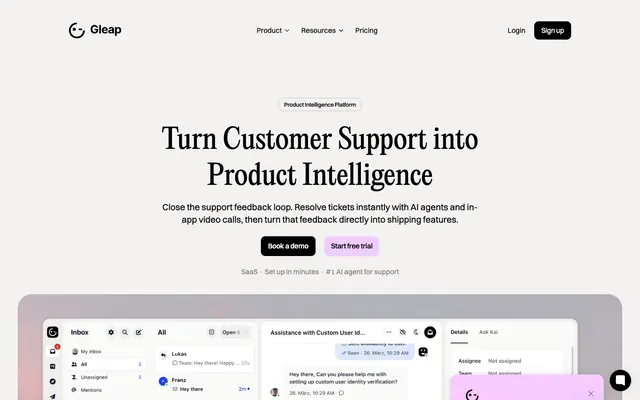
Gleap's visual style operates on a high-contrast model, pairing crisp, modern sans-serifs with a single, highly saturated magenta-purple accent. The UI uses spacious layouts and soft, rounded containers on a light background, creating a calm yet energetic feel. Typography shifts from inviting, editorial display fonts for headlines to compact, functional system fonts for body text. Interaction elements prominently feature the brand's signature purple to guide user focus and denote primary actions.
The page employs a max-width 1200px centered layout with a dominant light theme. Hero sections often feature a centered headline in the distinct serif font over atmospheric, organic gradient backgrounds. Vertical rhythm is established with a significant 30px gap between sections. Content sections frequently use an alternating text-left/visual-right pattern, or stacked centered blocks for feature descriptions. Pricing and feature comparisons often fall into multi-column (3-column) card grids. Navigation is a sticky top bar with a left-aligned logo and right-aligned actions, often using a distinct dark pill-shaped button for 'Sign up'.
The visual language predominantly features clean, product-focused screenshots of the software UI, often presented within rounded, slightly elevated containers. There's also use of abstract, gradient-rich backgrounds with subtle geometric shapes (like moons or soft hills) that provide atmospheric depth without competing with content. Iconography is generally monochromatic, using a filled style with clean lines. Imagery serves an explanatory and showcase role, demonstrating product functionality and providing decorative atmosphere rather than lifestyle context. Overall, it's a balance of functional UI demonstration and soft, atmospheric branding.
Reminiscent of Cal.com, Linear, Pitch, Vercel.
# Gleap — Style Reference
> Crisp canvas, magenta highlight

**Theme:** light

**Site:** https://gleap.io

Gleap's visual style operates on a high-contrast model, pairing crisp, modern sans-serifs with a single, highly saturated magenta-purple accent. The UI uses spacious layouts and soft, rounded containers on a light background, creating a calm yet energetic feel. Typography shifts from inviting, editorial display fonts for headlines to compact, functional system fonts for body text. Interaction elements prominently feature the brand's signature purple to guide user focus and denote primary actions.

## Tokens — Colors

| Name | Value | Token | Role |
|------|------|------|------|
| Amethyst Accent | `#f1ccff` | `--color-amethyst-accent` | Primary action buttons, prominent links, and accents within cards — it’s the brand’s signature interaction color, signaling interactivity |
| Sky Blue Highlight | `#91e0ff` | `--color-sky-blue-highlight` | Decorative card backgrounds, highlighted sections or text within content — provides visual interest |
| Cloud Canvas | `#f5f2f0` | `--color-cloud-canvas` | Primary page background, provides a soft, warm base for all content |
| Porcelain Surface | `#ffffff` | `--color-porcelain-surface` | Card backgrounds, elevated content areas, ensuring high contrast with text |
| Graphite Text | `#333333` | `--color-graphite-text` | Primary text color for body copy, links, and detailed information |
| Ink Text | `#000000` | `--color-ink-text` | Headlines, navigation items, and strong textual elements for maximum emphasis |
| Platinum Border | `#d6d6d6` | `--color-platinum-border` | Subtle borders and dividers for UI separation without harsh lines |
| Silver Detail | `#bcbcbc` | `--color-silver-detail` | Muted helper text, secondary borders, and subtle accent lines |
| Deep Plum | `#7b7b7b` | `--color-deep-plum` | Tertiary text, less prominent links and meta information |

## Tokens — Typography

### PP Editorial New
- **Substitute:** Playfair Display
- **Weights:** 400
- **Sizes:** 48px, 62px
- **Line height:** 1.2, 1.25, 1.3
- **Letter spacing:** normal
- **Role:** Display headlines and prominent section titles. Its classical, editorial feel contrasts the modern sans-serifs, lending an authoritative yet approachable tone.

### Switzer
- **Substitute:** Inter
- **Weights:** 400, 500, 600
- **Sizes:** 13px, 14px, 16px, 20px, 32px
- **Line height:** 1.19, 1.2, 1.4, 1.43, 1.44
- **Letter spacing:** -0.025em for 32px, -0.020em for 20px, -0.010em for 16px, normal for 13-14px
- **Role:** All body text, subheadings, labels, and functional UI elements. Its clean, geometric form maintains readability and directness across the interface. Letter spacing is subtly tightened at larger sizes for visual density.

### Arial
- **Substitute:** Roboto
- **Weights:** 400
- **Sizes:** 14px, 16px
- **Line height:** 1.25, 1.43
- **Letter spacing:** normal
- **Role:** Fallback and specific UI components where extreme simplicity and system-level rendering is preferred, such as internal tools or complex data displays.

### system-ui
- **Substitute:** Segoe UI
- **Weights:** 400
- **Sizes:** 14px
- **Line height:** 1
- **Letter spacing:** normal
- **Role:** Used for highly compact labels or system messages where minimal footprint is critical.

## Tokens — Type Scale

| Role | Size | Line height | Letter spacing |
|------|------|------|------|
| caption | 13px | 1.4 | — |
| body | 16px | 1.4 | -0.16px |
| subheading | 20px | 1.2 | -0.4px |
| heading | 32px | 1.44 | -0.8px |
| heading-lg | 48px | 1.25 | — |
| display | 62px | 1.3 | — |

## Tokens — Spacing

- **Max width:** 1200px
- **Section gap:** 30px
- **Card padding:** 40px
- **Element gap:** 16px

## Tokens — Radius

- **Buttons:** 10px
- **Cards:** 24px
- **badges:** 10px
- **largeElements:** 42px

## Tokens — Elevation

- **Product Feature Card:** `rgba(0, 0, 0, 0.04) 0px 8px 16px 0px`
- **Navigation Bar Button:** `rgba(16, 24, 40, 0.05) 0px 1px 2px 0px`

## Layout

The page employs a max-width 1200px centered layout with a dominant light theme. Hero sections often feature a centered headline in the distinct serif font over atmospheric, organic gradient backgrounds. Vertical rhythm is established with a significant 30px gap between sections. Content sections frequently use an alternating text-left/visual-right pattern, or stacked centered blocks for feature descriptions. Pricing and feature comparisons often fall into multi-column (3-column) card grids. Navigation is a sticky top bar with a left-aligned logo and right-aligned actions, often using a distinct dark pill-shaped button for 'Sign up'.

## Imagery

The visual language predominantly features clean, product-focused screenshots of the software UI, often presented within rounded, slightly elevated containers. There's also use of abstract, gradient-rich backgrounds with subtle geometric shapes (like moons or soft hills) that provide atmospheric depth without competing with content. Iconography is generally monochromatic, using a filled style with clean lines. Imagery serves an explanatory and showcase role, demonstrating product functionality and providing decorative atmosphere rather than lifestyle context. Overall, it's a balance of functional UI demonstration and soft, atmospheric branding.

## Components

### Primary Action Button (Amethyst)
*Main call to action, filled with the brand's primary color.*

Background: #f1ccff (Amethyst Accent), Text: #000000 (Ink Text), Border: #f1ccff, Padding: 10px vertical, 15px horizontal, Border-radius: 10px.

### Secondary Action Button (Outline)
*Less prominent actions, using only a border to differentiate.*

Background: transparent, Text: #000000 (Ink Text), Border: 1px solid #000000, Padding: 17px vertical, 20px horizontal, Border-radius: 0px.

### Affirmative Action Button (Dark)
*Confirmation or direct action button, inverted color scheme from the page.*

Background: #000000 (Ink Text), Text: #ffffff (Porcelain Surface), Border: #000000, Padding: 10px vertical, 15px horizontal, Border-radius: 10px.

### Icon Button (Dark Accent)
*Compact button, often used for single actions or icon-only controls, with a distinctive larger radius.*

Background: #000000 (Ink Text), Text: #ffffff (Porcelain Surface), Border: #ffffff, Padding: 14px vertical, 16px horizontal, Border-radius: 16px.

### Product Feature Card
*Highlights key features or content, with subtle elevation.*

Background: #ffffff (Porcelain Surface), Padding: 40px, Border-radius: 24px, Shadow: rgba(0, 0, 0, 0.04) 0px 8px 16px 0px.

### Informational Badge
*Categorizes or labels content with a soft, muted appearance.*

Background: transparent, Text: #333333 (Graphite Text), Padding: 5px vertical, 12px horizontal, Border-radius: 10px, Border: 1px solid #f5f2f0 (Cloud Canvas).

## Guidelines

### Do

- Use PP Editorial New (weight 400) for all display headlines, setting them at 48px or 62px with normal letter spacing for an elevated, editorial feel.
- Apply Switzer (weights 400, 500, 600) for all body text, subheadings, and UI labels, adjusting letter spacing to -0.010em for 16px, -0.020em for 20px, and -0.025em for 32px to maintain visual compactness.
- Elevate primary calls-to-action with Amethyst Accent (#f1ccff) for backgrounds, paired with Ink Text (#000000) for readability.
- Utilize a 10px border-radius for all buttons and badges, reserving 24px for cards and 42px for distinct large elements, to establish a consistent soft-rounded identity.
- Maintain a clear visual hierarchy by using Ink Text (#000000) for critical headlines and bold elements, and Graphite Text (#333333) for standard body copy and descriptions.
- Structure layout using a 1200px max-width container, centered on the Cloud Canvas (#f5f2f0) background, with a consistent 30px vertical gap between major sections.
- Apply subtle elevation to key UI components like Product Feature Cards using rgba(0, 0, 0, 0.04) 0px 8px 16px 0px shadows, while keeping default backgrounds clean and shadow-less.

### Don't

- Avoid using multiple chromatic colors for primary actions; Amethyst Accent (#f1ccff) is the singular brand color for interactive elements.
- Do not introduce sharp corners or unrounded containers; enforce the 10px, 24px, or 42px border-radius system meticulously.
- Refrain from using strong, colorful gradients or textures; the system thrives on clean, mostly flat surfaces and subtle, tonal backgrounds.
- Do not deviate from the defined type scale and letter spacing values, particularly for headlines and body text, to preserve the distinct typographic voice.
- Avoid overuse of shadows; reserve the rgba(0, 0, 0, 0.04) 0px 8px 16px 0px shadow for cards and key elevated components only, preventing visual clutter.
- Do not introduce new border colors for UI elements; stick to Platinum Border (#d6d6d6) or Ink Text (#000000) for subtle separation.
- Resist dense layouts; ensure generous use of the 16px elementGap and 40px cardPadding to maintain a comfortable reading experience and visual breathing room.

## Agent Prompt Guide

Quick Color Reference:
text: #333333
background: #f5f2f0
border: #d6d6d6
accent: #91e0ff
primary action: #f1ccff (filled action)

Example Component Prompts:
1. Create a Primary Action Button: #f1ccff background, #000000 text, 9999px radius, compact pill padding. Use this filled treatment for the main CTA.
2. Design a Product Feature Card: Porcelain Surface background, 40px padding, 24px border-radius, with a shadow rgba(0, 0, 0, 0.04) 0px 8px 16px 0px. Inside, use Graphite Text for a body paragraph (Switzer, 16px, weight 400, letter-spacing -0.16px), and a secondary action button with a transparent background, Ink Text color, 1px solid Ink Text border, 0px border-radius, 17px vertical and 20px horizontal padding, labeled 'Learn More'.
3. Construct a navigation bar item: Text 'Product' in Switzer weight 400, 16px, Ink Text color. When active, underline with a 2px border of Amethyst Accent. Use 16px elementGap for horizontal spacing between items.
More like this









Keep what you find
A free account saves references to boards and can send you a weekly email of picks based on what you save.
To see every result, go Pro.