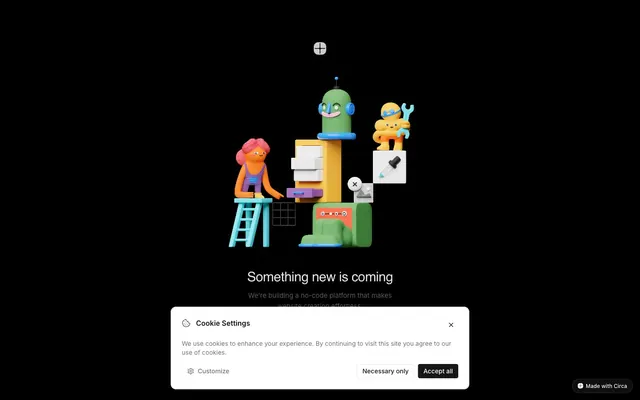
Preview image. Unlock full-res
Minimal dark canvas, playful 3D forms
Color palette
Supporting palette color for small decorative accents when the core palette needs contrast. Do not promote it to the primary CTA color
Page background (dominant), body text
Muted text, ghost button text, icon strokes, active states for ghost buttons
Muted helper text, secondary icons
Primary text, card backgrounds, ghost button backgrounds, active action button background
Hairline borders for components and form fields
High-contrast neutral action fill for primary buttons on light surfaces.
Typography
- Weights
- 500
- Sizes
- 30px
- Line height
- 1.15
- Letter spacing
- -0.6px
- Fallback
- Montserrat
Primary headings — weight 500 emphasizes clarity and modernism over traditional bold shouts, with subtle negative letter-spacing for a sophisticated feel.
- Weights
- 400, 500, 600
- Sizes
- 11px, 13px, 14px, 15px, 16px
- Line height
- 1.43, 1.5, 1.63
- Fallback
- System Font
Body copy, button text, and most UI elements — functional and legible across all sizes, forming the workhorse text of the system.
- Weights
- 500
- Sizes
- 12px
- Line height
- 1.5
Utility text for small components and system feedback, prioritizing native rendering speed and legibility at minimal sizes.
Spacing & shape
Elevation
Components
Transparent background with Charcoal (#171717) text, 4px border-radius, no border. Focuses user on primary content while offering navigation.
Deep Graphite (#111111) background, Frost White (#ffffff) text, 9999px (pill) border-radius, 6px vertical padding, 12px horizontal padding. Features a subtle overlay shadow rgba(0, 0, 0, 0.05) 0px 1px 2px 0px.
Background Frost White (#ffffff), 12px border-radius, 24px padding on all sides. Elevated with a soft shadow: rgba(0, 0, 0, 0.1) 0px 10px 15px -3px, rgba(0, 0, 0, 0.1) 0px 4px 6px -4px.
Frost White (#ffffff) background, Ink Black (#000000) text, 6px border-radius, 20px horizontal padding. Features no explicit borders to blend with background surfaces.
Charcoal (#171717) background, Frost White (#ffffff) text, 6px border-radius, 20px horizontal padding. Provides a clear contrast for secondary options in dark contexts.
Guidelines
- Prioritize Ink Black (#000000) as the dominant page background.
- Use Frost White (#ffffff) for primary text and Charcoal (#171717) or Stone Gray (#737373) for muted text and secondary information.
- Apply Geist font with a 500 weight for all hero-level headings, ensuring -0.6px letter-spacing.
- Maintain a 4px border-radius for interactive buttons and 12px for cards.
- Elevate critical UI elements like dialogs with soft shadows and a 12px border-radius.
- Utilize 12px as the standard element gap for arranging content within sections.
- Incorporate the Laurent Lime (#AFFF2C) only as a distinct brand accent for highlighted active states or illustrations.
- Avoid using saturated colors for backgrounds or large content blocks; reserve them strictly for accents.
- Do not introduce strong, hard shadows; elevation should be subtle and blended.
- Refrain from heavy borders on components; use hairline #e6e6e6 borders where necessary for separation instead of framing.
- Do not deviate from the specified Inter font for body text or button labels.
- Avoid decorative gradients on UI components — keep surfaces flat and monochromatic.
- Do not use varied letter-spacing on body text; keep it at 'normal' for readability.
- Do not use dark backgrounds for cards or dialogs; these remain Frost White (#ffffff) against the Ink Black (#000000) canvas.
About this system
ShowHide
Circa employs a bold, dark minimalism softened by whimsical 3D illustrations. The interface is primarily achromatic, establishing a stark backdrop for content and interaction. Typography is understated yet precise, relying on subtle weight differences and careful letter-spacing for hierarchy. Components are lightweight, favoring ghost elements and soft, contained surfaces with subtle elevation for critical information.
The page uses a full-bleed layout with content centered horizontally. The hero section features animated 3D illustrations as its focal point, with centered text overlays. Content is primarily stacked vertically, demonstrating a strong emphasis on comfortable vertical spacing. Navigation is minimal, indicated by a single 'Made with Circa' label at the bottom right. The overall impression is one of spaciousness, letting the central illustration command attention.
Abstract, playful 3D illustrations serve as the primary visual element, depicting whimsical characters and architectural structures. These are full-bleed against the dark background, providing decorative atmosphere and brand personality. Icons are minimal, either outlined or filled, with a consistent stroke weight, often in Charcoal or Frost White to blend with the UI. The density is image-heavy in the hero area, with illustrations acting as the main point of engagement, while other visuals are purely functional icons.
Reminiscent of Figma, Linear, Spline, Read.cv.
# Circa — Style Reference
> Minimal dark canvas, playful 3D forms

**Theme:** dark

**Site:** https://circa.so

Circa employs a bold, dark minimalism softened by whimsical 3D illustrations. The interface is primarily achromatic, establishing a stark backdrop for content and interaction. Typography is understated yet precise, relying on subtle weight differences and careful letter-spacing for hierarchy. Components are lightweight, favoring ghost elements and soft, contained surfaces with subtle elevation for critical information.

## Tokens — Colors

| Name | Value | Token | Role |
|------|------|------|------|
| Laurent Lime | `#AFFF2C` | `--color-laurent-lime` | Supporting palette color for small decorative accents when the core palette needs contrast. Do not promote it to the primary CTA color |
| Ink Black | `#000000` | `--color-ink-black` | Page background (dominant), body text |
| Charcoal | `#171717` | `--color-charcoal` | Muted text, ghost button text, icon strokes, active states for ghost buttons |
| Stone Gray | `#737373` | `--color-stone-gray` | Muted helper text, secondary icons |
| Frost White | `#ffffff` | `--color-frost-white` | Primary text, card backgrounds, ghost button backgrounds, active action button background |
| Silver Mist | `#e6e6e6` | `--color-silver-mist` | Hairline borders for components and form fields |
| Deep Graphite | `#111111` | `--color-deep-graphite` | High-contrast neutral action fill for primary buttons on light surfaces. |

## Tokens — Typography

### Geist
- **Substitute:** Montserrat
- **Weights:** 500
- **Sizes:** 30px
- **Line height:** 1.15
- **Letter spacing:** -0.6px
- **Role:** Primary headings — weight 500 emphasizes clarity and modernism over traditional bold shouts, with subtle negative letter-spacing for a sophisticated feel.

### Inter
- **Substitute:** System Font
- **Weights:** 400, 500, 600
- **Sizes:** 11px, 13px, 14px, 15px, 16px
- **Line height:** 1.43, 1.5, 1.63
- **Role:** Body copy, button text, and most UI elements — functional and legible across all sizes, forming the workhorse text of the system.

### system-ui
- **Weights:** 500
- **Sizes:** 12px
- **Line height:** 1.5
- **Role:** Utility text for small components and system feedback, prioritizing native rendering speed and legibility at minimal sizes.

## Tokens — Type Scale

Major Second (1.125) from 14px base.

| Role | Size | Line height | Letter spacing |
|------|------|------|------|
| caption | 11px | 1.5 | — |
| body-sm | 13px | 1.5 | — |
| body | 14px | 1.5 | — |
| body-lg | 15px | 1.5 | — |
| heading-sm | 16px | 1.5 | — |

## Tokens — Spacing

- **Section gap:** 40px
- **Card padding:** 24px
- **Element gap:** 12px

## Tokens — Radius

- **Buttons:** 4px
- **Cards:** 12px
- **pillButtons:** 9999px

## Tokens — Elevation

- **Pill Accent Button:** `rgba(0, 0, 0, 0.05) 0px 1px 2px 0px`
- **Dialog Card:** `rgba(0, 0, 0, 0.1) 0px 10px 15px -3px, rgba(0, 0, 0, 0.1) 0px 4px 6px -4px`

## Layout

The page uses a full-bleed layout with content centered horizontally. The hero section features animated 3D illustrations as its focal point, with centered text overlays. Content is primarily stacked vertically, demonstrating a strong emphasis on comfortable vertical spacing. Navigation is minimal, indicated by a single 'Made with Circa' label at the bottom right. The overall impression is one of spaciousness, letting the central illustration command attention.

## Imagery

Abstract, playful 3D illustrations serve as the primary visual element, depicting whimsical characters and architectural structures. These are full-bleed against the dark background, providing decorative atmosphere and brand personality. Icons are minimal, either outlined or filled, with a consistent stroke weight, often in Charcoal or Frost White to blend with the UI. The density is image-heavy in the hero area, with illustrations acting as the main point of engagement, while other visuals are purely functional icons.

## Components

### Ghost Button
*Secondary actions, navigation links*

Transparent background with Charcoal (#171717) text, 4px border-radius, no border. Focuses user on primary content while offering navigation.

### Pill Accent Button
*Small, informational labels or brand identifiers*

Deep Graphite (#111111) background, Frost White (#ffffff) text, 9999px (pill) border-radius, 6px vertical padding, 12px horizontal padding. Features a subtle overlay shadow rgba(0, 0, 0, 0.05) 0px 1px 2px 0px.

### Dialog Card
*Modal dialogs, cookie settings, important notifications*

Background Frost White (#ffffff), 12px border-radius, 24px padding on all sides. Elevated with a soft shadow: rgba(0, 0, 0, 0.1) 0px 10px 15px -3px, rgba(0, 0, 0, 0.1) 0px 4px 6px -4px.

### Default Action Button
*Primary calls to action within a dialog*

Frost White (#ffffff) background, Ink Black (#000000) text, 6px border-radius, 20px horizontal padding. Features no explicit borders to blend with background surfaces.

### Muted Action Button
*Secondary actions within a dialog*

Charcoal (#171717) background, Frost White (#ffffff) text, 6px border-radius, 20px horizontal padding. Provides a clear contrast for secondary options in dark contexts.

## Guidelines

### Do

- Prioritize Ink Black (#000000) as the dominant page background.
- Use Frost White (#ffffff) for primary text and Charcoal (#171717) or Stone Gray (#737373) for muted text and secondary information.
- Apply Geist font with a 500 weight for all hero-level headings, ensuring -0.6px letter-spacing.
- Maintain a 4px border-radius for interactive buttons and 12px for cards.
- Elevate critical UI elements like dialogs with soft shadows and a 12px border-radius.
- Utilize 12px as the standard element gap for arranging content within sections.
- Incorporate the Laurent Lime (#AFFF2C) only as a distinct brand accent for highlighted active states or illustrations.

### Don't

- Avoid using saturated colors for backgrounds or large content blocks; reserve them strictly for accents.
- Do not introduce strong, hard shadows; elevation should be subtle and blended.
- Refrain from heavy borders on components; use hairline #e6e6e6 borders where necessary for separation instead of framing.
- Do not deviate from the specified Inter font for body text or button labels.
- Avoid decorative gradients on UI components — keep surfaces flat and monochromatic.
- Do not use varied letter-spacing on body text; keep it at 'normal' for readability.
- Do not use dark backgrounds for cards or dialogs; these remain Frost White (#ffffff) against the Ink Black (#000000) canvas.

## Agent Prompt Guide

Quick Color Reference:
text: #ffffff
background: #000000
border: #e6e6e6
accent: #AFFF2C
primary action: no distinct CTA color

Example Component Prompts:
1. Create a primary headline: 'Something new is coming' using Geist, weight 500, size 30px, line-height 1.15, letter-spacing -0.6px, color #ffffff, centered on the page over an Ink Black (#000000) background.
2. Create a Dialog Card: a white (#ffffff) card with 12px border-radius, 24px padding, and shadow 'rgba(0, 0, 0, 0.1) 0px 10px 15px -3px, rgba(0, 0, 0, 0.1) 0px 4px 6px -4px'. Inside, a body text 'We use cookies...' in Inter, 14px, #737373.
3. Create a Pill Accent Button: 'Made with Circa' label as a button with Deep Graphite (#111111) background, Frost White (#ffffff) text (Inter, 11px), 9999px border-radius, 6px vertical padding, 12px horizontal padding, and shadow 'rgba(0, 0, 0, 0.05) 0px 1px 2px 0px'.
4. Create a Muted Action Button: 'Accept all' using Charcoal (#171717) background, Frost White (#ffffff) text (Inter, 15px), 6px border-radius, 20px horizontal padding, with a subtle border in Silver Mist (#e6e6e6).
5. Create a Ghost Button: 'Customize' button with transparent background, Charcoal (#171717) text (Inter, 15px), 4px border-radius, and a Silver Mist (#e6e6e6) border.
More like this









Keep what you find
A free account saves references to boards and can send you a weekly email of picks based on what you save.
To see every result, go Pro.