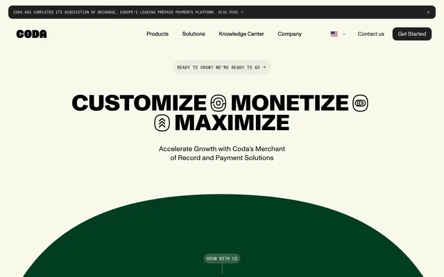
Preview image. Unlock full-res
digital-first canvas
Color palette
Dominant brand color for large background shapes, card backgrounds, and key accents. Signifies growth and nature
Highlight elements, decorative borders, and text accents drawing immediate attention
Decorative background fills for visual variety in cards
Decorative background fills for visual variety in cards
Decorative background fills for visual variety in cards
Accent text and decorative element colors
Accent text and decorative element colors
Accent text and decorative element colors
Primary page and card backgrounds, serving as a clean, warm base
Neutral form states, badge text, and quiet UI feedback where color should stay understated.
Secondary text, button backgrounds, and subtle borders for depth
Muted text, subtle borders, and background accents where a soft, near-gray tone is needed
Darker secondary text and icon coloration
Muted subheadings and descriptive text elements
Subtle button borders
Typography
- Weights
- 400, 500, 800
- Sizes
- 16px, 18px, 21px, 22px, 25px, 34px, 45px, 54px, 63px, 72px, 134px
- Line height
- 0.9, 1, 1.02, 1.13, 1.3, 1.43, 1.5, 1.71
- Letter spacing
- -0.01, 0.01
- Fallback
- system-ui
Primary display font for all headings, impactful calls to action, and prominent text elements. Its condensed structure and variable weight create a modern, direct tone. Use 'normal' letter spacing for smaller sizes, 'tight' for display headings to emphasize impact.
- Weights
- 400
- Sizes
- 16px
- Line height
- 1.5
- Fallback
- sans-serif
Fallback and general UI text where a system font is appropriate for readability and less emphasis than 'abcMonumentGrotesk'. Primarily for body and link text.
- Weights
- 400
- Sizes
- 10px, 12px, 14px, 16px
- Line height
- 0.9, 1, 1.2, 1.37
- Fallback
- monospace
Monospace font for badges, data points, or areas requiring a technical, precise aesthetic. Used sparingly for specific functional emphasis.
Spacing & shape
Components
backgroundColor=rgba(0, 0, 0, 0), color=Carbon Black, no specific borderRadius, padding=0px. Text is abcMonumentGrotesk, weight 400.
backgroundColor=rgba(0, 0, 0, 0), color=Carbon Black, border=1px solid Carbon Black, borderRadius=13.4175px, padding=13.4175px. Text is abcMonumentGrotesk.
backgroundColor=Obsidian Gray, color=Canvas Creme, borderRadius=8.94498px. Text is abcMonumentGrotesk, weight 400.
backgroundColor=rgba(0, 0, 0, 0), color=Canvas Creme, border=1px solid Canvas Creme, borderRadius=13.4175px. Text is abcMonumentGrotesk, weight 400.
backgroundColor=rgba(0, 0, 0, 0), borderRadius=22.3625px.
backgroundColor=Canvas Creme, borderRadius=22.3625px.
backgroundColor=Carbon Black, borderRadius=0px.
backgroundColor=rgba(0, 0, 0, 0), color=Canvas Creme, borderRadius=9999px, padding=0px 8.94498px.
backgroundColor=rgba(248, 249, 235, 0.2), color=Canvas Creme, borderRadius=9999px, padding=0px 8.94498px.
Guidelines
- Use Canvas Creme (#f8f9eb) as the dominant background for most sections.
- Apply abcMonumentGrotesk, weight 800, with letter spacing -0.01em for all major headlines to ensure high-impact visual presence.
- Utilize Forest Green (#003d21) for large, decorative background shapes and elements to establish strong brand identity.
- Implement a default border-radius of 22.3625px for cards and 8.94498px for filled buttons, contributing to the soft, modern aesthetic.
- Pair Carbon Black (#000000) for primary text with Canvas Creme (#f8f9eb) backgrounds for optimal contrast (19.7:1 AAA).
- Employ jetBrainsMono for all badges and smaller functional labels to convey precision.
- Maintain comfortable density with an element gap of 9px and a section gap of 63px.
- Avoid using multiple chromatic colors in close proximity; the color palette is designed for accent, not proliferation.
- Do not use generic sans-serif fonts for headlines; abcMonumentGrotesk is essential for brand recognition of prominent text.
- Never use dark text on dark backgrounds; ensure sufficient contrast by pairing light text with dark backgrounds or vice-versa.
- Do not introduce sharp, angular corners; all interactive and card-like components should feature generous border radii.
- Refrain from heavy drop shadows; elevation is achieved through color contrast and layered shapes rather than pronounced shadows.
- Do not treat every color in the palette as a functional UI color; some are specifically for decorative backgrounds or accents.
- Avoid generic button styles; prefer outlined or filled buttons that adhere to the specified radii and color contrasts.
About this system
ShowHide
Coda operates on a 'digital-first canvas' aesthetic, mixing a soft, near-white background with bold, condensed typography and large, organic shapes in deep forest green. The system leverages strong visual contrast between high-impact headlines and more conservative body text. Components are minimalist with generous corner radii, emphasizing functional clarity over decorative elements, punctuated by dynamic shapes and a striking brand green.
The page primarily uses a full-bleed structure without a fixed `pageMaxWidth`, creating expansive sections. The hero section is characterized by a centered, high-impact headline over a light background, often with large, organic, full-width colored shapes (like the Forest Green arc). Section rhythm is created through alternating background colors and large visual dividers (often full-bleed colored sections). Content arrangement frequently utilizes two-column layouts, with text on one side and a visual or card element on the other. A card grid for features is also evident. The layout prioritizes breathing room, with spacious vertical gaps between sections. Navigation is a sticky top bar with a centered logo and right-aligned links and buttons.
This site features a highly controlled visual language, emphasizing abstract 3D renders primarily in shades of Forest Green and Aura Green. Imagery is primarily decorative and atmospheric, often depicting swirling, organic, or connected shapes. Photography is minimal, appearing as tighter product crops or contextual UI screenshots rather than lifestyle. Icons are typically single-color, outlined, and minimal, appearing as functional glyphs or expressive emojis. The visual density is balanced, with imagery serving as large background elements or contained within UI cards, providing visual relief and brand reinforcement against text-heavy sections.
Reminiscent of Stripe, Rive, Framer, Linear.
# Coda — Style Reference
> digital-first canvas

**Theme:** light

**Site:** https://www.coda.co

Coda operates on a 'digital-first canvas' aesthetic, mixing a soft, near-white background with bold, condensed typography and large, organic shapes in deep forest green. The system leverages strong visual contrast between high-impact headlines and more conservative body text. Components are minimalist with generous corner radii, emphasizing functional clarity over decorative elements, punctuated by dynamic shapes and a striking brand green.

## Tokens — Colors

| Name | Value | Token | Role |
|------|------|------|------|
| Forest Green | `#003d21` | `--color-forest-green` | Dominant brand color for large background shapes, card backgrounds, and key accents. Signifies growth and nature |
| Aura Green | `#aafdc0` | `--color-aura-green` | Highlight elements, decorative borders, and text accents drawing immediate attention |
| Soft Teal | `#b0f4ff` | `--color-soft-teal` | Decorative background fills for visual variety in cards |
| Lavender Mist | `#d3beff` | `--color-lavender-mist` | Decorative background fills for visual variety in cards |
| Rose Blush | `#ffc0e6` | `--color-rose-blush` | Decorative background fills for visual variety in cards |
| Blue Violet | `#041668` | `--color-blue-violet` | Accent text and decorative element colors |
| Deep Plum | `#2d0078` | `--color-deep-plum` | Accent text and decorative element colors |
| Dark Magenta | `#3f0929` | `--color-dark-magenta` | Accent text and decorative element colors |
| Canvas Creme | `#f8f9eb` | `--color-canvas-creme` | Primary page and card backgrounds, serving as a clean, warm base |
| Carbon Black | `#000000` | `--color-carbon-black` | Neutral form states, badge text, and quiet UI feedback where color should stay understated. |
| Obsidian Gray | `#202020` | `--color-obsidian-gray` | Secondary text, button backgrounds, and subtle borders for depth |
| Sage Mist | `#c0c2a9` | `--color-sage-mist` | Muted text, subtle borders, and background accents where a soft, near-gray tone is needed |
| Mid-tone Gray | `#5a5a4f` | `--color-mid-tone-gray` | Darker secondary text and icon coloration |
| Light Taupe | `#7c7d76` | `--color-light-taupe` | Muted subheadings and descriptive text elements |
| Pale Ash | `#edeee1` | `--color-pale-ash` | Subtle button borders |

## Tokens — Typography

### abcMonumentGrotesk
- **Substitute:** system-ui
- **Weights:** 400, 500, 800
- **Sizes:** 16px, 18px, 21px, 22px, 25px, 34px, 45px, 54px, 63px, 72px, 134px
- **Line height:** 0.9, 1, 1.02, 1.13, 1.3, 1.43, 1.5, 1.71
- **Letter spacing:** -0.01, 0.01
- **Role:** Primary display font for all headings, impactful calls to action, and prominent text elements. Its condensed structure and variable weight create a modern, direct tone. Use 'normal' letter spacing for smaller sizes, 'tight' for display headings to emphasize impact.

### ui-sans-serif
- **Substitute:** sans-serif
- **Weights:** 400
- **Sizes:** 16px
- **Line height:** 1.5
- **Role:** Fallback and general UI text where a system font is appropriate for readability and less emphasis than 'abcMonumentGrotesk'. Primarily for body and link text.

### jetBrainsMono
- **Substitute:** monospace
- **Weights:** 400
- **Sizes:** 10px, 12px, 14px, 16px
- **Line height:** 0.9, 1, 1.2, 1.37
- **Role:** Monospace font for badges, data points, or areas requiring a technical, precise aesthetic. Used sparingly for specific functional emphasis.

## Tokens — Type Scale

Perfect Fourth (1.333) from 16px base.

| Role | Size | Line height | Letter spacing |
|------|------|------|------|
| caption | 10px | 1.2 | — |
| body | 16px | 1.5 | — |
| body-lg | 18px | 1.43 | — |
| subheading | 21px | 1.13 | — |
| heading-sm | 25px | 1.13 | — |
| heading | 34px | 1.13 | — |
| heading-lg | 45px | 1.02 | -0.45px |
| display | 72px | 0.9 | -0.72px |

## Tokens — Spacing

- **Section gap:** 63px
- **Card padding:** 13px
- **Element gap:** 9px

## Tokens — Radius

- **Default:** 13.4175px
- **Buttons:** 8.94498px
- **Cards:** 22.3625px
- **badges:** 9999px
- **extraLarge:** 44.725px
- **large:** 26.835px

## Layout

The page primarily uses a full-bleed structure without a fixed `pageMaxWidth`, creating expansive sections. The hero section is characterized by a centered, high-impact headline over a light background, often with large, organic, full-width colored shapes (like the Forest Green arc). Section rhythm is created through alternating background colors and large visual dividers (often full-bleed colored sections). Content arrangement frequently utilizes two-column layouts, with text on one side and a visual or card element on the other. A card grid for features is also evident. The layout prioritizes breathing room, with spacious vertical gaps between sections. Navigation is a sticky top bar with a centered logo and right-aligned links and buttons.

## Imagery

This site features a highly controlled visual language, emphasizing abstract 3D renders primarily in shades of Forest Green and Aura Green. Imagery is primarily decorative and atmospheric, often depicting swirling, organic, or connected shapes. Photography is minimal, appearing as tighter product crops or contextual UI screenshots rather than lifestyle. Icons are typically single-color, outlined, and minimal, appearing as functional glyphs or expressive emojis. The visual density is balanced, with imagery serving as large background elements or contained within UI cards, providing visual relief and brand reinforcement against text-heavy sections.

## Components

### Ghost Header Navigation Link
*Navigation item within the header.*

backgroundColor=rgba(0, 0, 0, 0), color=Carbon Black, no specific borderRadius, padding=0px. Text is abcMonumentGrotesk, weight 400.

### Pill Button with Outline
*Secondary action button, often for 'Learn More' or 'Go' actions.*

backgroundColor=rgba(0, 0, 0, 0), color=Carbon Black, border=1px solid Carbon Black, borderRadius=13.4175px, padding=13.4175px. Text is abcMonumentGrotesk.

### Filled Primary Button
*Primary call to action.*

backgroundColor=Obsidian Gray, color=Canvas Creme, borderRadius=8.94498px. Text is abcMonumentGrotesk, weight 400.

### Ghost Button with Light Text
*Action button on dark backgrounds.*

backgroundColor=rgba(0, 0, 0, 0), color=Canvas Creme, border=1px solid Canvas Creme, borderRadius=13.4175px. Text is abcMonumentGrotesk, weight 400.

### Transparent Card
*Informational card with no background fill.*

backgroundColor=rgba(0, 0, 0, 0), borderRadius=22.3625px.

### Canvas Creme Card
*Content container on the main Canvas Creme background.*

backgroundColor=Canvas Creme, borderRadius=22.3625px.

### Carbon Black Card
*Content container used to create visual contrast.*

backgroundColor=Carbon Black, borderRadius=0px.

### Pill Badge (Light text on transparent)
*Small, descriptive tag on dark backgrounds.*

backgroundColor=rgba(0, 0, 0, 0), color=Canvas Creme, borderRadius=9999px, padding=0px 8.94498px.

### Pill Badge (Light text on transparent, slightly opaque)
*Small, descriptive tag with subtle transparency.*

backgroundColor=rgba(248, 249, 235, 0.2), color=Canvas Creme, borderRadius=9999px, padding=0px 8.94498px.

## Guidelines

### Do

- Use Canvas Creme (#f8f9eb) as the dominant background for most sections.
- Apply abcMonumentGrotesk, weight 800, with letter spacing -0.01em for all major headlines to ensure high-impact visual presence.
- Utilize Forest Green (#003d21) for large, decorative background shapes and elements to establish strong brand identity.
- Implement a default border-radius of 22.3625px for cards and 8.94498px for filled buttons, contributing to the soft, modern aesthetic.
- Pair Carbon Black (#000000) for primary text with Canvas Creme (#f8f9eb) backgrounds for optimal contrast (19.7:1 AAA).
- Employ jetBrainsMono for all badges and smaller functional labels to convey precision.
- Maintain comfortable density with an element gap of 9px and a section gap of 63px.

### Don't

- Avoid using multiple chromatic colors in close proximity; the color palette is designed for accent, not proliferation.
- Do not use generic sans-serif fonts for headlines; abcMonumentGrotesk is essential for brand recognition of prominent text.
- Never use dark text on dark backgrounds; ensure sufficient contrast by pairing light text with dark backgrounds or vice-versa.
- Do not introduce sharp, angular corners; all interactive and card-like components should feature generous border radii.
- Refrain from heavy drop shadows; elevation is achieved through color contrast and layered shapes rather than pronounced shadows.
- Do not treat every color in the palette as a functional UI color; some are specifically for decorative backgrounds or accents.
- Avoid generic button styles; prefer outlined or filled buttons that adhere to the specified radii and color contrasts.

## Agent Prompt Guide

primary action: #202020 (filled action)
Create a Primary Action Button: #202020 background, #ffffff text, 9999px radius, compact pill padding. Use this filled treatment for the main CTA.

Example Component Prompts:
1. Create a hero section: Canvas Creme background. Headline 'CUSTOMIZE MONETIZE MAXIMIZE' at 72px abcMonumentGrotesk weight 800, #000000, letter-spacing -0.01em. Subtext at 25px abcMonumentGrotesk weight 400, #5a5a4f. Include an organic background shape filled with Forest Green.
3. Build a feature card: Canvas Creme Card, 22.3625px radius, 13px padding. Headline at 34px abcMonumentGrotesk weight 500, #000000. Body text at 18px abcMonumentGrotesk weight 400, #5a5a4f.
4. Create a navigation link: Ghost Header Navigation Link with 'Products' text at 16px abcMonumentGrotesk weight 400, #000000.
5. Implement a Badge: Pill Badge (Light text on transparent) with 'Coda portal' text at 12px jetBrainsMono weight 400, #f8f9eb text, 9999px radius, 0px 8.94498px padding.
More like this
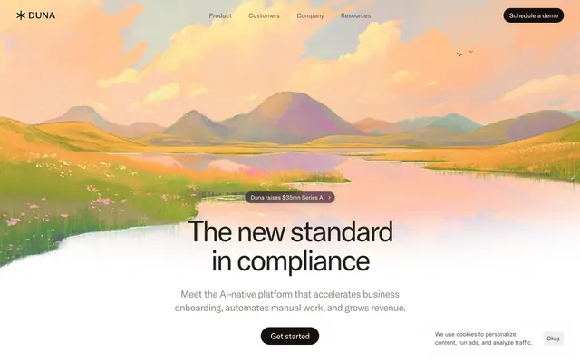









Keep what you find
A free account saves references to boards and can send you a weekly email of picks based on what you save.
To see every result, go Pro.