Preview image. Unlock full-res
Understated Compliance Authority
Color palette
Heading color, brand accents, selected decorative borders/strokes — a subtle, dark chromatic touch that feels like a shadow, not a highlight
Small informational button backgrounds (e.g., news announcements) — a desaturated, almost neutral chromatic tint
Primary text, strong headings, critical icons, high-contrast borders
Page backgrounds, primary card surfaces, ghost button backgrounds, default borders
Subtle section backgrounds, alternate surface treatment, cookie banner background
Secondary headings, prominent body text, darker icons and fills
Muted body text, helper text, subtle borders
Distinct card background color, differentiating content blocks from the canvas
Tertiary text, icon fills, understated borders
Input placeholder text, cookie banner text
Filled button backgrounds for primary calls to action
Decorative icon fills, subtle illustrative elements
Dark body text, dark icon strokes
Input field background color
Typography
- Weights
- 400
- Sizes
- 12px
- Line height
- 1.2
sans-serif — detected in extracted data but not described by AI
- Weights
- 400
- Sizes
- 20px
- Line height
- 1.5
- Letter spacing
- -0.0600em at 72px, -0.0500em at 44px, normal at 14px
- Fallback
- Inter
Primary typeface for all headings, body text, and links. The varied tracking values create a sophisticated, tailored feel, with tighter spacing for larger display text and normal spacing for smaller body text.
- Weights
- 400
- Sizes
- 14px, 16px
- Line height
- 1.5, 1.6, 1.71
- Letter spacing
- normal
- Fallback
- Inter
Specific body text usage, particularly for descriptive paragraphs where slightly looser tracking is preferred.
- Weights
- 400, 500
- Sizes
- 17px, 80px
- Line height
- 1, 1.76
- Letter spacing
- -0.0120em
- Fallback
- Inter
Used for specific large headings and numerical data, leveraging tabular figures for alignment and slightly tighter tracking for impact.
- Weights
- 400
- Sizes
- 20px
- Line height
- 1.5
- Letter spacing
- -0.0200em
- Fallback
- Inter
Used for emphasized body text or subheadings, with a distinct negative letter-spacing for a condensed appearance.
- Weights
- 400
- Sizes
- 12px, 14px
- Line height
- 1.2, 1.5
- Letter spacing
- normal
- Fallback
- system-ui
Supplemental font for card details and some smaller body text, used in contexts requiring greater system font fallback stability.
- Weights
- 400
- Sizes
- 12px, 14px, 16px, 18px, 20px, 24px, 32px, 40px, 44px, 72px
- Line height
- 1, 1.1, 1.2, 1.3, 1.4, 1.5
- Letter spacing
- -0.06, -0.05, -0.03, -0.02, -0.01, -0.006, 0.02
GT America Regular — detected in extracted data but not described by AI
Spacing & shape
Elevation
Components
Background: Onyx Button Background (#160f0c), Text: Canvas White (#ffffff), Border Radius: 999px, Padding: 8px vertical, 14px horizontal.
Background: transparent (rgba(26, 23, 21, 0)), Text: Midnight Ink (#000000), Border: 1px Midnight Ink (#000000), Border Radius: 999px, Padding: 6px vertical, 20px horizontal.
Background: Muted Slate (#766a7c), Text: Canvas White (#ffffff) / Midnight Ink (#000000) (if dark background), Border Radius: 999px, Padding: 6px vertical, 20px horizontal.
Background: Card Wash (#edece7), Border Radius: 16px, Box Shadow: none, Padding: 0px.
Background: Canvas White (#ffffff), Border Radius: 14px, Box Shadow: rgba(0, 0, 0, 0.05) 0px 0px 0px 1px inset, Padding: 0px.
Background: Input Fill (#eeeeee), Text: Medium Gray (#444444), Placeholder: Medium Gray (#444444), Border: 1px Medium Gray (#444444), Border Radius: 8px, Padding: 10px.
Text: Midnight Ink (#000000), Hover: Underlined with Midnight Ink (#000000) (not observed but inferred). No distinct background, padding for interactive area: 4px vertical, 6px horizontal.
Background: Near White (#f7f7f5), Text: Medium Gray (#444444), Border Radius: Not specified, but implied from overall shape language.
Guidelines
- Use GT America with specific letter-spacing adjustments for all headings to maintain the refined and precise typographic hierarchy.
- Utilize Canvas White (#ffffff) as the dominant page background, reserving Near White (#f7f7f5) for subtle section differentiation or specific component backgrounds.
- Apply a 999px border-radius to all buttons and small interactive elements to achieve a consistent pill-like shape.
- Distinguish cards by using either Card Wash (#edece7) for simple containers or Canvas White (#ffffff) with an inset shadow for elevated content.
- Prioritize Onyx Button Background (#160f0c) with Canvas White (#ffffff) text for primary calls to action, maintaining a premium, understated feel.
- Employ Accent Purple (#1b0624) sparingly and strategically for impactful headings or brand-specific graphical elements, not as a general accent color.
- Maintain comfortable element spacing using a base unit of 10px, with larger gaps for sections to ensure content breathing room.
- Avoid using highly saturated colors for interface elements; the brand relies on a nearly monochromatic palette with restrained chromatic accents.
- Do not use heavy drop shadows; elevation is primarily conveyed through subtle background shifts and a very soft inset shadow on specific cards.
- Do not introduce decorative borders or strong differentiating lines; surfaces are generally seamless or subtly defined by background color changes.
- Never use generic system fonts for headings or body text; always map to the GT America family to preserve the distinct typographic personality.
- Avoid arbitrary radius values; adhere to the established radii of 999px for buttons, 16px for cards, and 8px for inputs.
- Do not implement complex gradients or bold background patterns; the system favors clean, flat surfaces.
- Do not vary line-height aggressively across body text; stick to the established ratios to maintain consistent reading rhythm.
About this system
ShowHide
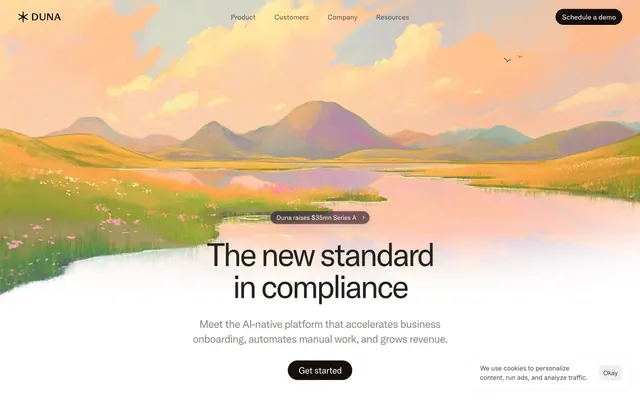
Duna employs a quietly confident and sophisticated aesthetic, characterized by a near-monochromatic palette and subtle textural shifts. Typography is precise and highly tracked, creating a sense of understated authority. Surfaces are clean and layered, with minimal elevation, allowing content to take precedence. The overall impression is one of grounded reliability, eschewing overt flash for refined clarity.
The page primarily uses a max-width contained layout, likely around 1200px, horizontally centered. The hero section is full-bleed with a large illustrative background and centered headline, followed by a 'news pill' that breaks the full-width image. Subsequent sections feature a consistent vertical rhythm, often with a centered stack of content (headline, body, buttons) or multi-column grids for features and data. There's a subtle alternating section pattern, primarily between Canvas White (#ffffff) and Near White (#f7f7f5) backgrounds. Navigation is a sticky top bar with left-aligned branding and right-aligned buttons/links.
Imagery primarily consists of evocative, painted landscape illustrations acting as large background heroes, featuring muted sunrise/sunset tones with soft, organic forms. Product imagery uses tightly cropped, detailed product screenshots or abstract graphics to illustrate concepts, often isolated on clean white backgrounds. Icons are minimal, outlined, monochromatic, and used for functional clarity rather than excessive decoration. The overall density is text-dominant, with imagery serving as atmospheric backdrops or focused explanatory elements.
Reminiscent of Linear, Stripe, Amie, Anthropic.
# Duna — Style Reference
> Understated Compliance Authority

**Theme:** light

**Site:** https://duna.com

Duna employs a quietly confident and sophisticated aesthetic, characterized by a near-monochromatic palette and subtle textural shifts. Typography is precise and highly tracked, creating a sense of understated authority. Surfaces are clean and layered, with minimal elevation, allowing content to take precedence. The overall impression is one of grounded reliability, eschewing overt flash for refined clarity.

## Tokens — Colors

| Name | Value | Token | Role |
|------|------|------|------|
| Accent Purple | `#1b0624` | `--color-accent-purple` | Heading color, brand accents, selected decorative borders/strokes — a subtle, dark chromatic touch that feels like a shadow, not a highlight |
| Muted Slate | `#766a7c` | `--color-muted-slate` | Small informational button backgrounds (e.g., news announcements) — a desaturated, almost neutral chromatic tint |
| Midnight Ink | `#000000` | `--color-midnight-ink` | Primary text, strong headings, critical icons, high-contrast borders |
| Canvas White | `#ffffff` | `--color-canvas-white` | Page backgrounds, primary card surfaces, ghost button backgrounds, default borders |
| Near White | `#f7f7f5` | `--color-near-white` | Subtle section backgrounds, alternate surface treatment, cookie banner background |
| Deep Charcoal | `#292421` | `--color-deep-charcoal` | Secondary headings, prominent body text, darker icons and fills |
| Subtle Gray | `#898683` | `--color-subtle-gray` | Muted body text, helper text, subtle borders |
| Card Wash | `#edece7` | `--color-card-wash` | Distinct card background color, differentiating content blocks from the canvas |
| Quiet Black | `#1a1816` | `--color-quiet-black` | Tertiary text, icon fills, understated borders |
| Medium Gray | `#444444` | `--color-medium-gray` | Input placeholder text, cookie banner text |
| Onyx Button Background | `#160f0c` | `--color-onyx-button-background` | Filled button backgrounds for primary calls to action |
| Light Steel | `#b2afae` | `--color-light-steel` | Decorative icon fills, subtle illustrative elements |
| Slate Text | `#0d0d0d` | `--color-slate-text` | Dark body text, dark icon strokes |
| Input Fill | `#eeeeee` | `--color-input-fill` | Input field background color |

## Tokens — Typography

### sans-serif
- **Weights:** 400
- **Sizes:** 12px
- **Line height:** 1.2
- **Role:** sans-serif — detected in extracted data but not described by AI

### GT America
- **Substitute:** Inter
- **Weights:** 400
- **Sizes:** 20px
- **Line height:** 1.5
- **Letter spacing:** -0.0600em at 72px, -0.0500em at 44px, normal at 14px
- **Role:** Primary typeface for all headings, body text, and links. The varied tracking values create a sophisticated, tailored feel, with tighter spacing for larger display text and normal spacing for smaller body text.

### GT America Trial Rg
- **Substitute:** Inter
- **Weights:** 400
- **Sizes:** 14px, 16px
- **Line height:** 1.5, 1.6, 1.71
- **Letter spacing:** normal
- **Role:** Specific body text usage, particularly for descriptive paragraphs where slightly looser tracking is preferred.

### GT America Trial Md
- **Substitute:** Inter
- **Weights:** 400, 500
- **Sizes:** 17px, 80px
- **Line height:** 1, 1.76
- **Letter spacing:** -0.0120em
- **Role:** Used for specific large headings and numerical data, leveraging tabular figures for alignment and slightly tighter tracking for impact.

### GT America Medium
- **Substitute:** Inter
- **Weights:** 400
- **Sizes:** 20px
- **Line height:** 1.5
- **Letter spacing:** -0.0200em
- **Role:** Used for emphasized body text or subheadings, with a distinct negative letter-spacing for a condensed appearance.

### Inter
- **Substitute:** system-ui
- **Weights:** 400
- **Sizes:** 12px, 14px
- **Line height:** 1.2, 1.5
- **Letter spacing:** normal
- **Role:** Supplemental font for card details and some smaller body text, used in contexts requiring greater system font fallback stability.

### GT America Regular
- **Weights:** 400
- **Sizes:** 12px, 14px, 16px, 18px, 20px, 24px, 32px, 40px, 44px, 72px
- **Line height:** 1, 1.1, 1.2, 1.3, 1.4, 1.5
- **Letter spacing:** -0.06, -0.05, -0.03, -0.02, -0.01, -0.006, 0.02
- **Role:** GT America Regular — detected in extracted data but not described by AI

## Tokens — Type Scale

Minor Third (1.2) from 16px base.

| Role | Size | Line height | Letter spacing |
|------|------|------|------|
| caption | 12px | 1.2 | — |
| body-sm | 14px | 1.5 | — |
| body | 16px | 1.71 | — |
| subheading | 18px | 1.5 | — |
| heading-sm | 20px | 1.5 | -0.4px |
| heading | 24px | 1.3 | -0.72px |
| heading-lg | 32px | 1.2 | -0.96px |
| display | 40px | 1.1 | -2px |
| display-lg | 44px | 1.1 | -2.2px |
| display-xl | 72px | 1 | -4.32px |

## Tokens — Spacing

- **Section gap:** 40px
- **Card padding:** 16px
- **Element gap:** 10px

## Tokens — Radius

- **Buttons:** 999px
- **Inputs:** 8px
- **Cards:** 16px
- **Images:** 24px
- **smallElements:** 12px

## Tokens — Elevation

- **Elevated Card:** `rgba(0, 0, 0, 0.05) 0px 0px 0px 1px inset`

## Layout

The page primarily uses a max-width contained layout, likely around 1200px, horizontally centered. The hero section is full-bleed with a large illustrative background and centered headline, followed by a 'news pill' that breaks the full-width image. Subsequent sections feature a consistent vertical rhythm, often with a centered stack of content (headline, body, buttons) or multi-column grids for features and data. There's a subtle alternating section pattern, primarily between Canvas White (#ffffff) and Near White (#f7f7f5) backgrounds. Navigation is a sticky top bar with left-aligned branding and right-aligned buttons/links.

## Imagery

Imagery primarily consists of evocative, painted landscape illustrations acting as large background heroes, featuring muted sunrise/sunset tones with soft, organic forms. Product imagery uses tightly cropped, detailed product screenshots or abstract graphics to illustrate concepts, often isolated on clean white backgrounds. Icons are minimal, outlined, monochromatic, and used for functional clarity rather than excessive decoration. The overall density is text-dominant, with imagery serving as atmospheric backdrops or focused explanatory elements.

## Components

### Primary Filled Button
*Main call to action button.*

Background: Onyx Button Background (#160f0c), Text: Canvas White (#ffffff), Border Radius: 999px, Padding: 8px vertical, 14px horizontal.

### Ghost Button
*Secondary action or navigation outside of primary flows.*

Background: transparent (rgba(26, 23, 21, 0)), Text: Midnight Ink (#000000), Border: 1px Midnight Ink (#000000), Border Radius: 999px, Padding: 6px vertical, 20px horizontal.

### Announcement Pill
*Small, informational component to highlight news or status.*

Background: Muted Slate (#766a7c), Text: Canvas White (#ffffff) / Midnight Ink (#000000) (if dark background), Border Radius: 999px, Padding: 6px vertical, 20px horizontal.

### Simple Card
*Basic container for information, features a subtle background to distinguish from canvas.*

Background: Card Wash (#edece7), Border Radius: 16px, Box Shadow: none, Padding: 0px.

### Elevated Card
*Interactive or featured card with a light shadow for depth.*

Background: Canvas White (#ffffff), Border Radius: 14px, Box Shadow: rgba(0, 0, 0, 0.05) 0px 0px 0px 1px inset, Padding: 0px.

### Text Input Active
*User input field.*

Background: Input Fill (#eeeeee), Text: Medium Gray (#444444), Placeholder: Medium Gray (#444444), Border: 1px Medium Gray (#444444), Border Radius: 8px, Padding: 10px.

### Navigation Link
*Top-level navigation items.*

Text: Midnight Ink (#000000), Hover: Underlined with Midnight Ink (#000000) (not observed but inferred). No distinct background, padding for interactive area: 4px vertical, 6px horizontal.

### Cookie Consent Banner
*Non-intrusive notification banner.*

Background: Near White (#f7f7f5), Text: Medium Gray (#444444), Border Radius: Not specified, but implied from overall shape language.

## Guidelines

### Do

- Use GT America with specific letter-spacing adjustments for all headings to maintain the refined and precise typographic hierarchy.
- Utilize Canvas White (#ffffff) as the dominant page background, reserving Near White (#f7f7f5) for subtle section differentiation or specific component backgrounds.
- Apply a 999px border-radius to all buttons and small interactive elements to achieve a consistent pill-like shape.
- Distinguish cards by using either Card Wash (#edece7) for simple containers or Canvas White (#ffffff) with an inset shadow for elevated content.
- Prioritize Onyx Button Background (#160f0c) with Canvas White (#ffffff) text for primary calls to action, maintaining a premium, understated feel.
- Employ Accent Purple (#1b0624) sparingly and strategically for impactful headings or brand-specific graphical elements, not as a general accent color.
- Maintain comfortable element spacing using a base unit of 10px, with larger gaps for sections to ensure content breathing room.

### Don't

- Avoid using highly saturated colors for interface elements; the brand relies on a nearly monochromatic palette with restrained chromatic accents.
- Do not use heavy drop shadows; elevation is primarily conveyed through subtle background shifts and a very soft inset shadow on specific cards.
- Do not introduce decorative borders or strong differentiating lines; surfaces are generally seamless or subtly defined by background color changes.
- Never use generic system fonts for headings or body text; always map to the GT America family to preserve the distinct typographic personality.
- Avoid arbitrary radius values; adhere to the established radii of 999px for buttons, 16px for cards, and 8px for inputs.
- Do not implement complex gradients or bold background patterns; the system favors clean, flat surfaces.
- Do not vary line-height aggressively across body text; stick to the established ratios to maintain consistent reading rhythm.

## Agent Prompt Guide

Quick Color Reference:
text: #000000
background: #ffffff
border: #000000
accent: #1b0624
primary action: #160f0c (filled action)

Example Component Prompts:
Create a hero section: full-bleed background set to a painted landscape illustration. Centered headline at 72px GT America, Accent Purple (#1b0624), letter-spacing -0.0600em. Subtext at 18px GT America, Subtle Gray (#898683), letter-spacing normal. Primary filled button below subtext: Onyx Button Background (#160f0c), Canvas White (#ffffff) text, 999px radius, 8px vertical 14px horizontal padding.

Create a feature card: Elevated Card with Canvas White (#ffffff) background, 14px radius, rgba(0, 0, 0, 0.05) 0px 0px 0px 1px inset shadow. Headline at 24px GT America, Midnight Ink (#000000), letter-spacing -0.0300em. Body text at 16px GT America Trial Rg, Deep Charcoal (#292421).

Create a ghost navigation button: Transparent background, Midnight Ink (#000000) text, 1px Midnight Ink (#000000) border, 999px radius, 6px vertical 20px horizontal padding, GT America 400 weight.
More like this










Keep what you find
A free account saves references to boards and can send you a weekly email of picks based on what you save.
To see every result, go Pro.