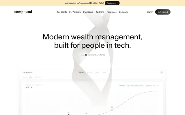
Preview image. Unlock full-res
Architectural blueprint on white marble.
Color palette
Announcement banners and informational tags — a rare splash of warmth
Primary page canvas and white card surfaces. Do not promote it to the primary CTA color
Primary text, headings, and filled primary action buttons — provides strong contrast against light surfaces
Subtle borders, dividers, subtle background patterns, and ghost button outlines
Secondary text, muted informational elements
Muted body text, helper text, and inactive icon fills
Subtle background shifts, hover states, and very light surface treatments
Tertiary text, descriptive labels, and fine print
Placeholder text, disabled states, and decorative icon accents
Overlays, specific card backgrounds, and fine accent lines; creates depth and separation for content blocks
Subtle background gradients for section headers or decorative elements, implying subtle depth
Backgrounds for dark, immersive sections, hinting at premium content or focus areas
Typography
- Weights
- 400
- Sizes
- 12px, 13px, 14px, 16px, 18px, 36px, 48px, 58px, 60px, 72px
- Line height
- 1, 1.1, 1.11, 1.25, 1.33, 1.38, 1.43, 1.5, 1.56, 1.71
- Letter spacing
- normal
- Fallback
- system-ui
The primary typeface for all text content. Its clean, sans-serif design maintains a modern and authoritative tone. The consistent single weight for all sizes prevents visual clutter and emphasizes the content's inherent importance.
Spacing & shape
Elevation
Components
Transparent background, text content in Graphite (#171717). No padding or border, relying on typography for definition. Used for header navigation items.
Filled with Graphite (#171717) background, Canvas White (#ffffff) text, and a 9999px border-radius creating a pill shape. Padding is 9px vertical, 20px horizontal.
Filled with Canvas White (#ffffff) background, Graphite (#171717) text, and a 9999px border-radius. Padding is 9px vertical, 16px horizontal. Used for 'Sign in'.
Canvas White (#ffffff) background with a 20px border-radius. Features a soft, spread-out shadow using rgba(207, 207, 207, 0.01) 0px 132px 53px 0px, making it appear to float subtly. Internal padding is 24px on all sides.
Deep Black (#000000) background with a tight 9px border-radius. No shadow, relying on the dark background for visual distinction. Internal padding is 15.5px on all sides.
Background at rgba(0, 0, 0, 0.05) with a 14px border-radius. No shadow. Internal padding is 6px on all sides. Used for nested or secondary content groupings.
Background color of Warm Gold (#ffc838). Text and button are Graphite (#171717) and Pill Primary Button style respectively, offering clear call-to-action within the banner.
Guidelines
- Use Monument Grotesk 400 for all text elements, ranging from 12px for captions to 72px for display headings.
- Apply Canvas White (#ffffff) as the primary page background and for elevated card surfaces, ensuring a clean, bright canvas.
- Employ Graphite (#171717) for all primary text and main calls to action, providing strong focal points and clear hierarchy.
- Utilize Ash Gray (#e5e7eb) for subtle borders and ghost button outlines to delineate elements without harsh lines.
- Round corners with a 9999px radius for all buttons and icons to create a consistent pill-like or circular shape.
- Apply a 20px border-radius to all primary content cards, softening their appearance and suggesting approachability.
- Always use diffuse, light shadows like rgba(207, 207, 207, 0.01) for elevated cards, maintaining a floating rather than heavy aesthetic.
- Avoid using saturated colors other than Warm Gold (#ffc838) for accents; the system is built on a near-monochromatic palette.
- Do not deviate from the single 400 weight for Monument Grotesk; visual hierarchy is established through size and color, not varied weight.
- Do not use hard, high-contrast shadows; the system favors soft, barely-there elevation effects.
- Avoid introducing additional border colors that aren't Ash Gray (#e5e7eb) or Graphite (#171717) to maintain visual consistency.
- Do not use sharp 0px border-radii for interactive elements or cards; all prominent components should have rounded corners.
- Refrain from bolding text for emphasis; use different font sizes or the Graphite (#171717) color for distinction.
- Do not break the established 4px element gap and 24px card padding; these values maintain the comfortable density.
About this system
ShowHide
Compound's design system evokes an architectural blueprint on a white canvas, emphasizing structured clarity and subtle premium detailing. The aesthetic focuses on minimal contrast and an almost monochromatic palette, allowing information and sophisticated typography to dominate. Surfaces typically feature generous radii and extremely light, diffused shadows, creating a sense of quiet elevation rather than stark separation. Interactivity is signaled through nuanced grays and the distinctive use of a nearly black fill for primary actions, providing a sharp, confident anchor within the otherwise restrained visual hierarchy.
Reminiscent of Linear, Stripe, Vercel.
# Compound — Style Reference
> Architectural blueprint on white marble.

**Theme:** light

**Site:** https://withcompound.com/membership

Compound's design system evokes an architectural blueprint on a white canvas, emphasizing structured clarity and subtle premium detailing. The aesthetic focuses on minimal contrast and an almost monochromatic palette, allowing information and sophisticated typography to dominate. Surfaces typically feature generous radii and extremely light, diffused shadows, creating a sense of quiet elevation rather than stark separation. Interactivity is signaled through nuanced grays and the distinctive use of a nearly black fill for primary actions, providing a sharp, confident anchor within the otherwise restrained visual hierarchy.

## Tokens — Colors

| Name | Value | Token | Role |
|------|------|------|------|
| Warm Gold | `#ffc838` | `--color-warm-gold` | Announcement banners and informational tags — a rare splash of warmth |
| Canvas White | `#ffffff` | `--color-canvas-white` | Primary page canvas and white card surfaces. Do not promote it to the primary CTA color |
| Graphite | `#171717` | `--color-graphite` | Primary text, headings, and filled primary action buttons — provides strong contrast against light surfaces |
| Ash Gray | `#e5e7eb` | `--color-ash-gray` | Subtle borders, dividers, subtle background patterns, and ghost button outlines |
| Smoke | `#7e7e7e` | `--color-smoke` | Secondary text, muted informational elements |
| Boulder | `#6f6f6f` | `--color-boulder` | Muted body text, helper text, and inactive icon fills |
| Cloud Gray | `#f3f3f3` | `--color-cloud-gray` | Subtle background shifts, hover states, and very light surface treatments |
| Stone Gray | `#8f8f8f` | `--color-stone-gray` | Tertiary text, descriptive labels, and fine print |
| Platinum | `#a0a0a0` | `--color-platinum` | Placeholder text, disabled states, and decorative icon accents |
| Deep Black | `#000000` | `--color-deep-black` | Overlays, specific card backgrounds, and fine accent lines; creates depth and separation for content blocks |
| Steel Gray Gradient | `#c7c7c7` | `--color-steel-gray-gradient` | Subtle background gradients for section headers or decorative elements, implying subtle depth |
| Dark Charcoal Gradient | `#505050` | `--color-dark-charcoal-gradient` | Backgrounds for dark, immersive sections, hinting at premium content or focus areas |

## Tokens — Typography

### Monument Grotesk
- **Substitute:** system-ui
- **Weights:** 400
- **Sizes:** 12px, 13px, 14px, 16px, 18px, 36px, 48px, 58px, 60px, 72px
- **Line height:** 1, 1.1, 1.11, 1.25, 1.33, 1.38, 1.43, 1.5, 1.56, 1.71
- **Letter spacing:** normal
- **Role:** The primary typeface for all text content. Its clean, sans-serif design maintains a modern and authoritative tone. The consistent single weight for all sizes prevents visual clutter and emphasizes the content's inherent importance.

## Tokens — Type Scale

| Role | Size | Line height | Letter spacing |
|------|------|------|------|
| caption | 12px | 1.71 | — |
| body | 14px | 1.5 | — |
| heading-sm | 18px | 1.38 | — |
| heading | 36px | 1.33 | — |
| heading-lg | 48px | 1.25 | — |
| display | 58px | 1.11 | — |

## Tokens — Spacing

- **Section gap:** 64px
- **Card padding:** 24px
- **Element gap:** 4px

## Tokens — Radius

- **Buttons:** 9999px
- **Cards:** 20px
- **Images:** 9999px
- **icons:** 9999px
- **lists:** 28px

## Tokens — Elevation

- **Elevated Content Card:** `rgba(207, 207, 207, 0.01) 0px 132px 53px 0px, rgba(207, 207, 207, 0.05) 0px 74px 44px 0px, rgba(207, 207, 207, 0.09) 0px 33px 33px 0px, rgba(207, 207, 207, 0.1) 0px 8px 18px 0px`
- **Link with Drop Shadow:** `rgba(0, 0, 0, 0.01) 0px 128px 51px 0px, rgba(0, 0, 0, 0.02) 0px 72px 43px 0px, rgba(0, 0, 0, 0.03) 0px 32px 32px 0px, rgba(0, 0, 0, 0.04) 0px 8px 18px 0px`
- **List Item:** `rgba(194, 194, 194, 0.01) 0px 168px 67px 0px, rgba(194, 194, 194, 0.05) 0px 94px 57px 0px, rgba(194, 194, 194, 0.09) 0px 42px 42px 0px, rgba(194, 194, 194, 0.1) 0px 10px 23px 0px`

## Components

### Text Only Button
*Link-style buttons for navigation and secondary actions.*

Transparent background, text content in Graphite (#171717). No padding or border, relying on typography for definition. Used for header navigation items.

### Pill Primary Button
*Main calls to action.*

Filled with Graphite (#171717) background, Canvas White (#ffffff) text, and a 9999px border-radius creating a pill shape. Padding is 9px vertical, 20px horizontal.

### Pill Inverted Button
*Secondary action or prominent ghost button.*

Filled with Canvas White (#ffffff) background, Graphite (#171717) text, and a 9999px border-radius. Padding is 9px vertical, 16px horizontal. Used for 'Sign in'.

### Elevated Content Card
*Container for featured information or interactive content blocks.*

Canvas White (#ffffff) background with a 20px border-radius. Features a soft, spread-out shadow using rgba(207, 207, 207, 0.01) 0px 132px 53px 0px, making it appear to float subtly. Internal padding is 24px on all sides.

### Dark Embed Card
*Embedded content blocks, often product screenshots or code examples.*

Deep Black (#000000) background with a tight 9px border-radius. No shadow, relying on the dark background for visual distinction. Internal padding is 15.5px on all sides.

### Subtle Highlight Card
*Highlighting related or suggested content with minimal visual weight.*

Background at rgba(0, 0, 0, 0.05) with a 14px border-radius. No shadow. Internal padding is 6px on all sides. Used for nested or secondary content groupings.

### Announcement Banner
*Top-level informational alerts or promotions.*

Background color of Warm Gold (#ffc838). Text and button are Graphite (#171717) and Pill Primary Button style respectively, offering clear call-to-action within the banner.

## Guidelines

### Do

- Use Monument Grotesk 400 for all text elements, ranging from 12px for captions to 72px for display headings.
- Apply Canvas White (#ffffff) as the primary page background and for elevated card surfaces, ensuring a clean, bright canvas.
- Employ Graphite (#171717) for all primary text and main calls to action, providing strong focal points and clear hierarchy.
- Utilize Ash Gray (#e5e7eb) for subtle borders and ghost button outlines to delineate elements without harsh lines.
- Round corners with a 9999px radius for all buttons and icons to create a consistent pill-like or circular shape.
- Apply a 20px border-radius to all primary content cards, softening their appearance and suggesting approachability.
- Always use diffuse, light shadows like rgba(207, 207, 207, 0.01) for elevated cards, maintaining a floating rather than heavy aesthetic.

### Don't

- Avoid using saturated colors other than Warm Gold (#ffc838) for accents; the system is built on a near-monochromatic palette.
- Do not deviate from the single 400 weight for Monument Grotesk; visual hierarchy is established through size and color, not varied weight.
- Do not use hard, high-contrast shadows; the system favors soft, barely-there elevation effects.
- Avoid introducing additional border colors that aren't Ash Gray (#e5e7eb) or Graphite (#171717) to maintain visual consistency.
- Do not use sharp 0px border-radii for interactive elements or cards; all prominent components should have rounded corners.
- Refrain from bolding text for emphasis; use different font sizes or the Graphite (#171717) color for distinction.
- Do not break the established 4px element gap and 24px card padding; these values maintain the comfortable density.

## Agent Prompt Guide

Quick Color Reference:
text: #171717
background: #e5e7eb
border: #e5e7eb
accent: #ffc838
primary action: #171717 (filled action)

Example Component Prompts:
1. Create a Primary Action Button: #171717 background, #a0a0a0 text, 9999px radius, compact pill padding. Use this filled treatment for the main CTA.
2. Create an Elevated Content Card: Canvas White (#ffffff) background, 20px border-radius, with the specified subtle shadow. Inside, include a Monument Grotesk 36px heading in Graphite (#171717) and body text in Boulder (#6f6f6f) at 14px.
3. Create a navigation bar: Ash Gray (#e5e7eb) bottom border, with text-only links in Graphite (#171717) for navigation items (e.g., 'Dashboard') and a Pill Inverted Button 'Sign in' (Canvas White #ffffff background, Graphite #171717 text, 9999px radius, 9px vert, 16px horiz padding).
More like this









Keep what you find
A free account saves references to boards and can send you a weekly email of picks based on what you save.
To see every result, go Pro.