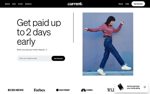
Preview image. Unlock full-res
White Canvas Precision
Color palette
Decorative background for brand elements, illustration accents — a vibrant linear progression from gold to orange to purple, ending transparent
Primary text, darkest surface elements, filled buttons, dark borders
Page backgrounds, surface fills, text on dark backgrounds, light borders
Muted body text, secondary information, default link borders, ghost button borders
Subtle dividers, light strokes
Input background fills, subtle background accents
Placeholder text, tertiary text
Typography
- Weights
- 100, 300, 400, 700
- Sizes
- 12px, 16px, 18px, 20px, 21px, 24px, 48px, 72px, 90px
- Line height
- 1, 1.1, 1.2, 1.25, 1.4, 1.5, 1.6
- Letter spacing
- -0.0400em at 90px, -0.0200em at 48px, -0.0130em at 24px, -0.0100em at 21px, normal for smaller sizes
- Fallback
- system-ui, sans-serif
Primary typeface for all headings and body text. Its range of weights and precise tracking enable clear hierarchical distinctions without changing font family. The light weights (100, 300) are reserved for large, impactful headlines, creating a sense of understated authority.
- Weights
- 400, 700
- Sizes
- 16px, 43px
- Line height
- 1.4
- Letter spacing
- -0.0100em at 43px, -0.0040em at 16px
- Fallback
- system-ui, sans-serif
Used sparingly for specific links and minor headings, providing a subtly different textual texture while maintaining legibility. Its slightly wider stance complements the primary typeface.
Spacing & shape
Elevation
Components
Background: Storm Anthracite (#000000). Text: Cloud White (#ffffff). Radius: 9999px. Padding: 14px vertical, 24px horizontal. Shadow: rgba(0, 0, 0, 0.01) 0px 140px 56px 0px, rgba(0, 0, 0, 0.05) 0px 79px 47px 0px, rgba(0, 0, 0, 0.09) 0px 35px 35px 0px, rgba(0, 0, 0, 0.1) 0px 9px 19px 0px.
Background: Cloud White (#ffffff). Text: Storm Anthracite (#000000). Border: 1px Storm Anthracite (#000000). Radius: 9999px. Padding: 14px vertical, 24px horizontal.
Background: transparent. Text: Storm Anthracite (#000000). No explicit border or radius visible, implies a text link with button-like functionality. Padding: 0.
Background: Ghost Fill (#ebeff2). Text: Storm Anthracite (#000000). Placeholder text: Deep Space (#4e525e). No visible border. Radius: 0px. Padding: 8px from bottom with variable horizontal padding.
Background: transparent. Text/Icon: Storm Anthracite (#000000). Radius: 0px. Minimal padding.
Background: transparent. Text: Storm Anthracite (#000000). Underline effect on hover (not visible in extracted data).
Background: Cloud White (#ffffff). Radius: 30px. Padding: typically 24px around content. No visible border.
Guidelines
- Prioritize `soehne` weight 300 for large display headings (48px and above) to achieve a whisper-like authority.
- Use Storm Anthracite (#000000) for primary text and Cloud White (#ffffff) for backgrounds to maintain high contrast.
- Apply a 9999px border-radius to all buttons for a friendly, approachable aesthetic.
- Maintain high typographic precision by using specified letter-spacing for `soehne` headlines: -0.96px at 48px, -3.6px at 90px.
- Use Skyline Gray (#737582) exclusively for secondary text and ghost button borders, not for primary text or filled elements.
- Ensure all interactive elements, especially primary buttons, receive the defined elevation shadow for subtle depth.
- Employ Ghost Fill (#ebeff2) for subtle background accents specifically on input fields or contained background zones.
- Do not use highly saturated colors for large areas or backgrounds; reserve them for small, functional accents like the Current Gradient.
- Avoid generic border-radii; adhere strictly to 9999px for buttons, 30px for cards, and 0px for inputs and layout elements.
- Do not vary typography by changing font families too often; `soehne` and `proxima-nova` are the only approved typefaces.
- Do not introduce heavy, opaque shadows; utilize the light, multi-layered elevation shadow for buttons to ensure a subtle effect.
- Avoid cluttering the layout; maintain generous section gaps of 80px and comfortable element gaps of 24px.
- Do not use chromatic colors for text unless they are part of a clearly defined brand element (e.g., within a logo or a specific icon).
- Never use `soehne` with a weight below 400 for body text; reserve lighter weights for headings only.
About this system
ShowHide
Current uses a crisp, high-contrast visual system built on a bright white canvas. Typography is the primary means of conveying hierarchy, with precise letter-spacing and varying weights providing clarity. Functional elements are often minimalist, relying on strong outlines or simple fills, and the brand accent color appears as a subtle, unexpected gradient in specific interactive contexts, avoiding overt saturation for a sophisticated feel. The overall impression is direct and confident.
Reminiscent of Revolut, Wise (formerly TransferWise), Chime, Monzo.
# Current — Style Reference
> White Canvas Precision

**Theme:** light

**Site:** https://current.com

Current uses a crisp, high-contrast visual system built on a bright white canvas. Typography is the primary means of conveying hierarchy, with precise letter-spacing and varying weights providing clarity. Functional elements are often minimalist, relying on strong outlines or simple fills, and the brand accent color appears as a subtle, unexpected gradient in specific interactive contexts, avoiding overt saturation for a sophisticated feel. The overall impression is direct and confident.

## Tokens — Colors

| Name | Value | Token | Role |
|------|------|------|------|
| Current Gradient | `#f4cb45` | `--color-current-gradient` | Decorative background for brand elements, illustration accents — a vibrant linear progression from gold to orange to purple, ending transparent |
| Storm Anthracite | `#000000` | `--color-storm-anthracite` | Primary text, darkest surface elements, filled buttons, dark borders |
| Cloud White | `#ffffff` | `--color-cloud-white` | Page backgrounds, surface fills, text on dark backgrounds, light borders |
| Skyline Gray | `#737582` | `--color-skyline-gray` | Muted body text, secondary information, default link borders, ghost button borders |
| Faded Steel | `#dfe5ec` | `--color-faded-steel` | Subtle dividers, light strokes |
| Ghost Fill | `#ebeff2` | `--color-ghost-fill` | Input background fills, subtle background accents |
| Deep Space | `#4e525e` | `--color-deep-space` | Placeholder text, tertiary text |

## Tokens — Typography

### soehne
- **Substitute:** system-ui, sans-serif
- **Weights:** 100, 300, 400, 700
- **Sizes:** 12px, 16px, 18px, 20px, 21px, 24px, 48px, 72px, 90px
- **Line height:** 1, 1.1, 1.2, 1.25, 1.4, 1.5, 1.6
- **Letter spacing:** -0.0400em at 90px, -0.0200em at 48px, -0.0130em at 24px, -0.0100em at 21px, normal for smaller sizes
- **Role:** Primary typeface for all headings and body text. Its range of weights and precise tracking enable clear hierarchical distinctions without changing font family. The light weights (100, 300) are reserved for large, impactful headlines, creating a sense of understated authority.

### proxima-nova
- **Substitute:** system-ui, sans-serif
- **Weights:** 400, 700
- **Sizes:** 16px, 43px
- **Line height:** 1.4
- **Letter spacing:** -0.0100em at 43px, -0.0040em at 16px
- **Role:** Used sparingly for specific links and minor headings, providing a subtly different textual texture while maintaining legibility. Its slightly wider stance complements the primary typeface.

## Tokens — Type Scale

Perfect Fifth (1.5) from 16px base.

| Role | Size | Line height | Letter spacing |
|------|------|------|------|
| caption | 12px | 1.4 | — |
| body | 16px | 1.4 | — |
| subheading | 20px | 1.25 | — |
| heading | 24px | 1.2 | -0.31px |
| heading-lg | 48px | 1.1 | -0.96px |
| display | 90px | 1 | -3.6px |

## Tokens — Spacing

- **Section gap:** 80px
- **Card padding:** 24px
- **Element gap:** 24px

## Tokens — Radius

- **Buttons:** 9999px
- **Cards:** 30px
- **input-text:** 0px
- **square-components:** 0px

## Tokens — Elevation

- **Primary Filled Button:** `rgba(0, 0, 0, 0.01) 0px 140px 56px 0px, rgba(0, 0, 0, 0.05) 0px 79px 47px 0px, rgba(0, 0, 0, 0.09) 0px 35px 35px 0px, rgba(0, 0, 0, 0.1) 0px 9px 19px 0px`

## Components

### Filled Primary Button
*Action button with dark background.*

Background: Storm Anthracite (#000000). Text: Cloud White (#ffffff). Radius: 9999px. Padding: 14px vertical, 24px horizontal. Shadow: rgba(0, 0, 0, 0.01) 0px 140px 56px 0px, rgba(0, 0, 0, 0.05) 0px 79px 47px 0px, rgba(0, 0, 0, 0.09) 0px 35px 35px 0px, rgba(0, 0, 0, 0.1) 0px 9px 19px 0px.

### Outlined Secondary Button
*Secondary action button with light background.*

Background: Cloud White (#ffffff). Text: Storm Anthracite (#000000). Border: 1px Storm Anthracite (#000000). Radius: 9999px. Padding: 14px vertical, 24px horizontal.

### Ghost Action Button
*Minimalist interactive element, often for 'Learn More' or informational actions.*

Background: transparent. Text: Storm Anthracite (#000000). No explicit border or radius visible, implies a text link with button-like functionality. Padding: 0.

### Mobile Number Input Field
*User input for contact information.*

Background: Ghost Fill (#ebeff2). Text: Storm Anthracite (#000000). Placeholder text: Deep Space (#4e525e). No visible border. Radius: 0px. Padding: 8px from bottom with variable horizontal padding.

### Information Icon Button
*Small, interactive icon for tooltips or additional context.*

Background: transparent. Text/Icon: Storm Anthracite (#000000). Radius: 0px. Minimal padding.

### Minimal Navigation Link
*Navigation links in header/footer.*

Background: transparent. Text: Storm Anthracite (#000000). Underline effect on hover (not visible in extracted data).

### Callout Card
*Feature showcase elements with text and an image.*

Background: Cloud White (#ffffff). Radius: 30px. Padding: typically 24px around content. No visible border.

## Guidelines

### Do

- Prioritize `soehne` weight 300 for large display headings (48px and above) to achieve a whisper-like authority.
- Use Storm Anthracite (#000000) for primary text and Cloud White (#ffffff) for backgrounds to maintain high contrast.
- Apply a 9999px border-radius to all buttons for a friendly, approachable aesthetic.
- Maintain high typographic precision by using specified letter-spacing for `soehne` headlines: -0.96px at 48px, -3.6px at 90px.
- Use Skyline Gray (#737582) exclusively for secondary text and ghost button borders, not for primary text or filled elements.
- Ensure all interactive elements, especially primary buttons, receive the defined elevation shadow for subtle depth.
- Employ Ghost Fill (#ebeff2) for subtle background accents specifically on input fields or contained background zones.

### Don't

- Do not use highly saturated colors for large areas or backgrounds; reserve them for small, functional accents like the Current Gradient.
- Avoid generic border-radii; adhere strictly to 9999px for buttons, 30px for cards, and 0px for inputs and layout elements.
- Do not vary typography by changing font families too often; `soehne` and `proxima-nova` are the only approved typefaces.
- Do not introduce heavy, opaque shadows; utilize the light, multi-layered elevation shadow for buttons to ensure a subtle effect.
- Avoid cluttering the layout; maintain generous section gaps of 80px and comfortable element gaps of 24px.
- Do not use chromatic colors for text unless they are part of a clearly defined brand element (e.g., within a logo or a specific icon).
- Never use `soehne` with a weight below 400 for body text; reserve lighter weights for headings only.

## Agent Prompt Guide

Quick Color Reference:
text: #000000
background: #ffffff
border: #737582 (for subtle outlines), #000000 (for strong outlines)
accent: #f4cb45 (gradient start)
primary action: #000000 (filled action)

Example Component Prompts:
1. Create a Primary Action Button: #000000 background, #ffffff text, 9999px radius, compact pill padding. Use this filled treatment for the main CTA.
2. Design a feature card: Cloud White (#ffffff) background, 30px radius. Inside, an image 200px tall. Below, a headline 'Advance up to $750' using soehne 24px, weight 700, Storm Anthracite (#000000). A body text 'It’s your paycheck – get access to more of it...' using soehne 16px, weight 400, Skyline Gray (#737582). A Ghost Action Button 'Learn More' in Storm Anthracite (#000000) text.
More like this










Keep what you find
A free account saves references to boards and can send you a weekly email of picks based on what you save.
To see every result, go Pro.