Preview image. Unlock full-res
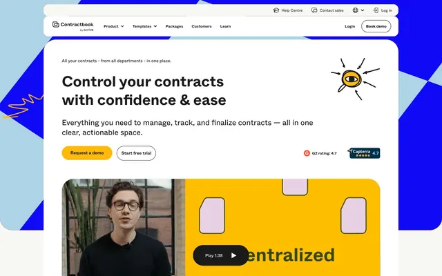
Playful professionalism, high-contrast clarity.
Color palette
Powerful accent color for key cards, button borders, and statement headlines — commands attention
Primary call-to-action buttons, prominent interactive elements, highlighted card backgrounds — indicates action and importance
Light background for informational cards, decorative accents in illustrations — adds a soft, approachable coolness
Rich background for specific content cards or accents — a grounded, natural tone
Soft accent for illustrations, decorative elements, or secondary headings — hints at creativity
Primary text, icon default, borders, dark overlay backgrounds — providing strong contrast on light surfaces
Page backgrounds, card surfaces, button backgrounds — the primary canvas for content
Subtle background for secondary cards and sections — offering a soft visual break from Pure White
Input fields, secondary card backgrounds, muted link backgrounds — a soft, tactile neutral for interactive elements and subtle content grouping
Strongest text contrast, button text on light backgrounds, hairline borders — used sparingly for maximum impact
Muted text, subtle dividers, inactive states — providing soft delineation without harshness
Placeholder text, secondary link text, less prominent UI elements — for reduced visual weight
Input field borders, disabled element borders — a light, unobtrusive boundary
Typography
- Weights
- 400, 700
- Sizes
- 11px, 12px, 14px, 16px, 25px, 28px, 32px, 40px, 48px
- Line height
- 1, 1.2, 1.24, 1.25, 1.3, 1.4, 1.43, 1.5, 1.6, 1.87
- Letter spacing
- normal
- Fallback
- Inter
Primary typeface for all text content, from headings to body copy and UI elements. Its clean, slightly humanist characteristics provide a friendly yet professional feel.
Spacing & shape
Components
Filled button with Energy Gold (#ffba09) background and Ink Black (#000000) text, using a 999px border-radius for a pill shape. Padding is 16px vertical, 28px horizontal.
Outlined button with transparent background, Washed Black (#1a1a1a) text and 1px border. Uses 999px border-radius. Padding is 16px vertical, 14px horizontal.
Outlined button with transparent background, Pure White (#ffffff) text and 1px border. Uses 999px border-radius. Padding is 10.5px vertical, 14px horizontal.
Solid Royal Blue (#1009f6) background, 24px border-radius. Contains internal elements padded by 48px.
Solid Beige (#f0f0ec) background, 24px border-radius. Contains internal elements padded by 48px.
Solid Energy Gold (#ffba09) background, 24px border-radius. Contains internal elements padded by 48px.
Solid Pure White (#ffffff) background, 40px border-radius. Contains internal elements padded by 59.5px.
Solid Beige (#f0f0ec) background with Silver Mist (#b3b3b3) 1px border, 4.375px border-radius. Text is Washed Black (#1a1a1a). Padding is 9px vertical, 14px horizontal.
Guidelines
- Prioritize Energy Gold (#ffba09) for all primary calls to action, ensuring immediate visual recognition.
- Use Abcwhyte font for all text content, maintaining consistency across headings, body, and UI elements.
- Apply 999px border-radius to all buttons and form fields to achieve a consistent pill-like or softly rounded appearance.
- Employ Washed Black (#1a1a1a) for primary text on light backgrounds to maximize readability.
- Leverage Royal Blue (#1009f6) and Energy Gold (#ffba09) as prominent accent colors for key content blocks or interactive states.
- Maintain generous section gaps of 60px to provide ample breathing room between content blocks and improve content scanning.
- Utilize Pure White (#ffffff) and Pearl (#f7f7f3) as primary and secondary background surfaces to create a clean, light canvas.
- Avoid using multiple font families; Abcwhyte is the sole typeface for this system.
- Do not introduce strong drop shadows; rely on color blocking and border radii for visual separation and distinction.
- Refrain from complex gradients or textures on primary UI elements; maintain clean, solid color fills.
- Do not use highly saturated colors for large areas of text to avoid strain; reserve vibrant colors for accents and actionable elements.
- Avoid arbitrary border-radii; adhere to the established radii of 24px, 40px, 999px, and 4.375px.
- Do not overcrowd sections; ensure comfortable element gaps of 14px and robust card padding for readability.
- Avoid using any non-system greys; stick to the defined neutral palette for consistency and accessibility.
About this system
ShowHide
Contractbook uses a playful, confident aesthetic with bold primary colors punctuating a clean, spacious light background. The system prioritizes readability and clear interaction points, leveraging vibrant yellow for primary actions and strong blue for statements. Typography is robust and direct, complementing the slightly soft, geometric shapes used throughout components and illustrations. Visual hierarchy is established through strategic color blocking and generous whitespace, rather than relying on complex elevation.
The site uses a max-width contained layout, approximately 1200px, centered on the screen. The hero section is full-width with a bold, centered headline and calls to action over a playful illustrated background. Content sections follow a rhythm of consistent vertical spacing, often featuring alternating light (Pure White) and Pearl (#f7f7f3) bands. Content is arranged predominantly in two-column text-left/visual-right patterns or centered stacks. Card grids are used for features or testimonials. The navigation is a sticky top bar with a clear brand logo and primary actions.
Imagery primarily consists of playful, hand-drawn vector illustrations with thick outlines and geometric shapes, often filled with brand accent colors like Sky Blue, Thistle Bloom, and Energy Gold. These illustrations provide decorative atmosphere and explanatory content, often presented in contained, rounded areas with large 40px radii. Product screenshots are minimal, focusing on UI snippets. The style is light-hearted and approachable, balancing the professional nature of the contract management software.
Reminiscent of Typeform, Slack, PandaDoc.
# Contractbook — Style Reference
> Playful professionalism, high-contrast clarity.

**Theme:** light

**Site:** https://contractbook.com

Contractbook uses a playful, confident aesthetic with bold primary colors punctuating a clean, spacious light background. The system prioritizes readability and clear interaction points, leveraging vibrant yellow for primary actions and strong blue for statements. Typography is robust and direct, complementing the slightly soft, geometric shapes used throughout components and illustrations. Visual hierarchy is established through strategic color blocking and generous whitespace, rather than relying on complex elevation.

## Tokens — Colors

| Name | Value | Token | Role |
|------|------|------|------|
| Royal Blue | `#1009f6` | `--color-royal-blue` | Powerful accent color for key cards, button borders, and statement headlines — commands attention |
| Energy Gold | `#ffba09` | `--color-energy-gold` | Primary call-to-action buttons, prominent interactive elements, highlighted card backgrounds — indicates action and importance |
| Sky Blue | `#add3e5` | `--color-sky-blue` | Light background for informational cards, decorative accents in illustrations — adds a soft, approachable coolness |
| Deep Moss | `#304801` | `--color-deep-moss` | Rich background for specific content cards or accents — a grounded, natural tone |
| Thistle Bloom | `#e3c7de` | `--color-thistle-bloom` | Soft accent for illustrations, decorative elements, or secondary headings — hints at creativity |
| Washed Black | `#1a1a1a` | `--color-washed-black` | Primary text, icon default, borders, dark overlay backgrounds — providing strong contrast on light surfaces |
| Pure White | `#ffffff` | `--color-pure-white` | Page backgrounds, card surfaces, button backgrounds — the primary canvas for content |
| Pearl | `#f7f7f3` | `--color-pearl` | Subtle background for secondary cards and sections — offering a soft visual break from Pure White |
| Beige | `#f0f0ec` | `--color-beige` | Input fields, secondary card backgrounds, muted link backgrounds — a soft, tactile neutral for interactive elements and subtle content grouping |
| Ink Black | `#000000` | `--color-ink-black` | Strongest text contrast, button text on light backgrounds, hairline borders — used sparingly for maximum impact |
| Concrete | `#d4d4d0` | `--color-concrete` | Muted text, subtle dividers, inactive states — providing soft delineation without harshness |
| Dim Grey | `#6d6868` | `--color-dim-grey` | Placeholder text, secondary link text, less prominent UI elements — for reduced visual weight |
| Silver Mist | `#b3b3b3` | `--color-silver-mist` | Input field borders, disabled element borders — a light, unobtrusive boundary |

## Tokens — Typography

### Abcwhyte
- **Substitute:** Inter
- **Weights:** 400, 700
- **Sizes:** 11px, 12px, 14px, 16px, 25px, 28px, 32px, 40px, 48px
- **Line height:** 1, 1.2, 1.24, 1.25, 1.3, 1.4, 1.43, 1.5, 1.6, 1.87
- **Letter spacing:** normal
- **Role:** Primary typeface for all text content, from headings to body copy and UI elements. Its clean, slightly humanist characteristics provide a friendly yet professional feel.

## Tokens — Type Scale

Perfect Fourth (1.333) from 14px base.

| Role | Size | Line height | Letter spacing |
|------|------|------|------|
| caption | 11px | 1.4 | — |
| body | 14px | 1.4 | — |
| heading-sm | 25px | 1.25 | — |
| heading | 28px | 1.2 | — |
| heading-lg | 32px | 1.2 | — |
| display | 48px | 1.2 | — |

## Tokens — Spacing

- **Section gap:** 60px
- **Card padding:** 14px
- **Element gap:** 14px

## Tokens — Radius

- **Buttons:** 999px
- **Inputs:** 4.375px
- **Cards:** 24px
- **Images:** 40px
- **tags:** 9999px

## Layout

The site uses a max-width contained layout, approximately 1200px, centered on the screen. The hero section is full-width with a bold, centered headline and calls to action over a playful illustrated background. Content sections follow a rhythm of consistent vertical spacing, often featuring alternating light (Pure White) and Pearl (#f7f7f3) bands. Content is arranged predominantly in two-column text-left/visual-right patterns or centered stacks. Card grids are used for features or testimonials. The navigation is a sticky top bar with a clear brand logo and primary actions.

## Imagery

Imagery primarily consists of playful, hand-drawn vector illustrations with thick outlines and geometric shapes, often filled with brand accent colors like Sky Blue, Thistle Bloom, and Energy Gold. These illustrations provide decorative atmosphere and explanatory content, often presented in contained, rounded areas with large 40px radii. Product screenshots are minimal, focusing on UI snippets. The style is light-hearted and approachable, balancing the professional nature of the contract management software.

## Components

### Primary Action Button
*Call to action*

Filled button with Energy Gold (#ffba09) background and Ink Black (#000000) text, using a 999px border-radius for a pill shape. Padding is 16px vertical, 28px horizontal.

### Secondary Ghost Button (Dark Text)
*Secondary action*

Outlined button with transparent background, Washed Black (#1a1a1a) text and 1px border. Uses 999px border-radius. Padding is 16px vertical, 14px horizontal.

### Secondary Ghost Button (Light Text)
*Secondary action*

Outlined button with transparent background, Pure White (#ffffff) text and 1px border. Uses 999px border-radius. Padding is 10.5px vertical, 14px horizontal.

### Accent Card - Royal Blue
*Content container*

Solid Royal Blue (#1009f6) background, 24px border-radius. Contains internal elements padded by 48px.

### Accent Card - Beige
*Content container*

Solid Beige (#f0f0ec) background, 24px border-radius. Contains internal elements padded by 48px.

### Accent Card - Energy Gold
*Content container*

Solid Energy Gold (#ffba09) background, 24px border-radius. Contains internal elements padded by 48px.

### Base Card (Rounded)
*Content container*

Solid Pure White (#ffffff) background, 40px border-radius. Contains internal elements padded by 59.5px.

### Simple Input Field
*Data entry*

Solid Beige (#f0f0ec) background with Silver Mist (#b3b3b3) 1px border, 4.375px border-radius. Text is Washed Black (#1a1a1a). Padding is 9px vertical, 14px horizontal.

## Guidelines

### Do

- Prioritize Energy Gold (#ffba09) for all primary calls to action, ensuring immediate visual recognition.
- Use Abcwhyte font for all text content, maintaining consistency across headings, body, and UI elements.
- Apply 999px border-radius to all buttons and form fields to achieve a consistent pill-like or softly rounded appearance.
- Employ Washed Black (#1a1a1a) for primary text on light backgrounds to maximize readability.
- Leverage Royal Blue (#1009f6) and Energy Gold (#ffba09) as prominent accent colors for key content blocks or interactive states.
- Maintain generous section gaps of 60px to provide ample breathing room between content blocks and improve content scanning.
- Utilize Pure White (#ffffff) and Pearl (#f7f7f3) as primary and secondary background surfaces to create a clean, light canvas.

### Don't

- Avoid using multiple font families; Abcwhyte is the sole typeface for this system.
- Do not introduce strong drop shadows; rely on color blocking and border radii for visual separation and distinction.
- Refrain from complex gradients or textures on primary UI elements; maintain clean, solid color fills.
- Do not use highly saturated colors for large areas of text to avoid strain; reserve vibrant colors for accents and actionable elements.
- Avoid arbitrary border-radii; adhere to the established radii of 24px, 40px, 999px, and 4.375px.
- Do not overcrowd sections; ensure comfortable element gaps of 14px and robust card padding for readability.
- Avoid using any non-system greys; stick to the defined neutral palette for consistency and accessibility.

## Agent Prompt Guide

**Quick Color Reference**
- text: #1a1a1a
- background: #ffffff
- border: #b3b3b3
- accent: #1009f6
- primary action: #ffba09 (filled action)

**3-5 Example Component Prompts**
- Create a Primary Action Button: #ffba09 background, #000000 text, 9999px radius, compact pill padding. Use this filled treatment for the main CTA.
- Design a feature card with a Royal Blue (#1009f6) background, 24px border-radius, and 48px internal padding. Inside, place a heading in Abcwhyte weight 700 size 25px, color #ffffff, and body text in Abcwhyte weight 400 size 14px, color #ffffff.
- Create a testimonial card on a Pearl (#f7f7f3) background, with a 40px border-radius. Use Abcwhyte weight 400 size 14px, color #1a1a1a for the quote, and Abcwhyte weight 700 size 16px, color #1a1a1a for the author's name.
More like this









Keep what you find
A free account saves references to boards and can send you a weekly email of picks based on what you save.
To see every result, go Pro.