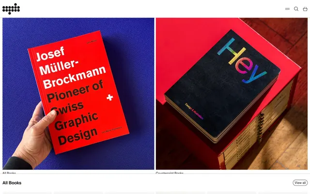
Preview image. Unlock full-res
Graphic design manual on white canvas
Color palette
Page backgrounds, hero sections, and primary surface fills. Provides a clean, bright foundation
Primary text color for headings, body copy, links, and icons. Establishes strong contrast against light surfaces
Subtle borders for separating elements, list dividers, and outlined buttons. Defines structure without adding visual weight
Typography
- Weights
- 400, 700
- Sizes
- 15px, 20px
- Line height
- 1
- Letter spacing
- -0.025em
- Fallback
- system-ui, sans-serif
Dominant typeface for all interface elements, body text, links, and buttons. Its compact tracking and neutral character contribute to the system's precise, information-dense feel.
- Weights
- 400
- Sizes
- 15px
- Line height
- 1.5
- Letter spacing
- normal
- Fallback
- sans-serif
Used for specific branding elements and potentially some content accents, providing a distinct, non-system font texture.
Spacing & shape
Components
Ghost button with Text Black text on Canvas White background, outlined by Border Gray. Features a 9999px border-radius for a soft, pill-like appearance. Padding is 3.75px vertical and 7.5px horizontal. Uses Helvetica 15px, weight 400.
Minimalist button appearing as plain text in Text Black, on a transparent background. No explicit padding or border-radius, aligning with content flow. Used for secondary actions or navigation items. Uses Helvetica 15px.
Transparent background input with Text Black text and a Text Black border. Features a 15px border-radius for a softly rounded aesthetic. Padding is 3.75px vertical and 7.5px horizontal. Uses Helvetica 15px.
Displays product images, names, and prices. The items are tightly packed with 8px horizontal and 19px vertical spacing between elements. Text is Text Black on a Canvas White background.
Navigation links use Text Black on transparent backgrounds, often outlined with Border Gray, indicating active or hover states. Helvetica 15px, weight 400 is used.
Guidelines
- Use Canvas White (#ffffff) as the default background for all page surfaces and major content blocks.
- Implement Text Black (#1c1c1c) for all primary text, headings, and functional icons to maintain high contrast.
- Apply Border Gray (#e5e7eb) for all hairline separators, subtle outlines, and inactive interactive component borders.
- Utilize 9999px border-radius for all pill-shaped buttons and tags, creating a soft, approachable boundary.
- Maintain a compact typographical rhythm with Helvetica (or system-ui sans-serif substitute) at a letter-spacing of -0.025em for all prominent text.
- Adhere to an 8px base unit for horizontal spacing between elements and 4px for fine-tuned vertical padding.
- Avoid introducing additional saturated colors unless explicitly for semantic states (e.g., error) or specific brand-approved product imagery, as the system is intentionally achromatic.
- Do not use heavy shadows or deeply colored backgrounds; surface elevation should be minimal and almost imperceptible, achieved through subtle borders where needed.
- Refrain from using large, decorative typefaces for headlines; the system prioritizes compact, functional typography.
- Do not deviate from the established border-radius values (9999px for buttons/tags, 15px for inputs); arbitrary rounded corners will disrupt the system's feel.
- Avoid excessive padding around interface elements; the site employs a compact density, maximizing information visibility.
About this system
ShowHide
Counterprint's visual system evokes a precise, almost utilitarian aesthetic, reminiscent of classic design publishing. The core palette is primarily achromatic, relying on sharp black text against stark white surfaces and soft gray borders. Typography is confident and compact, favoring a system sans-serif for most content, with a custom geometric sans-serif for specific branding. Components are lightweight, emphasizing function over embellishment, with generous use of infinite border-radius for buttons and subtle rounded corners for input fields, providing a touch of approachability within the otherwise rigorous structure.
The page maintains a full-width, non-contained layout, allowing content to stretch across the browser window. The hero section features a dynamic, full-bleed split visual with two large product images. Content is primarily arranged in a dense, multi-column grid for product listings, with consistent vertical spacing between sections. Navigation is minimalist, residing in a lightweight top bar that appears fixed on scroll.
The visual language relies heavily on product-focused photography and vibrant book cover art. Photography either features clean, high-key shots of books and products isolated on simple backgrounds (e.g., solid color blocks). Images are contained within rectangular frames, with no overlapping or complex masking. They are highly central to content, serving as both decorative atmosphere and explanatory content, occupying significant visual space in grid layouts.
Reminiscent of Unit Editions, Taschen, Actual Source.
# Counterprint — Style Reference
> Graphic design manual on white canvas

**Theme:** light

**Site:** https://www.counter-print.co.uk

Counterprint's visual system evokes a precise, almost utilitarian aesthetic, reminiscent of classic design publishing. The core palette is primarily achromatic, relying on sharp black text against stark white surfaces and soft gray borders. Typography is confident and compact, favoring a system sans-serif for most content, with a custom geometric sans-serif for specific branding. Components are lightweight, emphasizing function over embellishment, with generous use of infinite border-radius for buttons and subtle rounded corners for input fields, providing a touch of approachability within the otherwise rigorous structure.

## Tokens — Colors

| Name | Value | Token | Role |
|------|------|------|------|
| Canvas White | `#ffffff` | `--color-canvas-white` | Page backgrounds, hero sections, and primary surface fills. Provides a clean, bright foundation |
| Text Black | `#1c1c1c` | `--color-text-black` | Primary text color for headings, body copy, links, and icons. Establishes strong contrast against light surfaces |
| Border Gray | `#e5e7eb` | `--color-border-gray` | Subtle borders for separating elements, list dividers, and outlined buttons. Defines structure without adding visual weight |

## Tokens — Typography

### Helvetica
- **Substitute:** system-ui, sans-serif
- **Weights:** 400, 700
- **Sizes:** 15px, 20px
- **Line height:** 1
- **Letter spacing:** -0.025em
- **Role:** Dominant typeface for all interface elements, body text, links, and buttons. Its compact tracking and neutral character contribute to the system's precise, information-dense feel.

### GTStandard-M
- **Substitute:** sans-serif
- **Weights:** 400
- **Sizes:** 15px
- **Line height:** 1.5
- **Letter spacing:** normal
- **Role:** Used for specific branding elements and potentially some content accents, providing a distinct, non-system font texture.

## Tokens — Spacing

- **Section gap:** 28px
- **Card padding:** 8px
- **Element gap:** 8px

## Tokens — Radius

- **Buttons:** 9999px
- **Inputs:** 15px
- **others:** 9999px

## Layout

The page maintains a full-width, non-contained layout, allowing content to stretch across the browser window. The hero section features a dynamic, full-bleed split visual with two large product images. Content is primarily arranged in a dense, multi-column grid for product listings, with consistent vertical spacing between sections. Navigation is minimalist, residing in a lightweight top bar that appears fixed on scroll.

## Imagery

The visual language relies heavily on product-focused photography and vibrant book cover art. Photography either features clean, high-key shots of books and products isolated on simple backgrounds (e.g., solid color blocks). Images are contained within rectangular frames, with no overlapping or complex masking. They are highly central to content, serving as both decorative atmosphere and explanatory content, occupying significant visual space in grid layouts.

## Components

### Primary Ghost Button
*Interactive element*

Ghost button with Text Black text on Canvas White background, outlined by Border Gray. Features a 9999px border-radius for a soft, pill-like appearance. Padding is 3.75px vertical and 7.5px horizontal. Uses Helvetica 15px, weight 400.

### Text Link Button
*Interactive element*

Minimalist button appearing as plain text in Text Black, on a transparent background. No explicit padding or border-radius, aligning with content flow. Used for secondary actions or navigation items. Uses Helvetica 15px.

### Search Input Field
*Data entry*

Transparent background input with Text Black text and a Text Black border. Features a 15px border-radius for a softly rounded aesthetic. Padding is 3.75px vertical and 7.5px horizontal. Uses Helvetica 15px.

### Product Grid Item
*Display component for products*

Displays product images, names, and prices. The items are tightly packed with 8px horizontal and 19px vertical spacing between elements. Text is Text Black on a Canvas White background.

### Nav Menu Item
*Navigation link*

Navigation links use Text Black on transparent backgrounds, often outlined with Border Gray, indicating active or hover states. Helvetica 15px, weight 400 is used.

## Guidelines

### Do

- Use Canvas White (#ffffff) as the default background for all page surfaces and major content blocks.
- Implement Text Black (#1c1c1c) for all primary text, headings, and functional icons to maintain high contrast.
- Apply Border Gray (#e5e7eb) for all hairline separators, subtle outlines, and inactive interactive component borders.
- Utilize 9999px border-radius for all pill-shaped buttons and tags, creating a soft, approachable boundary.
- Maintain a compact typographical rhythm with Helvetica (or system-ui sans-serif substitute) at a letter-spacing of -0.025em for all prominent text.
- Adhere to an 8px base unit for horizontal spacing between elements and 4px for fine-tuned vertical padding.

### Don't

- Avoid introducing additional saturated colors unless explicitly for semantic states (e.g., error) or specific brand-approved product imagery, as the system is intentionally achromatic.
- Do not use heavy shadows or deeply colored backgrounds; surface elevation should be minimal and almost imperceptible, achieved through subtle borders where needed.
- Refrain from using large, decorative typefaces for headlines; the system prioritizes compact, functional typography.
- Do not deviate from the established border-radius values (9999px for buttons/tags, 15px for inputs); arbitrary rounded corners will disrupt the system's feel.
- Avoid excessive padding around interface elements; the site employs a compact density, maximizing information visibility.

## Agent Prompt Guide

Quick Color Reference: text: #1c1c1c, background: #ffffff, border: #e5e7eb, accent: no distinct accent color, primary action: no distinct CTA color

Example Component Prompts:
1. Create a header: Canvas White background, Text Black text. Right-aligned ghost buttons for 'Menu', 'Search', 'Cart' with 9999px radius, Border Gray outline, 3.75px vertical, 7.5px horizontal padding, Helvetica 15px 400.
2. Design a product grid item: Canvas White background. Product image at top, followed by Helvetica 15px 400 Text Black product title, then price below. Items should be spaced 8px horizontally and 19px vertically.
3. Create a navigation text link: Text Black, Helvetica 15px 400, on a transparent background, no padding or borders. Used in a list format, each item separated by Border Gray line.
More like this





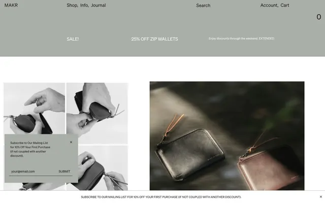




Keep what you find
A free account saves references to boards and can send you a weekly email of picks based on what you save.
To see every result, go Pro.