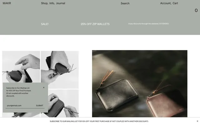
Preview image. Unlock full-res
Workshop-crafted monochrome utility.
Color palette
Primary text, headings, links, borders for outlines, input text. This near-black provides strong contrast on light backgrounds
Page backgrounds, elevated card surfaces, main content areas
Subtle background for secondary sections, light dividers, input field backgrounds
Button backgrounds, promotional banners — a muted, desaturated gray to provide a soft interactive surface without strong chromatic emphasis
Typography
- Weights
- 400
- Sizes
- 11px, 12px, 13px, 14px, 16px, 18px, 20px, 32px
- Line height
- 1.15, 1.35, 1.4, 1.45, 1.8
- Letter spacing
- 0.015em at smaller sizes, 0.03em at larger sizes
- Fallback
- Inter
Primary typeface for all text content: body, headings, links, and buttons. Its clean, utilitarian nature underpins the brand's direct aesthetic.
- Weights
- 400
- Sizes
- 13px, 20px
- Line height
- 1.15
- Letter spacing
- normal
- Fallback
- Space Mono
Used sparingly for decorative links or specific callouts, lending a technical, almost machine-generated feel.
Spacing & shape
Components
Background: Stone (#a9aea9), Text: Ink (#1c1717), Border: 1px solid Ink (#1c1717), Radius: 0px. Padding 16px top, 10px right, 12px bottom, 20px left. Text uses Sohne Web Regular 13px.
Background: transparent, Text: Ink (#1c1717), Border: 1px solid Ink (#1c1717), Radius: 0px. Padding 1px top, 2px right, 1px bottom, 2px left.
Background: transparent, Text: Ink (#1c1717). No padding or border. Used as a text-only label.
Guidelines
- Use Ink (#1c1717) for all primary text and Canvas (#ffffff) for primary backgrounds.
- Maintain a rigid 0px border-radius for all UI elements, including buttons, inputs, and cards.
- Apply Sohne Web Regular (400) for all body text, headings, and interactive elements.
- Structure layouts with ample white space, using a section gap of 90px between major content blocks.
- Utilize Stone (#a9aea9) as the background for primary interactive buttons, paired with Ink (#1c1717) text and a 1px Ink border.
- Employ Fog (#f0f0f0) sparingly for subtle background differentiation in secondary content areas or inputs.
- Reserve CircularXXMonoWeb-Regular (400) for specific decorative text elements or unique callouts, not for general content.
- Avoid using any saturated or vivid accent colors; the palette is strictly monochrome.
- Do not introduce rounded corners or soft edges on any components.
- Refrain from using drop shadows or elevation effects; elements should appear flat on the canvas.
- Do not use gradients; all colors should be solid fills.
- Avoid decorative typography; maintain the utilitarian style of Sohne Web as the dominant font.
- Do not deviate from the specified spacing units; consistency in 5px element gaps and 90px section gaps is key.
- Do not use default browser link colors; all links must be styled with Ink (#1c1717).
About this system
ShowHide
MAKR employs a utilitarian workshop aesthetic, characterized by a monochrome palette, robust typography, and minimal decorative elements. The design prioritizes directness and product focus, using abundant white space and a tightly constrained color scheme of near-black text on white or light gray surfaces. Interactions are subdued, relying on subtle background shifts and text changes rather than overt animations or vibrant accent colors. The overall impression is one of crafted precision and understated quality.
The page primarily uses a full-bleed layout, where content sections span the full width of the viewport, particularly for large image blocks and product showcases. Textual content and UI elements are typically contained within a centered max-width content area (implicitly around 1200px based on observable patterns). The hero section often features large, immersive product photography with superimposed text links or minimal headlines. Section rhythm is driven by consistent vertical spacing of 90px and alternating content blocks, sometimes featuring equal-width multi-column grids for presenting product variations or features. Navigation is a minimal top bar with left-aligned brand logo and right-aligned utility links (Account, Cart).
The imagery features tightly cropped, professional product photography against neutral backgrounds (often white, gray, or soft blurs of natural settings). There is a mix of highly detailed product shots and contextual action shots that showcase products in use, without overt lifestyle branding. Photography is often monochromatic or desaturated, aligning with the overall brand aesthetic. Illustrations and abstract graphics are absent. Icons are minimal, utility-based, and appear as simple outlined or filled shapes consistent with the primary text color, #1c1717. Images serve to showcase the product directly and provide functional context, rather than purely decorative or atmospheric roles.
Reminiscent of A.P.C., Everlane, Aesop, Common Projects, Studio McGee.
# MAKR — Style Reference
> Workshop-crafted monochrome utility.

**Theme:** light

**Site:** https://makr.com

MAKR employs a utilitarian workshop aesthetic, characterized by a monochrome palette, robust typography, and minimal decorative elements. The design prioritizes directness and product focus, using abundant white space and a tightly constrained color scheme of near-black text on white or light gray surfaces. Interactions are subdued, relying on subtle background shifts and text changes rather than overt animations or vibrant accent colors. The overall impression is one of crafted precision and understated quality.

## Tokens — Colors

| Name | Value | Token | Role |
|------|------|------|------|
| Ink | `#1c1717` | `--color-ink` | Primary text, headings, links, borders for outlines, input text. This near-black provides strong contrast on light backgrounds |
| Canvas | `#ffffff` | `--color-canvas` | Page backgrounds, elevated card surfaces, main content areas |
| Fog | `#f0f0f0` | `--color-fog` | Subtle background for secondary sections, light dividers, input field backgrounds |
| Stone | `#a9aea9` | `--color-stone` | Button backgrounds, promotional banners — a muted, desaturated gray to provide a soft interactive surface without strong chromatic emphasis |

## Tokens — Typography

### Sohne Web
- **Substitute:** Inter
- **Weights:** 400
- **Sizes:** 11px, 12px, 13px, 14px, 16px, 18px, 20px, 32px
- **Line height:** 1.15, 1.35, 1.4, 1.45, 1.8
- **Letter spacing:** 0.015em at smaller sizes, 0.03em at larger sizes
- **Role:** Primary typeface for all text content: body, headings, links, and buttons. Its clean, utilitarian nature underpins the brand's direct aesthetic.

### CircularXXMonoWeb
- **Substitute:** Space Mono
- **Weights:** 400
- **Sizes:** 13px, 20px
- **Line height:** 1.15
- **Letter spacing:** normal
- **Role:** Used sparingly for decorative links or specific callouts, lending a technical, almost machine-generated feel.

## Tokens — Type Scale

Augmented Fourth (1.414) from 11px base.

| Role | Size | Line height | Letter spacing |
|------|------|------|------|
| caption | 11px | 1.45 | 0.165px |
| heading | 18px | 1.35 | 0.27px |
| heading-lg | 20px | 1.15 | 0.6px |
| display | 32px | 1.15 | 0.96px |

## Tokens — Spacing

- **Section gap:** 90px
- **Card padding:** 12px
- **Element gap:** 5px

## Tokens — Radius

- **all:** 0px

## Layout

The page primarily uses a full-bleed layout, where content sections span the full width of the viewport, particularly for large image blocks and product showcases. Textual content and UI elements are typically contained within a centered max-width content area (implicitly around 1200px based on observable patterns). The hero section often features large, immersive product photography with superimposed text links or minimal headlines. Section rhythm is driven by consistent vertical spacing of 90px and alternating content blocks, sometimes featuring equal-width multi-column grids for presenting product variations or features. Navigation is a minimal top bar with left-aligned brand logo and right-aligned utility links (Account, Cart).

## Imagery

The imagery features tightly cropped, professional product photography against neutral backgrounds (often white, gray, or soft blurs of natural settings). There is a mix of highly detailed product shots and contextual action shots that showcase products in use, without overt lifestyle branding. Photography is often monochromatic or desaturated, aligning with the overall brand aesthetic. Illustrations and abstract graphics are absent. Icons are minimal, utility-based, and appear as simple outlined or filled shapes consistent with the primary text color, #1c1717. Images serve to showcase the product directly and provide functional context, rather than purely decorative or atmospheric roles.

## Components

### Primary Filled Button
*Call to action.*

Background: Stone (#a9aea9), Text: Ink (#1c1717), Border: 1px solid Ink (#1c1717), Radius: 0px. Padding 16px top, 10px right, 12px bottom, 20px left. Text uses Sohne Web Regular 13px.

### Text Input
*Form text entry.*

Background: transparent, Text: Ink (#1c1717), Border: 1px solid Ink (#1c1717), Radius: 0px. Padding 1px top, 2px right, 1px bottom, 2px left.

### Product Tag Badge
*Informational labels for products or promotions.*

Background: transparent, Text: Ink (#1c1717). No padding or border. Used as a text-only label.

## Guidelines

### Do

- Use Ink (#1c1717) for all primary text and Canvas (#ffffff) for primary backgrounds.
- Maintain a rigid 0px border-radius for all UI elements, including buttons, inputs, and cards.
- Apply Sohne Web Regular (400) for all body text, headings, and interactive elements.
- Structure layouts with ample white space, using a section gap of 90px between major content blocks.
- Utilize Stone (#a9aea9) as the background for primary interactive buttons, paired with Ink (#1c1717) text and a 1px Ink border.
- Employ Fog (#f0f0f0) sparingly for subtle background differentiation in secondary content areas or inputs.
- Reserve CircularXXMonoWeb-Regular (400) for specific decorative text elements or unique callouts, not for general content.

### Don't

- Avoid using any saturated or vivid accent colors; the palette is strictly monochrome.
- Do not introduce rounded corners or soft edges on any components.
- Refrain from using drop shadows or elevation effects; elements should appear flat on the canvas.
- Do not use gradients; all colors should be solid fills.
- Avoid decorative typography; maintain the utilitarian style of Sohne Web as the dominant font.
- Do not deviate from the specified spacing units; consistency in 5px element gaps and 90px section gaps is key.
- Do not use default browser link colors; all links must be styled with Ink (#1c1717).

## Agent Prompt Guide

Quick Color Reference:
- text: #1c1717
- background: #ffffff
- border: #1c1717
- accent: no distinct accent color
- primary action: no distinct CTA color

Example Component Prompts:
- Create a product listing card: Canvas (#ffffff) background, 0px radius. Use Sohne Web (400) 18px text for product titles in Ink (#1c1717), and Sohne Web (400) 14px text for prices. Keep 12px padding around content. Outline the bottom of the card with a 1px solid Ink (#1c1717) border.
- Design a 'Subscribe' input field with a 'Submit' button: Input field with transparent background, #1c1717 text, 1px solid #1c1717 border, 0px radius, 1px top/bottom, 2px left/right padding. Adjacent Submit button with Stone (#a9aea9) background, Ink (#1c1717) text, 1px solid Ink (#1c1717) border, 0px radius, 16px top, 10px right, 12px bottom, 20px left padding.
- Create a promotional banner: Stone (#a9aea9) background band, with Sohne Web (400) 13px text in Ink (#1c1717) for promotional messages, centered horizontally. Use 7px top and bottom padding.
More like this









Keep what you find
A free account saves references to boards and can send you a weekly email of picks based on what you save.
To see every result, go Pro.