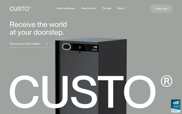
Preview image. Unlock full-res
Industrial product showcase, matte gray
Color palette
Dark borders and separators for elevated surfaces and inverted UI. Do not promote it to the primary CTA color
Page backgrounds, card surfaces, ghost button text and borders, secondary UI elements
Input element borders, subtle dividers, footer borders
Dominant background for hero sections, large-scale UI surfaces
Secondary text, link borders when inactive, list item borders, supporting UI text
Tertiary text, subtle borders around headings and body elements
Typography
- Weights
- 400
- Sizes
- 15px, 16px, 19px, 20px, 30px, 38px, 57px
- Line height
- 1, 1.05, 1.15, 1.25, 1.38, 1.42, 1.43, 1.62
- Letter spacing
- normal
- Fallback
- system-ui
The sole typeface, carrying all textual weight. Its consistent weight across different sizes provides a calm, authoritative voice without resorting to heavy or bold treatments, creating a uniform, technical feel.
Spacing & shape
Components
Ghost button with no background, 'Canvas White' text and border on dark backgrounds, or 'Midnight Graphite' on light backgrounds. No corner radius. Padding is 0.
Ghost button with no background. 'Midnight Graphite' text and border. Radius 8px. Text is 'Midnight Graphite', padding 20px vertical, 32px horizontal.
No background, 'Platinum Gray' border, 'Midnight Graphite' text. Radius 8px. Padding 20px vertical, 32px horizontal.
No background, 'Platinum Gray' border, 'Midnight Graphite' text. Radius 7px. Padding 16px vertical, 52px left, 60px right.
Guidelines
- Prioritize achromatic colors (Midnight Graphite, Canvas White, Platinum Gray) for all UI elements to maintain a neutral, product-focused aesthetic.
- Utilize PP Neue Montreal Medium (weight 400) consistently for all text, relying on size and line-height for hierarchy rather than varied weights.
- Maintain generous vertical spacing between sections, using the 110px section gap to prevent visual clutter.
- Apply an 8px border-radius to all interactive elements like buttons and input fields to convey a soft, modern touch.
- Use 'Midnight Graphite' for primary text and 'Muted Steel' for secondary or helper text to establish clear content hierarchy.
- Frame primary call-to-action buttons as ghost buttons with contrasting borders and text, rather than solid fills, to integrate with the minimalist aesthetic.
- Avoid introducing any additional saturated colors beyond the existing achromatic palette; color should be restricted to product imagery.
- Do not use varied font weights; all typography should use PP Neue Montreal Medium at weight 400.
- Refrain from heavy drop shadows or significant elevation; components should generally remain flat or have minimal depth.
- Do not use overly complex or decorative backgrounds; stick to solid achromatic tones or large product photography.
- Avoid tight, condensed layouts; ensure comfortable padding using the 20px card padding and 24px element gap.
- Never use solid-fill primary buttons; all primary interaction should use the ghosted border style.
About this system
ShowHide
Custo presents a restrained, product-focused aesthetic, blending industrial-grade minimalism with an approachable comfort. The visual system uses achromatic tones, allowing product imagery to take center stage. Typography is clean and assertive, providing clear information without unnecessary ornamentation. Components are subtly interactive with ghosted borders and generous padding, creating an experience that feels understated yet responsive.
The page structure favors a full-bleed layout for hero sections, while subsequent content is often implicitly contained without explicit max-width settings, achieving a sense of spaciousness. The hero features a large product image with a contrasting achromatic background (Hero Ash), overlaid with a prominent headline. Content sections alternate between visually distinct blocks, often presenting a large headline followed by a ghosted call-to-action, or a two-column layout with product imagery on one side and text on the other. Navigation is a minimalist top bar, disappearing against the white canvas or black header, with ghosted menu items and a subtly outlined 'Order now' button. Vertical rhythm is consistent, with generous spacing between major sections.
The visual language is split between high-key, tightly cropped product photography on neutral backgrounds (Hero Ash or Canvas White) and aspirational lifestyle imagery featuring people interacting with the product in real-world settings. Product shots are typically isolated, highlighting the device as the hero. Icons are simple, outlined, monochromatic, and used functionally for navigation or feature explanation, appearing as thin strokes aligning with the minimal component style. Imagery primarily serves to showcase the product and its benefits, rather than just decorative atmosphere, occupying significant visual space in alternating sections.
Reminiscent of Oura Ring, Linear, Apple (product pages), Whoop.
# Custo — Style Reference
> Industrial product showcase, matte gray

**Theme:** light

**Site:** https://custo.io

Custo presents a restrained, product-focused aesthetic, blending industrial-grade minimalism with an approachable comfort. The visual system uses achromatic tones, allowing product imagery to take center stage. Typography is clean and assertive, providing clear information without unnecessary ornamentation. Components are subtly interactive with ghosted borders and generous padding, creating an experience that feels understated yet responsive.

## Tokens — Colors

| Name | Value | Token | Role |
|------|------|------|------|
| Midnight Graphite | `#000000` | `--color-midnight-graphite` | Dark borders and separators for elevated surfaces and inverted UI. Do not promote it to the primary CTA color |
| Canvas White | `#ffffff` | `--color-canvas-white` | Page backgrounds, card surfaces, ghost button text and borders, secondary UI elements |
| Platinum Gray | `#d8d8d8` | `--color-platinum-gray` | Input element borders, subtle dividers, footer borders |
| Hero Ash | `#9ea29f` | `--color-hero-ash` | Dominant background for hero sections, large-scale UI surfaces |
| Muted Steel | `#8e9194` | `--color-muted-steel` | Secondary text, link borders when inactive, list item borders, supporting UI text |
| Lightest Slate | `#a7aaad` | `--color-lightest-slate` | Tertiary text, subtle borders around headings and body elements |

## Tokens — Typography

### PP Neue Montreal
- **Substitute:** system-ui
- **Weights:** 400
- **Sizes:** 15px, 16px, 19px, 20px, 30px, 38px, 57px
- **Line height:** 1, 1.05, 1.15, 1.25, 1.38, 1.42, 1.43, 1.62
- **Letter spacing:** normal
- **Role:** The sole typeface, carrying all textual weight. Its consistent weight across different sizes provides a calm, authoritative voice without resorting to heavy or bold treatments, creating a uniform, technical feel.

## Tokens — Type Scale

Augmented Fourth (1.414) from 15px base.

| Role | Size | Line height | Letter spacing |
|------|------|------|------|
| caption | 15px | 1.62 | — |
| subheading | 19px | 1.42 | — |
| heading | 30px | 1.25 | — |
| heading-lg | 38px | 1.15 | — |
| display | 57px | 1.05 | — |

## Tokens — Spacing

- **Section gap:** 110px
- **Card padding:** 20px
- **Element gap:** 24px

## Tokens — Radius

- **Buttons:** 8px
- **Inputs:** 8px
- **Cards:** 8px
- **links:** 31.35px

## Layout

The page structure favors a full-bleed layout for hero sections, while subsequent content is often implicitly contained without explicit max-width settings, achieving a sense of spaciousness. The hero features a large product image with a contrasting achromatic background (Hero Ash), overlaid with a prominent headline. Content sections alternate between visually distinct blocks, often presenting a large headline followed by a ghosted call-to-action, or a two-column layout with product imagery on one side and text on the other. Navigation is a minimalist top bar, disappearing against the white canvas or black header, with ghosted menu items and a subtly outlined 'Order now' button. Vertical rhythm is consistent, with generous spacing between major sections.

## Imagery

The visual language is split between high-key, tightly cropped product photography on neutral backgrounds (Hero Ash or Canvas White) and aspirational lifestyle imagery featuring people interacting with the product in real-world settings. Product shots are typically isolated, highlighting the device as the hero. Icons are simple, outlined, monochromatic, and used functionally for navigation or feature explanation, appearing as thin strokes aligning with the minimal component style. Imagery primarily serves to showcase the product and its benefits, rather than just decorative atmosphere, occupying significant visual space in alternating sections.

## Components

### Outline Accent Button
*Primary Call to Action*

Ghost button with no background, 'Canvas White' text and border on dark backgrounds, or 'Midnight Graphite' on light backgrounds. No corner radius. Padding is 0.

### Contained Small Button
*Secondary Call to Action*

Ghost button with no background. 'Midnight Graphite' text and border. Radius 8px. Text is 'Midnight Graphite', padding 20px vertical, 32px horizontal.

### Input Field
*Standard Data Entry*

No background, 'Platinum Gray' border, 'Midnight Graphite' text. Radius 8px. Padding 20px vertical, 32px horizontal.

### Compact Input Field
*Header Search/Small Field*

No background, 'Platinum Gray' border, 'Midnight Graphite' text. Radius 7px. Padding 16px vertical, 52px left, 60px right.

## Guidelines

### Do

- Prioritize achromatic colors (Midnight Graphite, Canvas White, Platinum Gray) for all UI elements to maintain a neutral, product-focused aesthetic.
- Utilize PP Neue Montreal Medium (weight 400) consistently for all text, relying on size and line-height for hierarchy rather than varied weights.
- Maintain generous vertical spacing between sections, using the 110px section gap to prevent visual clutter.
- Apply an 8px border-radius to all interactive elements like buttons and input fields to convey a soft, modern touch.
- Use 'Midnight Graphite' for primary text and 'Muted Steel' for secondary or helper text to establish clear content hierarchy.
- Frame primary call-to-action buttons as ghost buttons with contrasting borders and text, rather than solid fills, to integrate with the minimalist aesthetic.

### Don't

- Avoid introducing any additional saturated colors beyond the existing achromatic palette; color should be restricted to product imagery.
- Do not use varied font weights; all typography should use PP Neue Montreal Medium at weight 400.
- Refrain from heavy drop shadows or significant elevation; components should generally remain flat or have minimal depth.
- Do not use overly complex or decorative backgrounds; stick to solid achromatic tones or large product photography.
- Avoid tight, condensed layouts; ensure comfortable padding using the 20px card padding and 24px element gap.
- Never use solid-fill primary buttons; all primary interaction should use the ghosted border style.

## Agent Prompt Guide

Quick Color Reference:
- text: #000000
- background: #ffffff
- border: #d8d8d8
- accent: no distinct accent color
- primary action: no distinct CTA color

Example Component Prompts:
- Create a hero section: 'Hero Ash' background (#9ea29f), centered headline 'Receive the world at your doorstep.' at 57px PP Neue Montreal Medium (weight 400, lineHeight 1.05, #000000 text). Below it, a neutral Outline Accent Button with 'Canvas White' text and border, padding 0.
- Design a feature card: 'Canvas White' background, 8px border-radius, 20px padding. Inside, use a 30px PP Neue Montreal Medium heading (#000000, lineHeight 1.25), followed by a 16px PP Neue Montreal Medium body text (#000000, lineHeight 1.43).
- Build an input field: 'Canvas White' background, 8px border-radius, 1px 'Platinum Gray' border (#d8d8d8). Placeholder text and input text are 'Midnight Graphite' (#000000) at 16px PP Neue Montreal Medium. Padding 20px vertical, 32px horizontal.
- Generate a navigation link: 'Midnight Graphite' text (#000000) at 16px PP Neue Montreal Medium (weight 400), with an underline on hover using 'Midnight Graphite' (#000000).
More like this









Keep what you find
A free account saves references to boards and can send you a weekly email of picks based on what you save.
To see every result, go Pro.