Preview image. Unlock full-res
monochrome industrial blueprint
Color palette
Page backgrounds, button backgrounds
Primary text, borders, default icon fills
Stronger text emphasis, specific icon fills, button text
Subtle secondary text or inactive elements
Typography
- Weights
- 400, 600
- Sizes
- 12px, 24px, 60px, 375px
- Line height
- 0.7, 0.8, 0.9, 1.1, 1.3
- Letter spacing
- -0.0400em
- Fallback
- Inter
All textual elements from headings to body text and interactive elements. Its wide range of weights and sizes, combined with consistent negative letter-spacing, creates a cohesive and impactful typographic hierarchy, lending a strong, technical voice.
Spacing & shape
Components
Text link with Deep Black text on Canvas Fog background. Features a 1px Deep Black border on hover or active states. Padding is 0px top/bottom and 18px left/right. Zero border-radius for a sharp, angular look.
A ghost button for actions, featuring Deep Black text on a transparent background with a 1px Deep Black border. Zero border-radius, with 12px top/bottom and 12px left/right padding. The background changes to Canvas Fog on hover.
Minimal button with 0px padding and a 0px border-radius. Uses Deep Black for text and a transparent background. Often seen with specific icons.
Filled button with Canvas Fog background and Midnight Ink text. Features a 1px Midnight Ink border and 0px border-radius. Padding is 12px top/bottom and 12px left/right.
Guidelines
- Always use 'Suisse Int'l' or its substitute for all text, adhering strictly to the defined weights and sizes for typographic hierarchy.
- Maintain a monochrome palette: use Canvas Fog (#f1f1f1) for primary backgrounds and Midnight Ink (#101010) or Deep Black (#000000) for text and strong accents.
- Apply a global border-radius of 0px to all interactive elements and containers to reinforce the angular, industrial aesthetic.
- Utilize 1px borders in Midnight Ink (#101010) or Deep Black (#000000) for interactive states and structural divisions.
- Employ consistent letter-spacing of -0.0400em for all text, regardless of size, for a tight, controlled typographic appearance.
- Structure layout with strict vertical rhythm using 24px section gaps and 18px element gaps, without exception.
- Signal interactivity through background color changes from transparent to Canvas Fog (#f1f1f1) on hover for ghost elements, rather than chromatic alterations.
- Do not introduce vibrant accent colors; the design relies on a strictly achromatic palette.
- Avoid rounded corners; all elements should maintain sharp, 0px corner radii.
- Do not use box shadows or other elevation effects; all surfaces are flat and defined by borders.
- Never vary letter-spacing based on text size; the consistent narrow tracking is a core identity feature.
- Do not use generic system fonts; 'Suisse Int'l' is critical to the brand's typographic voice.
- Avoid soft or subtle borders; structural elements and interactive states demand distinct 1px black borders.
- Do not rely on subtle changes in neutral hues for hierarchy; instead, use explicit borders, text weight, and text scale.
About this system
ShowHide
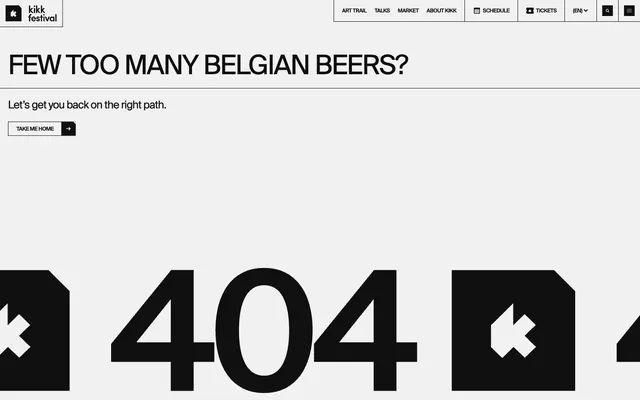
Kikk Festival employs a stark, high-contrast, monochrome visual system, built around a utilitarian aesthetic and robust typography. The primary canvas is a pale gray, providing a subtle backdrop for the dominant black elements. Visual hierarchy is achieved through scale and weight in typography, rather than color, creating a direct and assertive communication style. Interactivity is signaled through subtle background changes and prominent borders, reinforcing the system's structured and functional character.
The page maintains a centered, maximal-width content area rather than full-bleed. The hero section presents very large, impactful typography as the primary visual element. Content is arranged in stacked blocks with significant vertical separation, indicated by clear section gaps. Distinct horizontal dividers in black reinforce structural breaks. Navigation is a minimalist top bar with ghost utility links and discrete bordered buttons, emphasizing clear boundaries over seamless flow.
The site's visual language for imagery is minimal and functional, featuring dark, distinct icons or symbolic graphics rather than photography or detailed illustrations. Icons are solid-filled or outlined in black, with sharp, geometric forms. The large '404' graphic appears to be a distorted, monumental typographic element rather than a traditional image, reinforcing a strong, graphic-design-led aesthetic. Imagery serves a purely indicative or decorative function, always adhering to the monochrome palette and angular style, never for atmosphere or detailed content explanation. Density is image-sparse, prioritizing text and structural elements.
Reminiscent of AIGA, Gropius House, The Next Web (older designs).
# Kikk Festival — Style Reference
> monochrome industrial blueprint

**Theme:** light

**Site:** https://www.kikk.be/2021

Kikk Festival employs a stark, high-contrast, monochrome visual system, built around a utilitarian aesthetic and robust typography. The primary canvas is a pale gray, providing a subtle backdrop for the dominant black elements. Visual hierarchy is achieved through scale and weight in typography, rather than color, creating a direct and assertive communication style. Interactivity is signaled through subtle background changes and prominent borders, reinforcing the system's structured and functional character.

## Tokens — Colors

| Name | Value | Token | Role |
|------|------|------|------|
| Canvas Fog | `#f1f1f1` | `--color-canvas-fog` | Page backgrounds, button backgrounds |
| Midnight Ink | `#101010` | `--color-midnight-ink` | Primary text, borders, default icon fills |
| Deep Black | `#000000` | `--color-deep-black` | Stronger text emphasis, specific icon fills, button text |
| Medium Gray | `#aeaeae` | `--color-medium-gray` | Subtle secondary text or inactive elements |

## Tokens — Typography

### Suisse Int'l
- **Substitute:** Inter
- **Weights:** 400, 600
- **Sizes:** 12px, 24px, 60px, 375px
- **Line height:** 0.7, 0.8, 0.9, 1.1, 1.3
- **Letter spacing:** -0.0400em
- **Role:** All textual elements from headings to body text and interactive elements. Its wide range of weights and sizes, combined with consistent negative letter-spacing, creates a cohesive and impactful typographic hierarchy, lending a strong, technical voice.

## Tokens — Type Scale

| Role | Size | Line height | Letter spacing |
|------|------|------|------|
| caption | 12px | 1.3 | -0.48px |
| body | 24px | 1.1 | -0.96px |
| heading | 60px | 0.9 | -2.4px |
| display | 375px | 0.7 | -15px |

## Tokens — Spacing

- **Section gap:** 24px
- **Card padding:** 18px
- **Element gap:** 18px

## Tokens — Radius

- **all:** 0px

## Layout

The page maintains a centered, maximal-width content area rather than full-bleed. The hero section presents very large, impactful typography as the primary visual element. Content is arranged in stacked blocks with significant vertical separation, indicated by clear section gaps. Distinct horizontal dividers in black reinforce structural breaks. Navigation is a minimalist top bar with ghost utility links and discrete bordered buttons, emphasizing clear boundaries over seamless flow.

## Imagery

The site's visual language for imagery is minimal and functional, featuring dark, distinct icons or symbolic graphics rather than photography or detailed illustrations. Icons are solid-filled or outlined in black, with sharp, geometric forms. The large '404' graphic appears to be a distorted, monumental typographic element rather than a traditional image, reinforcing a strong, graphic-design-led aesthetic. Imagery serves a purely indicative or decorative function, always adhering to the monochrome palette and angular style, never for atmosphere or detailed content explanation. Density is image-sparse, prioritizing text and structural elements.

## Components

### Outline Nav Link
*Header navigation items*

Text link with Deep Black text on Canvas Fog background. Features a 1px Deep Black border on hover or active states. Padding is 0px top/bottom and 18px left/right. Zero border-radius for a sharp, angular look.

### Ghost Button
*Primary Call-to-action*

A ghost button for actions, featuring Deep Black text on a transparent background with a 1px Deep Black border. Zero border-radius, with 12px top/bottom and 12px left/right padding. The background changes to Canvas Fog on hover.

### Navigation Button
*Utility navigation items or dropdown triggers*

Minimal button with 0px padding and a 0px border-radius. Uses Deep Black for text and a transparent background. Often seen with specific icons.

### Filled Basic Button
*Secondary action button for internal navigation.*

Filled button with Canvas Fog background and Midnight Ink text. Features a 1px Midnight Ink border and 0px border-radius. Padding is 12px top/bottom and 12px left/right.

## Guidelines

### Do

- Always use 'Suisse Int'l' or its substitute for all text, adhering strictly to the defined weights and sizes for typographic hierarchy.
- Maintain a monochrome palette: use Canvas Fog (#f1f1f1) for primary backgrounds and Midnight Ink (#101010) or Deep Black (#000000) for text and strong accents.
- Apply a global border-radius of 0px to all interactive elements and containers to reinforce the angular, industrial aesthetic.
- Utilize 1px borders in Midnight Ink (#101010) or Deep Black (#000000) for interactive states and structural divisions.
- Employ consistent letter-spacing of -0.0400em for all text, regardless of size, for a tight, controlled typographic appearance.
- Structure layout with strict vertical rhythm using 24px section gaps and 18px element gaps, without exception.
- Signal interactivity through background color changes from transparent to Canvas Fog (#f1f1f1) on hover for ghost elements, rather than chromatic alterations.

### Don't

- Do not introduce vibrant accent colors; the design relies on a strictly achromatic palette.
- Avoid rounded corners; all elements should maintain sharp, 0px corner radii.
- Do not use box shadows or other elevation effects; all surfaces are flat and defined by borders.
- Never vary letter-spacing based on text size; the consistent narrow tracking is a core identity feature.
- Do not use generic system fonts; 'Suisse Int'l' is critical to the brand's typographic voice.
- Avoid soft or subtle borders; structural elements and interactive states demand distinct 1px black borders.
- Do not rely on subtle changes in neutral hues for hierarchy; instead, use explicit borders, text weight, and text scale.

## Agent Prompt Guide

Quick Color Reference:
text: #101010
background: #f1f1f1
border: #101010
accent: #101010
primary action: no distinct CTA color

Example Component Prompts:
1. Create a primary page heading: 'FEW TOO MANY BELGIAN BEERS?', Suisse Int'l bold (weight 600) at 60px size, line height 0.9, letter spacing -2.4px, text color Midnight Ink (#101010).
2. Create a ghost button labeled 'TAKE ME HOME': Suisse Int'l regular (weight 400) at 12px size, line height 1.3, letter spacing -0.48px, text color Deep Black (#000000), transparent background, 1px solid Deep Black (#000000) border, 0px border-radius, 12px top/bottom padding, 12px left/right padding.
3. Create a navigation link: 'ART TRAIL', Suisse Int'l regular (weight 400) at 12px size, line height 1.3, letter spacing -0.48px, text color Midnight Ink (#101010), transparent background, 0px padding.
More like this









Keep what you find
A free account saves references to boards and can send you a weekly email of picks based on what you save.
To see every result, go Pro.