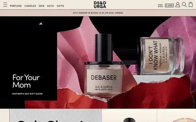
Preview image. Unlock full-res
curated gallery, artisanal display
Color palette
Page backgrounds, card surfaces, ghost button backgrounds — a warm, light neutral creating a natural paper-like base
Primary text, headings, strong borders, icons, interactive elements — providing high contrast and graphic boldness against light surfaces
Typography
- Weights
- 400, 600, 800
- Sizes
- 12px, 14px, 16px, 18px, 30px, 60px, 120px
- Line height
- 0.83, 0.92, 1.17, 1.22, 1.25, 1.27, 1.43
- Letter spacing
- 0.6, 0.7, 0.8, 0.9, -1.5, -3, -6
- Fallback
- Montserrat
All textual content, from navigation to product titles. The varied weights and precise letter-spacing create distinct hierarchies and give a modern, authoritative tone. Tighter tracking for larger sizes enhances the impact of display text.
Spacing & shape
Components
Background #f2e9de, text #000000. Features sharp 0px border-radius, with padding applied for text legibility, typically 5px or 7px horizontal.
Transparent background, text #000000. Sharp 0px border-radius. Minimal padding, usually 5px or 7px horizontal.
Text in #000000. Active states may involve bolding or underlining. Letter spacing is visually significant, particularly for main navigation elements at similar sizes.
Transparent background with 0px border-radius. Text in #000000. Features significant horizontal padding (20px) but no explicit vertical padding from the raw data, implying tight vertical integration.
Small text size (e.g., 12px Sofia Pro), #000000 text on a #f2e9de background. Tightly packed without additional padding to maximize screen real estate.
Implied by overall page structure—a clear rectangular area with #f2e9de background. Text is #000000. Uses a 0px border radius and often has strong top and bottom borders (1px #000000) for visual separation.
Guidelines
- Use #f2e9de as the dominant background color for all main sections and UI surfaces.
- Apply #000000 for all primary text, headings, graphical elements, and interface borders to ensure crisp contrast.
- Maintain a strict 0px border-radius for all UI components, including buttons, cards, and input fields.
- Prioritize Sofia Pro (or Montserrat) for all typography, employing different weights to establish hierarchy rather than color changes.
- Utilize 1px solid #000000 borders for clear visual separation of content blocks and interactive elements.
- Ensure letter-spacing is applied as specified for Sofia Pro to maintain its distinctive character, particularly tighter tracking for larger display text.
- Use a minimum 10px element gap for close-related items and 50px for distinct section breaks, reflecting the compact density.
- Do not introduce any additional background colors beyond #f2e9de for canvas/surface roles.
- Avoid using any rounded corners or soft edges on any UI elements; enforce the 0px radius.
- Refrain from introducing any color into typography for semantic meaning or emphasis; rely solely on weight and size.
- Do not add drop shadows or complex elevation effects; the design emphasizes flat surfaces and strong borders.
- Avoid decorative gradients; surfaces should remain solid color blocks.
- Do not deviate from the specified letter-spacing for Sofia Pro; imprecise tracking will alter the brand's typographic tone.
- Do not introduce inconsistent padding values; adhere to the 5px, 7px, and 20px patterns derived for interactive elements.
About this system
ShowHide
D.S. & DURGA presents a meticulously crafted aesthetic resembling a gallery display for luxury artisanal products. The design emphasizes stark contrasts with a largely achromatic palette, combining a warm off-white canvas with sharp black typography and deliberate image boundaries. Typography is bold and communicative, used as a primary design element for product showcasing and narrative. The overall impression is one of curated elegance and understated theatricality.
The page structure is full-bleed, with content expanding to the edges of the viewport horizontally but organized into distinct sections vertically. The hero section often features a dominant, atmospheric image or product shot with centered, large-format text. Content sections alternate between visually strong media blocks and typography-driven informational panels, frequently using 2-column layouts that can reverse. A strong vertical rhythm is established by consistently sized vertical dividers (1px solid #000000) or pronounced section breaks. Navigation features a sticky top bar with minimal links and iconic interactive elements. The layout feels dense but intentionally sparse around key product visuals.
This design system uses a combination of product photography and stylized, conceptual imagery. Photography features tight crops of products on clean, often dark, backgrounds, emphasizing texture and form. Lifestyle imagery uses high-contrast, often black-and-white or desaturated palettes, with unexpected, artistic compositions (e.g., scissors, water glass) that serve as decorative atmosphere rather than direct product showcasing. Imagery is often full-bleed or large blocks, integrated seamlessly into the grid, with sharp, unmasked edges. Icons are outlined, fine-stroke, and monochrome, reinforcing the graphic, minimalist aesthetic. The overall density of imagery is high, often used to create impactful visual sections.
Reminiscent of Aesop, Byredo, Le Labo, Frama.
# D.S. & DURGA — Style Reference
> curated gallery, artisanal display

**Theme:** light

**Site:** https://www.dsanddurga.com

D.S. & DURGA presents a meticulously crafted aesthetic resembling a gallery display for luxury artisanal products. The design emphasizes stark contrasts with a largely achromatic palette, combining a warm off-white canvas with sharp black typography and deliberate image boundaries. Typography is bold and communicative, used as a primary design element for product showcasing and narrative. The overall impression is one of curated elegance and understated theatricality.

## Tokens — Colors

| Name | Value | Token | Role |
|------|------|------|------|
| Canvas Parchment | `#f2e9de` | `--color-canvas-parchment` | Page backgrounds, card surfaces, ghost button backgrounds — a warm, light neutral creating a natural paper-like base |
| Midnight Ink | `#000000` | `--color-midnight-ink` | Primary text, headings, strong borders, icons, interactive elements — providing high contrast and graphic boldness against light surfaces |

## Tokens — Typography

### Sofia Pro
- **Substitute:** Montserrat
- **Weights:** 400, 600, 800
- **Sizes:** 12px, 14px, 16px, 18px, 30px, 60px, 120px
- **Line height:** 0.83, 0.92, 1.17, 1.22, 1.25, 1.27, 1.43
- **Letter spacing:** 0.6, 0.7, 0.8, 0.9, -1.5, -3, -6
- **Role:** All textual content, from navigation to product titles. The varied weights and precise letter-spacing create distinct hierarchies and give a modern, authoritative tone. Tighter tracking for larger sizes enhances the impact of display text.

## Tokens — Type Scale

Perfect Fifth (1.5) from 16px base.

| Role | Size | Line height | Letter spacing |
|------|------|------|------|
| caption | 12px | 1.43 | 0.6px |
| body-sm | 14px | 1.27 | 0.7px |
| body | 16px | 1.25 | 0.8px |
| subheading | 18px | 1.22 | 0.9px |
| heading | 30px | 1.17 | -1.5px |
| heading-lg | 60px | 0.92 | -3px |
| display | 120px | 0.83 | -6px |

## Tokens — Spacing

- **Section gap:** 50px
- **Card padding:** 20px
- **Element gap:** 10px

## Tokens — Radius

- **all:** 0px

## Layout

The page structure is full-bleed, with content expanding to the edges of the viewport horizontally but organized into distinct sections vertically. The hero section often features a dominant, atmospheric image or product shot with centered, large-format text. Content sections alternate between visually strong media blocks and typography-driven informational panels, frequently using 2-column layouts that can reverse. A strong vertical rhythm is established by consistently sized vertical dividers (1px solid #000000) or pronounced section breaks. Navigation features a sticky top bar with minimal links and iconic interactive elements. The layout feels dense but intentionally sparse around key product visuals.

## Imagery

This design system uses a combination of product photography and stylized, conceptual imagery. Photography features tight crops of products on clean, often dark, backgrounds, emphasizing texture and form. Lifestyle imagery uses high-contrast, often black-and-white or desaturated palettes, with unexpected, artistic compositions (e.g., scissors, water glass) that serve as decorative atmosphere rather than direct product showcasing. Imagery is often full-bleed or large blocks, integrated seamlessly into the grid, with sharp, unmasked edges. Icons are outlined, fine-stroke, and monochrome, reinforcing the graphic, minimalist aesthetic. The overall density of imagery is high, often used to create impactful visual sections.

## Components

### Text Button - Canvas Background
*Standard button for actions and navigation, with a subtle background.*

Background #f2e9de, text #000000. Features sharp 0px border-radius, with padding applied for text legibility, typically 5px or 7px horizontal.

### Ghost Button - Transparent
*Secondary action or link, blending into the background.*

Transparent background, text #000000. Sharp 0px border-radius. Minimal padding, usually 5px or 7px horizontal.

### Navigation Link
*Primary navigation items in the header and footer.*

Text in #000000. Active states may involve bolding or underlining. Letter spacing is visually significant, particularly for main navigation elements at similar sizes.

### Product Input Field
*Single-line text input for search or forms.*

Transparent background with 0px border-radius. Text in #000000. Features significant horizontal padding (20px) but no explicit vertical padding from the raw data, implying tight vertical integration.

### Information Banner
*Promotional or notification banner, often for shipping or offers.*

Small text size (e.g., 12px Sofia Pro), #000000 text on a #f2e9de background. Tightly packed without additional padding to maximize screen real estate.

### Feature Card (implicitly defined)
*Used for displaying product categories or featured items.*

Implied by overall page structure—a clear rectangular area with #f2e9de background. Text is #000000. Uses a 0px border radius and often has strong top and bottom borders (1px #000000) for visual separation.

## Guidelines

### Do

- Use #f2e9de as the dominant background color for all main sections and UI surfaces.
- Apply #000000 for all primary text, headings, graphical elements, and interface borders to ensure crisp contrast.
- Maintain a strict 0px border-radius for all UI components, including buttons, cards, and input fields.
- Prioritize Sofia Pro (or Montserrat) for all typography, employing different weights to establish hierarchy rather than color changes.
- Utilize 1px solid #000000 borders for clear visual separation of content blocks and interactive elements.
- Ensure letter-spacing is applied as specified for Sofia Pro to maintain its distinctive character, particularly tighter tracking for larger display text.
- Use a minimum 10px element gap for close-related items and 50px for distinct section breaks, reflecting the compact density.

### Don't

- Do not introduce any additional background colors beyond #f2e9de for canvas/surface roles.
- Avoid using any rounded corners or soft edges on any UI elements; enforce the 0px radius.
- Refrain from introducing any color into typography for semantic meaning or emphasis; rely solely on weight and size.
- Do not add drop shadows or complex elevation effects; the design emphasizes flat surfaces and strong borders.
- Avoid decorative gradients; surfaces should remain solid color blocks.
- Do not deviate from the specified letter-spacing for Sofia Pro; imprecise tracking will alter the brand's typographic tone.
- Do not introduce inconsistent padding values; adhere to the 5px, 7px, and 20px patterns derived for interactive elements.

## Agent Prompt Guide

Quick Color Reference:
text: #000000
background: #f2e9de
border: #000000
accent: no distinct accent color
primary action: no distinct CTA color

Example Component Prompts:
1. Create a primary navigation item: text 'Gifts' using Sofia Pro weight 400, size 16px, line-height 1.25, letter-spacing 0.8px, color #000000.
No distinct primary action color was observed; use the extracted neutral button treatments instead of inventing a filled CTA color.
3. Create a functional ghost button: Background transparent, border 1px solid #000000, text 'Take the sniff quiz' Sofia Pro weight 400, size 16px, line-height 1.25, letter-spacing 0.8px, color #000000, radius 0px, horizontal padding 7px.
4. Create a product feature header: 'CULT-FAVORITES' using Sofia Pro weight 600, size 30px, line-height 1.17, letter-spacing -1.5px, color #000000.
More like this









Keep what you find
A free account saves references to boards and can send you a weekly email of picks based on what you save.
To see every result, go Pro.