Preview image. Unlock full-res
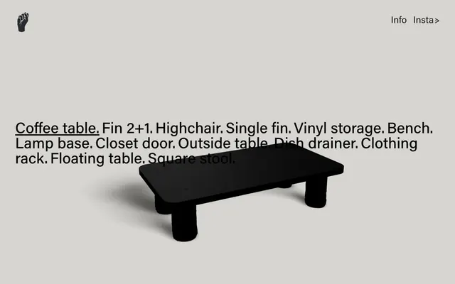
industrial rawness, refined quiet: a cool grey canvas for stark matte black forms and unadorned typography.
Color palette
Page background, primary surface for product display — a cool, neutral base that makes products pop without distraction
Dark borders and separators for elevated surfaces and inverted UI. Do not promote it to the primary CTA color
Typography
- Weights
- 400
- Sizes
- 16px, 30px, 48px
- Line height
- 1, 1.5
- Letter spacing
- normal
- Fallback
- system-ui
All textual content, from body text to headlines and navigation elements, in a consistent, functional weight. Its directness supports the raw, unadorned aesthetic.
Spacing & shape
Components
Matte Black (#000000) text at 48px, acumin-pro weight 400, underlined with a 1px Matte Black (#000000) border, typically in a stacked list.
Matte Black (#000000) text at 16px, acumin-pro weight 400. Not underlined by default, but an interactive state or on-hover might introduce an underline.
An icon rendered in Matte Black (#000000) against the Canvas Grey (#f2f2f2) background, sized to afford quick recognition without dominating the header.
Guidelines
- Prioritize Canvas Grey (#f2f2f2) for backgrounds, providing a clean, cool, and neutral base for all content.
- Use Matte Black (#000000) exclusively for all text, icons, and interactive strokes to maintain stark contrast and visual consistency.
- Present typography unadorned; use acumin-pro (system-ui fallback) at weight 400 across all text roles.
- Maintain generous spacing with an element gap of 20px and section gaps of 60px to ensure visual calm and focus on individual items.
- Ensure interactive text elements, like product titles, are underlined in Matte Black (#000000) to clearly indicate their link status.
- Use a max content width of 1440px, centering all content to provide a focused viewing experience.
- Avoid decorative elements, additional colors, or complex gradients that would detract from the industrial presentation.
- Do not introduce multiple font weights or styles that could disrupt the uniform and functional typographic system.
- Refrain from using strong shadows or heavy borders, as this would contradict the light, raw aesthetic.
- Do not clutter the layout; elements should appear spacious and largely isolated in their presentation.
- Avoid photographic imagery; instead, rely on isolated product renders or clean, symbolic icons.
- Do not use animation other than very subtle transitions if absolutely necessary; the design is static and focused.
About this system
ShowHide
Souss Furniture embodies a minimalist, industrial aesthetic with a muted color palette serving as a stark backdrop for product forms. Typography is direct and unstyled, primarily focusing on conveying product names and essential navigation. The system emphasizes clear object presentation over decorative flair, with most visual weight coming from the products themselves and strong text contrasts. Layouts are spacious, allowing elements to breathe, reflecting a gallery-like presentation of individual pieces.
The page adheres to a max-width contained layout, centering content within a 1440px wide frame. The hero section is characterized by a centered, large-scale product image with minimal surrounding text, creating a strong focal point. Content is arranged predominantly in a single-column, stacked format, with product titles listed sequentially. The rhythm is open and spacious, with generous vertical spacing between text blocks and images, making each element feel distinct and important. Navigation is a minimalist top bar with links aligned to the top-right, while a simple logo resides in the top-left, reinforcing a gallery-like, un-cluttered presentation.
The site primarily features 3D product renders set against a plain, light background. These renders showcase the physical form of furniture pieces with realistic shadows but without environmental context or lifestyle photography. The focus is entirely on the object itself, treated as a sculptural form. Icons are simple, outlined, and monochromatic, like the hand icon in the header, serving a purely functional rather than decorative role. The imagery is content-specific, acting as a direct product showcase rather than atmospheric decoration.
Reminiscent of Figma, Case Furniture, Dieter Rams' work (Braun).
# Souss Furniture — Style Reference
> industrial rawness, refined quiet: a cool grey canvas for stark matte black forms and unadorned typography.

**Theme:** light

**Site:** https://soussfurniture.com

Souss Furniture embodies a minimalist, industrial aesthetic with a muted color palette serving as a stark backdrop for product forms. Typography is direct and unstyled, primarily focusing on conveying product names and essential navigation. The system emphasizes clear object presentation over decorative flair, with most visual weight coming from the products themselves and strong text contrasts. Layouts are spacious, allowing elements to breathe, reflecting a gallery-like presentation of individual pieces.

## Tokens — Colors

| Name | Value | Token | Role |
|------|------|------|------|
| Canvas Grey | `#f2f2f2` | `--color-canvas-grey` | Page background, primary surface for product display — a cool, neutral base that makes products pop without distraction |
| Matte Black | `#000000` | `--color-matte-black` | Dark borders and separators for elevated surfaces and inverted UI. Do not promote it to the primary CTA color |

## Tokens — Typography

### acumin-pro
- **Substitute:** system-ui
- **Weights:** 400
- **Sizes:** 16px, 30px, 48px
- **Line height:** 1, 1.5
- **Letter spacing:** normal
- **Role:** All textual content, from body text to headlines and navigation elements, in a consistent, functional weight. Its directness supports the raw, unadorned aesthetic.

## Tokens — Type Scale

| Role | Size | Line height | Letter spacing |
|------|------|------|------|
| body-sm | 16px | 1.5 | — |
| body | 30px | 1.5 | — |
| heading | 48px | 1 | — |

## Tokens — Spacing

- **Max width:** 1440px
- **Section gap:** 60px
- **Card padding:** 16px
- **Element gap:** 20px

## Tokens — Radius

- **none:** 0px

## Layout

The page adheres to a max-width contained layout, centering content within a 1440px wide frame. The hero section is characterized by a centered, large-scale product image with minimal surrounding text, creating a strong focal point. Content is arranged predominantly in a single-column, stacked format, with product titles listed sequentially. The rhythm is open and spacious, with generous vertical spacing between text blocks and images, making each element feel distinct and important. Navigation is a minimalist top bar with links aligned to the top-right, while a simple logo resides in the top-left, reinforcing a gallery-like, un-cluttered presentation.

## Imagery

The site primarily features 3D product renders set against a plain, light background. These renders showcase the physical form of furniture pieces with realistic shadows but without environmental context or lifestyle photography. The focus is entirely on the object itself, treated as a sculptural form. Icons are simple, outlined, and monochromatic, like the hand icon in the header, serving a purely functional rather than decorative role. The imagery is content-specific, acting as a direct product showcase rather than atmospheric decoration.

## Components

### Product Title Link
*Interactive text for product names*

Matte Black (#000000) text at 48px, acumin-pro weight 400, underlined with a 1px Matte Black (#000000) border, typically in a stacked list.

### Header Navigation Link
*Top-right navigation items*

Matte Black (#000000) text at 16px, acumin-pro weight 400. Not underlined by default, but an interactive state or on-hover might introduce an underline.

### Logo Icon
*Site identifier in the top-left*

An icon rendered in Matte Black (#000000) against the Canvas Grey (#f2f2f2) background, sized to afford quick recognition without dominating the header.

## Guidelines

### Do

- Prioritize Canvas Grey (#f2f2f2) for backgrounds, providing a clean, cool, and neutral base for all content.
- Use Matte Black (#000000) exclusively for all text, icons, and interactive strokes to maintain stark contrast and visual consistency.
- Present typography unadorned; use acumin-pro (system-ui fallback) at weight 400 across all text roles.
- Maintain generous spacing with an element gap of 20px and section gaps of 60px to ensure visual calm and focus on individual items.
- Ensure interactive text elements, like product titles, are underlined in Matte Black (#000000) to clearly indicate their link status.
- Use a max content width of 1440px, centering all content to provide a focused viewing experience.

### Don't

- Avoid decorative elements, additional colors, or complex gradients that would detract from the industrial presentation.
- Do not introduce multiple font weights or styles that could disrupt the uniform and functional typographic system.
- Refrain from using strong shadows or heavy borders, as this would contradict the light, raw aesthetic.
- Do not clutter the layout; elements should appear spacious and largely isolated in their presentation.
- Avoid photographic imagery; instead, rely on isolated product renders or clean, symbolic icons.
- Do not use animation other than very subtle transitions if absolutely necessary; the design is static and focused.

## Agent Prompt Guide

Quick Color Reference:
text: #000000
background: #f2f2f2
border: #000000
accent: no distinct accent color
primary action: no distinct CTA color

Example Component Prompts:
Create a header with a logo icon on the left (Matte Black #000000) and two navigation links 'Info' and 'Insta>' on the right, all using acumin-pro weight 400 at 16px, text color Matte Black (#000000) on a Canvas Grey (#f2f2f2) background.
Create a product listing title: 'Coffee table.' using acumin-pro weight 400, 48px size, Matte Black (#000000) text color, with a 1px Matte Black (#000000) underline, on a Canvas Grey (#f2f2f2) background.
Create a list item for a product description, like 'Fin 2+1.' using acumin-pro weight 400, 30px size, Matte Black (#000000) text color, on a Canvas Grey (#f2f2f2) background with 20px vertical spacing between items.
More like this









Keep what you find
A free account saves references to boards and can send you a weekly email of picks based on what you save.
To see every result, go Pro.