Preview image. Unlock full-res
Whimsical Botanical Canvas
Color palette
Primary action button background, accented headings, link accents, decorative elements — a warm, vivid contrast to the muted palette
Decorative illustration fill and stroke
Decorative illustration fill and stroke
Decorative illustration fill and stroke
Decorative illustration stroke and fill
Decorative illustration stroke
Decorative illustration fill and stroke
Decorative illustration fill and stroke
Decorative illustration fill
Page background, primary surface for sections
Card backgrounds, input fields, navigation hover states
Primary text, headings, input text, borders, navigation links
Decorative illustration fill, icons
Typography
- Weights
- 100, 400, 500
- Sizes
- 24px, 28px, 32px, 48px, 120px
- Line height
- 0.85, 1, 1.2, 1.3, 1.4, 1.6, 2
- Letter spacing
- normal
- Fallback
- serif
Primary headings and display text, lending a refined, editorial feel. The range of weights and ample line-height for larger sizes allows for expressive yet legible headlines.
- Weights
- 300, 400, 500
- Sizes
- 12px, 16px, 20px, 24px, 36px, 48px
- Line height
- 1.2, 1.4, 1.6, 2
- Letter spacing
- 0.2000em
- Fallback
- sans-serif
Body text, links, smaller headings, navigation items, and button text. Its subtle letter-spacing provides an open, airy feel, enhancing readability for longer passages.
Spacing & shape
Components
A filled button with 'Sunset Blush' background, 'Paper White' text, 0px border-radius, and generous horizontal padding. text-transform is uppercase and letter spacing is wide, indicating an active control and creating a playful contrast against the classic headline font.
Transparent background with 10px horizontal padding. Borders and shadow are absent, allowing content to float on the 'Canvas Petal' background. Used for quiz items and secondary informational blocks.
'Paper White' background with 0px border-radius, no shadow, and generous internal padding (40px left, 20px right, 60px bottom). Used for prominent content sections like 'Fun Facts'.
'Paper White' background, 'Midnight Ink' text color and border. Padding is 20px on all sides, with 0px border-radius. Font is calibre regular at 20px, ensuring clear input.
calibre font, Midnight Ink text color, 0px border-radius. On hover, the link shows a subtle underline. It is designed to be lightweight and textual, integrating seamlessly with the page header.
Guidelines
- Prioritize 'Canvas Petal' (#fef1ec) as the default page background for all new sections, fostering an airy, consistent base.
- Use 'Midnight Ink' (#11223f) for all body text, headings, and primary UI elements to ensure high contrast and readability.
- Employ 'Sunset Blush' (#ff5734) exclusively for primary action buttons or significant accent elements, ensuring it stands out as a focal point.
- Apply calibre with 0.2000em letter-spacing for all navigation, body text, and button labels to maintain an open and readable tone.
- Implement 0px border-radius for all cards and interactive elements, favoring a sharp, clean edge over rounded corners.
- Utilize 'Paper White' (#ffffff) for card and input backgrounds, providing a lighter surface against the primary canvas.
- Maintain a clear visual hierarchy by using Canela Web for all headlines and display text, allowing calibre for supporting content.
- Do not use highly saturated colors other than 'Sunset Blush' (#ff5734) for functional UI elements; other vivid colors are reserved for illustrations.
- Avoid applying drop shadows or strong elevation to components; maintain a flat, layered aesthetic as seen on cards.
- Do not introduce new decorative elements or illustrations without first referencing the existing color palette of greens, yellows, and oranges.
- Refrain from using bold or heavy weights for primary body text; calibre weights 300-400 are preferred for most text content.
- Do not vary the border-radius of interactive elements; all buttons and cards should adhere to a 0px radius where applicable.
- Avoid tight letter-spacing for calibre font; ensure a consistent 0.2000em tracking to preserve its signature open feel.
- Do not use generic system fonts; always specify 'Canela Web' for headlines and 'calibre' for body text and interactive elements.
About this system
ShowHide
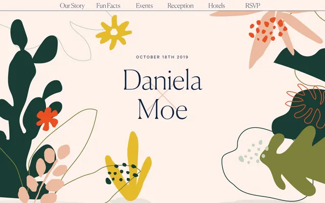
Daniela and Moe embodies a whimsical, botanical garden aesthetic with a light, airy canvas and expressive organic illustrations. Typography balances classic elegance with contemporary readability. The color palette is driven by natural, muted tones with a singular bold accent orange that brings vitality to interactive elements and key details. Components are visually light, often appearing as ghost elements or subtly differentiated surfaces, ensuring the lush imagery takes center stage.
The page primarily uses a full-bleed layout, particularly for hero sections, allowing the botanical illustrations to extend to the edges. Content sections tend to be centered, but with no fixed `pageMaxWidth`, they adapt to viewport width. The hero features a large, centered headline over an illustrative background. Subsequent sections follow a consistent vertical rhythm with 'Canvas Petal' backgrounds. Content arrangement often utilizes a multi-column grid, particularly for displaying 'Fun Facts' cards, which are organized in a 4-column layout. Navigation is a simple, sticky top bar with centered text links. The overall density is comfortable, ensuring ample negative space around content blocks.
The site features abstract, organic botanical illustrations as the primary visual element, characterized by flat, filled shapes with occasional outlines. Colors within these illustrations leverage a diverse, muted palette of greens, yellows, corals, and subtle grays. These graphics are largely decorative and atmospheric, forming a lush, full-bleed backdrop in hero sections and serving as contained accents within content blocks. They create a consistent visual theme of a whimsical, natural garden. Icons, where present, are line-drawn with a delicate stroke weight and often adopt the 'Sunset Blush' accent color, serving explanatory roles without overwhelming the design.
Reminiscent of Paperless Post, Minted, Greenvelope.
# Daniela and Moe Wedding 2019 — Style Reference
> Whimsical Botanical Canvas

**Theme:** light

**Site:** https://danielaandmoe.com

Daniela and Moe embodies a whimsical, botanical garden aesthetic with a light, airy canvas and expressive organic illustrations. Typography balances classic elegance with contemporary readability. The color palette is driven by natural, muted tones with a singular bold accent orange that brings vitality to interactive elements and key details. Components are visually light, often appearing as ghost elements or subtly differentiated surfaces, ensuring the lush imagery takes center stage.

## Tokens — Colors

| Name | Value | Token | Role |
|------|------|------|------|
| Sunset Blush | `#ff5734` | `--color-sunset-blush` | Primary action button background, accented headings, link accents, decorative elements — a warm, vivid contrast to the muted palette |
| Mossy Green | `#7e813c` | `--color-mossy-green` | Decorative illustration fill and stroke |
| Deep Forest | `#193c35` | `--color-deep-forest` | Decorative illustration fill and stroke |
| Coral Haze | `#f6bba4` | `--color-coral-haze` | Decorative illustration fill and stroke |
| Dusty Sage | `#c6d7d0` | `--color-dusty-sage` | Decorative illustration stroke and fill |
| Azure Whisper | `#092a49` | `--color-azure-whisper` | Decorative illustration stroke |
| Sunbeam Gold | `#e5ba2b` | `--color-sunbeam-gold` | Decorative illustration fill and stroke |
| Crimson Bloom | `#ec4f22` | `--color-crimson-bloom` | Decorative illustration fill and stroke |
| Dark Fern | `#003322` | `--color-dark-fern` | Decorative illustration fill |
| Canvas Petal | `#fef1ec` | `--color-canvas-petal` | Page background, primary surface for sections |
| Paper White | `#ffffff` | `--color-paper-white` | Card backgrounds, input fields, navigation hover states |
| Midnight Ink | `#11223f` | `--color-midnight-ink` | Primary text, headings, input text, borders, navigation links |
| Shadow | `#000000` | `--color-shadow` | Decorative illustration fill, icons |

## Tokens — Typography

### Canela Web
- **Substitute:** serif
- **Weights:** 100, 400, 500
- **Sizes:** 24px, 28px, 32px, 48px, 120px
- **Line height:** 0.85, 1, 1.2, 1.3, 1.4, 1.6, 2
- **Letter spacing:** normal
- **Role:** Primary headings and display text, lending a refined, editorial feel. The range of weights and ample line-height for larger sizes allows for expressive yet legible headlines.

### calibre
- **Substitute:** sans-serif
- **Weights:** 300, 400, 500
- **Sizes:** 12px, 16px, 20px, 24px, 36px, 48px
- **Line height:** 1.2, 1.4, 1.6, 2
- **Letter spacing:** 0.2000em
- **Role:** Body text, links, smaller headings, navigation items, and button text. Its subtle letter-spacing provides an open, airy feel, enhancing readability for longer passages.

## Tokens — Type Scale

Golden Ratio (1.618) from 16px base.

| Role | Size | Line height | Letter spacing |
|------|------|------|------|
| caption | 12px | 1.4 | 2.4px |
| body | 16px | 1.4 | 3.2px |
| subheading | 24px | 1.2 | 4.8px |
| heading | 32px | 1.2 | — |
| heading-lg | 48px | 1 | 9.6px |
| display | 120px | 0.85 | — |

## Tokens — Spacing

- **Section gap:** 32px
- **Card padding:** 20px
- **Element gap:** 20px

## Tokens — Radius

- **Buttons:** 0px
- **Cards:** 0px
- **other:** 200px

## Layout

The page primarily uses a full-bleed layout, particularly for hero sections, allowing the botanical illustrations to extend to the edges. Content sections tend to be centered, but with no fixed `pageMaxWidth`, they adapt to viewport width. The hero features a large, centered headline over an illustrative background. Subsequent sections follow a consistent vertical rhythm with 'Canvas Petal' backgrounds. Content arrangement often utilizes a multi-column grid, particularly for displaying 'Fun Facts' cards, which are organized in a 4-column layout. Navigation is a simple, sticky top bar with centered text links. The overall density is comfortable, ensuring ample negative space around content blocks.

## Imagery

The site features abstract, organic botanical illustrations as the primary visual element, characterized by flat, filled shapes with occasional outlines. Colors within these illustrations leverage a diverse, muted palette of greens, yellows, corals, and subtle grays. These graphics are largely decorative and atmospheric, forming a lush, full-bleed backdrop in hero sections and serving as contained accents within content blocks. They create a consistent visual theme of a whimsical, natural garden. Icons, where present, are line-drawn with a delicate stroke weight and often adopt the 'Sunset Blush' accent color, serving explanatory roles without overwhelming the design.

## Components

### Primary Action Button
*Call to action button*

A filled button with 'Sunset Blush' background, 'Paper White' text, 0px border-radius, and generous horizontal padding. text-transform is uppercase and letter spacing is wide, indicating an active control and creating a playful contrast against the classic headline font.

### Transparent Content Card
*Content container for detailed information*

Transparent background with 10px horizontal padding. Borders and shadow are absent, allowing content to float on the 'Canvas Petal' background. Used for quiz items and secondary informational blocks.

### White Content Card
*Elevated content container*

'Paper White' background with 0px border-radius, no shadow, and generous internal padding (40px left, 20px right, 60px bottom). Used for prominent content sections like 'Fun Facts'.

### Text Input Field
*Form input element*

'Paper White' background, 'Midnight Ink' text color and border. Padding is 20px on all sides, with 0px border-radius. Font is calibre regular at 20px, ensuring clear input.

### Navigation Link
*Global navigation item*

calibre font, Midnight Ink text color, 0px border-radius. On hover, the link shows a subtle underline. It is designed to be lightweight and textual, integrating seamlessly with the page header.

## Guidelines

### Do

- Prioritize 'Canvas Petal' (#fef1ec) as the default page background for all new sections, fostering an airy, consistent base.
- Use 'Midnight Ink' (#11223f) for all body text, headings, and primary UI elements to ensure high contrast and readability.
- Employ 'Sunset Blush' (#ff5734) exclusively for primary action buttons or significant accent elements, ensuring it stands out as a focal point.
- Apply calibre with 0.2000em letter-spacing for all navigation, body text, and button labels to maintain an open and readable tone.
- Implement 0px border-radius for all cards and interactive elements, favoring a sharp, clean edge over rounded corners.
- Utilize 'Paper White' (#ffffff) for card and input backgrounds, providing a lighter surface against the primary canvas.
- Maintain a clear visual hierarchy by using Canela Web for all headlines and display text, allowing calibre for supporting content.

### Don't

- Do not use highly saturated colors other than 'Sunset Blush' (#ff5734) for functional UI elements; other vivid colors are reserved for illustrations.
- Avoid applying drop shadows or strong elevation to components; maintain a flat, layered aesthetic as seen on cards.
- Do not introduce new decorative elements or illustrations without first referencing the existing color palette of greens, yellows, and oranges.
- Refrain from using bold or heavy weights for primary body text; calibre weights 300-400 are preferred for most text content.
- Do not vary the border-radius of interactive elements; all buttons and cards should adhere to a 0px radius where applicable.
- Avoid tight letter-spacing for calibre font; ensure a consistent 0.2000em tracking to preserve its signature open feel.
- Do not use generic system fonts; always specify 'Canela Web' for headlines and 'calibre' for body text and interactive elements.

## Agent Prompt Guide

Quick Color Reference:
text: #11223f
background: #fef1ec
border: #11223f
accent: #ff5734
primary action: #ff5734 (filled action)

3-5 Example Component Prompts:
1. Create a Hero Section: 'Canvas Petal' background (#fef1ec), with a centered 'Daniela Moe' headline at 120px Canela Web weight 100, color 'Midnight Ink' (#11223f). Include an abstract botanical illustration using 'Mossy Green' (#7e813c), 'Coral Haze' (#f6bba4), and 'Sunbeam Gold' (#e5ba2b) as fills and strokes, positioned decoratively in the corners.
2. Create a 'Fun Fact' Card: 'Paper White' background (#ffffff), 0px border-radius, 10px horizontal padding, no shadow. Text should be calibre 16px, 'Midnight Ink' (#11223f). Place a line-drawn icon above the text, using 'Sunset Blush' (#ff5734) for its stroke.
3. Create a Primary Action Button: 'Sunset Blush' background (#ff5734), 'Paper White' text (#ffffff), 0px border-radius. Text should be calibre 16px weight 500, with 0.2000em letter-spacing. Padding should be 1px vertical and 6px horizontal.
4. Create a Text Input Field: 'Paper White' background (#ffffff), 20px padding all sides, 0px border-radius. Border is 1px solid 'Midnight Ink' (#11223f). Placeholder and input text should be calibre 20px 'Midnight Ink' (#11223f).
5. Create a Navigation Link: 'Midnight Ink' text (#11223f) with calibre 16px font. Underline on hover.
More like this









Keep what you find
A free account saves references to boards and can send you a weekly email of picks based on what you save.
To see every result, go Pro.