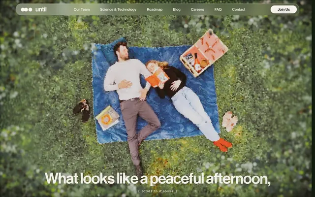
Preview image. Unlock full-res
Warm parchment, dark charcoal type
Color palette
Brand accent, highlighted text, subtle background fills for emphasis
Decorative hero background gradient
Hairline borders, dividers, input outlines, and card edges on light surfaces. Do not promote it to the primary CTA color
Primary text, borders, dark card backgrounds
Footer text, strong accents for outlines, primary text on white
Button backgrounds, elevated surfaces
Muted helper text, delicate dividers, inactive states
Typography
- Weights
- 400, 500
- Sizes
- 14px, 16px
- Line height
- 1, 1.43, 1.5
- Letter spacing
- -0.009, 0.01
- Fallback
- Inter
Body text, navigation, buttons, captions. Behaves as a highly legible Swiss grotesque, grounding the system with clarity.
- Weights
- 400, 500
- Sizes
- 16px, 24px, 32px, 39px, 56px, 69px
- Line height
- 0.9, 0.95, 1, 1.1, 1.5
- Letter spacing
- -0.01, -0.02, -0.021, -0.024, -0.025, -0.037
- Fallback
- Graphik
Headlines and prominent text. Noticeably tight letter-spacing at larger sizes (-0.037em at 69px) creates a sophisticated, almost artistic visual density, preventing sprawl.
- Weights
- 400, 500
- Sizes
- 12px, 14px
- Line height
- 1, 1.4, 1.5
- Letter spacing
- -0.0250em, 0.0500em
- Fallback
- JetBrains Mono
Small functional text, code snippets, metadata. Its monospaced nature offers a technical counterpoint to the sans-serifs, particularly with its slightly positive letter-spacing (`0.05em` at 12px) to enhance legibility at small sizes.
Spacing & shape
Elevation
Components
Background: rgba(0, 0, 0, 0) (transparent), text color: #f7f3ec (Parchment), border: none. On hover, a subtle interaction would likely appear, though not explicitly defined here.
Background: #121212 (Charcoal), text color: #ffffff (Snow), border-radius: 64px. Padding is implied by content, but the radius suggests a pill-like structure for all buttons.
Background: #ffffff (Snow), text color: #121212 (Charcoal), border-radius: 64px.
Background: #f7f3ec (Parchment), border-radius: 32px. Features a subtle, sophisticated inner and outer shadow: `rgba(255, 255, 255, 0.1) 0px -1px 2px 0px inset, rgba(255, 255, 255, 0.1) 0px 1px 2px 0px inset, rgba(0, 0, 0, 0.1) 0px 0px 2px 0px, rgba(0, 0, 0, 0.05) 0px 3px 17px 0px`.
Ghostly, semi-transparent navigation bar with `backdrop-filter: blur(25.5px) brightness(1.04) contrast(1.075)`. Text is #f7f3ec (Parchment) against the hero image, switching to #121212 (Charcoal) or #f7f3ec depending on section background.
Guidelines
- Prioritize Neue Haas Display for all headings and large text, ensuring letter-spacing is applied for aesthetic cohesion.
- Use Parchment (#f7f3ec) as the default background color for main content sections and Snow (#ffffff) for card backgrounds to establish clear visual hierarchy.
- Apply Charcoal (#121212) or Midnight Ink (#000000) for all primary text elements to maintain contrast and legibility.
- Utilize Olive Grove (#6c853b) exclusively for subtle accentuation of key information, links, or decorative elements, never for large areas or primary actions.
- Implement `border-radius: 64px` for all buttons, creating a consistent pill shape for interactive elements.
- Apply `border-radius: 32px` with the subtle shadow `rgba(255, 255, 255, 0.1) 0px -1px 2px 0px inset, rgba(255, 255, 255, 0.1) 0px 1px 2px 0px inset, rgba(0, 0, 0, 0.1) 0px 0px 2px 0px, rgba(0, 0, 0, 0.05) 0px 3px 17px 0px` for all cards to provide gentle depth.
- Maintain a base unit of 8px for spacing, with a consistent `96px` section gap to create clear vertical rhythm.
- Do not use highly saturated or vivid colors that are not Olive Grove (#6c853b), as the system relies on a near-monochromatic palette.
- Avoid sharp corners; all functional UI elements should have a defined border-radius, typically 24px, 32px, or 64px.
- Do not introduce heavy, opaque shadows; leverage the subtle card shadow or the contained, softer shadows for depth.
- Do not use generic system fonts; Neue Haas Text and Display are critical for brand identity.
- Avoid breaking component padding suggestions; maintain a `32px` padding around card content.
- Do not use large blocks of bright, solid color for backgrounds; favor the neutral Parchment or Snow, or image backgrounds with subtle filtering.
About this system
ShowHide
Until presents a calm, sophisticated aesthetic, combining a nearly monochromatic UI with thoughtful typographic play and tactile surface treatments. The primary canvas is a warm, off-white, contrasted with deep charcoal text and accents. Subtle shadows and rounded corner cards provide gentle dimensionality, making the interface feel grounded and inviting. A single olive green brand accent adds a touch of organic warmth, used sparingly to highlight key information and interactive elements.
The page primarily uses a max-width contained layout of 1283px, centered within the viewport. The hero section is full-bleed, featuring a large background image with centered, large-scale text and a semi-transparent, blur-effect sticky header. Content sections follow a consistent vertical rhythm with 96px section gaps, often employing a dual-column layout alternating text and visuals, or a grid of cards (likely 4-columns based on screenshots). The density is balanced, with ample whitespace providing breathing room around content blocks.
The site uses high-quality, realistic photography as its primary imagery. These images are often full-bleed or large backgrounds, at times processed with a subtle painterly or grainy filter, suggesting a blend of scientific precision and artistic interpretation. Product photography, when present, focuses on lab environments and people interacting with technology. Iconography is minimal and functional, typically filled and monochromatic charcoal, integrated seamlessly into the text flow. Imagery primarily serves to set an atmosphere and provide context, rather than being purely decorative.
Reminiscent of Axiom Space, Neuralink, Eight Sleep, Perception Kayaks.
# until — Style Reference
> Warm parchment, dark charcoal type

**Theme:** light

**Site:** https://www.untillabs.com

Until presents a calm, sophisticated aesthetic, combining a nearly monochromatic UI with thoughtful typographic play and tactile surface treatments. The primary canvas is a warm, off-white, contrasted with deep charcoal text and accents. Subtle shadows and rounded corner cards provide gentle dimensionality, making the interface feel grounded and inviting. A single olive green brand accent adds a touch of organic warmth, used sparingly to highlight key information and interactive elements.

## Tokens — Colors

| Name | Value | Token | Role |
|------|------|------|------|
| Olive Grove | `#6c853b` | `--color-olive-grove` | Brand accent, highlighted text, subtle background fills for emphasis |
| Sunset Fade | `#c6350f` | `--color-sunset-fade` | Decorative hero background gradient |
| Parchment | `#f7f3ec` | `--color-parchment` | Hairline borders, dividers, input outlines, and card edges on light surfaces. Do not promote it to the primary CTA color |
| Charcoal | `#121212` | `--color-charcoal` | Primary text, borders, dark card backgrounds |
| Midnight Ink | `#000000` | `--color-midnight-ink` | Footer text, strong accents for outlines, primary text on white |
| Snow | `#ffffff` | `--color-snow` | Button backgrounds, elevated surfaces |
| Soft Stone | `#bebebe` | `--color-soft-stone` | Muted helper text, delicate dividers, inactive states |

## Tokens — Typography

### neueHaasText
- **Substitute:** Inter
- **Weights:** 400, 500
- **Sizes:** 14px, 16px
- **Line height:** 1, 1.43, 1.5
- **Letter spacing:** -0.009, 0.01
- **Role:** Body text, navigation, buttons, captions. Behaves as a highly legible Swiss grotesque, grounding the system with clarity.

### neueHaasDisplay
- **Substitute:** Graphik
- **Weights:** 400, 500
- **Sizes:** 16px, 24px, 32px, 39px, 56px, 69px
- **Line height:** 0.9, 0.95, 1, 1.1, 1.5
- **Letter spacing:** -0.01, -0.02, -0.021, -0.024, -0.025, -0.037
- **Role:** Headlines and prominent text. Noticeably tight letter-spacing at larger sizes (-0.037em at 69px) creates a sophisticated, almost artistic visual density, preventing sprawl.

### Geist Mono
- **Substitute:** JetBrains Mono
- **Weights:** 400, 500
- **Sizes:** 12px, 14px
- **Line height:** 1, 1.4, 1.5
- **Letter spacing:** -0.0250em, 0.0500em
- **Role:** Small functional text, code snippets, metadata. Its monospaced nature offers a technical counterpoint to the sans-serifs, particularly with its slightly positive letter-spacing (`0.05em` at 12px) to enhance legibility at small sizes.

## Tokens — Type Scale

| Role | Size | Line height | Letter spacing |
|------|------|------|------|
| caption | 12px | 1.5 | 0.05em |
| body-sm | 14px | 1.43 | -0.009em |
| body | 16px | 1.5 | 0.01em |
| subheading | 24px | 1 | -0.02em |
| heading-sm | 32px | 0.95 | -0.021em |
| heading | 39px | 0.95 | -0.024em |
| heading-lg | 56px | 0.9 | -0.025em |
| display | 69px | 0.9 | -0.037em |

## Tokens — Spacing

- **Max width:** 1283px
- **Section gap:** 96px
- **Card padding:** 32px
- **Element gap:** 8px

## Tokens — Radius

- **Buttons:** 64px
- **Cards:** 32px
- **Images:** 24px
- **input:** 6px
- **pill:** 50px

## Tokens — Elevation

- **Information Card:** `rgba(255, 255, 255, 0.1) 0px -1px 2px 0px inset, rgba(255, 255, 255, 0.1) 0px 1px 2px 0px inset, rgba(0, 0, 0, 0.1) 0px 0px 2px 0px, rgba(0, 0, 0, 0.05) 0px 3px 17px 0px`
- **Image with elevation:** `rgba(0, 0, 0, 0.043) 0px 7.5px 30px 0px, rgba(255, 255, 255, 0.3) 0px 1px 1px 0px inset`

## Layout

The page primarily uses a max-width contained layout of 1283px, centered within the viewport. The hero section is full-bleed, featuring a large background image with centered, large-scale text and a semi-transparent, blur-effect sticky header. Content sections follow a consistent vertical rhythm with 96px section gaps, often employing a dual-column layout alternating text and visuals, or a grid of cards (likely 4-columns based on screenshots). The density is balanced, with ample whitespace providing breathing room around content blocks.

## Imagery

The site uses high-quality, realistic photography as its primary imagery. These images are often full-bleed or large backgrounds, at times processed with a subtle painterly or grainy filter, suggesting a blend of scientific precision and artistic interpretation. Product photography, when present, focuses on lab environments and people interacting with technology. Iconography is minimal and functional, typically filled and monochromatic charcoal, integrated seamlessly into the text flow. Imagery primarily serves to set an atmosphere and provide context, rather than being purely decorative.

## Components

### Ghost Header Button
*Navigation button in the header, visually transparent until hover.*

Background: rgba(0, 0, 0, 0) (transparent), text color: #f7f3ec (Parchment), border: none. On hover, a subtle interaction would likely appear, though not explicitly defined here.

### Primary Filled Button
*Key action buttons, such as 'Join Us' or 'Join the team'.*

Background: #121212 (Charcoal), text color: #ffffff (Snow), border-radius: 64px. Padding is implied by content, but the radius suggests a pill-like structure for all buttons.

### Secondary Filled Button
*Less prominent actions, often alongside a primary button.*

Background: #ffffff (Snow), text color: #121212 (Charcoal), border-radius: 64px.

### Information Card
*Content containers for text and images, often used in grids.*

Background: #f7f3ec (Parchment), border-radius: 32px. Features a subtle, sophisticated inner and outer shadow: `rgba(255, 255, 255, 0.1) 0px -1px 2px 0px inset, rgba(255, 255, 255, 0.1) 0px 1px 2px 0px inset, rgba(0, 0, 0, 0.1) 0px 0px 2px 0px, rgba(0, 0, 0, 0.05) 0px 3px 17px 0px`.

### Header Navigation
*Top-level navigation element for page sections.*

Ghostly, semi-transparent navigation bar with `backdrop-filter: blur(25.5px) brightness(1.04) contrast(1.075)`. Text is #f7f3ec (Parchment) against the hero image, switching to #121212 (Charcoal) or #f7f3ec depending on section background.

## Guidelines

### Do

- Prioritize Neue Haas Display for all headings and large text, ensuring letter-spacing is applied for aesthetic cohesion.
- Use Parchment (#f7f3ec) as the default background color for main content sections and Snow (#ffffff) for card backgrounds to establish clear visual hierarchy.
- Apply Charcoal (#121212) or Midnight Ink (#000000) for all primary text elements to maintain contrast and legibility.
- Utilize Olive Grove (#6c853b) exclusively for subtle accentuation of key information, links, or decorative elements, never for large areas or primary actions.
- Implement `border-radius: 64px` for all buttons, creating a consistent pill shape for interactive elements.
- Apply `border-radius: 32px` with the subtle shadow `rgba(255, 255, 255, 0.1) 0px -1px 2px 0px inset, rgba(255, 255, 255, 0.1) 0px 1px 2px 0px inset, rgba(0, 0, 0, 0.1) 0px 0px 2px 0px, rgba(0, 0, 0, 0.05) 0px 3px 17px 0px` for all cards to provide gentle depth.
- Maintain a base unit of 8px for spacing, with a consistent `96px` section gap to create clear vertical rhythm.

### Don't

- Do not use highly saturated or vivid colors that are not Olive Grove (#6c853b), as the system relies on a near-monochromatic palette.
- Avoid sharp corners; all functional UI elements should have a defined border-radius, typically 24px, 32px, or 64px.
- Do not introduce heavy, opaque shadows; leverage the subtle card shadow or the contained, softer shadows for depth.
- Do not use generic system fonts; Neue Haas Text and Display are critical for brand identity.
- Avoid breaking component padding suggestions; maintain a `32px` padding around card content.
- Do not use large blocks of bright, solid color for backgrounds; favor the neutral Parchment or Snow, or image backgrounds with subtle filtering.

## Agent Prompt Guide

Quick Color Reference:
- text: #121212
- background: #f7f3ec
- border: #121212
- accent: #6c853b
- primary action: no distinct CTA color

Example Component Prompts:
- Create a Hero Section: full-bleed background, with a semi-transparent floating header featuring 'Join Us' button at text size 16px, weight 400 from neueHaasText, color #121212, and background #ffffff with 64px radius. The main headline appears centered at 69px 'neueHaasDisplay' weight 500, color #f7f3ec, letter-spacing -0.037em.
- Create an Information Card: background #f7f3ec, border-radius 32px, with shadow `rgba(255, 255, 255, 0.1) 0px -1px 2px 0px inset, rgba(255, 255, 255, 0.1) 0px 1px 2px 0px inset, rgba(0, 0, 0, 0.1) 0px 0px 2px 0px, rgba(0, 0, 0, 0.05) 0px 3px 17px 0px`. Inside, a heading at 32px 'neueHaasDisplay' weight 500, color #121212, letter-spacing -0.021em, and body text at 16px 'neueHaasText' weight 400, color #121212.
More like this









Keep what you find
A free account saves references to boards and can send you a weekly email of picks based on what you save.
To see every result, go Pro.