Preview image. Unlock full-res
Warm parchment whispers
Color palette
Primary page background — a consistent warm, muted canvas that defines the brand's soft aesthetic
Secondary background surfaces, subtly lighter than the primary canvas, providing a delicate elevation for content blocks
Primary text color, link text, button borders for ghost buttons, and hairline dividers. Offers high contrast against light backgrounds while maintaining a subdued feel
Secondary text color for body copy and subtle borders, slightly softer than Deep Slate for less prominent information
Subtle border color for very fine UI distinctions
Typography
- Weights
- 400
- Sizes
- 10px, 14px, 15px, 17px
- Line height
- 1, 1.5
- Letter spacing
- 0.0660em at 10px, 0.0990em at 17px
- Fallback
- Inter
Body copy, navigation links, footer text, and all small informational text. Its slightly wide tracking enhances an open, airy feel.
- Weights
- 400
- Sizes
- 30px
- Line height
- 1.3, 2
- Letter spacing
- normal
- Fallback
- Space Mono
Headings, button text, and other prominent short text. Its singular use at 30px delivers clear messaging with ample room to breathe.
Spacing & shape
Components
Transparent background, Deep Slate (#444242) text. No padding, borders, or radius—it's a text link that acts as a button.
Deep Slate (#444242) text, Basis font at various sizes (10, 14px), with a letter-spacing of 0.066em or 0.099em for distinctiveness. No background or borders, relying on text color for interaction.
No background color, borders, radius, or box-shadow. Relies entirely on layout and content for definition. Has a top padding of 135px.
Guidelines
- Always use Parchment (#dacabf) as the default page background, only using Soft Stone (#efe3dc) for subtle content block variations.
- Apply Deep Slate (#444242) for all primary text and critical interactive elements to maintain high contrast with the canvas.
- Ensure all interactive elements, like buttons and links, are visually minimal, primarily relying on text color (#444242) for distinction.
- Utilize the Basis font with its characteristic letter-spacing (0.066em-0.099em) for all body copy and navigation items.
- Maintain a zero border-radius ('0px') system-wide for a stark, unsoftened aesthetic.
- Employ a spacious layout, adhering to a 45px section gap and a 20px element gap for generous breathing room.
- Treat all cards and content sections as transparent overlays, defined by their content and surrounding whitespace, rather than distinct visual containers.
- Do not introduce rounded corners; curves are not present in the system.
- Avoid using strong, saturated colors; the palette is exclusively muted and achromatic.
- Do not add shadows or elevation effects; elements should appear flat against the background.
- Do not use heavy, filled buttons or call-to-actions; interactive elements are ghosted or text-based.
- Do not overcomplicate layouts with grids or complex visual hierarchies. Embrace simple, stacked, or binary arrangements.
- Never deviate from the specified letter-spacing for the Basis font; it's a signature typographic detail.
- Do not use dark backgrounds for full sections; the theme is consistently light, with warm, pale neutrals.
About this system
ShowHide
DDNA employs a serene, naturally-toned aesthetic, using a dominant warm beige canvas and muted grays for text and accents. The design focuses on elegant simplicity with minimal UI elements that recede into the background, bringing attention to product imagery. Typography is understated yet precise, with subtle letter-spacing for refined readability. Components are largely borderless and transparent, emphasizing content over chrome, with the brand's unique identity conveyed through subtle visual details.
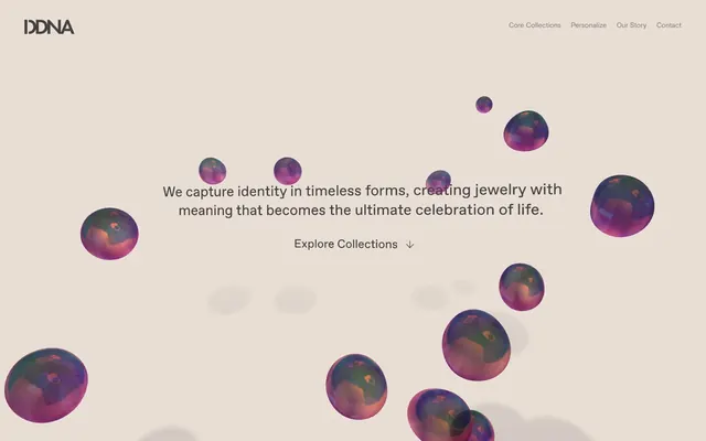
The page maintains a full-bleed background of Parchment (#dacabf), with content typically centered within an implied maximum width. The hero section features a centered headline over the decorative 3D spheres. Sections are arranged with consistent vertical spacing (45px section gap), creating a seamless flow without distinct visual dividers. Content is often presented in a single, centered block, with text and 'ghost' links stacked. Navigation is a minimalist top bar with text links, receding into the background.
The site uses photography of jewelry, presented as tight crops on pure white or muted backgrounds, focusing directly on the product's form and detail without lifestyle context. Abstract 3D rendered spheres with iridescence are used decoratively, providing visual interest and a sense of preciousness or material depth, often floating over the main canvas. Iconography is minimal, primarily text-based or simple arrows, maintaining a clean, content-forward visual approach. The density is moderate, with imagery serving as hero elements and product showcases, balanced by ample white space.
Reminiscent of A.P.C., Studio Nicholson, COS, The Row.
# ddna — Style Reference
> Warm parchment whispers

**Theme:** light

**Site:** https://d-d-n-a.com

DDNA employs a serene, naturally-toned aesthetic, using a dominant warm beige canvas and muted grays for text and accents. The design focuses on elegant simplicity with minimal UI elements that recede into the background, bringing attention to product imagery. Typography is understated yet precise, with subtle letter-spacing for refined readability. Components are largely borderless and transparent, emphasizing content over chrome, with the brand's unique identity conveyed through subtle visual details.

## Tokens — Colors

| Name | Value | Token | Role |
|------|------|------|------|
| Parchment | `#dacabf` | `--color-parchment` | Primary page background — a consistent warm, muted canvas that defines the brand's soft aesthetic |
| Soft Stone | `#efe3dc` | `--color-soft-stone` | Secondary background surfaces, subtly lighter than the primary canvas, providing a delicate elevation for content blocks |
| Deep Slate | `#444242` | `--color-deep-slate` | Primary text color, link text, button borders for ghost buttons, and hairline dividers. Offers high contrast against light backgrounds while maintaining a subdued feel |
| Muted Ash | `#595552` | `--color-muted-ash` | Secondary text color for body copy and subtle borders, slightly softer than Deep Slate for less prominent information |
| Faded Quarry | `#938a83` | `--color-faded-quarry` | Subtle border color for very fine UI distinctions |

## Tokens — Typography

### Basis
- **Substitute:** Inter
- **Weights:** 400
- **Sizes:** 10px, 14px, 15px, 17px
- **Line height:** 1, 1.5
- **Letter spacing:** 0.0660em at 10px, 0.0990em at 17px
- **Role:** Body copy, navigation links, footer text, and all small informational text. Its slightly wide tracking enhances an open, airy feel.

### Favorit
- **Substitute:** Space Mono
- **Weights:** 400
- **Sizes:** 30px
- **Line height:** 1.3, 2
- **Letter spacing:** normal
- **Role:** Headings, button text, and other prominent short text. Its singular use at 30px delivers clear messaging with ample room to breathe.

## Tokens — Type Scale

Minor Third (1.2) from 15px base.

| Role | Size | Line height | Letter spacing |
|------|------|------|------|
| caption | 10px | 1.5 | — |
| body-sm | 14px | 1.5 | — |
| body | 15px | 1.5 | — |
| body-lg | 17px | 1.5 | — |

## Tokens — Spacing

- **Section gap:** 45px
- **Card padding:** 135px
- **Element gap:** 20px

## Tokens — Radius

- **all:** 0px

## Layout

The page maintains a full-bleed background of Parchment (#dacabf), with content typically centered within an implied maximum width. The hero section features a centered headline over the decorative 3D spheres. Sections are arranged with consistent vertical spacing (45px section gap), creating a seamless flow without distinct visual dividers. Content is often presented in a single, centered block, with text and 'ghost' links stacked. Navigation is a minimalist top bar with text links, receding into the background.

## Imagery

The site uses photography of jewelry, presented as tight crops on pure white or muted backgrounds, focusing directly on the product's form and detail without lifestyle context. Abstract 3D rendered spheres with iridescence are used decoratively, providing visual interest and a sense of preciousness or material depth, often floating over the main canvas. Iconography is minimal, primarily text-based or simple arrows, maintaining a clean, content-forward visual approach. The density is moderate, with imagery serving as hero elements and product showcases, balanced by ample white space.

## Components

### Ghost Button
*Primary action button for 'Explore Collections'.*

Transparent background, Deep Slate (#444242) text. No padding, borders, or radius—it's a text link that acts as a button.

### Navigation Link
*Top navigation and footer links.*

Deep Slate (#444242) text, Basis font at various sizes (10, 14px), with a letter-spacing of 0.066em or 0.099em for distinctiveness. No background or borders, relying on text color for interaction.

### Transparent Card
*Content containers for product listings or features.*

No background color, borders, radius, or box-shadow. Relies entirely on layout and content for definition. Has a top padding of 135px.

## Guidelines

### Do

- Always use Parchment (#dacabf) as the default page background, only using Soft Stone (#efe3dc) for subtle content block variations.
- Apply Deep Slate (#444242) for all primary text and critical interactive elements to maintain high contrast with the canvas.
- Ensure all interactive elements, like buttons and links, are visually minimal, primarily relying on text color (#444242) for distinction.
- Utilize the Basis font with its characteristic letter-spacing (0.066em-0.099em) for all body copy and navigation items.
- Maintain a zero border-radius ('0px') system-wide for a stark, unsoftened aesthetic.
- Employ a spacious layout, adhering to a 45px section gap and a 20px element gap for generous breathing room.
- Treat all cards and content sections as transparent overlays, defined by their content and surrounding whitespace, rather than distinct visual containers.

### Don't

- Do not introduce rounded corners; curves are not present in the system.
- Avoid using strong, saturated colors; the palette is exclusively muted and achromatic.
- Do not add shadows or elevation effects; elements should appear flat against the background.
- Do not use heavy, filled buttons or call-to-actions; interactive elements are ghosted or text-based.
- Do not overcomplicate layouts with grids or complex visual hierarchies. Embrace simple, stacked, or binary arrangements.
- Never deviate from the specified letter-spacing for the Basis font; it's a signature typographic detail.
- Do not use dark backgrounds for full sections; the theme is consistently light, with warm, pale neutrals.

## Agent Prompt Guide

Quick Color Reference:
text: #444242
background: #dacabf
border: #444242 (for ghost buttons)
accent: no distinct accent color
primary action: no distinct CTA color

Example Component Prompts:
1. Create a hero section: Parchment background (#dacabf). Centered headline 'DDNA - The ultimate celebration of life.' using Favorit font, size 30px, weight 400, normal letter-spacing, color Deep Slate (#444242). Below it, a Ghost Button 'Explore Collections' with Deep Slate text (#444242), Basis font, 14px, weight 400, letter-spacing 0.0990em.
2. Create a navigation bar: Background transparent. Links 'Core Collections', 'Personalize', 'Our Story', 'Contact' using Basis font, 14px, weight 400, letter-spacing 0.0990em, color Deep Slate (#444242). Each has 20px left margin from the next link.
3. Create a footer section: Soft Stone background (#efe3dc). Body text 'Copyright 2026' using Muted Ash (#595552), Basis font, 14px, weight 400, letter-spacing 0.0990em, centered.
More like this









Keep what you find
A free account saves references to boards and can send you a weekly email of picks based on what you save.
To see every result, go Pro.