Preview image. Unlock full-res
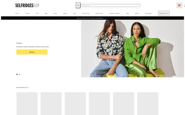
High-contrast retail catalog.
Color palette
Primary action backgrounds, high-attention elements — a bright, unmissable signal
Primary text, prominent borders, active states — the dominant dark tone for content and structure
Strongest text emphasis, input borders, button text, icons — used for maximum contrast and definition
Main page background, card surfaces, form inputs — the foundational light surface
Secondary section backgrounds, subtle surface separation — provides a soft break from pure white
Subtle button backgrounds, navigation borders — a light, almost imperceptible boundary
Neutral form states, badge text, and quiet UI feedback where color should stay understated. Do not promote it to the primary CTA color
Navigation text, less prominent borders — a mid-tone for secondary navigational text
Secondary button backgrounds — a slightly darker off-white for visual distinction
Muted button text, decorative body text — minimal visual weight
Typography
- Weights
- 400
- Sizes
- 13px
- Line height
- 1.2
- Letter spacing
- normal
- Fallback
- Arial, sans-serif
Body copy, button labels, and all general interface text. Its ubiquity reinforces a no-frills, direct communication style.
Spacing & shape
Components
A striking yellow filled button for primary calls to action. Uses Selfridges Yellow (#ffe255) for background and border, with True Black (#000000) text. Features 12px vertical and 48px horizontal padding, with zero border radius to maintain a sharp, deliberate edge.
A ghost button for navigation and secondary actions. No background or border, using True Black (#000000) for text. Features 8px vertical and 4px horizontal padding, with zero border radius.
A minimally styled button for tertiary actions. Light Pearl (#efefef) background with True Black (#000000) text, no border. Features 1px vertical and 6px horizontal padding, zero border radius.
A light gray background button often used for shopping services. Porcelain Gray (#eaeaea) background and True Black (#000000) text. Features 1px vertical and 6px horizontal padding. A distinctive 100% border radius gives it a pill-like shape, often differentiating it from other buttons.
Standard input field with Canvas White (#ffffff) background, True Black (#000000) text, and a border in Input Border Gray (#767676). Padding is 1px vertical and 2px horizontal, with zero border radius.
Guidelines
- Prioritize Canvas White (#ffffff) as the dominant background color for content areas.
- Use Selfridges Yellow (#ffe255) exclusively for primary action backgrounds and high-attention graphical elements, never for text or borders unless it's for an active button state.
- Ensure all primary text uses Raisin Black (#212121) for maximum readability and contrast.
- Apply a 0px border-radius to all buttons and input fields to maintain a sharp, angular aesthetic, reserving 4px for specific non-interactive elements.
- Maintain generous section gaps of 24px to create distinct content blocks and avoid visual clutter.
- Use Porcelain Gray (#eaeaea) or Light Pearl (#efefef) for subtle button backgrounds only, not for large surface areas.
- Utilize Input Border Gray (#767676) for all input field borders and secondary text where less emphasis is needed.
- Do not introduce additional chromatic accent colors beyond Selfridges Yellow (#ffe255).
- Avoid softened edges with large border radii; the design relies on square and rectangular forms.
- Do not use dark backgrounds for main content sections; the system is built on a light theme with minimal dark elements.
- Refrain from using Raisin Black (#212121) or True Black (#000000) as background colors for large sections or cards.
- Do not use subtle gradients or shadows; the aesthetic is flat and direct and relies on color and line for definition.
- Avoid compacting elements with less than 8px of element gap; space is used to ensure clarity.
- Do not override the default Arial font; consistency across all text is key.
About this system
ShowHide
Selfridges presents a classic e-commerce aesthetic with a foundation of stark white surfaces and unapologetic black typography. A single, vibrant yellow accent color acts as a high-contrast call to action, drawing immediate attention. The design prioritizes clear information hierarchy through careful use of neutral shades for borders and secondary text, paired with crisp, unrounded edges across most interactive elements to convey directness.
The site employs a primarily contained fixed-width layout within a maximum width section, centered on the page. The hero features a large, often full-width photograph with overlaid text and a clear call-to-action on the left. Content sections flow vertically with a consistent 24px section gap, transitioning between full-width imagery and more structured grid-based content like product carousels or feature blocks. Navigation is a persistent top bar, with elements arranged in a classic retail pattern: logo top-left, search bar central, and utility icons/services top-right. Grid usage includes multi-column layouts for product listings and feature showcases.
The site uses a mix of high-fashion photography and styled product shots. Photography is typically full-bleed or large-scale, often featuring models in editorial poses, with a clean white or light background when showing products directly. Images are untrimmed, using sharp edges to integrate seamlessly into content blocks. There is a strong emphasis on showcasing products and lifestyle, with imagery playing a key role in visual storytelling and product presentation.
Reminiscent of Net-a-Porter, Farfetch, MR PORTER, SSENSE.
# Designer Fashion — Style Reference
> High-contrast retail catalog.

**Theme:** light

**Site:** https://www.selfridges.com

Selfridges presents a classic e-commerce aesthetic with a foundation of stark white surfaces and unapologetic black typography. A single, vibrant yellow accent color acts as a high-contrast call to action, drawing immediate attention. The design prioritizes clear information hierarchy through careful use of neutral shades for borders and secondary text, paired with crisp, unrounded edges across most interactive elements to convey directness.

## Tokens — Colors

| Name | Value | Token | Role |
|------|------|------|------|
| Selfridges Yellow | `#ffe255` | `--color-selfridges-yellow` | Primary action backgrounds, high-attention elements — a bright, unmissable signal |
| Raisin Black | `#212121` | `--color-raisin-black` | Primary text, prominent borders, active states — the dominant dark tone for content and structure |
| True Black | `#000000` | `--color-true-black` | Strongest text emphasis, input borders, button text, icons — used for maximum contrast and definition |
| Canvas White | `#ffffff` | `--color-canvas-white` | Main page background, card surfaces, form inputs — the foundational light surface |
| Whisper Gray | `#f6f6f6` | `--color-whisper-gray` | Secondary section backgrounds, subtle surface separation — provides a soft break from pure white |
| Porcelain Gray | `#eaeaea` | `--color-porcelain-gray` | Subtle button backgrounds, navigation borders — a light, almost imperceptible boundary |
| Input Border Gray | `#767676` | `--color-input-border-gray` | Neutral form states, badge text, and quiet UI feedback where color should stay understated. Do not promote it to the primary CTA color |
| Stone Gray | `#545454` | `--color-stone-gray` | Navigation text, less prominent borders — a mid-tone for secondary navigational text |
| Light Pearl | `#efefef` | `--color-light-pearl` | Secondary button backgrounds — a slightly darker off-white for visual distinction |
| Muted Silver | `#b7b7b7` | `--color-muted-silver` | Muted button text, decorative body text — minimal visual weight |

## Tokens — Typography

### Arial
- **Substitute:** Arial, sans-serif
- **Weights:** 400
- **Sizes:** 13px
- **Line height:** 1.2
- **Letter spacing:** normal
- **Role:** Body copy, button labels, and all general interface text. Its ubiquity reinforces a no-frills, direct communication style.

## Tokens — Spacing

- **Section gap:** 24px
- **Card padding:** 12px
- **Element gap:** 8px

## Tokens — Radius

- **Buttons:** 0px
- **Inputs:** 0px
- **Cards:** 0px
- **other:** 4px

## Layout

The site employs a primarily contained fixed-width layout within a maximum width section, centered on the page. The hero features a large, often full-width photograph with overlaid text and a clear call-to-action on the left. Content sections flow vertically with a consistent 24px section gap, transitioning between full-width imagery and more structured grid-based content like product carousels or feature blocks. Navigation is a persistent top bar, with elements arranged in a classic retail pattern: logo top-left, search bar central, and utility icons/services top-right. Grid usage includes multi-column layouts for product listings and feature showcases.

## Imagery

The site uses a mix of high-fashion photography and styled product shots. Photography is typically full-bleed or large-scale, often featuring models in editorial poses, with a clean white or light background when showing products directly. Images are untrimmed, using sharp edges to integrate seamlessly into content blocks. There is a strong emphasis on showcasing products and lifestyle, with imagery playing a key role in visual storytelling and product presentation.

## Components

### Selfridges Primary Button
*Call to action*

A striking yellow filled button for primary calls to action. Uses Selfridges Yellow (#ffe255) for background and border, with True Black (#000000) text. Features 12px vertical and 48px horizontal padding, with zero border radius to maintain a sharp, deliberate edge.

### Navigation Link Button
*Navigation button*

A ghost button for navigation and secondary actions. No background or border, using True Black (#000000) for text. Features 8px vertical and 4px horizontal padding, with zero border radius.

### Ghost Secondary Button
*Secondary action*

A minimally styled button for tertiary actions. Light Pearl (#efefef) background with True Black (#000000) text, no border. Features 1px vertical and 6px horizontal padding, zero border radius.

### Shop Service Button
*Shopping service action*

A light gray background button often used for shopping services. Porcelain Gray (#eaeaea) background and True Black (#000000) text. Features 1px vertical and 6px horizontal padding. A distinctive 100% border radius gives it a pill-like shape, often differentiating it from other buttons.

### Default Input Field
*User input*

Standard input field with Canvas White (#ffffff) background, True Black (#000000) text, and a border in Input Border Gray (#767676). Padding is 1px vertical and 2px horizontal, with zero border radius.

## Guidelines

### Do

- Prioritize Canvas White (#ffffff) as the dominant background color for content areas.
- Use Selfridges Yellow (#ffe255) exclusively for primary action backgrounds and high-attention graphical elements, never for text or borders unless it's for an active button state.
- Ensure all primary text uses Raisin Black (#212121) for maximum readability and contrast.
- Apply a 0px border-radius to all buttons and input fields to maintain a sharp, angular aesthetic, reserving 4px for specific non-interactive elements.
- Maintain generous section gaps of 24px to create distinct content blocks and avoid visual clutter.
- Use Porcelain Gray (#eaeaea) or Light Pearl (#efefef) for subtle button backgrounds only, not for large surface areas.
- Utilize Input Border Gray (#767676) for all input field borders and secondary text where less emphasis is needed.

### Don't

- Do not introduce additional chromatic accent colors beyond Selfridges Yellow (#ffe255).
- Avoid softened edges with large border radii; the design relies on square and rectangular forms.
- Do not use dark backgrounds for main content sections; the system is built on a light theme with minimal dark elements.
- Refrain from using Raisin Black (#212121) or True Black (#000000) as background colors for large sections or cards.
- Do not use subtle gradients or shadows; the aesthetic is flat and direct and relies on color and line for definition.
- Avoid compacting elements with less than 8px of element gap; space is used to ensure clarity.
- Do not override the default Arial font; consistency across all text is key.

## Agent Prompt Guide

Quick Color Reference:
text: #212121
background: #ffffff
border: #212121
accent: none observed
primary action: #ffe255 (filled action)

Example Component Prompts:
Create a hero section with a large image on the right, overlaid text block on the left: 'Hotting up' (heading, #212121, Arial 400), 'Get ready for summer with fashion, swimwear and accessories.' (body, #212121, Arial 400), and a Selfridges Primary Button with text 'Shop now'.
Create a product card: Canvas White (#ffffff) background, Raisin Black (#212121) border, a product image (full-bleed within card), and Arial 400 text in Raisin Black (#212121) for product name at 13px, with padding of 12px.
Create a footer section: Subtle Canvas (#f6f6f6) background, 24px padding, with navigation links in Raisin Black (#212121), Arial 400 at 13px, and social media icons in True Black (#000000).
Create a search input field: Canvas White (#ffffff) background, border in Input Border Gray (#767676), placeholder text in Input Border Gray (#767676), with 1px vertical and 2px horizontal padding.
Create a Primary Action Button: #ffe255 background, #000000 text, 9999px radius, compact pill padding. Use this filled treatment for the main CTA.
More like this









Keep what you find
A free account saves references to boards and can send you a weekly email of picks based on what you save.
To see every result, go Pro.