Preview image. Unlock full-res
Monochromatic Canvas, Bold Interruption
Color palette
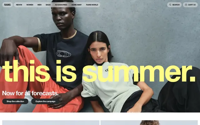
Hero headline text accent—a jarring, high-impact brand statement
Page backgrounds, subtle card accents, hairline borders, ghost button borders
Primary text, icon fills, dominant button text
High-contrast text on dark backgrounds, selected button text
Primary action button backgrounds
Muted text, helper text, secondary list items
Alternative dark button background (less prominent than Deep Graphite)
Typography
- Weights
- 400
- Sizes
- 12px, 14px
- Line height
- 1.2
- Letter spacing
- normal
- Fallback
- Open Sans
Body text, navigation items, secondary labels, and button text, maintaining a consistent, compact feel across the interface.
- Weights
- 400, 600, 700
- Sizes
- 14px, 16px, 20px, 32px, 40px, 48px, 232px, 245px
- Line height
- 0.9, 1, 1.02, 1.2
- Letter spacing
- normal
- Fallback
- Open Sans
Headlines, product titles, and other prominent text. The very large sizes (232px, 245px) are reserved for a signature brand headline, prioritizing visual impact over conventional sizing.
Spacing & shape
Components
Background: Deep Graphite (#26292a), Text: Pure Arctic (#ffffff). Padding: 12px vertical, 32px horizontal. Border radius: 9999px (pill-shaped).
Background: rgba(227, 227, 227, 0.52), Text: Midnight Ink (#10100f). Padding: 0px vertical, 16px horizontal. Border radius: 9999px.
No background or padding, text color: Midnight Ink (#10100f). Used for main navigation and inline links.
Background: rgba(16, 16, 15, 0.8), Text: Pure Arctic (#ffffff). Padding: 12px vertical, 32px horizontal. Border radius: 9999px.
Guidelines
- Use Midnight Ink (#10100f) as the primary text color on Canvas Fog (#efefef) backgrounds for optimal contrast (contrast ratio 19.0:1 AAA).
- Apply Deep Graphite (#26292a) for primary action button backgrounds, ensuring text is Pure Arctic (#ffffff).
- Reserve Bright Solar (#fffb85) exclusively for high-impact display headlines to maintain its unique visual weight.
- Utilize 9999px border-radius generously on interactive elements like buttons and chips to create a soft, approachable feel.
- Maintain a comfortable density with a consistent element gap of 16px between most UI components.
- Use EuropaGroNr2SH at large sizes and higher weights (600, 700) for headlines and brand text to emphasize a bold, striking impression.
- Ensure hairline borders across the design use Canvas Fog (#efefef) for subtle structural definition.
- Avoid using Bright Solar (#fffb85) for body text or small labels; its high contrast and light nature make it unsuitable for readability at small sizes.
- Do not introduce additional saturated colors; maintain the brand's monochromatic palette with Bright Solar as the only chromatic accent.
- Do not use sharp 0px border radii on buttons or interactive elements; the 9999px pill shape is a core brand identifier.
- Avoid heavy drop shadows or strong elevation; the design emphasizes flat surfaces with minimal depth.
- Do not deviate from the EuropaGroNr2SB and EuropaGroNr2SH font families; font consistency is crucial to the brand's aesthetic.
- Never use generic blue as a link color; standard links should default to Midnight Ink (#10100f) or Subtle Gray (#b3b3b2).
About this system
ShowHide
Rains INT uses a refined monochrome aesthetic focused on clean surfaces and confident typography. The visual language emphasizes product and fashion photography, with UI elements acting as subtle guides. A primary black serves text and button backgrounds, contrasted with a nearly white background, while a unique yellow is reserved for high-impact headlines, creating a striking yet minimal brand statement. Components are lightweight with generous soft radii, allowing imagery and bold type to dominate the visual hierarchy.
The page primarily uses a full-bleed structure for hero sections, seamlessly integrating large-scale imagery and typography. Subsequent content sections alternate between full-width blocks and sections with a subtle max-width constraint for text-heavy areas. The section rhythm is primarily driven by consistent vertical spacing (40px). Content is arranged in a fluid manner, ranging from superimposed text over full-bleed images to simple adjacent blocks of text and visuals without a rigid grid. Navigation is a compact sticky header with text links, maintaining a minimal presence at the top.
The imagery features professional fashion photography with a focus on product and lifestyle, often presented in large-scale, sometimes full-bleed layouts. Models are styled in the brand's apparel, creating a contemporary, editorial feel. Products are frequently showcased in context, against minimalist backgrounds or urban settings. The photos have a slightly desaturated or muted color palette overall, allowing the UI elements and specific product colors to stand out. Icons are minimal, utilizing either the Midnight Ink or Pure Arctic tones for outlines or solid fills, maintaining a clean, utilitarian aesthetic.
Reminiscent of Arc'teryx, A.P.C., COS, Oura Ring.
# Rains INT — Style Reference
> Monochromatic Canvas, Bold Interruption

**Theme:** light

**Site:** https://www.rains.com

Rains INT uses a refined monochrome aesthetic focused on clean surfaces and confident typography. The visual language emphasizes product and fashion photography, with UI elements acting as subtle guides. A primary black serves text and button backgrounds, contrasted with a nearly white background, while a unique yellow is reserved for high-impact headlines, creating a striking yet minimal brand statement. Components are lightweight with generous soft radii, allowing imagery and bold type to dominate the visual hierarchy.

## Tokens — Colors

| Name | Value | Token | Role |
|------|------|------|------|
| Bright Solar | `#fffb85` | `--color-bright-solar` | Hero headline text accent—a jarring, high-impact brand statement |
| Canvas Fog | `#efefef` | `--color-canvas-fog` | Page backgrounds, subtle card accents, hairline borders, ghost button borders |
| Midnight Ink | `#10100f` | `--color-midnight-ink` | Primary text, icon fills, dominant button text |
| Pure Arctic | `#ffffff` | `--color-pure-arctic` | High-contrast text on dark backgrounds, selected button text |
| Deep Graphite | `#26292a` | `--color-deep-graphite` | Primary action button backgrounds |
| Subtle Gray | `#b3b3b2` | `--color-subtle-gray` | Muted text, helper text, secondary list items |
| Dark Button | `#40403f` | `--color-dark-button` | Alternative dark button background (less prominent than Deep Graphite) |

## Tokens — Typography

### EuropaGroNr2SB
- **Substitute:** Open Sans
- **Weights:** 400
- **Sizes:** 12px, 14px
- **Line height:** 1.2
- **Letter spacing:** normal
- **Role:** Body text, navigation items, secondary labels, and button text, maintaining a consistent, compact feel across the interface.

### EuropaGroNr2SH
- **Substitute:** Open Sans
- **Weights:** 400, 600, 700
- **Sizes:** 14px, 16px, 20px, 32px, 40px, 48px, 232px, 245px
- **Line height:** 0.9, 1, 1.02, 1.2
- **Letter spacing:** normal
- **Role:** Headlines, product titles, and other prominent text. The very large sizes (232px, 245px) are reserved for a signature brand headline, prioritizing visual impact over conventional sizing.

## Tokens — Type Scale

Perfect Fourth (1.333) from 14px base.

| Role | Size | Line height | Letter spacing |
|------|------|------|------|
| caption | 12px | 1.2 | — |
| body | 14px | 1.2 | — |
| heading | 20px | 1.02 | — |
| heading-lg | 32px | 1.2 | — |
| display-sm | 40px | 1 | — |
| display | 48px | 1 | — |

## Tokens — Spacing

- **Section gap:** 40px
- **Card padding:** 16px
- **Element gap:** 16px

## Tokens — Radius

- **Buttons:** 9999px
- **other:** 9999px

## Layout

The page primarily uses a full-bleed structure for hero sections, seamlessly integrating large-scale imagery and typography. Subsequent content sections alternate between full-width blocks and sections with a subtle max-width constraint for text-heavy areas. The section rhythm is primarily driven by consistent vertical spacing (40px). Content is arranged in a fluid manner, ranging from superimposed text over full-bleed images to simple adjacent blocks of text and visuals without a rigid grid. Navigation is a compact sticky header with text links, maintaining a minimal presence at the top.

## Imagery

The imagery features professional fashion photography with a focus on product and lifestyle, often presented in large-scale, sometimes full-bleed layouts. Models are styled in the brand's apparel, creating a contemporary, editorial feel. Products are frequently showcased in context, against minimalist backgrounds or urban settings. The photos have a slightly desaturated or muted color palette overall, allowing the UI elements and specific product colors to stand out. Icons are minimal, utilizing either the Midnight Ink or Pure Arctic tones for outlines or solid fills, maintaining a clean, utilitarian aesthetic.

## Components

### Filled Primary Button
*Primary calls to action, prominent interactive elements.*

Background: Deep Graphite (#26292a), Text: Pure Arctic (#ffffff). Padding: 12px vertical, 32px horizontal. Border radius: 9999px (pill-shaped).

### Ghost Secondary Button
*Secondary actions that need to de-emphasize visual weight.*

Background: rgba(227, 227, 227, 0.52), Text: Midnight Ink (#10100f). Padding: 0px vertical, 16px horizontal. Border radius: 9999px.

### Bare Navigation Link
*Top-level navigation items and in-text links.*

No background or padding, text color: Midnight Ink (#10100f). Used for main navigation and inline links.

### Transparent Dark Button
*Alternative dark button with transparent background for subtle interaction.*

Background: rgba(16, 16, 15, 0.8), Text: Pure Arctic (#ffffff). Padding: 12px vertical, 32px horizontal. Border radius: 9999px.

## Guidelines

### Do

- Use Midnight Ink (#10100f) as the primary text color on Canvas Fog (#efefef) backgrounds for optimal contrast (contrast ratio 19.0:1 AAA).
- Apply Deep Graphite (#26292a) for primary action button backgrounds, ensuring text is Pure Arctic (#ffffff).
- Reserve Bright Solar (#fffb85) exclusively for high-impact display headlines to maintain its unique visual weight.
- Utilize 9999px border-radius generously on interactive elements like buttons and chips to create a soft, approachable feel.
- Maintain a comfortable density with a consistent element gap of 16px between most UI components.
- Use EuropaGroNr2SH at large sizes and higher weights (600, 700) for headlines and brand text to emphasize a bold, striking impression.
- Ensure hairline borders across the design use Canvas Fog (#efefef) for subtle structural definition.

### Don't

- Avoid using Bright Solar (#fffb85) for body text or small labels; its high contrast and light nature make it unsuitable for readability at small sizes.
- Do not introduce additional saturated colors; maintain the brand's monochromatic palette with Bright Solar as the only chromatic accent.
- Do not use sharp 0px border radii on buttons or interactive elements; the 9999px pill shape is a core brand identifier.
- Avoid heavy drop shadows or strong elevation; the design emphasizes flat surfaces with minimal depth.
- Do not deviate from the EuropaGroNr2SB and EuropaGroNr2SH font families; font consistency is crucial to the brand's aesthetic.
- Never use generic blue as a link color; standard links should default to Midnight Ink (#10100f) or Subtle Gray (#b3b3b2).

## Agent Prompt Guide

Quick Color Reference:
text: #10100f
background: #efefef
border: #efefef
accent: #fffb85
primary action: #26292a (filled action)

Example Component Prompts:
Create a hero section: Full-width background image. Large headline (size 245px or 232px, weight 400) in Bright Solar (#fffb85). Subtext: 'Now for all forecasts.' (EuropaGroNr2SB, size 14, weight 400, Pure Arctic #ffffff). Directly below, two Ghost Secondary Buttons: 'Shop the collection' and 'Explore the campaign' (background rgba(227, 227, 227, 0.52), text Midnight Ink #10100f, 9999px radius, 0px vertical 16px horizontal padding).

Create a product category card: Background Canvas Fog (#efefef), with a prominent product image spanning the top. Title (EuropaGroNr2SH, size 16, weight 400, Midnight Ink #10100f) below the image. Simple 'Shop [Category]' Bare Navigation Link (EuropaGroNr2SB, size 14, weight 400, Midnight Ink #10100f).

Create a primary call-to-action block: Centered text 'Explore TexXel' (EuropaGroNr2SH, size 20, weight 400, Pure Arctic #ffffff). Below it, a Filled Primary Button 'Shop TexXel' (background Deep Graphite #26292a, text Pure Arctic #ffffff, 9999px radius, 12px vertical 32px horizontal padding).
More like this









Keep what you find
A free account saves references to boards and can send you a weekly email of picks based on what you save.
To see every result, go Pro.