Preview image. Unlock full-res
Crisp White Blueprint
Color palette
Interactive links, primary outlined button borders, active navigation items — a vivid punch of color against the monochrome provides clear calls to action and visual interest
Secondary interactive link text and borders
Decorative line graphics and illustrations — provides abstract visual flair without dominating the UI
Decorative line graphics and illustrations, paired with Path Gold for a dynamic visual effect
Subtle image box shadows, introducing depth with a cool tint
Page backgrounds, card surfaces, primary content areas
Dark borders and separators for elevated surfaces and inverted UI
Muted text, subheadings, subtle borders
Typography
- Weights
- 400, 600, 700
- Sizes
- 16px, 24px
- Line height
- 1.2, 1.4, 1.5
- Fallback
- system-ui
Primary text, headings, and all UI elements. Its system-font nature prioritizes speed and native feel over a custom brand typeface.
Spacing & shape
Elevation
Components
Text link using Ink Black (#222222) at 16px, 400 weight. On hover/active, the text color changes to True Blue (#0000ff).
An underlined link where the underline is True Blue (#0000ff). Text color is Ink Black (#222222) and changes to True Blue (#0000ff) on hover. This is the primary interactive element style.
An underlined link where the underline is Deep Violet (#555abf). Text color is Ink Black (#222222) and changes to Deep Violet (#555abf) on hover. Used for contextual links.
Uses Ink Black (#222222) text at 24px, 600 weight, with a line height of 1.2. Follows a 16px internal padding-top and padding-bottom, and typically has a 32px bottom margin to separate from content.
Ink Black (#222222) text at 16px, 400 weight, with a line height of 1.5. Uses a 16px bottom margin to separate paragraphs.
Guidelines
- Prioritize a stark high-contrast aesthetic: use Ink Black (#222222) for text and Canvas White (#ffffff) for backgrounds.
- Accent interactive elements only with True Blue (#0000ff) for borders, text on hover, and active states. Do not fill buttons with solid color.
- Maintain generous vertical spacing between content sections, typically 64px, to ensure a comfortable density.
- Employ system fonts (-apple-system) for all text to achieve a native, performant user experience.
- Keep all border radii at 0px unless specified for a particular brand graphic or image container, maintaining a sharp, angular aesthetic.
- Use decorative line graphics in Path Gold (#fcd669) and Path Orange (#f79a59) sparsely and only to partition content blocks or add abstract visual interest without acting as functional UI.
- Apply subtle `box-shadow: 0 0 0 5px #000080` to select image frames for a distinct, tinted visual lift.
- Avoid decorative gradients or heavy drop shadows on UI elements; the design emphasizes flatness and clarity.
- Do not introduce new colors beyond the defined palette for UI elements; color is reserved for distinct functional roles and specified decorative graphics.
- Avoid overly complex layouts or grid structures; prefer single-column content flow with clear headings and ample white space.
- Do not use highly expressive or decorative fonts; stick to the system sans-serif for all text.
- Do not use filled buttons as primary actions; always prefer outlined or text links with True Blue (#0000ff) as the highlight.
- Do not use rounded corners on cards, buttons, or inputs; maintain sharp, rectangular forms.
About this system
ShowHide
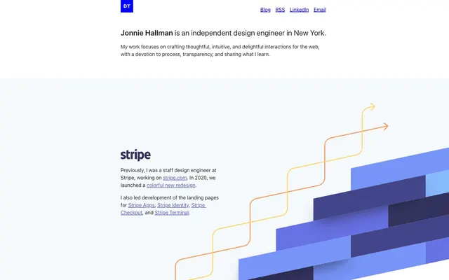
destroytoday.com operates with a stark, high-contrast clarity: crisp black text on a bright white canvas. The design emphasizes content through abundant negative space, anchored by a singular vivid blue accent that highlights interactive elements and the brand's graphic identity. Components are minimalist, focusing on function over adornment, with a sense of lightweight precision.
The site uses a combination of focused product screenshots, often presented within device mockups (like the iPhone frame with a blue border). Abstract geometric illustrations, with sharp angles and layered shapes in various blues and violets (e.g., #276baa, #2181c2, #52b2f2, #555abf, #43458b, #32325d, #7795f8, #87bbfd, #6772e5), are used as decorative background elements, often diagonally segmented and paired with dynamic orange and gold path lines. Iconography is minimalist, often monochrome, and embedded directly into the UI. Imagery serves both to explain product work and to provide abstract visual breaks, keeping the overall density balanced between text and visual information.
Reminiscent of Stripe (older design), Linear, Figma.
# destroytoday.com — Style Reference
> Crisp White Blueprint

**Theme:** light

**Site:** https://destroytoday.com

destroytoday.com operates with a stark, high-contrast clarity: crisp black text on a bright white canvas. The design emphasizes content through abundant negative space, anchored by a singular vivid blue accent that highlights interactive elements and the brand's graphic identity. Components are minimalist, focusing on function over adornment, with a sense of lightweight precision.

## Tokens — Colors

| Name | Value | Token | Role |
|------|------|------|------|
| True Blue | `#0000ff` | `--color-true-blue` | Interactive links, primary outlined button borders, active navigation items — a vivid punch of color against the monochrome provides clear calls to action and visual interest |
| Deep Violet | `#555abf` | `--color-deep-violet` | Secondary interactive link text and borders |
| Path Gold | `#fcd669` | `--color-path-gold` | Decorative line graphics and illustrations — provides abstract visual flair without dominating the UI |
| Path Orange | `#f79a59` | `--color-path-orange` | Decorative line graphics and illustrations, paired with Path Gold for a dynamic visual effect |
| Shaded Navy | `#000080` | `--color-shaded-navy` | Subtle image box shadows, introducing depth with a cool tint |
| Canvas White | `#ffffff` | `--color-canvas-white` | Page backgrounds, card surfaces, primary content areas |
| Ink Black | `#222222` | `--color-ink-black` | Dark borders and separators for elevated surfaces and inverted UI |
| Ash Grey | `#d8d4cf` | `--color-ash-grey` | Muted text, subheadings, subtle borders |

## Tokens — Typography

### -apple-system
- **Substitute:** system-ui
- **Weights:** 400, 600, 700
- **Sizes:** 16px, 24px
- **Line height:** 1.2, 1.4, 1.5
- **Role:** Primary text, headings, and all UI elements. Its system-font nature prioritizes speed and native feel over a custom brand typeface.

## Tokens — Spacing

- **Max width:** 1200px
- **Section gap:** 64px
- **Card padding:** 32px
- **Element gap:** 16px

## Tokens — Radius

- **Default:** 0px

## Tokens — Elevation

- **Image Frame:** `0 0 0 5px #000080`

## Imagery

The site uses a combination of focused product screenshots, often presented within device mockups (like the iPhone frame with a blue border). Abstract geometric illustrations, with sharp angles and layered shapes in various blues and violets (e.g., #276baa, #2181c2, #52b2f2, #555abf, #43458b, #32325d, #7795f8, #87bbfd, #6772e5), are used as decorative background elements, often diagonally segmented and paired with dynamic orange and gold path lines. Iconography is minimalist, often monochrome, and embedded directly into the UI. Imagery serves both to explain product work and to provide abstract visual breaks, keeping the overall density balanced between text and visual information.

## Components

### Header Navigation Link
*Top-level navigation items*

Text link using Ink Black (#222222) at 16px, 400 weight. On hover/active, the text color changes to True Blue (#0000ff).

### Primary Outlined Link
*Key interactive links and call-to-actions*

An underlined link where the underline is True Blue (#0000ff). Text color is Ink Black (#222222) and changes to True Blue (#0000ff) on hover. This is the primary interactive element style.

### Secondary Outlined Link
*Subtle interactive links within content*

An underlined link where the underline is Deep Violet (#555abf). Text color is Ink Black (#222222) and changes to Deep Violet (#555abf) on hover. Used for contextual links.

### Page Title
*Main heading for content blocks*

Uses Ink Black (#222222) text at 24px, 600 weight, with a line height of 1.2. Follows a 16px internal padding-top and padding-bottom, and typically has a 32px bottom margin to separate from content.

### Body Paragraph
*Standard text content*

Ink Black (#222222) text at 16px, 400 weight, with a line height of 1.5. Uses a 16px bottom margin to separate paragraphs.

## Guidelines

### Do

- Prioritize a stark high-contrast aesthetic: use Ink Black (#222222) for text and Canvas White (#ffffff) for backgrounds.
- Accent interactive elements only with True Blue (#0000ff) for borders, text on hover, and active states. Do not fill buttons with solid color.
- Maintain generous vertical spacing between content sections, typically 64px, to ensure a comfortable density.
- Employ system fonts (-apple-system) for all text to achieve a native, performant user experience.
- Keep all border radii at 0px unless specified for a particular brand graphic or image container, maintaining a sharp, angular aesthetic.
- Use decorative line graphics in Path Gold (#fcd669) and Path Orange (#f79a59) sparsely and only to partition content blocks or add abstract visual interest without acting as functional UI.
- Apply subtle `box-shadow: 0 0 0 5px #000080` to select image frames for a distinct, tinted visual lift.

### Don't

- Avoid decorative gradients or heavy drop shadows on UI elements; the design emphasizes flatness and clarity.
- Do not introduce new colors beyond the defined palette for UI elements; color is reserved for distinct functional roles and specified decorative graphics.
- Avoid overly complex layouts or grid structures; prefer single-column content flow with clear headings and ample white space.
- Do not use highly expressive or decorative fonts; stick to the system sans-serif for all text.
- Do not use filled buttons as primary actions; always prefer outlined or text links with True Blue (#0000ff) as the highlight.
- Do not use rounded corners on cards, buttons, or inputs; maintain sharp, rectangular forms.

## Agent Prompt Guide

Create an Outlined Primary Action: Transparent background, #0000ff border and text, 9999px radius, compact pill padding. Use it for the main CTA instead of a filled button.

Example Component Prompts:
- Create a top navigation bar: Canvas White (#ffffff) background. Brand logo 'DT' in True Blue (#0000ff). Navigation links 'Blog', 'RSS', 'LinkedIn', 'Email' as Header Navigation Links (Ink Black text, True Blue on hover/active).
- Create a main content section: Canvas White (#ffffff) background. Heading 'Jonnie Hallman is an independent design engineer in New York.' as Page Title. Body text 'My work focuses on crafting thoughtful...' as Body Paragraph.
- Design a featured section with abstract graphics: Canvas White (#ffffff) background. Include a decorative element using Path Gold (#fcd669) and Path Orange (#f79a59) line graphics. Integrate a text block with a Page Title and Body Paragraph.
More like this









Keep what you find
A free account saves references to boards and can send you a weekly email of picks based on what you save.
To see every result, go Pro.