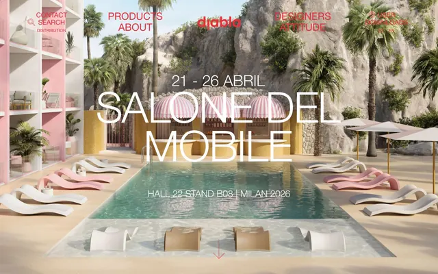
Preview image. Unlock full-res
Tropical Modernism Pop
Color palette
Brand accent, outline buttons, active links, functional icons — a vivid pop against the muted palette
Secondary accent for decorative elements, soft blocks
Primary body text, dark borders, general UI text
Headlines, strong text emphasis, button borders with a bold presence
Page backgrounds, card surfaces, subtle input backgrounds — provides a soft, warm canvas
Alternative input backgrounds, card surfaces
Typography
- Weights
- 400
- Sizes
- 10px, 12px, 14px, 15px, 16px, 18px, 22px, 33px
- Line height
- 1, 1.09, 1.13, 1.2, 1.22, 1.29, 1.3, 1.43, 1.5, 1.8, 2, 2.33, 2.8
- Letter spacing
- normal
- Fallback
- Helvetica Neue
Body text, links, smaller headings, UI labels — provides a clean, neutral voice for information.
- Weights
- 400
- Sizes
- 80px, 110px
- Line height
- 0.88, 0.91
- Letter spacing
- normal
- Fallback
- Helvetica Neue Light
Large display headlines — thin weight at massive sizes creates an airy, modern, almost whispered statement.
- Weights
- 400
- Sizes
- 13px
- Line height
- 1.2
Arial — detected in extracted data but not described by AI
Spacing & shape
Components
Text: Coral Kiss (#ed2e38), Linotype Helvetica Neue LT Std Roman, weight 400. Background: transparent. Border: 1px solid Coral Kiss (#ed2e38). Padding: 0px vertical, 20px horizontal. Border radius: 14px.
Text: Deep Ink (#000000), Linotype Helvetica Neue LT Std Roman, weight 400. Background: transparent. Border: 1px solid Deep Ink (#000000). Padding: 0px vertical, 0px horizontal. Border radius: 0px.
Text: Coral Kiss (#ed2e38). Background: transparent. Border: 1px solid Coral Kiss (#ed2e38) on bottom, otherwise transparent. Border-radius: 0px.
Text: Coral Kiss (#ed2e38). Background: Shell Pink (#fcf0f3). Border: 1px solid Coral Kiss (#ed2e38). Border-radius: 50% (circular). Padding: 0px.
Guidelines
- Always use Coral Kiss (#ed2e38) as the primary brand accent for interactive elements and highlights.
- Maintain a clear visual hierarchy by limiting large headlines to Linotype Helvetica Neue LT Std Lt at sizes 80px or 110px.
- Apply Shell Pink (#fcf0f3) for ambient backgrounds and card surfaces to establish the site's warm, light base.
- Utilize a 14px border radius for interactive elements like buttons and links to create a consistent soft, rounded treatment.
- Employ consistent 0px vertical padding with 20px horizontal padding for primary outlined buttons to create a flat, elongated look.
- Break up page content with alternating sections using Shell Pink (#fcf0f3) and Pure White (#ffffff) backgrounds.
- Use Linotype Helvetica Neue LT Std Roman (400) for all body text, links, and minor headings with normal letter spacing.
- Avoid using multiple chromatic colors; Coral Kiss (#ed2e38) should be the singular vibrant accent.
- Do not use heavy shadows or significant elevation; maintain a flat, open aesthetic.
- Refrain from using solid fill buttons; the primary action style is an outlined button with Coral Kiss (#ed2e38).
- Never deviate from the specified font families or their intended roles and weights.
- Do not introduce complex gradient fills; the system relies on solid colors and subtle background variations.
About this system
ShowHide
Diabla's visual system evokes a playful, modern aesthetic set against a backdrop of sun-drenched outdoor living. The design is characterized by crisp white and a soft pastel pink canvas, punctuated by a vibrant, almost neon red accent for crucial interactions and branding. Typography is elegant and airy, maintaining a degree of formality even amidst the relaxed, resort-like imagery. Components are lightweight with defined outlines, contributing to an open, spacious feel.
The page primarily uses a full-bleed layout for hero sections, filling the viewport with striking imagery and large text overlays. Subsequent sections follow a max-width contained pattern, with content centered. Section rhythm is established through consistent vertical spacing around 80px, creating a comfortable density. Content often alternates between text-dominant blocks and imagery or product showcases, following a flexible grid for features and product displays. The overall structure is open and breathable, avoiding dense information blocks.
Diabla features high-quality, aspirational photography and 3D renders of their furniture in lush, tropical or Mediterranean outdoor settings. The visuals are clean and focus on product integration within an idealized lifestyle. Photography is generally high-key, with natural lighting and vibrant but soft colors that blend with the brand's playful aesthetic. Imagery often serves as a full-bleed hero or contained rectangles, seamlessly integrated with text. Icons are minimal, outlined, and used descriptively for navigation and small functional elements.
Reminiscent of Kettal, Ferm Living, Hay Design, Muuto.
# Diabla — Style Reference
> Tropical Modernism Pop

**Theme:** light

**Site:** https://www.diablaoutdoor.com/en

Diabla's visual system evokes a playful, modern aesthetic set against a backdrop of sun-drenched outdoor living. The design is characterized by crisp white and a soft pastel pink canvas, punctuated by a vibrant, almost neon red accent for crucial interactions and branding. Typography is elegant and airy, maintaining a degree of formality even amidst the relaxed, resort-like imagery. Components are lightweight with defined outlines, contributing to an open, spacious feel.

## Tokens — Colors

| Name | Value | Token | Role |
|------|------|------|------|
| Coral Kiss | `#ed2e38` | `--color-coral-kiss` | Brand accent, outline buttons, active links, functional icons — a vivid pop against the muted palette |
| Rosy Clouds | `#F9C2CC` | `--color-rosy-clouds` | Secondary accent for decorative elements, soft blocks |
| Carbon | `#333333` | `--color-carbon` | Primary body text, dark borders, general UI text |
| Deep Ink | `#000000` | `--color-deep-ink` | Headlines, strong text emphasis, button borders with a bold presence |
| Shell Pink | `#fcf0f3` | `--color-shell-pink` | Page backgrounds, card surfaces, subtle input backgrounds — provides a soft, warm canvas |
| Pure White | `#ffffff` | `--color-pure-white` | Alternative input backgrounds, card surfaces |

## Tokens — Typography

### Linotype Helvetica Neue LT Std Roman
- **Substitute:** Helvetica Neue
- **Weights:** 400
- **Sizes:** 10px, 12px, 14px, 15px, 16px, 18px, 22px, 33px
- **Line height:** 1, 1.09, 1.13, 1.2, 1.22, 1.29, 1.3, 1.43, 1.5, 1.8, 2, 2.33, 2.8
- **Letter spacing:** normal
- **Role:** Body text, links, smaller headings, UI labels — provides a clean, neutral voice for information.

### Linotype Helvetica Neue LT Std Lt
- **Substitute:** Helvetica Neue Light
- **Weights:** 400
- **Sizes:** 80px, 110px
- **Line height:** 0.88, 0.91
- **Letter spacing:** normal
- **Role:** Large display headlines — thin weight at massive sizes creates an airy, modern, almost whispered statement.

### Arial
- **Weights:** 400
- **Sizes:** 13px
- **Line height:** 1.2
- **Role:** Arial — detected in extracted data but not described by AI

## Tokens — Type Scale

Perfect Fifth (1.5) from 14px base.

| Role | Size | Line height | Letter spacing |
|------|------|------|------|
| caption | 10px | 1.43 | — |
| body | 14px | 1.22 | — |
| body-lg | 18px | 1.2 | — |
| heading-sm | 22px | 1.13 | — |
| heading | 33px | 1.09 | — |
| heading-lg | 80px | 0.91 | — |
| display | 110px | 0.88 | — |

## Tokens — Spacing

- **Section gap:** 80px
- **Card padding:** 25px
- **Element gap:** 10px

## Tokens — Radius

- **Buttons:** 14px
- **Inputs:** 0px
- **links:** 14px

## Layout

The page primarily uses a full-bleed layout for hero sections, filling the viewport with striking imagery and large text overlays. Subsequent sections follow a max-width contained pattern, with content centered. Section rhythm is established through consistent vertical spacing around 80px, creating a comfortable density. Content often alternates between text-dominant blocks and imagery or product showcases, following a flexible grid for features and product displays. The overall structure is open and breathable, avoiding dense information blocks.

## Imagery

Diabla features high-quality, aspirational photography and 3D renders of their furniture in lush, tropical or Mediterranean outdoor settings. The visuals are clean and focus on product integration within an idealized lifestyle. Photography is generally high-key, with natural lighting and vibrant but soft colors that blend with the brand's playful aesthetic. Imagery often serves as a full-bleed hero or contained rectangles, seamlessly integrated with text. Icons are minimal, outlined, and used descriptively for navigation and small functional elements.

## Components

### Outlined Button - Coral Kiss
*Primary action button, often paired with an icon.*

Text: Coral Kiss (#ed2e38), Linotype Helvetica Neue LT Std Roman, weight 400. Background: transparent. Border: 1px solid Coral Kiss (#ed2e38). Padding: 0px vertical, 20px horizontal. Border radius: 14px.

### Outlined Button - Deep Ink
*Secondary action or ghost button.*

Text: Deep Ink (#000000), Linotype Helvetica Neue LT Std Roman, weight 400. Background: transparent. Border: 1px solid Deep Ink (#000000). Padding: 0px vertical, 0px horizontal. Border radius: 0px.

### Input - Underlined Coral Kiss
*Text input field with focus.*

Text: Coral Kiss (#ed2e38). Background: transparent. Border: 1px solid Coral Kiss (#ed2e38) on bottom, otherwise transparent. Border-radius: 0px.

### Input - Shell Pink Background Circle
*Small input or selection with a circular, soft background.*

Text: Coral Kiss (#ed2e38). Background: Shell Pink (#fcf0f3). Border: 1px solid Coral Kiss (#ed2e38). Border-radius: 50% (circular). Padding: 0px.

## Guidelines

### Do

- Always use Coral Kiss (#ed2e38) as the primary brand accent for interactive elements and highlights.
- Maintain a clear visual hierarchy by limiting large headlines to Linotype Helvetica Neue LT Std Lt at sizes 80px or 110px.
- Apply Shell Pink (#fcf0f3) for ambient backgrounds and card surfaces to establish the site's warm, light base.
- Utilize a 14px border radius for interactive elements like buttons and links to create a consistent soft, rounded treatment.
- Employ consistent 0px vertical padding with 20px horizontal padding for primary outlined buttons to create a flat, elongated look.
- Break up page content with alternating sections using Shell Pink (#fcf0f3) and Pure White (#ffffff) backgrounds.
- Use Linotype Helvetica Neue LT Std Roman (400) for all body text, links, and minor headings with normal letter spacing.

### Don't

- Avoid using multiple chromatic colors; Coral Kiss (#ed2e38) should be the singular vibrant accent.
- Do not use heavy shadows or significant elevation; maintain a flat, open aesthetic.
- Refrain from using solid fill buttons; the primary action style is an outlined button with Coral Kiss (#ed2e38).
- Never deviate from the specified font families or their intended roles and weights.
- Do not introduce complex gradient fills; the system relies on solid colors and subtle background variations.

## Agent Prompt Guide

Quick Color Reference:
- text: #333333
- background: #fcf0f3
- border: #ed2e38
- accent: #ed2e38
- primary action: #ed2e38 (outlined action border)

Example Component Prompts:
- Create a hero overlay with the title 'SALONE DEL MOBILE': text Linotype Helvetica Neue LT Std Lt, weight 400, size 110px, line-height 0.88, color Pure White (#ffffff).
- Make an 'EXPLORE' button for navigation: text Coral Kiss (#ed2e38), Linotype Helvetica Neue LT Std Roman, weight 400. Background transparent, 1px solid Coral Kiss (#ed2e38) border. 14px border-radius, with 0px vertical and 20px horizontal padding.
- Design a text block with a subheading 'FOUR SEASONS': subheading text Coral Kiss (#ed2e38), Linotype Helvetica Neue LT Std Roman, weight 400, size 33px. Body text Carbon (#333333), Linotype Helvetica Neue LT Std Roman, weight 400, size 14px, line height 1.22.
- Produce an input field for a newsletter signup: Text Coral Kiss (#ed2e38), Linotype Helvetica Neue LT Std Roman, weight 400, size 14px. Background Shell Pink (#fcf0f3). No borders, 50% border radius for a circular shape. 5px vertical padding and 5px right margin.
More like this









Keep what you find
A free account saves references to boards and can send you a weekly email of picks based on what you save.
To see every result, go Pro.