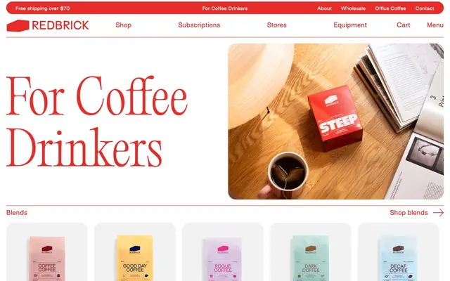
Preview image. Unlock full-res
Red enamel on white canvas.
Color palette
Brand accent color for borders, outlines, links, and text highlights, creating a distinctive energetic feel. Used for primary interactive states
Primary text color and occasional border
Background for secondary surfaces like product cards
Main page background and text on dark backgrounds
Used for specific link backgrounds and navigation elements
Typography
- Weights
- 400
- Sizes
- 15px, 20px, 30px, 35px
- Line height
- 1, 1.2, 1.3, 1.5
- Letter spacing
- -0.013em at 35px, -0.017em at 30px, -0.030em at 20px, -0.040em at 15px
- Fallback
- Inter
Body copy, primary navigation, input fields, and standard UI text. Its compact, almost compressed letterforms bring a modern, efficient feel to functional text.
- Weights
- 300
- Sizes
- 100px, 105px, 150px
- Line height
- 0.99, 1.1, 1.2
- Letter spacing
- -0.005em at 150px, 0.004em at 105px, 0.006em at 100px
- Fallback
- Playfair Display
Display and large editorial headlines. The light weight (300) combined with large sizes creates a sophisticated, almost whispered authority.
- Weights
- 400
- Sizes
- 10px
- Line height
- 1.5
- Letter spacing
- 0.060em
- Fallback
- Arial
Small helper text and metadata where legibility is key without demanding attention.
- Weights
- 400
- Sizes
- 10px
- Line height
- 1.5
- Letter spacing
- 0.06
GTStandard-M — detected in extracted data but not described by AI
Spacing & shape
Components
Text in Crimson Roast (#e82c2a), outlined with a 1px Crimson Roast border, and a 50px border-radius. Padding is 5px vertical and 30px horizontal, ensuring a minimal yet distinct presence against the white background.
Background is Cloud Cover (#f2f2f2) with a 25px border-radius. Contains product imagery and text, with no internal padding on the card itself, assuming content provides its own spacing.
Background is transparent, text color matching Crimson Roast (#e82c2a). Outlined with a 1px Crimson Roast border, and a 50px border-radius. Padding is 5px vertical and 30px horizontal, identical to CTA buttons.
Text in Inkwell (#212529) using the Surt font, size 15px. Underlined on hover or active with a 1px Crimson Roast solid border, and occasionally uses a 3.75px border-radius sparingly.
Uses Editorial Old font, weight 300, color Crimson Roast (#e82c2a). Sizes can range from 100px to 150px with tight line heights and varying negative letter-spacing for an impactful, editorial feel.
Background is Crimson Roast (#e82c2a), text color is Pure White (#ffffff). Utilizes compact Surt 15px text and serves as a full-width information strip.
Guidelines
- Prioritize Crimson Roast (#e82c2a) as the primary accent for all interactive elements, borders, and significant text highlights.
- Use Editorial Old font for all display-level headings (100px and above), maintaining its delicate weight 300.
- Apply a 50px border-radius to all buttons and input fields for a consistent, soft pill-like shape.
- Utilize Cloud Cover (#f2f2f2) specifically for product card backgrounds, maintaining a soft, recessive surface.
- Maintain generous section gaps of 50px to create ample negative space and visual segmentation between content blocks.
- Ensure all body text and UI elements use the Surt font at its specified weights and compact letter-spacing values.
- Do not introduce new saturated colors; maintain the brand's restraint to its single vivid red.
- Avoid heavy drop shadows or significant elevation; rely on outlines and background color differences for distinction.
- Do not use bold weights or all-caps for large editorial headlines; Editorial Old 300 is meant to be restrained.
- Do not deviate from the 25px radius for cards and images, or the 50px radius for buttons/inputs; these are signature shapes.
- Do not use deep, dark backgrounds for entire sections, except for specific, contained elements like the 'skip to content' link, maintaining a light theme.
- Avoid using system-ui for anything other than small, supporting text; it is not for primary content or UI elements.
About this system
ShowHide
Redbrick Coffee uses a bold, expressive e-commerce aesthetic, characterized by a dominant, warm red that demands attention. High-contrast typography emphasizes a traditional serif for large, editorial headlines and a practical sans-serif for functional UI elements. Surfaces are minimal, relying on stark white and a soft F2F2F2 gray for product cards, while interaction is guided by an outlined red accent. Elements are generously spaced, creating a clean rhythm against the vibrant brand color.
The page primarily uses a full-bleed structure for hero sections and banners, transitioning to a centered, contained layout for product listings and textual content. The hero often features a large image on one side and a prominent Editorial Old headline on the other. Sections alternate between full-bleed vibrant red areas (like announcement bars) and white or light gray content blocks. Content is arranged in alternating image-left/text-right or text-left/image-right patterns, and occasionally a 3-column grid for product cards. Vertical spacing is consistent and generous, using a 50px section gap for a spacious feel. Navigation is a top bar with a sticky header, featuring minimal Surt font links and a distinct Crimson Roast 'Menu' button.
Photography is product-focused, featuring tight crops of coffee bags and brewing equipment in clean, often brightly lit, environments. There's a strong emphasis on the product itself, sometimes with hands interacting with equipment or holding a cup, without extensive lifestyle contexts. Images frequently use a soft 25px border-radius, maintaining the brand's rounded aesthetic. Hero imagery often shows product packaging in vivid red. Icons are minimalist, outline-based, and primarily rendered in Crimson Roast (#e82c2a) against white, serving as functional accents.
Reminiscent of Oatly, Trade Coffee, Minor Figures, Fellow Products.
# Redbrick Coffee — Style Reference
> Red enamel on white canvas.

**Theme:** light

**Site:** https://redbrick.coffee

Redbrick Coffee uses a bold, expressive e-commerce aesthetic, characterized by a dominant, warm red that demands attention. High-contrast typography emphasizes a traditional serif for large, editorial headlines and a practical sans-serif for functional UI elements. Surfaces are minimal, relying on stark white and a soft F2F2F2 gray for product cards, while interaction is guided by an outlined red accent. Elements are generously spaced, creating a clean rhythm against the vibrant brand color.

## Tokens — Colors

| Name | Value | Token | Role |
|------|------|------|------|
| Crimson Roast | `#e82c2a` | `--color-crimson-roast` | Brand accent color for borders, outlines, links, and text highlights, creating a distinctive energetic feel. Used for primary interactive states |
| Inkwell | `#212529` | `--color-inkwell` | Primary text color and occasional border |
| Cloud Cover | `#f2f2f2` | `--color-cloud-cover` | Background for secondary surfaces like product cards |
| Pure White | `#ffffff` | `--color-pure-white` | Main page background and text on dark backgrounds |
| Deep Space | `#121212` | `--color-deep-space` | Used for specific link backgrounds and navigation elements |

## Tokens — Typography

### Surt
- **Substitute:** Inter
- **Weights:** 400
- **Sizes:** 15px, 20px, 30px, 35px
- **Line height:** 1, 1.2, 1.3, 1.5
- **Letter spacing:** -0.013em at 35px, -0.017em at 30px, -0.030em at 20px, -0.040em at 15px
- **Role:** Body copy, primary navigation, input fields, and standard UI text. Its compact, almost compressed letterforms bring a modern, efficient feel to functional text.

### Editorial Old
- **Substitute:** Playfair Display
- **Weights:** 300
- **Sizes:** 100px, 105px, 150px
- **Line height:** 0.99, 1.1, 1.2
- **Letter spacing:** -0.005em at 150px, 0.004em at 105px, 0.006em at 100px
- **Role:** Display and large editorial headlines. The light weight (300) combined with large sizes creates a sophisticated, almost whispered authority.

### system-ui
- **Substitute:** Arial
- **Weights:** 400
- **Sizes:** 10px
- **Line height:** 1.5
- **Letter spacing:** 0.060em
- **Role:** Small helper text and metadata where legibility is key without demanding attention.

### GTStandard-M
- **Weights:** 400
- **Sizes:** 10px
- **Line height:** 1.5
- **Letter spacing:** 0.06
- **Role:** GTStandard-M — detected in extracted data but not described by AI

## Tokens — Type Scale

Perfect Fifth (1.5) from 15px base.

| Role | Size | Line height | Letter spacing |
|------|------|------|------|
| caption | 10px | 1.5 | 0.06em |
| body | 15px | 1.5 | -0.04em |
| subheading | 20px | 1.3 | -0.03em |
| heading-sm | 30px | 1.2 | -0.017em |
| heading | 35px | 1 | -0.013em |
| display-sm | 100px | 1.2 | 0.006em |
| display-md | 105px | 1.1 | 0.004em |
| display | 150px | 0.99 | -0.005em |

## Tokens — Spacing

- **Section gap:** 50px
- **Card padding:** 0px
- **Element gap:** 10px

## Tokens — Radius

- **Buttons:** 50px
- **Inputs:** 50px
- **Cards:** 25px
- **Images:** 25px
- **links:** 3.75px

## Layout

The page primarily uses a full-bleed structure for hero sections and banners, transitioning to a centered, contained layout for product listings and textual content. The hero often features a large image on one side and a prominent Editorial Old headline on the other. Sections alternate between full-bleed vibrant red areas (like announcement bars) and white or light gray content blocks. Content is arranged in alternating image-left/text-right or text-left/image-right patterns, and occasionally a 3-column grid for product cards. Vertical spacing is consistent and generous, using a 50px section gap for a spacious feel. Navigation is a top bar with a sticky header, featuring minimal Surt font links and a distinct Crimson Roast 'Menu' button.

## Imagery

Photography is product-focused, featuring tight crops of coffee bags and brewing equipment in clean, often brightly lit, environments. There's a strong emphasis on the product itself, sometimes with hands interacting with equipment or holding a cup, without extensive lifestyle contexts. Images frequently use a soft 25px border-radius, maintaining the brand's rounded aesthetic. Hero imagery often shows product packaging in vivid red. Icons are minimalist, outline-based, and primarily rendered in Crimson Roast (#e82c2a) against white, serving as functional accents.

## Components

### Outlined Call to Action Button
*Primary interactive element for actions.*

Text in Crimson Roast (#e82c2a), outlined with a 1px Crimson Roast border, and a 50px border-radius. Padding is 5px vertical and 30px horizontal, ensuring a minimal yet distinct presence against the white background.

### Product Card
*Displays individual product items in a grid.*

Background is Cloud Cover (#f2f2f2) with a 25px border-radius. Contains product imagery and text, with no internal padding on the card itself, assuming content provides its own spacing.

### Outlined Input Field
*User input fields.*

Background is transparent, text color matching Crimson Roast (#e82c2a). Outlined with a 1px Crimson Roast border, and a 50px border-radius. Padding is 5px vertical and 30px horizontal, identical to CTA buttons.

### Navigation Link
*Top-level navigation items.*

Text in Inkwell (#212529) using the Surt font, size 15px. Underlined on hover or active with a 1px Crimson Roast solid border, and occasionally uses a 3.75px border-radius sparingly.

### Hero Headline
*Large, attention-grabbing titles.*

Uses Editorial Old font, weight 300, color Crimson Roast (#e82c2a). Sizes can range from 100px to 150px with tight line heights and varying negative letter-spacing for an impactful, editorial feel.

### Banner Notification
*Top narrow banner for announcements.*

Background is Crimson Roast (#e82c2a), text color is Pure White (#ffffff). Utilizes compact Surt 15px text and serves as a full-width information strip.

## Guidelines

### Do

- Prioritize Crimson Roast (#e82c2a) as the primary accent for all interactive elements, borders, and significant text highlights.
- Use Editorial Old font for all display-level headings (100px and above), maintaining its delicate weight 300.
- Apply a 50px border-radius to all buttons and input fields for a consistent, soft pill-like shape.
- Utilize Cloud Cover (#f2f2f2) specifically for product card backgrounds, maintaining a soft, recessive surface.
- Maintain generous section gaps of 50px to create ample negative space and visual segmentation between content blocks.
- Ensure all body text and UI elements use the Surt font at its specified weights and compact letter-spacing values.

### Don't

- Do not introduce new saturated colors; maintain the brand's restraint to its single vivid red.
- Avoid heavy drop shadows or significant elevation; rely on outlines and background color differences for distinction.
- Do not use bold weights or all-caps for large editorial headlines; Editorial Old 300 is meant to be restrained.
- Do not deviate from the 25px radius for cards and images, or the 50px radius for buttons/inputs; these are signature shapes.
- Do not use deep, dark backgrounds for entire sections, except for specific, contained elements like the 'skip to content' link, maintaining a light theme.
- Avoid using system-ui for anything other than small, supporting text; it is not for primary content or UI elements.

## Agent Prompt Guide

Quick Color Reference:
text: #212529
background: #ffffff
border: #e82c2a
accent: #e82c2a
primary action: #e82c2a (outlined action border)

Example Component Prompts:
Create an Outlined Primary Action: Transparent background, #e82c2a border and text, 9999px radius, compact pill padding. Use it for the main CTA instead of a filled button.

Create a product card: Cloud Cover (#f2f2f2) background, 25px radius. Add an image with 25px radius covering the top portion. Below the image, add product title 'Espresso Blend' in Inkwell (#212529), Surt font, size 20px, weight 400. Include price '$18.00' in Inkwell (#212529), Surt font, size 15px, weight 400.

Create a navigation bar: Pure White (#ffffff) background. Include 'Shop' link in Inkwell (#212529), Surt font, size 15px, weight 400. Include a 'Cart' link with an icon in Inkwell (#212529). Include an 'Outlined Menu Button': 'Menu', text #e82c2a, 1px border #e82c2a, 50px radius, 5px vertical padding, 30px horizontal padding.

Create a section with a large heading: 'Our Story' in Crimson Roast (#e82c2a), Editorial Old font, size 100px, weight 300, line height 1.2. Below, add a paragraph of body text in Inkwell (#212529), Surt font, size 15px, weight 400, line height 1.5, element gap 15px from heading.
More like this
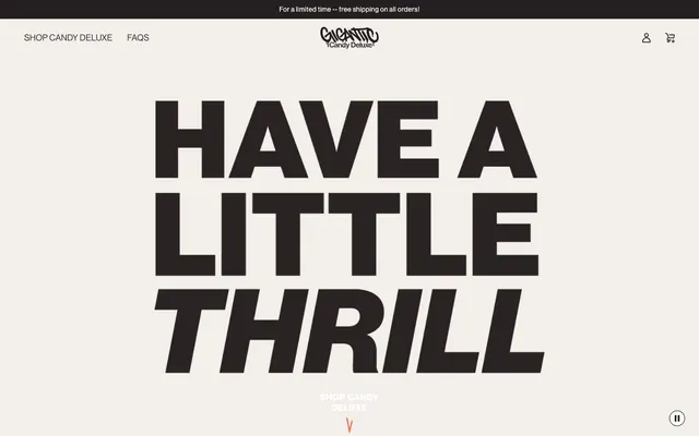









Keep what you find
A free account saves references to boards and can send you a weekly email of picks based on what you save.
To see every result, go Pro.