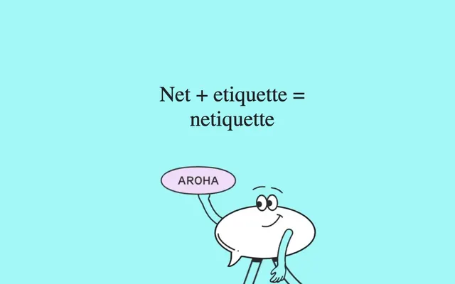
Preview image. Unlock full-res
Color palette
Page background, primary surface for all content blocks and illustrations — creates an airy, friendly atmosphere
Primary text color for headings, body text, and links. Also used for decorative border strokes on illustrations and in footers, providing strong contrast against the Sky Canvas
Typography
- Weights
- 400, 700
- Sizes
- 16px, 24px, 32px, 60px, 66px, 68px
- Line height
- 1.2
- Letter spacing
- normal
- Fallback
- Playfair Display
Headlines and emphasis text — its custom, decorative serif character defines the brand's unique voice. The varying weights and generous sizes establish a clear hierarchy and visual playfulness.
- Weights
- 400, 500
- Sizes
- 12px, 16px
- Line height
- 1.2
- Letter spacing
- 0.1670em
- Fallback
- Inter
Body text and functional UI elements — a clean, readable sans-serif that balances the distinct Feijoa display. The slight letter-spacing aids legibility for smaller text blocks.
Spacing & shape
Components
Uses Feijoa display, weight 400 or 700, at sizes from 32px to 68px. Text color is Ink Text (#222222). Margin-top of 200px and padding-bottom of 100px for generous vertical spacing.
Uses system-ui, weight 400, at 16px. Line height 1.20, letter spacing 0.1670em. Text color is Ink Text (#222222). Content is often contained within generous horizontal margins (113px or 143px).
Illustrations are typically contained within a div with a 1px solid Ink Text (#222222) border. Generous margin-top of 25px or 50px separates them from surrounding content.
Uses Feijoa display or system-ui, depending on context (Feijoa for prominent links, system-ui for inline). Text color is Ink Text (#222222). No distinct hover or underline styling is apparent from the data, maintaining the monochromatic palette.
Guidelines
- Always use Sky Canvas (#a3f7f7) as the background for all main content areas.
- Employ Feijoa display for all headings and prominent text to establish brand personality, varying weight between 400 and 700.
- Utilize system-ui for all body text and smaller informational elements, ensuring a letter-spacing of 0.1670em for enhanced readability at smaller sizes.
- Maintain generous vertical spacing with elementGap at 20px, cardPadding at 20px, and sectionGap at 50px for all content blocks.
- Ensure all textual content, including links, is rendered in Ink Text (#222222) for maximum contrast and brand consistency.
- Frame significant visual content, such as illustrations, with a 1px solid Ink Text (#222222) border.
- Avoid introducing additional background colors; maintain the primary Sky Canvas (#a3f7f7) backdrop throughout the design.
- Do not use highly saturated chromatic colors for text or primary UI elements; stick to the Ink Text (#222222) for all text.
- Refrain from complex shadow effects or gradients; the design thrives on flat surfaces and clear visual separation.
- Do not break the established typographic scale; use the defined Feijoa display and system-ui sizes and weights strictly.
- Avoid tight content packing; always provide ample padding and margin, using 20px as a minimum element separation.
About this system
ShowHide
Dialitdown embraces a playful, illustrative aesthetic with a vibrant main canvas and classic serif typography. The design feels like an interactive storybook, using ample white space (as light blue) around content blocks to emphasize readability. Illustrations provide a friendly and approachable tone, with text rendered cleanly atop a single, bright background color. The visual identity prioritizes clarity and a distinctive, whimsical character over complex UI elements.
Reminiscent of Mailchimp, Intercom, Basecamp.
# Dialitdown — Style Reference
> Whimsical Storybook Canvas

**Theme:** light

**Site:** https://www.dialitdown.co.nz

Dialitdown embraces a playful, illustrative aesthetic with a vibrant main canvas and classic serif typography. The design feels like an interactive storybook, using ample white space (as light blue) around content blocks to emphasize readability. Illustrations provide a friendly and approachable tone, with text rendered cleanly atop a single, bright background color. The visual identity prioritizes clarity and a distinctive, whimsical character over complex UI elements.

## Tokens — Colors

| Name | Value | Token | Role |
|------|------|------|------|
| Sky Canvas | `#a3f7f7` | `--color-sky-canvas` | Page background, primary surface for all content blocks and illustrations — creates an airy, friendly atmosphere |
| Ink Text | `#222222` | `--color-ink-text` | Primary text color for headings, body text, and links. Also used for decorative border strokes on illustrations and in footers, providing strong contrast against the Sky Canvas |

## Tokens — Typography

### Feijoa display
- **Substitute:** Playfair Display
- **Weights:** 400, 700
- **Sizes:** 16px, 24px, 32px, 60px, 66px, 68px
- **Line height:** 1.2
- **Letter spacing:** normal
- **Role:** Headlines and emphasis text — its custom, decorative serif character defines the brand's unique voice. The varying weights and generous sizes establish a clear hierarchy and visual playfulness.

### system-ui
- **Substitute:** Inter
- **Weights:** 400, 500
- **Sizes:** 12px, 16px
- **Line height:** 1.2
- **Letter spacing:** 0.1670em
- **Role:** Body text and functional UI elements — a clean, readable sans-serif that balances the distinct Feijoa display. The slight letter-spacing aids legibility for smaller text blocks.

## Tokens — Type Scale

Perfect Fourth (1.333) from 16px base.

| Role | Size | Line height | Letter spacing |
|------|------|------|------|
| caption | 12px | 1.2 | 0.167px |
| body | 16px | 1.2 | 0.167px |
| subheading | 24px | 1.2 | — |
| heading | 32px | 1.2 | — |
| display-sm | 60px | 1.2 | — |
| display | 66px | 1.2 | — |
| display-lg | 68px | 1.2 | — |

## Tokens — Spacing

- **Section gap:** 50px
- **Card padding:** 20px
- **Element gap:** 20px

## Tokens — Radius

- **Default:** 0px

## Components

### Primary Heading
*Page titles and large section headers*

Uses Feijoa display, weight 400 or 700, at sizes from 32px to 68px. Text color is Ink Text (#222222). Margin-top of 200px and padding-bottom of 100px for generous vertical spacing.

### Body Text Block
*Main informational content*

Uses system-ui, weight 400, at 16px. Line height 1.20, letter spacing 0.1670em. Text color is Ink Text (#222222). Content is often contained within generous horizontal margins (113px or 143px).

### Illustration Container
*Houses custom cartoon illustrations*

Illustrations are typically contained within a div with a 1px solid Ink Text (#222222) border. Generous margin-top of 25px or 50px separates them from surrounding content.

### Link Text
*Interactive text elements*

Uses Feijoa display or system-ui, depending on context (Feijoa for prominent links, system-ui for inline). Text color is Ink Text (#222222). No distinct hover or underline styling is apparent from the data, maintaining the monochromatic palette.

## Guidelines

### Do

- Always use Sky Canvas (#a3f7f7) as the background for all main content areas.
- Employ Feijoa display for all headings and prominent text to establish brand personality, varying weight between 400 and 700.
- Utilize system-ui for all body text and smaller informational elements, ensuring a letter-spacing of 0.1670em for enhanced readability at smaller sizes.
- Maintain generous vertical spacing with elementGap at 20px, cardPadding at 20px, and sectionGap at 50px for all content blocks.
- Ensure all textual content, including links, is rendered in Ink Text (#222222) for maximum contrast and brand consistency.
- Frame significant visual content, such as illustrations, with a 1px solid Ink Text (#222222) border.

### Don't

- Avoid introducing additional background colors; maintain the primary Sky Canvas (#a3f7f7) backdrop throughout the design.
- Do not use highly saturated chromatic colors for text or primary UI elements; stick to the Ink Text (#222222) for all text.
- Refrain from complex shadow effects or gradients; the design thrives on flat surfaces and clear visual separation.
- Do not break the established typographic scale; use the defined Feijoa display and system-ui sizes and weights strictly.
- Avoid tight content packing; always provide ample padding and margin, using 20px as a minimum element separation.

## Agent Prompt Guide

Quick Color Reference:
text: #222222
background: #a3f7f7
border: #222222
accent: no distinct accent color
primary action: no distinct CTA color

Example Component Prompts:
1. Create a page hero section: background Sky Canvas (#a3f7f7). Centered headline 'Net + etiquette = netiquette' using Feijoa display weight 600, 68px, Ink Text (#222222). Immediately below, a centered illustration with a 1px solid Ink Text (#222222) border, separated by 50px margin-top.
2. Create a body content block: background Sky Canvas (#a3f7f7). Left-aligned text 'Australia's coastline stretches over 50,000 kilometers...' using system-ui weight 400, 16px, Ink Text (#222222), line height 1.20, letter spacing 0.1670em. Ensure 20px padding-bottom for the text block.
3. Create a section divider: A simple 1px solid Ink Text (#222222) stroke, followed by a heading 'The Call of the Wild: National Parks and the Outback' in Feijoa display weight 700, 32px, Ink Text (#222222), with 200px margin-top.
More like this









Keep what you find
A free account saves references to boards and can send you a weekly email of picks based on what you save.
To see every result, go Pro.