Preview image. Unlock full-res
monochromatic starkness with glowing teal
Color palette
Brand accent, interactive highlights, active states, decorative fills, glowing elements. Signals actionable items and key brand iconography
Used for gradient highlights and subtle glowing effects, often paired with System Teal
Page backgrounds, card surfaces, ghost button backgrounds, default text in negative space
Slightly off-white backgrounds for subtle surface differentiation, secondary text
Hairline borders, dividers, subtle button outlines
Primary body text, headings, dark button backgrounds, icons
Deepest text color for maximum contrast, occasionally used for icons
Typography
- Weights
- 400, 600, 700
- Sizes
- 9px, 12px, 14px, 15px, 16px, 20px, 22px, 23px, 50px, 100px, 115px, 116px
- Line height
- 0.98, 1, 1.03, 1.04, 1.07, 1.23, 1.25, 1.58, 1.59
- Letter spacing
- -0.28px at 9px (0.07em), -1.2px at 15px (0.07em), -4.4px at 100px (0.07em)
- Fallback
- system-ui, sans-serif
Primary headings and display text, conveying a strong, geometric, and modern digital presence with its clean lines. Noticeable for its slightly condensed appearance at larger sizes.
- Weights
- 400, 700
- Sizes
- 16px, 24px, 45px, 86px
- Line height
- 1, 1.5
- Letter spacing
- 2.25px at 45px (0.05em), 4.3px at 86px (0.05em)
- Fallback
- Avenir Next, sans-serif
Large, impactful display headings that provide a unique, highly geometric and wide feel. Used sparingly for maximum effect, reinforcing the high-tech, architectural feel.
- Weights
- 400, 600, 700
- Sizes
- 8px, 9px, 11px, 12px, 13px, 15px, 16px
- Line height
- 0.77, 1.25, 1.33, 1.46, 1.5, 1.56, 1.58, 1.6, 1.63, 1.64
- Letter spacing
- 0.24px at 8px (0.03em), 1.6px at 16px (0.10em)
- Fallback
- Roboto, Helvetica Neue, sans-serif
Body copy, descriptions, and smaller textual elements. Provides legibility and a neutral grounding against the more prominent display fonts, with varied letter spacing for distinct visual texture.
Spacing & shape
Components
Ghost button with rounded corners: Text Graphite for text, transparent background, Border Fog 1px border. Padding of 0px top/bottom, 15px left/right. Font Rubik, weight 400. Letter spacing 0.07em.
Transparent background button with Border Fog border and rounded corners (999px). Uses Text Graphite for text. Padding of 0px top/bottom, 15px left/right.
Solid Text Graphite background with Canvas White text and rounded corners (999px). Padding of 0px top/bottom, 20px left/right.
Text Graphite text, 0px border-radius, top padding 20px, bottom padding 20px, left padding 50px.
Hairline borders using Border Fog, primarily for horizontal separation.
Guidelines
- Prioritize a System Teal accent for all interactive elements, active states, and small brand details, like button borders or icon fills for calls to action.
- Use Text Graphite (#242424) for primary body text and most headings, transitioning to Pitch Black (#000000) only for highest contrast where context allows.
- Employ Rubik for most major headings and display text, leveraging its geometric character. For maximal impact, use Akrobat for the largest, most significant titles.
- Ensure all interactive buttons and tags utilize a 999px border-radius, creating an approachable, pill-shaped aesthetic.
- Maintain high contrast between text and backgrounds; primarily use Canvas White (#ffffff) or Surface Frost (#f9f9f9) for backgrounds against dark text.
- Apply Open Sans (#400) for all body copy and descriptive text, ensuring readability across varying text densities.
- Introduce a subtle 1px Border Fog (#e5e7eb) for dividers, outlines, and inactive states to maintain visual structure without heaviness.
- Avoid introducing additional chromatic colors; the System Teal (#16ebeb) is the sole brand accent.
- Do not use heavy, filled background cards or sections; prefer transparent or subtly differentiated Surface Frost (#f9f9f9) and Canvas White (#ffffff) backgrounds.
- Do not use standard rectangular buttons; all buttons and tags should adhere to the 999px rounded-corner aesthetic.
- Avoid mixing font families arbitrarily; stick to Rubik for headings/display, Akrobat for impactful titles, and Open Sans for body text.
- Do not use dark backgrounds extensively; the site is predominantly light-themed, with dark elements serving as strong contrast points.
- Do not rely on subtle visual cues for interactive elements; the System Teal should clearly indicate clickable or active states.
- Avoid complex shadow effects; stick to the subtle glow of rgba(109, 248, 248, 0.6) 0px 0px 4px 1px for accent glow or rgba(0, 0, 0, 0.05) 5px 5px 15px 5px for soft elevation.
About this system
ShowHide
Sougen presents a digital-futuristic aesthetic through a high-contrast, mostly achromatic palette punctuated by a singular, vivid teal accent. Typography is a blend of structured geometric sans-serifs, emphasizing clean lines and generous letter spacing that hints at digital interfaces. Components are lightweight, often outlined, and favor rounded forms for interactive elements, reinforcing an approachable yet modern digital presence. The visual system balances stark, almost monochrome backgrounds with vivid, glowing accents to draw attention to interactive elements and brand identity.
The page employs a full-bleed layout for the hero section with a centered, high-contrast headline and supporting text. Subsequent sections appear to follow a max-width contained pattern, with content likely centered. Vertical spacing between sections is generous, contributing to a comfortable density. Content arrangement often features a centered stack for textual information, transitioning to a split-section for features or ecosystem details. The navigation consists of a minimal top bar with social icons and a 'Scroll Down' indicator for primary interaction guidance.
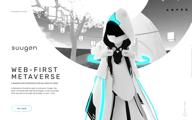
The visual language is characterized by 3D rendered, stylized characters and abstract architectural forms, primarily in achromatic tones (white, black, gray). The core imagery is a character in a white hooded cloak with glowing System Teal accents, symbolizing technological advancement. Graphics are clean, often outlined, and minimal, contributing to a futuristic, digital aesthetic. Imagery serves an explanatory and atmospheric role, showcasing product concepts rather than real-world applications. The density is moderate, with imagery occupying dominant visual space in the hero section and complementing text in content blocks.
Reminiscent of The Sandbox, Decentraland, Figma, Linear.
# Sougen — Style Reference
> monochromatic starkness with glowing teal

**Theme:** light

**Site:** https://sougen.co

Sougen presents a digital-futuristic aesthetic through a high-contrast, mostly achromatic palette punctuated by a singular, vivid teal accent. Typography is a blend of structured geometric sans-serifs, emphasizing clean lines and generous letter spacing that hints at digital interfaces. Components are lightweight, often outlined, and favor rounded forms for interactive elements, reinforcing an approachable yet modern digital presence. The visual system balances stark, almost monochrome backgrounds with vivid, glowing accents to draw attention to interactive elements and brand identity.

## Tokens — Colors

| Name | Value | Token | Role |
|------|------|------|------|
| System Teal | `#16ebeb` | `--color-system-teal` | Brand accent, interactive highlights, active states, decorative fills, glowing elements. Signals actionable items and key brand iconography |
| Teal Glow | `#6df8f8` | `--color-teal-glow` | Used for gradient highlights and subtle glowing effects, often paired with System Teal |
| Canvas White | `#ffffff` | `--color-canvas-white` | Page backgrounds, card surfaces, ghost button backgrounds, default text in negative space |
| Surface Frost | `#f9f9f9` | `--color-surface-frost` | Slightly off-white backgrounds for subtle surface differentiation, secondary text |
| Border Fog | `#e5e7eb` | `--color-border-fog` | Hairline borders, dividers, subtle button outlines |
| Text Graphite | `#242424` | `--color-text-graphite` | Primary body text, headings, dark button backgrounds, icons |
| Pitch Black | `#000000` | `--color-pitch-black` | Deepest text color for maximum contrast, occasionally used for icons |

## Tokens — Typography

### Rubik
- **Substitute:** system-ui, sans-serif
- **Weights:** 400, 600, 700
- **Sizes:** 9px, 12px, 14px, 15px, 16px, 20px, 22px, 23px, 50px, 100px, 115px, 116px
- **Line height:** 0.98, 1, 1.03, 1.04, 1.07, 1.23, 1.25, 1.58, 1.59
- **Letter spacing:** -0.28px at 9px (0.07em), -1.2px at 15px (0.07em), -4.4px at 100px (0.07em)
- **Role:** Primary headings and display text, conveying a strong, geometric, and modern digital presence with its clean lines. Noticeable for its slightly condensed appearance at larger sizes.

### Akrobat
- **Substitute:** Avenir Next, sans-serif
- **Weights:** 400, 700
- **Sizes:** 16px, 24px, 45px, 86px
- **Line height:** 1, 1.5
- **Letter spacing:** 2.25px at 45px (0.05em), 4.3px at 86px (0.05em)
- **Role:** Large, impactful display headings that provide a unique, highly geometric and wide feel. Used sparingly for maximum effect, reinforcing the high-tech, architectural feel.

### Open Sans
- **Substitute:** Roboto, Helvetica Neue, sans-serif
- **Weights:** 400, 600, 700
- **Sizes:** 8px, 9px, 11px, 12px, 13px, 15px, 16px
- **Line height:** 0.77, 1.25, 1.33, 1.46, 1.5, 1.56, 1.58, 1.6, 1.63, 1.64
- **Letter spacing:** 0.24px at 8px (0.03em), 1.6px at 16px (0.10em)
- **Role:** Body copy, descriptions, and smaller textual elements. Provides legibility and a neutral grounding against the more prominent display fonts, with varied letter spacing for distinct visual texture.

## Tokens — Type Scale

| Role | Size | Line height | Letter spacing |
|------|------|------|------|
| heading | 23px | 1.23 | -1.61px |
| heading-lg | 50px | 1.07 | -3.5px |
| display | 100px | 1 | -7px |
| display-xl | 116px | 0.98 | -8.12px |

## Tokens — Spacing

- **Section gap:** 90px
- **Card padding:** 15px
- **Element gap:** 15px

## Tokens — Radius

- **Buttons:** 999px
- **tags:** 999px

## Layout

The page employs a full-bleed layout for the hero section with a centered, high-contrast headline and supporting text. Subsequent sections appear to follow a max-width contained pattern, with content likely centered. Vertical spacing between sections is generous, contributing to a comfortable density. Content arrangement often features a centered stack for textual information, transitioning to a split-section for features or ecosystem details. The navigation consists of a minimal top bar with social icons and a 'Scroll Down' indicator for primary interaction guidance.

## Imagery

The visual language is characterized by 3D rendered, stylized characters and abstract architectural forms, primarily in achromatic tones (white, black, gray). The core imagery is a character in a white hooded cloak with glowing System Teal accents, symbolizing technological advancement. Graphics are clean, often outlined, and minimal, contributing to a futuristic, digital aesthetic. Imagery serves an explanatory and atmospheric role, showcasing product concepts rather than real-world applications. The density is moderate, with imagery occupying dominant visual space in the hero section and complementing text in content blocks.

## Components

### Hero Outline Button
*Primary call to action in hero sections.*

Ghost button with rounded corners: Text Graphite for text, transparent background, Border Fog 1px border. Padding of 0px top/bottom, 15px left/right. Font Rubik, weight 400. Letter spacing 0.07em.

### Accent Ghost Button
*Secondary call to action or interactive element.*

Transparent background button with Border Fog border and rounded corners (999px). Uses Text Graphite for text. Padding of 0px top/bottom, 15px left/right.

### Filled Dark Button
*High-contrast action button.*

Solid Text Graphite background with Canvas White text and rounded corners (999px). Padding of 0px top/bottom, 20px left/right.

### Footer Nav Link
*Navigation links in the footer.*

Text Graphite text, 0px border-radius, top padding 20px, bottom padding 20px, left padding 50px.

### Subtle Dividers
*Visual separation between content blocks.*

Hairline borders using Border Fog, primarily for horizontal separation.

## Guidelines

### Do

- Prioritize a System Teal accent for all interactive elements, active states, and small brand details, like button borders or icon fills for calls to action.
- Use Text Graphite (#242424) for primary body text and most headings, transitioning to Pitch Black (#000000) only for highest contrast where context allows.
- Employ Rubik for most major headings and display text, leveraging its geometric character. For maximal impact, use Akrobat for the largest, most significant titles.
- Ensure all interactive buttons and tags utilize a 999px border-radius, creating an approachable, pill-shaped aesthetic.
- Maintain high contrast between text and backgrounds; primarily use Canvas White (#ffffff) or Surface Frost (#f9f9f9) for backgrounds against dark text.
- Apply Open Sans (#400) for all body copy and descriptive text, ensuring readability across varying text densities.
- Introduce a subtle 1px Border Fog (#e5e7eb) for dividers, outlines, and inactive states to maintain visual structure without heaviness.

### Don't

- Avoid introducing additional chromatic colors; the System Teal (#16ebeb) is the sole brand accent.
- Do not use heavy, filled background cards or sections; prefer transparent or subtly differentiated Surface Frost (#f9f9f9) and Canvas White (#ffffff) backgrounds.
- Do not use standard rectangular buttons; all buttons and tags should adhere to the 999px rounded-corner aesthetic.
- Avoid mixing font families arbitrarily; stick to Rubik for headings/display, Akrobat for impactful titles, and Open Sans for body text.
- Do not use dark backgrounds extensively; the site is predominantly light-themed, with dark elements serving as strong contrast points.
- Do not rely on subtle visual cues for interactive elements; the System Teal should clearly indicate clickable or active states.
- Avoid complex shadow effects; stick to the subtle glow of rgba(109, 248, 248, 0.6) 0px 0px 4px 1px for accent glow or rgba(0, 0, 0, 0.05) 5px 5px 15px 5px for soft elevation.

## Agent Prompt Guide

### Quick Color Reference
- text: #242424
- background: #ffffff
- border: #e5e7eb
- accent: #16ebeb
- primary action: no distinct CTA color

### 3-5 Example Component Prompts
- Create a hero section with a 'Hero Outline Button': transparent background, Border Fog (#e5e7eb) 1px border, 999px radius, Text Graphite (#242424) text, Rubik font weight 400, 0px vertical padding, 15px horizontal padding.
- Design a footer navigation bar with 'Footer Nav Link' items: Text Graphite (#242424) text, Open Sans font, no border, 20px top/bottom padding, 50px left padding.
- Implement a 'Filled Dark Button': Text Graphite (#242424) background, Canvas White (#ffffff) text, 999px radius, 0px vertical padding, 20px horizontal padding, Rubik font, weight 400.
- Construct a content block with a subtle divider: use a 1px solid Border Fog (#e5e7eb) for horizontal separation, with Canvas White (#ffffff) background for content areas.
More like this








Keep what you find
A free account saves references to boards and can send you a weekly email of picks based on what you save.
To see every result, go Pro.