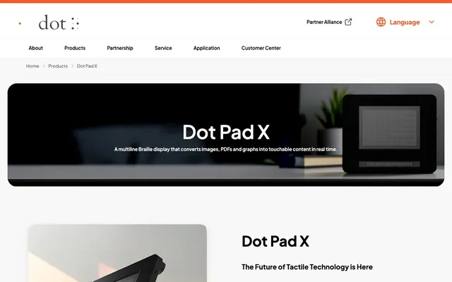
Preview image. Unlock full-res
Crisp monochrome utility with orange spark
Color palette
Primary call-to-action buttons, badge backgrounds, brand highlights. Creates urgency and focus; Semantic error states in badges
Orange text accent for links, tags, and emphasized short phrases. Do not promote it to the primary CTA color
Page backgrounds, card surfaces, all primary UI canvases
Primary text, core informational elements, general UI text
Subtle borders, dividers, ghost button outlines. Provides separation without visual weight
Headings, section titles, alternative dark backgrounds in thematic blocks
Card borders, subtle box shadows
Secondary surface background, background for alternating content blocks
Body text, list items, secondary informational text
Muted helper text, secondary body copy, less prominent UI labels
Subtle button backgrounds, inactive states
Typography
- Weights
- 300, 400, 500, 600, 700, 800
- Sizes
- 12px, 14px, 15px, 16px, 18px, 20px, 22px, 24px, 30px, 32px, 40px, 46px, 50px, 60px, 80px
- Line height
- 1.34, 1.4, 1.45, 1.5, 1.6, 1.64, 1.78, 1.8
- Letter spacing
- normal
- Fallback
- system-ui, sans-serif
The sole typeface for all textual content. Its clean, geometric form supports technical communication while various weights provide hierarchy without additional typefamilies. Weight 800 is used for impactful headlines, while weight 400 is common for body text, ensuring legibility and a contemporary feel.
Spacing & shape
Components
Background: Sunburst Orange (#ff5a2f), Text: Canvas White (#ffffff). Border radius: 30px. Padding: 12px vertical, 24px horizontal. No box shadow in default state.
Background: transparent. Text: Flame Orange (#f15b2b). Border: 1px solid Flame Orange (#f15b2b). Border radius: 8px.
Background: transparent, Text: Ink Black (#000000). No border, minimal padding. Border radius: 0px or 100% for icons.
Background: Canvas White (#ffffff). Border radius: 20px. Padding: 48px vertical, 36px horizontal. No box shadow.
Background: Cloud Gray (#f5f5f5). Border radius: 20px. Padding: 20px vertical, 40px horizontal. No box shadow.
Background: transparent. Text: Sunburst Orange (#ff5a2f). Border radius: 20px. Padding: 6px vertical, 14px horizontal.
Background: Canvas White (#ffffff). Border radius: 30px. Padding: 40px all around. No box shadow.
Guidelines
- Use Sunburst Orange (#ff5a2f) exclusively for primary action backgrounds and brand highlights.
- Maintain a clear visual hierarchy with Plus Jakarta Sans: use heavier weights (700, 800) for headlines and 400 for body text.
- Apply generous vertical spacing between sections, adhering to multiples of 24px for `elementGap` and `sectionGap`.
- Round all interactive elements like buttons and badges with a 30px or 8px radius to convey approachability; use 20px for cards and images.
- Utilize Ash Gray (#e5e7eb) for subtle borders and dividers to maintain a light and spacious feel.
- Ensure all primary text uses Ink Black (#000000) or Dark Graphite (#1f1f1f) for maximum contrast against light surfaces.
- Employ the `Cloud Gray` (#f5f5f5) as a background for alternating content blocks to create visual rhythm without heavy division.
- Do not introduce new typefaces; rely solely on Plus Jakarta Sans for all typographic needs.
- Avoid using multiple chromatic colors; restrict accents to the defined Sunburst Orange and Flame Orange derivatives.
- Do not apply drop shadows broadly to cards or sections; reserve the subtle shadow for interactive buttons only.
- Do not deviate from the established border radii; irregular rounding breaks the visual rhythm.
- Avoid dense, information-heavy layouts; favor spacious arrangements and clear visual separation.
- Do not use highly saturated colors for backgrounds; stick to the neutral palette for canvas and surfaces.
- Do not use dark backgrounds for entire pages; the system is designed around a dominant light theme.
About this system
ShowHide
Dot Inc. employs a stark, functional aesthetic with high-contrast monochrome UI elements, punctuated by a single vibrant orange accent. The design feels spacious and robust, using generous padding and rounded corners to soften otherwise sharp information blocks. Typography is clear and direct, reinforcing a sense of precise utility. This system prioritizes straightforward presentation in a light theme environment, with color reserved for interactive elements and brand recognition.
The page primarily uses a full-bleed top section often with a hero image, transitioning into a contained max-width content area (implicitly around 1200px based on component widths). Vertical rhythm is established through consistent section gaps (around 24px). Content often alternates between image-left/text-right and text-left/image-right patterns, providing dynamic flow. Card grids are used for features, showcasing multiple items in a structured layout. The overall density is spacious with ample white space between elements and sections, enhancing readability and focus. Navigation is a sticky top bar, providing persistent access.
This system features a mix of product shots and subtle ambient visuals. Product imagery is typically clean, tightly cropped, and often set against muted or dark backgrounds to emphasize the device itself. Visuals can fill containers or be softly rounded (20px radius). There is minimal use of photography or human elements, focusing instead on the technology. Icons are outlined, simple, and monochrome, often using Ink Black or a muted gray. Imagery functions primarily to showcase products and illustrate features directly.
# Dot Inc. — Style Reference
> Crisp monochrome utility with orange spark

**Theme:** light

**Site:** https://pad.dotincorp.com

Dot Inc. employs a stark, functional aesthetic with high-contrast monochrome UI elements, punctuated by a single vibrant orange accent. The design feels spacious and robust, using generous padding and rounded corners to soften otherwise sharp information blocks. Typography is clear and direct, reinforcing a sense of precise utility. This system prioritizes straightforward presentation in a light theme environment, with color reserved for interactive elements and brand recognition.

## Tokens — Colors

| Name | Value | Token | Role |
|------|------|------|------|
| Sunburst Orange | `#ff5a2f` | `--color-sunburst-orange` | Primary call-to-action buttons, badge backgrounds, brand highlights. Creates urgency and focus; Semantic error states in badges |
| Flame Orange | `#f15b2b` | `--color-flame-orange` | Orange text accent for links, tags, and emphasized short phrases. Do not promote it to the primary CTA color |
| Canvas White | `#ffffff` | `--color-canvas-white` | Page backgrounds, card surfaces, all primary UI canvases |
| Ink Black | `#000000` | `--color-ink-black` | Primary text, core informational elements, general UI text |
| Ash Gray | `#e5e7eb` | `--color-ash-gray` | Subtle borders, dividers, ghost button outlines. Provides separation without visual weight |
| Dark Graphite | `#1f1f1f` | `--color-dark-graphite` | Headings, section titles, alternative dark backgrounds in thematic blocks |
| Stone Gray | `#b7bfc1` | `--color-stone-gray` | Card borders, subtle box shadows |
| Cloud Gray | `#f5f5f5` | `--color-cloud-gray` | Secondary surface background, background for alternating content blocks |
| Charcoal Text | `#333333` | `--color-charcoal-text` | Body text, list items, secondary informational text |
| Mid Gray | `#707070` | `--color-mid-gray` | Muted helper text, secondary body copy, less prominent UI labels |
| Light Gray | `#dddddd` | `--color-light-gray` | Subtle button backgrounds, inactive states |

## Tokens — Typography

### Plus Jakarta Sans
- **Substitute:** system-ui, sans-serif
- **Weights:** 300, 400, 500, 600, 700, 800
- **Sizes:** 12px, 14px, 15px, 16px, 18px, 20px, 22px, 24px, 30px, 32px, 40px, 46px, 50px, 60px, 80px
- **Line height:** 1.34, 1.4, 1.45, 1.5, 1.6, 1.64, 1.78, 1.8
- **Letter spacing:** normal
- **Role:** The sole typeface for all textual content. Its clean, geometric form supports technical communication while various weights provide hierarchy without additional typefamilies. Weight 800 is used for impactful headlines, while weight 400 is common for body text, ensuring legibility and a contemporary feel.

## Tokens — Type Scale

Perfect Fourth (1.333) from 16px base.

| Role | Size | Line height | Letter spacing |
|------|------|------|------|
| caption | 12px | 1.5 | — |
| body-sm | 14px | 1.6 | — |
| body | 16px | 1.64 | — |
| subheading | 20px | 1.5 | — |
| heading-sm | 24px | 1.45 | — |
| heading | 32px | 1.4 | — |
| heading-lg | 46px | 1.34 | — |
| display | 80px | 1.34 | — |

## Tokens — Spacing

- **Section gap:** 24px
- **Card padding:** 40px
- **Element gap:** 24px

## Tokens — Radius

- **Buttons:** 8px
- **Cards:** 20px
- **Images:** 20px
- **badges:** 20px
- **forms:** 30px

## Layout

The page primarily uses a full-bleed top section often with a hero image, transitioning into a contained max-width content area (implicitly around 1200px based on component widths). Vertical rhythm is established through consistent section gaps (around 24px). Content often alternates between image-left/text-right and text-left/image-right patterns, providing dynamic flow. Card grids are used for features, showcasing multiple items in a structured layout. The overall density is spacious with ample white space between elements and sections, enhancing readability and focus. Navigation is a sticky top bar, providing persistent access.

## Imagery

This system features a mix of product shots and subtle ambient visuals. Product imagery is typically clean, tightly cropped, and often set against muted or dark backgrounds to emphasize the device itself. Visuals can fill containers or be softly rounded (20px radius). There is minimal use of photography or human elements, focusing instead on the technology. Icons are outlined, simple, and monochrome, often using Ink Black or a muted gray. Imagery functions primarily to showcase products and illustrate features directly.

## Components

### Primary Filled Button
*Primary call-to-action button, highly visible.*

Background: Sunburst Orange (#ff5a2f), Text: Canvas White (#ffffff). Border radius: 30px. Padding: 12px vertical, 24px horizontal. No box shadow in default state.

### Outlined Call to Action Button
*Secondary action button, providing a clear but less dominant call to action.*

Background: transparent. Text: Flame Orange (#f15b2b). Border: 1px solid Flame Orange (#f15b2b). Border radius: 8px.

### Ghost Button
*Tertiary action button or navigation item.*

Background: transparent, Text: Ink Black (#000000). No border, minimal padding. Border radius: 0px or 100% for icons.

### Standard Card
*Container for content sections, features, or product details.*

Background: Canvas White (#ffffff). Border radius: 20px. Padding: 48px vertical, 36px horizontal. No box shadow.

### Alternating Background Card
*Container for content sections in an alternating background layout.*

Background: Cloud Gray (#f5f5f5). Border radius: 20px. Padding: 20px vertical, 40px horizontal. No box shadow.

### Feature Badge
*Highlights key features or attributes.*

Background: transparent. Text: Sunburst Orange (#ff5a2f). Border radius: 20px. Padding: 6px vertical, 14px horizontal.

### Image Card
*Container for product imagery with descriptive text.*

Background: Canvas White (#ffffff). Border radius: 30px. Padding: 40px all around. No box shadow.

## Guidelines

### Do

- Use Sunburst Orange (#ff5a2f) exclusively for primary action backgrounds and brand highlights.
- Maintain a clear visual hierarchy with Plus Jakarta Sans: use heavier weights (700, 800) for headlines and 400 for body text.
- Apply generous vertical spacing between sections, adhering to multiples of 24px for `elementGap` and `sectionGap`.
- Round all interactive elements like buttons and badges with a 30px or 8px radius to convey approachability; use 20px for cards and images.
- Utilize Ash Gray (#e5e7eb) for subtle borders and dividers to maintain a light and spacious feel.
- Ensure all primary text uses Ink Black (#000000) or Dark Graphite (#1f1f1f) for maximum contrast against light surfaces.
- Employ the `Cloud Gray` (#f5f5f5) as a background for alternating content blocks to create visual rhythm without heavy division.

### Don't

- Do not introduce new typefaces; rely solely on Plus Jakarta Sans for all typographic needs.
- Avoid using multiple chromatic colors; restrict accents to the defined Sunburst Orange and Flame Orange derivatives.
- Do not apply drop shadows broadly to cards or sections; reserve the subtle shadow for interactive buttons only.
- Do not deviate from the established border radii; irregular rounding breaks the visual rhythm.
- Avoid dense, information-heavy layouts; favor spacious arrangements and clear visual separation.
- Do not use highly saturated colors for backgrounds; stick to the neutral palette for canvas and surfaces.
- Do not use dark backgrounds for entire pages; the system is designed around a dominant light theme.

## Agent Prompt Guide

Quick Color Reference:
- text: #000000
- background: #ffffff
- border: #e5e7eb
- accent: #f15b2b
- primary action: #ff5a2f (filled action)

Example Component Prompts:
- Create a 'Find a Reseller' button: background Sunburst Orange (#ff5a2f), text Canvas White (#ffffff), radius 30px, 12px 24px padding.
- Create a secondary 'Request a Demo' button: transparent background, text Flame Orange (#f15b2b), border 1px solid Flame Orange (#f15b2b), radius 8px.
- Create a product feature card: background Canvas White (#ffffff), border radius 20px, 48px 36px padding, heading Ink Black (#000000) weight 700, body Charcoal Text (#333333).
- Create a navigation link: transparent background, text Ink Black (#000000), font Plus Jakarta Sans weight 500, size 16px.
- Create a section header: text Dark Graphite (#1f1f1f) weight 800, size 46px, line height 1.34, element gap 24px below.
More like this









Keep what you find
A free account saves references to boards and can send you a weekly email of picks based on what you save.
To see every result, go Pro.