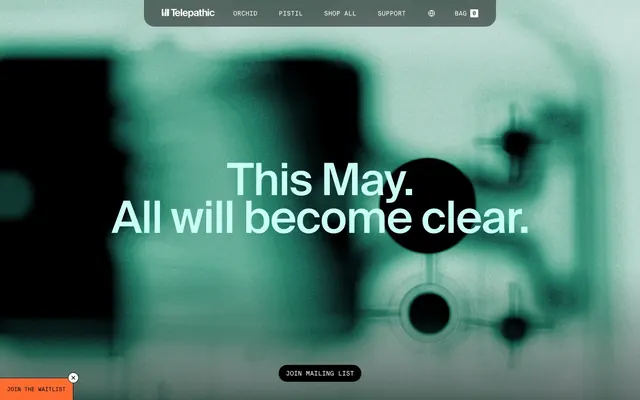
Preview image. Unlock full-res
Techno-futurist laboratory
Color palette
Orange action color for filled buttons, selected navigation states, and focused conversion moments.
Page background, primary surface, subtle borders
Primary text, solid button backgrounds, strong outlines, header bar background
Button text on dark backgrounds, card backgrounds, light text accents
Muted text, secondary navigation, input borders, icon strokes
Darker background accents, subtle fills in complex elements
Subtle background accents, dividers
Light background accents, very subtle surface differentiators
Decorative graphical elements, subtle background textures
Typography
- Weights
- 400
- Sizes
- 12px, 16px, 18px, 20px, 24px, 100px
- Line height
- 0.85, 1.2, 1.25, 1.4, 1.5
- Letter spacing
- -0.0300em, -0.0200em
- Fallback
- Inter
Primary text, headings, general UI labels. The tighter letter-spacing at larger sizes (-0.0300em for 100px) enhances its controlled, technical feel.
- Weights
- 400
- Sizes
- 12px, 14px, 16px
- Line height
- 1, 1.2, 1.25, 1.33, 1.43, 1.5
- Letter spacing
- normal
- Fallback
- JetBrains Mono
Code snippets, data displays, subtle navigation items, input values. Its fixed-width nature reinforces the technical aesthetic.
Spacing & shape
Components
Solid Charcoal background (#000000) with Snow text (#ffffff), 24px border radius, 14px vertical padding, 16px horizontal padding. Font is Suisse Intl weight 400.
Solid Amber Glow background (#ff6c2f) with Snow text (#ffffff), 24px border radius, 14px vertical padding, 16px horizontal padding. Font is Suisse Intl weight 400.
Transparent background with Snow text (#ffffff), 0px border radius, 8px padding. Has a 1px Steel (#a3a3a3) border for outline definition. Font is Suisse Intl Mono weight 400.
Transparent background with Charcoal text (#000000), 24px border radius, 0px vertical padding, 16px horizontal padding. Font is Suisse Intl weight 400.
Transparent background with 0px border radius and no box shadow. Content relies on surrounding layout for definition. Padding is 0px.
Transparent background, Steel text (#a3a3a3), and a 'Steel' bottom border. 0px border radius, 0px vertical padding, 12px horizontal padding. Uses Suisse Intl Mono font. Placeholder text is Steel (#a3a3a3).
Guidelines
- Prioritize Charcoal (#000000) for primary text and Snow (#ffffff) for backgrounds to maintain a high-contrast base.
- Use Amber Glow (#ff6c2f) exclusively for primary calls-to-action like 'Join Mailing List' to ensure its impact.
- Apply Suisse Intl with tight letter-spacing (-0.0300em for 100px text) for headlines to create a sharp, modern feel.
- Use Suisse Intl Mono for any technical or data-driven text, like input fields or code, to convey precision.
- Maintain minimal padding (8px, 12px) and flush card designs (0px border radius, no shadow) to keep surfaces lightweight.
- Construct button corners with a large radius (24px) for a soft, approachable pill-like shape, or 0px for Ghost Buttons.
- Apply backdrop filters for blurring to backgrounds in hero sections or behind overlays to create depth and focus on foreground elements.
- Avoid using Amber Glow (#ff6c2f) as a general-purpose color; limit its use to primary interactive elements.
- Do not introduce additional bold or highly saturated colors unless they are part of explicit product branding within content areas.
- Refrain from using heavy box shadows or strong borders on cards; surfaces should appear flat or subtly defined by their surroundings.
- Do not deviate from the specified tight letter-spacing for Suisse Intl at larger sizes; it's key to the typographical identity.
- Avoid creating layouts that feel dense or cluttered; maintain generous negative space and clear section breaks (40px).
- Do not use generic system fonts; always default to Suisse Intl or Suisse Intl Mono for all text elements.
About this system
ShowHide
Telepathic Instruments blends scientific product UI with artistic ambiguity. The interface centers on a minimal, high-contrast monochrome palette, punctuated by a single vibrant orange accent. Typography is compact and precise, using a bespoke geometric sans-serif that lends a technical yet refined feel. Visuals often feature abstract, blurry backgrounds with sparse, distinct elements foregrounded, creating a sense of unfolding discovery.
The site employs a full-bleed page model, allowing background elements to extend to the edges of the viewport. The hero section is full-bleed with a dark, abstract background and a large, centered headline. Content sections generally use alternating background colors (Canvas / Snow) to define distinct areas, separated by a section gap of 40px. Content within sections tends to be centrally aligned or structured in two-column layouts (text beside image/product feature). There's evidence of card grids for displaying products or user-generated content. The navigation is a sticky top bar, minimal and high-contrast, becoming fully opaque on scroll.
Imagery is a mix of abstract, blurry digital graphics and product-focused photography/screenshots. Abstract graphics often feature teal/green hues on dark backgrounds, using blur effects to create depth and mystery. Product photography is clean and focused, showing items like beanies and t-shirts in simple, outdoor settings or clear product shots with minimal distraction. Product screenshots (e.g., the synth plugin) are UI-focused, showcasing the interface clearly. Icons are primarily outlined or filled monochrome, often in Steel or Snow. The overall role of imagery leans towards atmospheric (abstract graphics) and explanatory/showcasing (product shots). Imagery density is moderate; hero sections are image-heavy, while other sections are text-dominant with smaller supporting visuals.
Reminiscent of Teenage Engineering, Arturia, Native Instruments, Orbital.cx.
# Telepathic Instruments — Style Reference
> Techno-futurist laboratory

**Theme:** light

**Site:** https://telepathicinstruments.com

Telepathic Instruments blends scientific product UI with artistic ambiguity. The interface centers on a minimal, high-contrast monochrome palette, punctuated by a single vibrant orange accent. Typography is compact and precise, using a bespoke geometric sans-serif that lends a technical yet refined feel. Visuals often feature abstract, blurry backgrounds with sparse, distinct elements foregrounded, creating a sense of unfolding discovery.

## Tokens — Colors

| Name | Value | Token | Role |
|------|------|------|------|
| Amber Glow | `#ff6c2f` | `--color-amber-glow` | Orange action color for filled buttons, selected navigation states, and focused conversion moments. |
| Canvas | `#e5e7eb` | `--color-canvas` | Page background, primary surface, subtle borders |
| Charcoal | `#000000` | `--color-charcoal` | Primary text, solid button backgrounds, strong outlines, header bar background |
| Snow | `#ffffff` | `--color-snow` | Button text on dark backgrounds, card backgrounds, light text accents |
| Steel | `#a3a3a3` | `--color-steel` | Muted text, secondary navigation, input borders, icon strokes |
| Ash | `#191919` | `--color-ash` | Darker background accents, subtle fills in complex elements |
| Mercury | `#c2c2c2` | `--color-mercury` | Subtle background accents, dividers |
| Powder | `#dddee2` | `--color-powder` | Light background accents, very subtle surface differentiators |
| Muted Sage | `#d7cdb8` | `--color-muted-sage` | Decorative graphical elements, subtle background textures |

## Tokens — Typography

### Suisse Intl
- **Substitute:** Inter
- **Weights:** 400
- **Sizes:** 12px, 16px, 18px, 20px, 24px, 100px
- **Line height:** 0.85, 1.2, 1.25, 1.4, 1.5
- **Letter spacing:** -0.0300em, -0.0200em
- **Role:** Primary text, headings, general UI labels. The tighter letter-spacing at larger sizes (-0.0300em for 100px) enhances its controlled, technical feel.

### Suisse Intl Mono
- **Substitute:** JetBrains Mono
- **Weights:** 400
- **Sizes:** 12px, 14px, 16px
- **Line height:** 1, 1.2, 1.25, 1.33, 1.43, 1.5
- **Letter spacing:** normal
- **Role:** Code snippets, data displays, subtle navigation items, input values. Its fixed-width nature reinforces the technical aesthetic.

## Tokens — Type Scale

Perfect Fifth (1.5) from 16px base.

| Role | Size | Line height | Letter spacing |
|------|------|------|------|
| caption | 12px | 1.5 | — |
| body | 16px | 1.5 | — |
| subheading | 18px | 1.4 | — |
| heading-sm | 20px | 1.25 | — |
| heading | 24px | 1.2 | — |
| display | 100px | 0.85 | -0.03em |

## Tokens — Spacing

- **Section gap:** 40px
- **Card padding:** 12px
- **Element gap:** 8px

## Tokens — Radius

- **Default:** 2px
- **Buttons:** 24px
- **Cards:** 0px
- **circular:** 9999px
- **large:** 32px

## Layout

The site employs a full-bleed page model, allowing background elements to extend to the edges of the viewport. The hero section is full-bleed with a dark, abstract background and a large, centered headline. Content sections generally use alternating background colors (Canvas / Snow) to define distinct areas, separated by a section gap of 40px. Content within sections tends to be centrally aligned or structured in two-column layouts (text beside image/product feature). There's evidence of card grids for displaying products or user-generated content. The navigation is a sticky top bar, minimal and high-contrast, becoming fully opaque on scroll.

## Imagery

Imagery is a mix of abstract, blurry digital graphics and product-focused photography/screenshots. Abstract graphics often feature teal/green hues on dark backgrounds, using blur effects to create depth and mystery. Product photography is clean and focused, showing items like beanies and t-shirts in simple, outdoor settings or clear product shots with minimal distraction. Product screenshots (e.g., the synth plugin) are UI-focused, showcasing the interface clearly. Icons are primarily outlined or filled monochrome, often in Steel or Snow. The overall role of imagery leans towards atmospheric (abstract graphics) and explanatory/showcasing (product shots). Imagery density is moderate; hero sections are image-heavy, while other sections are text-dominant with smaller supporting visuals.

## Components

### Primary Action Button
*Call to action button for primary actions.*

Solid Charcoal background (#000000) with Snow text (#ffffff), 24px border radius, 14px vertical padding, 16px horizontal padding. Font is Suisse Intl weight 400.

### Amber Glow Action Button
*Highlighting a key action for immediate visibility.*

Solid Amber Glow background (#ff6c2f) with Snow text (#ffffff), 24px border radius, 14px vertical padding, 16px horizontal padding. Font is Suisse Intl weight 400.

### Ghost Button
*Secondary and tertiary actions that require less visual emphasis.*

Transparent background with Snow text (#ffffff), 0px border radius, 8px padding. Has a 1px Steel (#a3a3a3) border for outline definition. Font is Suisse Intl Mono weight 400.

### Text Link Button
*Low-prominence inline actions or navigation.*

Transparent background with Charcoal text (#000000), 24px border radius, 0px vertical padding, 16px horizontal padding. Font is Suisse Intl weight 400.

### Product Card
*Displaying product information or content blocks.*

Transparent background with 0px border radius and no box shadow. Content relies on surrounding layout for definition. Padding is 0px.

### Form Input
*User input fields.*

Transparent background, Steel text (#a3a3a3), and a 'Steel' bottom border. 0px border radius, 0px vertical padding, 12px horizontal padding. Uses Suisse Intl Mono font. Placeholder text is Steel (#a3a3a3).

## Guidelines

### Do

- Prioritize Charcoal (#000000) for primary text and Snow (#ffffff) for backgrounds to maintain a high-contrast base.
- Use Amber Glow (#ff6c2f) exclusively for primary calls-to-action like 'Join Mailing List' to ensure its impact.
- Apply Suisse Intl with tight letter-spacing (-0.0300em for 100px text) for headlines to create a sharp, modern feel.
- Use Suisse Intl Mono for any technical or data-driven text, like input fields or code, to convey precision.
- Maintain minimal padding (8px, 12px) and flush card designs (0px border radius, no shadow) to keep surfaces lightweight.
- Construct button corners with a large radius (24px) for a soft, approachable pill-like shape, or 0px for Ghost Buttons.
- Apply backdrop filters for blurring to backgrounds in hero sections or behind overlays to create depth and focus on foreground elements.

### Don't

- Avoid using Amber Glow (#ff6c2f) as a general-purpose color; limit its use to primary interactive elements.
- Do not introduce additional bold or highly saturated colors unless they are part of explicit product branding within content areas.
- Refrain from using heavy box shadows or strong borders on cards; surfaces should appear flat or subtly defined by their surroundings.
- Do not deviate from the specified tight letter-spacing for Suisse Intl at larger sizes; it's key to the typographical identity.
- Avoid creating layouts that feel dense or cluttered; maintain generous negative space and clear section breaks (40px).
- Do not use generic system fonts; always default to Suisse Intl or Suisse Intl Mono for all text elements.

## Agent Prompt Guide

Quick Color Reference:
text: #000000
background: #e5e7eb
border: #a3a3a3
accent: #ff6c2f
primary action: #ff6c2f (filled action)

Example Component Prompts:
1. Create a hero section: Charcoal background. Headline 'This May. All will become clear.' at 100px Suisse Intl weight 400, Snow text (#ffffff), letter-spacing -30px. Centered. Below, an Amber Glow Action Button 'Join Mailing List' (Amber Glow background #ff6c2f, Snow text #ffffff, 24px radius, 14px 16px padding).
2. Design a product card: Transparent background, no border radius, 0px padding. Image of 'Orange Orchid Beanie', beneath it 'Orange Orchid Beanie' as heading-sm Suisse Intl weight 400 #000000, 12px element gap, with a small caption in Suisse Intl Mono weight 400 #a3a3a3.
3. Create a navigation bar item: Text 'Orchid' in Snow (#ffffff) Suisse Intl Mono weight 400 at 16px, normal letter-spacing. Use 6px horizontal padding between items. On hover, text color slightly darkens to Steel (#a3a3a3).
More like this









Keep what you find
A free account saves references to boards and can send you a weekly email of picks based on what you save.
To see every result, go Pro.