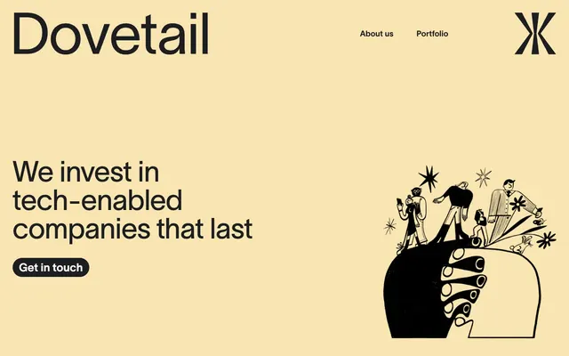
Preview image. Unlock full-res
Warm parchment, sharp ink — a trusted signature.
Color palette
Muted background for specific sections or cards, brand accent color
Primary page background, text on dark surfaces, crucial brand text elements, footer text
Primary text color, background for primary action buttons, borders for ghost buttons, dark surface accents
Subtle borders, dividers, muted backgrounds for secondary content blocks
Decorative SVG fills, high-contrast icon details
Typography
- Weights
- 400, 600, 700
- Sizes
- 20px, 22px, 28px, 32px, 48px, 72px
- Line height
- 1, 1.17, 1.36, 1.4, 1.5
- Letter spacing
- -0.01em at 72px, -0.005em at 48px, 0.005em at 32px, 0.007em at 28px, 0.010em at 20px
- Fallback
- Inter
Primary typeface for all headings, body text, navigation, and interactive elements. Its custom nature and precise tracking at different sizes define the brand's sharp, modern voice.
Spacing & shape
Components
Background: Charcoal Ink (#1d1e21), Text: Parchment (#fef9f3). Border radius: 24px. Padding: 14px vertical, 16px horizontal. Font: Lausanne, 400 weight.
Transparent background, Text: Charcoal Ink (#1d1e21). Border radius: 9999px (pill-shaped). Padding: 0px. Font: Lausanne, 400 weight.
Background: Sunkissed Ochre (#f9e5b1). Border radius: 16px. No shadow. Padding: 28px vertical, 32px horizontal. Used to highlight section details.
Text: Charcoal Ink (#1d1e21). Padding: 9px vertical, 12px horizontal. Font: Lausanne, 400 weight. No explicit background or border, relies on text for presence.
Border radius: 16px. Background is inherited from the parent container. Minimal styling around images to keep focus on content.
Background: Sunkissed Ochre (#f9e5b1). Border radius: 91px (pill-shaped). Padding: 15px vertical, 20px horizontal. Text: Charcoal Ink (#1d1e21). Font: Lausanne, 400 weight.
Guidelines
- Use Parchment (#fef9f3) as the default page background to establish a warm, clean canvas.
- Apply Lausanne typeface for all text elements, maintaining its specified weights and letter-spacing for brand consistency.
- Utilize Charcoal Ink (#1d1e21) for primary text and interactive button backgrounds to ensure strong contrast and visual hierarchy.
- Employ Haze Gray (#e5e7eb) for subtle borders and dividers, providing visual segmentation without heaviness.
- Round corners with 16px for cards and images, and 24px or 9999px for buttons and tags to maintain a consistent soft, yet structured, feel.
- Structure layout with base unit 8px. Maintain 24px element gaps and 32px section gaps for comfortable density.
- Integrate Sunkissed Ochre (#f9e5b1) as a background accent for feature sections, adding warmth and differentiation.
- Avoid heavy shadows; the system relies on subtle borders and background colors for differentiation instead of elevation.
- Do not introduce new chromatic colors outside of Sunkissed Ochre, as the brand identity is built on a restricted, warm neutral palette.
- Refrain from altering the specified font weights or letter spacing for Lausanne; these are critical for the brand's typographic tone.
- Do not use sharp 0px radius corners unless specifically called for by a unique component, as most interactive elements use rounded forms.
- Avoid dense, information-heavy blocks. Opt for comfortable spacing and clear visual hierarchy using designated element and section gaps.
- Do not use generic system fonts; Lausanne is a key brand identifier and should be used consistently across all platforms.
About this system
ShowHide
Dovetail uses a sophisticated, understated aesthetic: a warm off-white canvas sets a clean foundation, punctuated by a soft, muted yellow accent. Typography is central, using a bespoke sans-serif for sharp, confident headlines and body text. Components are minimal, relying on subtle borders and rounded corners rather than heavy shadows or fills, maintaining an open and airy feel. The overall impression is one of approachable authority, balancing professional rigor with a comforting visual warmth.
The page primarily uses a full-bleed layout, particularly in the hero section, which features a large headline and illustration over a Sunkissed Ochre background. Subsequent sections maintain a comfortable vertical rhythm with consistent 32px section gaps. Content is typically arranged in two-column structures (text left, image/illustration right, or vice versa) or centered stacks for headings and single paragraph blocks. A specific feature uses a grid of 'pill-shaped' tags.
The visual language combines stylized two-tone illustrations with high-quality, candid, somewhat desaturated photography. Illustrations appear organic and playful, using the brand's primary black and white with occasional use of Sunkissed Ochre as an accent. Photography is contained within rounded-corner frames (16px radius), appearing as authentic, non-staged glimpses into teamwork or product interaction. Both types serve as explanatory content and create atmosphere, without being overly dense, allowing text to dominate.
Reminiscent of Alinea Invest, Braid, Linear, Monzo.
# Dovetail — Style Reference
> Warm parchment, sharp ink — a trusted signature.

**Theme:** light

**Site:** https://dovetail.no

Dovetail uses a sophisticated, understated aesthetic: a warm off-white canvas sets a clean foundation, punctuated by a soft, muted yellow accent. Typography is central, using a bespoke sans-serif for sharp, confident headlines and body text. Components are minimal, relying on subtle borders and rounded corners rather than heavy shadows or fills, maintaining an open and airy feel. The overall impression is one of approachable authority, balancing professional rigor with a comforting visual warmth.

## Tokens — Colors

| Name | Value | Token | Role |
|------|------|------|------|
| Sunkissed Ochre | `#f9e5b1` | `--color-sunkissed-ochre` | Muted background for specific sections or cards, brand accent color |
| Parchment | `#fef9f3` | `--color-parchment` | Primary page background, text on dark surfaces, crucial brand text elements, footer text |
| Charcoal Ink | `#1d1e21` | `--color-charcoal-ink` | Primary text color, background for primary action buttons, borders for ghost buttons, dark surface accents |
| Haze Gray | `#e5e7eb` | `--color-haze-gray` | Subtle borders, dividers, muted backgrounds for secondary content blocks |
| Midnight | `#000000` | `--color-midnight` | Decorative SVG fills, high-contrast icon details |

## Tokens — Typography

### Lausanne
- **Substitute:** Inter
- **Weights:** 400, 600, 700
- **Sizes:** 20px, 22px, 28px, 32px, 48px, 72px
- **Line height:** 1, 1.17, 1.36, 1.4, 1.5
- **Letter spacing:** -0.01em at 72px, -0.005em at 48px, 0.005em at 32px, 0.007em at 28px, 0.010em at 20px
- **Role:** Primary typeface for all headings, body text, navigation, and interactive elements. Its custom nature and precise tracking at different sizes define the brand's sharp, modern voice.

## Tokens — Type Scale

| Role | Size | Line height | Letter spacing |
|------|------|------|------|
| body-sm | 20px | 1.5 | 0.2px |
| body | 22px | 1.5 | 0.154px |
| subheading | 28px | 1.4 | 0.196px |
| heading-sm | 32px | 1.36 | 0.16px |
| heading | 48px | 1.17 | -0.24px |
| display | 72px | 1 | -0.72px |

## Tokens — Spacing

- **Section gap:** 32px
- **Element gap:** 24px

## Tokens — Radius

- **Buttons:** 24px
- **Cards:** 16px
- **Images:** 16px
- **lists:** 91px
- **navItems:** 16px
- **tags:** 9999px

## Layout

The page primarily uses a full-bleed layout, particularly in the hero section, which features a large headline and illustration over a Sunkissed Ochre background. Subsequent sections maintain a comfortable vertical rhythm with consistent 32px section gaps. Content is typically arranged in two-column structures (text left, image/illustration right, or vice versa) or centered stacks for headings and single paragraph blocks. A specific feature uses a grid of 'pill-shaped' tags.

## Imagery

The visual language combines stylized two-tone illustrations with high-quality, candid, somewhat desaturated photography. Illustrations appear organic and playful, using the brand's primary black and white with occasional use of Sunkissed Ochre as an accent. Photography is contained within rounded-corner frames (16px radius), appearing as authentic, non-staged glimpses into teamwork or product interaction. Both types serve as explanatory content and create atmosphere, without being overly dense, allowing text to dominate.

## Components

### Filled Primary Button
*Call to action button*

Background: Charcoal Ink (#1d1e21), Text: Parchment (#fef9f3). Border radius: 24px. Padding: 14px vertical, 16px horizontal. Font: Lausanne, 400 weight.

### Ghost Navigation Button
*Secondary call to action or navigation item*

Transparent background, Text: Charcoal Ink (#1d1e21). Border radius: 9999px (pill-shaped). Padding: 0px. Font: Lausanne, 400 weight.

### Primary Card
*Group related content, feature sections*

Background: Sunkissed Ochre (#f9e5b1). Border radius: 16px. No shadow. Padding: 28px vertical, 32px horizontal. Used to highlight section details.

### Navigation Link
*Site navigation item*

Text: Charcoal Ink (#1d1e21). Padding: 9px vertical, 12px horizontal. Font: Lausanne, 400 weight. No explicit background or border, relies on text for presence.

### Image Card
*Display images within content*

Border radius: 16px. Background is inherited from the parent container. Minimal styling around images to keep focus on content.

### Accent Tag
*Highlight key terms within text or lists*

Background: Sunkissed Ochre (#f9e5b1). Border radius: 91px (pill-shaped). Padding: 15px vertical, 20px horizontal. Text: Charcoal Ink (#1d1e21). Font: Lausanne, 400 weight.

## Guidelines

### Do

- Use Parchment (#fef9f3) as the default page background to establish a warm, clean canvas.
- Apply Lausanne typeface for all text elements, maintaining its specified weights and letter-spacing for brand consistency.
- Utilize Charcoal Ink (#1d1e21) for primary text and interactive button backgrounds to ensure strong contrast and visual hierarchy.
- Employ Haze Gray (#e5e7eb) for subtle borders and dividers, providing visual segmentation without heaviness.
- Round corners with 16px for cards and images, and 24px or 9999px for buttons and tags to maintain a consistent soft, yet structured, feel.
- Structure layout with base unit 8px. Maintain 24px element gaps and 32px section gaps for comfortable density.
- Integrate Sunkissed Ochre (#f9e5b1) as a background accent for feature sections, adding warmth and differentiation.

### Don't

- Avoid heavy shadows; the system relies on subtle borders and background colors for differentiation instead of elevation.
- Do not introduce new chromatic colors outside of Sunkissed Ochre, as the brand identity is built on a restricted, warm neutral palette.
- Refrain from altering the specified font weights or letter spacing for Lausanne; these are critical for the brand's typographic tone.
- Do not use sharp 0px radius corners unless specifically called for by a unique component, as most interactive elements use rounded forms.
- Avoid dense, information-heavy blocks. Opt for comfortable spacing and clear visual hierarchy using designated element and section gaps.
- Do not use generic system fonts; Lausanne is a key brand identifier and should be used consistently across all platforms.

## Agent Prompt Guide

### Quick Color Reference
text: #1d1e21
background: #fef9f3
border: #e5e7eb
accent: #f9e5b1
primary action: #1d1e21 (filled action)

### 3-5 Example Component Prompts
1. Create a hero section: Sunkissed Ochre background (#f9e5b1). Headline: 'We invest in tech-enabled companies that last' (Lausanne, 72px, 1.0 line-height, Charcoal Ink #1d1e21, letter-spacing -0.72px). Button: 'Get in touch' (Filled Primary Button with Charcoal Ink #1d1e21 background, Parchment #fef9f3 text, 24px radius, 14px 16px padding).
2. Design a feature section: Parchment background (#fef9f3). Headline: 'Driven by people, enabled by technology' (Lausanne, 48px, 1.17 line-height, Charcoal Ink #1d1e21, letter-spacing -0.24px). Body text: 'Combining capital with hands-on experience...' (Lausanne, 22px, 1.5 line-height, Charcoal Ink #1d1e21). Accent tags: 'Capital', '+ Design', '+ Tech' (Accent Tag with Sunkissed Ochre #f9e5b1 background, 91px radius, 15px 20px padding).
3. Build a navigation bar: Parchment background (#fef9f3). Logo: 'Dovetail' (Lausanne, 32px, 1.4 line-height, Charcoal Ink #1d1e21). Navigation links: 'About us', 'Portfolio' (Lausanne, 20px, 1.5 line-height, Charcoal Ink #1d1e21). Action button: 'Get in touch' (Filled Primary Button with Charcoal Ink #1d1e21 background, Parchment #fef9f3 text, 24px radius, 14px 16px padding).
More like this









Keep what you find
A free account saves references to boards and can send you a weekly email of picks based on what you save.
To see every result, go Pro.