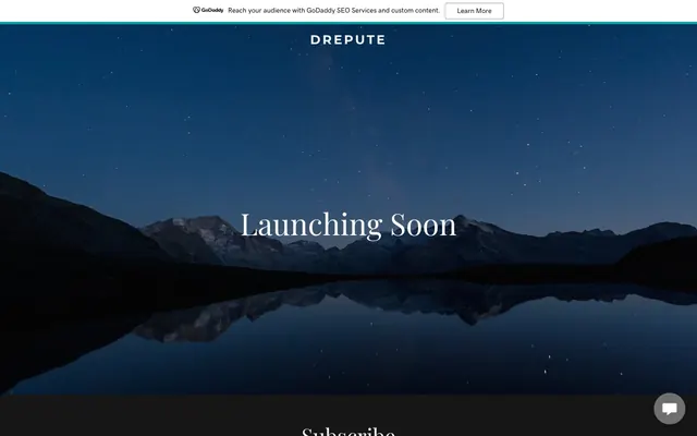
Preview image. Unlock full-res
Midnight Lake Serenity: a tranquil, dark expanse punctuated by crisp, minimal text and subtle, interactive glints of light.
Color palette
Highlighting interactive links, subtle ghost button borders — a singular, cool accent color that draws attention without shouting
Page backgrounds, hero section background, primary card surfaces — the dominant deep, dark canvas
Primary text on light backgrounds, dark button borders, subtle decorative strokes
Primary text on dark backgrounds, interactive element backgrounds, input borders, ghost icon fills
Muted text, placeholder text in inputs, subtle element borders
Secondary body text, supporting information text, less prominent borders
Tertiary text, navigation links, and subtle outlined button borders
Border for interaction components, indicating a soft, interactive boundary
Typography
- Weights
- 400, 700
- Sizes
- 14px, 16px
- Line height
- 1.2, 1.5
- Letter spacing
- -1.14px at 16px, -1.0px at 14px
- Fallback
- system-ui
Primary text for body content, buttons, inputs, and navigation — provides a clear, modern counterpoint to the more decorative display font.
- Weights
- 400
- Sizes
- 16px, 44px, 62px
- Line height
- 1.2, 1.25
- Letter spacing
- normal
- Fallback
- Times New Roman
Expressive serif for primary headings and prominent display text — its elegant, classic character lends gravity and distinctiveness to key messages.
- Weights
- 700
- Sizes
- 26px
- Line height
- 1.2
- Letter spacing
- -3.85px at 26px
- Fallback
- Arial
Used for distinctive, high-impact headings — its bold weight and tight tracking create a strong focal point.
- Weights
- 400
- Sizes
- 14px, 16px
- Line height
- 1.2
GD Sherpa — detected in extracted data but not described by AI
- Weights
- 400
- Sizes
- 16px
- Line height
- 1.2
Times — detected in extracted data but not described by AI
Spacing & shape
Components
Text: #000000. Background: #ffffff. Border: 1px solid #8995a9 (Mountain Mist). Padding: 8px vertical, 24px horizontal. Radius: 4px. Font: Source Sans Pro, 16px weight 400, line height 1.2.
Text: #000000. Background: #ffffff. Border: 1px solid #000000 (Night Sky). Padding: 8px vertical, 32px horizontal. Radius: 4px. Font: Source Sans Pro, 16px weight 400, line height 1.2.
Text: #bfbfbf (Ash Gray). Background: rgba(22, 22, 22, 0) (transparent). Border: 1px solid #ffffff (Snow Drift). Padding: 23px top, 7px bottom, 16px horizontal. Radius: 4px. Font: Source Sans Pro, 16px weight 400, line height 1.2.
Text: #ffffff (Snow Drift). Font: Playfair Display, 16px weight 400, line height 1.2.
Text: #ffffff (Snow Drift). Font: Playfair Display, 62px weight 400, line height 1.25.
Guidelines
- Ground all primary layouts in 'Midnight Lake' (#161616) as the dominant background color to maintain the deep, dark aesthetic.
- Use 'Snow Drift' (#ffffff) for all main headings and body text on dark backgrounds to ensure strong contrast and legibility.
- Apply 'Playfair Display' for all primary display text and headings, leveraging its elegant serif character.
- Structure interactive elements with minimal, crisp borders, such as 1px solid 'Mountain Mist' (#8995a9) for secondary actions or 'Teal Accent' (#00a4a6) for active links.
- Maintain a tight layout with 'elementGap' of 24px and component radii consistently at 4px.
- Introduce 'Teal Accent' (#00a4a6) sparingly, strictly for links and interactive outlines where a subtle highlight is desired, avoiding its use as a filled button background.
- Employ Source Sans Pro for all functional text, like buttons, inputs, and body copy, to provide a modern, legible contrast to the decorative serifs.
- Avoid using bright or overly saturated colors as primary backgrounds; the system relies on deep, subdued tones.
- Do not introduce heavy shadows or gradients; rely on clean, flat surfaces and crisp borders for visual definition.
- Refrain from using multiple distinct accent colors; 'Teal Accent' (#00a4a6) should largely be the sole chromatic highlight.
- Do not fill primary action buttons with 'Teal Accent' (#00a4a6); reserve it for outlines or text accents.
- Avoid excessive imagery or complex visual elements in content areas; prioritize clean typography and functional UI.
- Do not deviate from the established small border radius of 4px; rounded edges should be consistent and subtle.
About this system
ShowHide
Drepute employs a dark, contemplative aesthetic, grounding itself in the deep blues and blacks of a stark night sky or a still lake. Typography is central, using elegant serifs for prominent messages and clear sans-serifs for utility. The interface is highly minimal, with muted controls and a focus on content, relying on white text on dark backgrounds and thin borders for structure. Interactivity is suggested by subtle outlines and a scarcity of vibrant color, making any color highlight feel purposeful and significant.
The page employs a full-bleed layout for its hero section, featuring a centered headline over the background image. Subsequent sections, like the 'Subscribe' area, appear to use a max-width contained layout, vertically centered with clear, consistent spacing. The overall rhythm is one of spaciousness with minimal, focused content blocks stacked vertically, relying on generous vertical padding and strong typographic contrasts to define sections. A thin banner at the top acts as a secondary, lighter navigation or alert area. The navigation itself is a simple top bar, also full-width, displaying the brand name and possibly a few links.
The site primarily features a single, full-bleed night landscape photograph as a hero background, depicting mountains reflected in a still lake under a starry sky. This imagery serves as a decorative, atmospheric backdrop rather than conveying specific content. There is no other prominent use of photography, illustration, or complex graphics. Icons are minimal, likely monochromatic or ghost-style (such as the chat icon), serving strictly functional roles.
Reminiscent of Calm (App), Linear, Superhuman.
# Drepute — Style Reference
> Midnight Lake Serenity: a tranquil, dark expanse punctuated by crisp, minimal text and subtle, interactive glints of light.

**Theme:** dark

**Site:** https://drepute.xyz

Drepute employs a dark, contemplative aesthetic, grounding itself in the deep blues and blacks of a stark night sky or a still lake. Typography is central, using elegant serifs for prominent messages and clear sans-serifs for utility. The interface is highly minimal, with muted controls and a focus on content, relying on white text on dark backgrounds and thin borders for structure. Interactivity is suggested by subtle outlines and a scarcity of vibrant color, making any color highlight feel purposeful and significant.

## Tokens — Colors

| Name | Value | Token | Role |
|------|------|------|------|
| Teal Accent | `#00a4a6` | `--color-teal-accent` | Highlighting interactive links, subtle ghost button borders — a singular, cool accent color that draws attention without shouting |
| Midnight Lake | `#161616` | `--color-midnight-lake` | Page backgrounds, hero section background, primary card surfaces — the dominant deep, dark canvas |
| Night Sky | `#000000` | `--color-night-sky` | Primary text on light backgrounds, dark button borders, subtle decorative strokes |
| Snow Drift | `#ffffff` | `--color-snow-drift` | Primary text on dark backgrounds, interactive element backgrounds, input borders, ghost icon fills |
| Ash Gray | `#bfbfbf` | `--color-ash-gray` | Muted text, placeholder text in inputs, subtle element borders |
| Slate Dew | `#a9a9a9` | `--color-slate-dew` | Secondary body text, supporting information text, less prominent borders |
| Pebble Stone | `#7f8080` | `--color-pebble-stone` | Tertiary text, navigation links, and subtle outlined button borders |
| Mountain Mist | `#8995a9` | `--color-mountain-mist` | Border for interaction components, indicating a soft, interactive boundary |

## Tokens — Typography

### Source Sans Pro
- **Substitute:** system-ui
- **Weights:** 400, 700
- **Sizes:** 14px, 16px
- **Line height:** 1.2, 1.5
- **Letter spacing:** -1.14px at 16px, -1.0px at 14px
- **Role:** Primary text for body content, buttons, inputs, and navigation — provides a clear, modern counterpoint to the more decorative display font.

### Playfair Display
- **Substitute:** Times New Roman
- **Weights:** 400
- **Sizes:** 16px, 44px, 62px
- **Line height:** 1.2, 1.25
- **Letter spacing:** normal
- **Role:** Expressive serif for primary headings and prominent display text — its elegant, classic character lends gravity and distinctiveness to key messages.

### Montserrat
- **Substitute:** Arial
- **Weights:** 700
- **Sizes:** 26px
- **Line height:** 1.2
- **Letter spacing:** -3.85px at 26px
- **Role:** Used for distinctive, high-impact headings — its bold weight and tight tracking create a strong focal point.

### GD Sherpa
- **Weights:** 400
- **Sizes:** 14px, 16px
- **Line height:** 1.2
- **Role:** GD Sherpa — detected in extracted data but not described by AI

### Times
- **Weights:** 400
- **Sizes:** 16px
- **Line height:** 1.2
- **Role:** Times — detected in extracted data but not described by AI

## Tokens — Type Scale

| Role | Size | Line height | Letter spacing |
|------|------|------|------|
| body-sm | 14px | 1.2 | -1px |
| body | 16px | 1.2 | -1.14px |
| subheading | 26px | 1.2 | -3.85px |
| heading | 44px | 1.25 | — |
| display | 62px | 1.25 | — |

## Tokens — Spacing

- **Section gap:** 32px
- **Card padding:** 24px
- **Element gap:** 24px

## Tokens — Radius

- **Buttons:** 4px
- **Inputs:** 4px

## Layout

The page employs a full-bleed layout for its hero section, featuring a centered headline over the background image. Subsequent sections, like the 'Subscribe' area, appear to use a max-width contained layout, vertically centered with clear, consistent spacing. The overall rhythm is one of spaciousness with minimal, focused content blocks stacked vertically, relying on generous vertical padding and strong typographic contrasts to define sections. A thin banner at the top acts as a secondary, lighter navigation or alert area. The navigation itself is a simple top bar, also full-width, displaying the brand name and possibly a few links.

## Imagery

The site primarily features a single, full-bleed night landscape photograph as a hero background, depicting mountains reflected in a still lake under a starry sky. This imagery serves as a decorative, atmospheric backdrop rather than conveying specific content. There is no other prominent use of photography, illustration, or complex graphics. Icons are minimal, likely monochromatic or ghost-style (such as the chat icon), serving strictly functional roles.

## Components

### Light Outlined Button
*Secondary action button on dark backgrounds.*

Text: #000000. Background: #ffffff. Border: 1px solid #8995a9 (Mountain Mist). Padding: 8px vertical, 24px horizontal. Radius: 4px. Font: Source Sans Pro, 16px weight 400, line height 1.2.

### Solid Text Button (default)
*Primary action button, used primarily against lighter areas or when a strong contrast is needed.*

Text: #000000. Background: #ffffff. Border: 1px solid #000000 (Night Sky). Padding: 8px vertical, 32px horizontal. Radius: 4px. Font: Source Sans Pro, 16px weight 400, line height 1.2.

### Text Input
*Standard input field for user data.*

Text: #bfbfbf (Ash Gray). Background: rgba(22, 22, 22, 0) (transparent). Border: 1px solid #ffffff (Snow Drift). Padding: 23px top, 7px bottom, 16px horizontal. Radius: 4px. Font: Source Sans Pro, 16px weight 400, line height 1.2.

### Brand Logo
*Primary brand identifier in navigation.*

Text: #ffffff (Snow Drift). Font: Playfair Display, 16px weight 400, line height 1.2.

### Hero Headline
*Large, prominent text for hero sections.*

Text: #ffffff (Snow Drift). Font: Playfair Display, 62px weight 400, line height 1.25.

## Guidelines

### Do

- Ground all primary layouts in 'Midnight Lake' (#161616) as the dominant background color to maintain the deep, dark aesthetic.
- Use 'Snow Drift' (#ffffff) for all main headings and body text on dark backgrounds to ensure strong contrast and legibility.
- Apply 'Playfair Display' for all primary display text and headings, leveraging its elegant serif character.
- Structure interactive elements with minimal, crisp borders, such as 1px solid 'Mountain Mist' (#8995a9) for secondary actions or 'Teal Accent' (#00a4a6) for active links.
- Maintain a tight layout with 'elementGap' of 24px and component radii consistently at 4px.
- Introduce 'Teal Accent' (#00a4a6) sparingly, strictly for links and interactive outlines where a subtle highlight is desired, avoiding its use as a filled button background.
- Employ Source Sans Pro for all functional text, like buttons, inputs, and body copy, to provide a modern, legible contrast to the decorative serifs.

### Don't

- Avoid using bright or overly saturated colors as primary backgrounds; the system relies on deep, subdued tones.
- Do not introduce heavy shadows or gradients; rely on clean, flat surfaces and crisp borders for visual definition.
- Refrain from using multiple distinct accent colors; 'Teal Accent' (#00a4a6) should largely be the sole chromatic highlight.
- Do not fill primary action buttons with 'Teal Accent' (#00a4a6); reserve it for outlines or text accents.
- Avoid excessive imagery or complex visual elements in content areas; prioritize clean typography and functional UI.
- Do not deviate from the established small border radius of 4px; rounded edges should be consistent and subtle.

## Agent Prompt Guide

Quick Color Reference:
text: #ffffff
background: #161616
border: #000000
accent: #00a4a6
primary action: #00a4a6 (outlined action border)

Example Component Prompts:
Create a hero section: 'Midnight Lake' (#161616) background. Centered headline 'Launching Soon' at 62px Playfair Display weight 400, 'Snow Drift' (#ffffff). Above that, the logo 'Drepute' at 16px Playfair Display weight 400, 'Snow Drift' (#ffffff).
Create a 'Learn More' button: 'Snow Drift' (#ffffff) background, 'Night Sky' (#000000) text (Source Sans Pro 16px weight 400), 1px solid 'Midnight Lake' (#000000) border, 4px radius, 8px vertical padding, 32px horizontal padding.
Create a subscribe section: 'Midnight Lake' (#161616) background. Centered heading 'Subscribe' at 44px Playfair Display weight 400, 'Snow Drift' (#ffffff). An input box with transparent background, 'Ash Gray' (#bfbfbf) placeholder text (Source Sans Pro 16px weight 400), 1px solid 'Snow Drift' (#ffffff) border, 4px radius, 23px top / 7px bottom / 16px horizontal padding.
Create a navigation bar: 'Midnight Lake' (#161616) background. 'Drepute' logo as 16px Playfair Display weight 400 in 'Snow Drift' (#ffffff). Navigation link 'Learn More' in 'Pebble Stone' (#7f8080) at 14px Source Sans Pro weight 400.
More like this









Keep what you find
A free account saves references to boards and can send you a weekly email of picks based on what you save.
To see every result, go Pro.