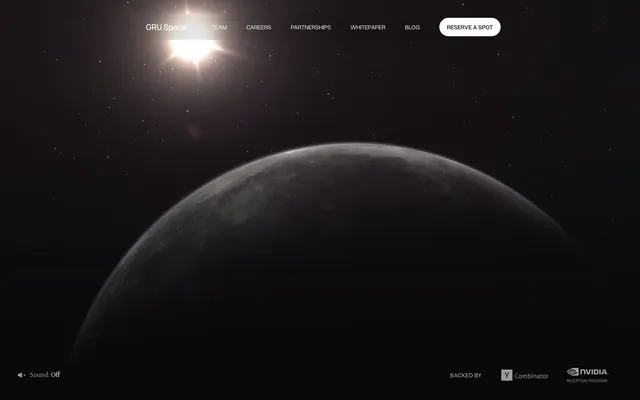
Preview image. Unlock full-res
Star Chart Blueprint: High-contrast, sharp, and focused on pure form against a dark void.
Color palette
Primary background for the entire application, creating a deep, infinite canvas. Also used for some text.
Dominant text color for headings and body, accent color for borders and interactive elements, providing high contrast against the Void Black.
Secondary text and informational accents, offering a subtle contrast to Lunar White without diminishing readability.
Subtle border color, creating very low-contrast divisions within the dark theme.
Background for minor elements or dividers, a slightly lighter shade of the background.
Background for specific card elements, providing a distinct, slightly desaturated surface within the dark theme.
Typography
- Weights
- 400, 500
- Sizes
- 12px, 14px, 16px, 18px, 19px, 20px, 24px, 28px, 51px
- Line height
- 1.1, 1.2, 1.3, 1.4, 1.5, 1.6
- Letter spacing
- -0.01em at larger sizes; 0.02em for smaller text, maintaining legibility across contrast levels.
- Fallback
- Inter
The primary workhorse typeface for all body text, navigation, buttons, and most headings below display size. Its modern, sans-serif character supports the technical and forward-looking brand identity.
- Weights
- 400
- Sizes
- 16px, 51px, 54px
- Line height
- 1, 1.1, 1.2, 1.4
- Letter spacing
- -0.011em at 54px, -0.01em at 51px, -0.009em at 16px, creating a refined, tight feel for headlines.
- Fallback
- Playfair Display
Used exclusively for large display headings; its classical serif form provides a sense of gravitas and sophistication, contrasting with the technical sans-serif to create an elevated, almost luxury, feel for key brand statements.
Spacing & shape
Components
Border-only button with Lunar White text and 1440px border-radius, giving it a pill shape. Text is Overused Grotesk, 16px, weight 400. No background, transparent.
Text link using Overused Grotesk, 16px, weight 400, Lunar White color, no background or border, 0px border-radius.
Transparent background card with 0px border-radius. Text uses Overused Grotesk or PP Mondwest with Lunar White or Slate Gray color. Padding of 80px top/bottom and 72px left on desktop. Hover state darkens text to 60% opacity.
Rectangle with 20px border-radius and Moon Rock background (#b4b7b8). Padding of 16px around content. Text is Overused Grotesk, Lunar White.
Card with a translucent dark background (rgba(0,0,0,0.4)) and 8px border-radius. Padding of 12px vertical and 20px horizontal. Text is Lunar White with Overused Grotesk.
White background, Lunar White border with 0px border-radius. Text is Void Black. Padding of 8px vertical and 24px horizontal. Placeholder text is Slate Grey (#6b6b6b).
Guidelines
- Use Overused Grotesk (or Inter) for all body copy and UI elements, prioritizing readability with Lunar White #ffffff on Void Black #080808.
- Employ PP Mondwest (or Playfair Display) exclusively for large, impactful headlines at sizes 51px and 54px to convey brand authority.
- Maintain a fully dark theme with 'Void Black' #080808 as the pervasive background color.
- Apply a 1440px border-radius to all buttons for a distinctive pill shape, ensuring a soft touch within the otherwise sharp interface.
- Utilize 'Lunar White' #ffffff for all interactive element borders and primary text to ensure maximum contrast and visual guidance.
- Use letter-spacing as specified for PP Mondwest headlines (-0.011em at largest size) to ensure a high-end, tight typographic presentation.
- Do not use shadows for elevation; rely solely on color contrast and background changes for layering and hierarchy.
- Avoid using chromatic colors; the palette is strictly achromatic with very subtle dark and light grays.
- Do not introduce new fonts; restrict typography to Overused Grotesk and PP Mondwest to maintain distinct roles.
- Do not deviate from the specified border-radii; especially the 1440px pill shape for buttons and 0px for inputs.
- Do not use generic button styles; all buttons are primarily ghost buttons with a visible border, not solid fills.
- Avoid excessive imagery; the aesthetic is text and UI-dominant, with imagery used sparingly and powerfully (e.g., full-bleed backgrounds).
About this system
ShowHide
GRU Space presents a 'cosmic minimalist' aesthetic, leveraging deep blacks and stark whites to evoke the vastness of space and the precision of engineering. The combination of two distinct custom typefaces — one a contemporary sans-serif, the other a more traditional serif for display — creates a tension between futuristic ambition and foundational elegance. Minimalist border-only buttons, coupled with a complete absence of shadows, emphasize a flat, high-contrast digital environment, akin to looking at a star chart.
The page employs a full-bleed layout, where background imagery and dark gradients extend to the edges of the viewport, creating a vast, immersive experience. Content is primarily centered within a flexible max-width container that isn't strictly defined but provides comfortable reading lines. The hero section features a full-viewport visual (dynamic video/image) with a centered headline and navigation pinned to the top. Subsequent sections maintain consistent vertical spacing (sectionGap of 80px) and often utilize a single-column stacked content arrangement, with text-heavy blocks contrasting against the dark backgrounds. There's no distinct grid for cards or features, rather content flows linearly. Navigation is a sticky top bar with minimal links and a prominent 'Reserve a Spot' ghost button.
The visual language is characterized by realistic, high-resolution photography of celestial bodies (planets, stars, sun flares) used full-bleed as background elements, creating an immersive, atmospheric context. These images are often dark and moody, serving as subtle backdrops rather than focal points. Product-specific visuals are minimal, with abstract UI graphics represented through high-contrast grid lines (+ shapes) on dark surfaces. Icons are typically monochromatic white outlines. The density is image-heavy in the hero but otherwise text-dominant, with imagery functioning decoratively to establish mood and theme.
Reminiscent of Axiom Space, SpaceX, Apple (Pro product pages), Baidu (Science & Tech pages).
# GRU Space — Style Reference
> Star Chart Blueprint: High-contrast, sharp, and focused on pure form against a dark void.

**Theme:** dark

**Site:** https://www.gru.space

GRU Space presents a 'cosmic minimalist' aesthetic, leveraging deep blacks and stark whites to evoke the vastness of space and the precision of engineering. The combination of two distinct custom typefaces — one a contemporary sans-serif, the other a more traditional serif for display — creates a tension between futuristic ambition and foundational elegance. Minimalist border-only buttons, coupled with a complete absence of shadows, emphasize a flat, high-contrast digital environment, akin to looking at a star chart.

## Tokens — Colors

| Name | Value | Token | Role |
|------|------|------|------|
| Void Black | `#080808` | `--color-void-black` | Primary background for the entire application, creating a deep, infinite canvas. Also used for some text. |
| Lunar White | `#ffffff` | `--color-lunar-white` | Dominant text color for headings and body, accent color for borders and interactive elements, providing high contrast against the Void Black. |
| Slate Gray | `#9c9c9c` | `--color-slate-gray` | Secondary text and informational accents, offering a subtle contrast to Lunar White without diminishing readability. |
| Obsidian Grey | `#191919` | `--color-obsidian-grey` | Subtle border color, creating very low-contrast divisions within the dark theme. |
| Meteorite Gray | `#393939` | `--color-meteorite-gray` | Background for minor elements or dividers, a slightly lighter shade of the background. |
| Moon Rock | `#b4b7b8` | `--color-moon-rock` | Background for specific card elements, providing a distinct, slightly desaturated surface within the dark theme. |

## Tokens — Typography

### Overused Grotesk
- **Substitute:** Inter
- **Weights:** 400, 500
- **Sizes:** 12px, 14px, 16px, 18px, 19px, 20px, 24px, 28px, 51px
- **Line height:** 1.1, 1.2, 1.3, 1.4, 1.5, 1.6
- **Letter spacing:** -0.01em at larger sizes; 0.02em for smaller text, maintaining legibility across contrast levels.
- **Role:** The primary workhorse typeface for all body text, navigation, buttons, and most headings below display size. Its modern, sans-serif character supports the technical and forward-looking brand identity.

### PP Mondwest
- **Substitute:** Playfair Display
- **Weights:** 400
- **Sizes:** 16px, 51px, 54px
- **Line height:** 1, 1.1, 1.2, 1.4
- **Letter spacing:** -0.011em at 54px, -0.01em at 51px, -0.009em at 16px, creating a refined, tight feel for headlines.
- **Role:** Used exclusively for large display headings; its classical serif form provides a sense of gravitas and sophistication, contrasting with the technical sans-serif to create an elevated, almost luxury, feel for key brand statements.

## Tokens — Type Scale

Major Third (1.25) from 16px base.

| Role | Size | Line height | Letter spacing |
|------|------|------|------|
| caption | 12px | 1.5 | 0.24px |
| body-sm | 14px | 1.4 | — |
| body | 16px | 1.4 | -0.16px |
| subheading | 19px | 1.3 | — |
| heading | 24px | 1.2 | — |
| heading-lg | 28px | 1.2 | — |
| display | 51px | 1.1 | -0.51px |
| display-xl | 54px | 1 | -0.59px |

## Tokens — Spacing

- **Section gap:** 80px

## Tokens — Radius

- **Buttons:** 1440px
- **Inputs:** 0px
- **Cards:** 6px
- **badges:** 20px

## Layout

The page employs a full-bleed layout, where background imagery and dark gradients extend to the edges of the viewport, creating a vast, immersive experience. Content is primarily centered within a flexible max-width container that isn't strictly defined but provides comfortable reading lines. The hero section features a full-viewport visual (dynamic video/image) with a centered headline and navigation pinned to the top. Subsequent sections maintain consistent vertical spacing (sectionGap of 80px) and often utilize a single-column stacked content arrangement, with text-heavy blocks contrasting against the dark backgrounds. There's no distinct grid for cards or features, rather content flows linearly. Navigation is a sticky top bar with minimal links and a prominent 'Reserve a Spot' ghost button.

## Imagery

The visual language is characterized by realistic, high-resolution photography of celestial bodies (planets, stars, sun flares) used full-bleed as background elements, creating an immersive, atmospheric context. These images are often dark and moody, serving as subtle backdrops rather than focal points. Product-specific visuals are minimal, with abstract UI graphics represented through high-contrast grid lines (+ shapes) on dark surfaces. Icons are typically monochromatic white outlines. The density is image-heavy in the hero but otherwise text-dominant, with imagery functioning decoratively to establish mood and theme.

## Components

### Primary Ghost Button Group

### Featured In — Press Article Cards

### Hero Headline & CTA Block

### Primary Ghost Button
*Call to action button for primary actions*

Border-only button with Lunar White text and 1440px border-radius, giving it a pill shape. Text is Overused Grotesk, 16px, weight 400. No background, transparent.

### Header Navigation Link
*Navigation items in the header*

Text link using Overused Grotesk, 16px, weight 400, Lunar White color, no background or border, 0px border-radius.

### Featured Article Card
*Displays news articles or similar content*

Transparent background card with 0px border-radius. Text uses Overused Grotesk or PP Mondwest with Lunar White or Slate Gray color. Padding of 80px top/bottom and 72px left on desktop. Hover state darkens text to 60% opacity.

### Badge with Moon Rock Background
*Category tags or specific status indicators*

Rectangle with 20px border-radius and Moon Rock background (#b4b7b8). Padding of 16px around content. Text is Overused Grotesk, Lunar White.

### Dark Overlay Card
*Informational cards with slight background emphasis*

Card with a translucent dark background (rgba(0,0,0,0.4)) and 8px border-radius. Padding of 12px vertical and 20px horizontal. Text is Lunar White with Overused Grotesk.

### Text Input Field
*User input for forms*

White background, Lunar White border with 0px border-radius. Text is Void Black. Padding of 8px vertical and 24px horizontal. Placeholder text is Slate Grey (#6b6b6b).

## Guidelines

### Do

- Use Overused Grotesk (or Inter) for all body copy and UI elements, prioritizing readability with Lunar White #ffffff on Void Black #080808.
- Employ PP Mondwest (or Playfair Display) exclusively for large, impactful headlines at sizes 51px and 54px to convey brand authority.
- Maintain a fully dark theme with 'Void Black' #080808 as the pervasive background color.
- Apply a 1440px border-radius to all buttons for a distinctive pill shape, ensuring a soft touch within the otherwise sharp interface.
- Utilize 'Lunar White' #ffffff for all interactive element borders and primary text to ensure maximum contrast and visual guidance.
- Use letter-spacing as specified for PP Mondwest headlines (-0.011em at largest size) to ensure a high-end, tight typographic presentation.

### Don't

- Do not use shadows for elevation; rely solely on color contrast and background changes for layering and hierarchy.
- Avoid using chromatic colors; the palette is strictly achromatic with very subtle dark and light grays.
- Do not introduce new fonts; restrict typography to Overused Grotesk and PP Mondwest to maintain distinct roles.
- Do not deviate from the specified border-radii; especially the 1440px pill shape for buttons and 0px for inputs.
- Do not use generic button styles; all buttons are primarily ghost buttons with a visible border, not solid fills.
- Avoid excessive imagery; the aesthetic is text and UI-dominant, with imagery used sparingly and powerfully (e.g., full-bleed backgrounds).

## Agent Prompt Guide

### Quick Color Reference
- Text (Primary): #ffffff (Lunar White)
- Background (Primary): #080808 (Void Black)
- CTA Button Border: #ffffff (Lunar White)
- Accent (Headline Text): #ffffff (Lunar White)
- Secondary Text: #9c9c9c (Slate Gray)

### 3-5 Example Component Prompts
1. Create a Hero Section: Full-bleed background image of space. Centered headline 'The First Hotel on the Moon' using PP Mondwest 54px #ffffff, lineHeight 1.0, letterSpacing -0.59px. Subtext 'Take Part in Humanity’s Journey to the Next Frontier' directly below, using Overused Grotesk 28px #ffffff, lineHeight 1.2.
2. Design a Primary Ghost Button: Text 'RESERVE A SPOT' using Overused Grotesk 16px weight 400. Background transparent, border 1px solid #ffffff, border-radius 1440px. Padding 10px 20px.
3. Implement a 'Featured In' Article Card: Transparent background. Headline 'This company is taking $1 million reservations...' using Overused Grotesk 24px #ffffff. Date 'January 13, 2026' below it, using Overused Grotesk 14px #9c9c9c. No border, no shadow, 0px radius. Padding 80px top/bottom and 72px left.
More like this









Keep what you find
A free account saves references to boards and can send you a weekly email of picks based on what you save.
To see every result, go Pro.