Preview image. Unlock full-res
Gallery Wall on Linen Canvas
Color palette
Primary text, prominent headings, brand elements. Creates strong contrast on light backgrounds
Body background, primary surface color for pages and large sections. Provides a warm, soft base
Internal component backgrounds and outlines (e.g., active states, specific badges). Appears as a slightly cooler white against the Off-White Canvas
Neutral form states, badge text, and quiet UI feedback where color should stay understated. Do not promote it to the primary CTA color
Muted helper text, secondary labels, less prominent headings. Offers low contrast for supporting information
Card text, list item text, specific body text sections. Darker than Detail Gray for slightly more emphasis
Darker headings, often appearing with accompanying borders. Provides a near-black contrast
Typography
- Weights
- 400
- Sizes
- 14px, 15px, 33px
- Line height
- 1, 1.2, 1.43
- Fallback
- Gill Sans
Primary UI text, general body copy, navigation links, and some headings. Its clean, classic lines contribute to the understated feel.
- Weights
- 400, 500
- Sizes
- 14px, 16px, 21px, 24px, 32px, 64px
- Line height
- 1, 1.25
- Fallback
- Gill Sans
Headings and prominent text elements, including the brand title. The subtly varied weights and larger sizes provide hierarchical emphasis.
- Weights
- 400, 500
- Sizes
- 10px, 11px, 12px, 14px
- Line height
- 1.25, 1.43, 1.55, 1.67, 2
- Letter spacing
- 0.007em (10px), 0.008em (11px), 0.071em (12px), 0.167em (14px), 0.182em (14px), 0.183em (14px)
- Fallback
- Fira Mono
Metadata, labels, small descriptive text, and a distinct monospace voice for certain UI elements like prices. The wide tracking at smaller sizes creates a crafted, deliberate feel.
Spacing & shape
Components
Text in Gill Sans, weight 400, (sizes vary but commonly 14px), color Ink Black. Interactivity is indicated by a hairline border below in Detail Gray on hover/active states. Uses 13px vertical and 15px horizontal padding.
Completely borderless and shadowless, with 0px radius. Relies on surrounding whitespace for definition. Typography within uses a range of Gill Sans and Fira Mono variants for titles, descriptions, and metadata. No explicit padding, content fills the implied space.
Ghost White text, color #ffffff. 5px border-radius. No background fill, appears as text directly on images. Horizontal padding of 10px, no vertical padding.
Detail Gray text, color #242429. 0px border-radius. No background fill, appears as text directly on images. No explicit padding.
Guidelines
- Prioritize photography and rich content over UI elements, using the Off-White Canvas background (#f9f5f2) as a clean stage.
- Use Gill Sans MT Pro at large sizes and Ink Black (#000000) for primary headlines to establish an immediate sense of scale and brand identity.
- Define interactive elements like navigation links with subtle hairline borders in Detail Gray (#242429), rather than background fills.
- Employ ample whitespace. Use 60px as the default vertical section gap and 10px for internal element spacing to create breathing room.
- Use Fira Mono for metadata or supplementary information, applying its characteristic wide letter-spacing to underscore a crafted, editorial feel.
- Maintain an achromatic palette. Introduce color only through rich, natural photography.
- Ensure all card-like components have a border-radius of 0px for a sharp, architectural quality.
- Avoid heavy borders, drop shadows, or background fills on cards; let imagery and typography define content blocks.
- Do not use explicit background colors for primary buttons; rely on transparent backgrounds with text and subtle borders.
- Refrain from using strong, saturated colors in the UI; the visual system is almost entirely achromatic, with color derived from content.
- Do not introduce decorative icons or graphic elements that distract from the photography or minimalist aesthetic.
- Avoid excessive element padding; elements should feel compact and integrated, allowing whitespace between them to manage density.
- Do not use 'standard' button radii; specifically use 0px or 5px (for badges) as defined by the system.
- Never use generic system fonts without carefully considering the Gill Sans and Fira Mono families for their specific roles in creating the brand's voice.
About this system
ShowHide
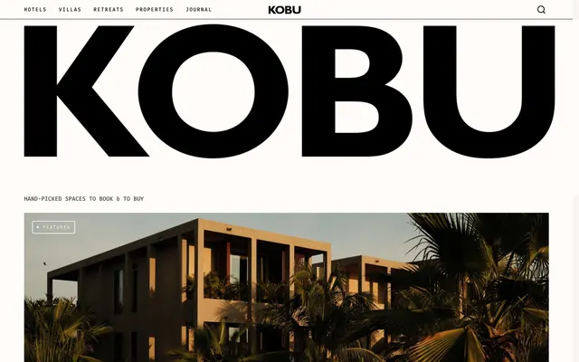
Kobu employs a sophisticated, exclusive ambiance, built on a minimalist achromatic palette. Deep blacks and off-white neutrals provide a clean canvas for high-quality photography, while precise typography, featuring a striking large serif for branding and refined sans-serifs for content, conveys an understated luxury. The system prioritizes ample whitespace and minimal UI elements, letting content and imagery speak, with borders and subtle text variations indicating interactivity and hierarchy.
The page primarily uses a max-width contained layout, with content centered. The hero section often features full-bleed imagery (or near full-bleed within a section) establishing an immersive feel. Sections flow seamlessly, often with consistent vertical spacing of around 60px, without hard visual dividers. Content is arranged in alternating patterns, such as text-left, image-right compositions, and responsive multi-column (e.g., 2-3 column) card grids for displaying properties. The navigation is a minimal, top-aligned header, static and unobtrusive, featuring essential links and a search icon. Density is comfortable, with a noticeable emphasis on breathable whitespace providing a gallery-like presentation.
The visual language is dominated by professional, high-quality photography of architectural spaces, interiors, and natural landscapes. Images are typically full-bleed or very large within their containers, acting as primary content rather than decorative elements. They lean towards a desaturated, sophisticated aesthetic, often showcasing deep greens, warm earth tones, and cool grays, reflecting a luxurious and serene atmosphere. There are minimal icons, which are thin-lined and monochrome, supporting UI functions without drawing undue attention. Imagery serves to immediately immerse the user in the 'experience' of the featured properties, occupying significant visual space relative to text.
Reminiscent of Aman Resorts, The Line (e-commerce), Nowness, Cabana Magazine.
# Kobu — Style Reference
> Gallery Wall on Linen Canvas

**Theme:** light

**Site:** https://kobu.co

Kobu employs a sophisticated, exclusive ambiance, built on a minimalist achromatic palette. Deep blacks and off-white neutrals provide a clean canvas for high-quality photography, while precise typography, featuring a striking large serif for branding and refined sans-serifs for content, conveys an understated luxury. The system prioritizes ample whitespace and minimal UI elements, letting content and imagery speak, with borders and subtle text variations indicating interactivity and hierarchy.

## Tokens — Colors

| Name | Value | Token | Role |
|------|------|------|------|
| Ink Black | `#000000` | `--color-ink-black` | Primary text, prominent headings, brand elements. Creates strong contrast on light backgrounds |
| Off-White Canvas | `#f9f5f2` | `--color-off-white-canvas` | Body background, primary surface color for pages and large sections. Provides a warm, soft base |
| Ghost White | `#ffffff` | `--color-ghost-white` | Internal component backgrounds and outlines (e.g., active states, specific badges). Appears as a slightly cooler white against the Off-White Canvas |
| Detail Gray | `#242429` | `--color-detail-gray` | Neutral form states, badge text, and quiet UI feedback where color should stay understated. Do not promote it to the primary CTA color |
| Subtle Gray | `#919191` | `--color-subtle-gray` | Muted helper text, secondary labels, less prominent headings. Offers low contrast for supporting information |
| Dark Charcoal | `#3e3e3e` | `--color-dark-charcoal` | Card text, list item text, specific body text sections. Darker than Detail Gray for slightly more emphasis |
| Shadow Dark | `#070707` | `--color-shadow-dark` | Darker headings, often appearing with accompanying borders. Provides a near-black contrast |

## Tokens — Typography

### Gill Sans
- **Substitute:** Gill Sans
- **Weights:** 400
- **Sizes:** 14px, 15px, 33px
- **Line height:** 1, 1.2, 1.43
- **Role:** Primary UI text, general body copy, navigation links, and some headings. Its clean, classic lines contribute to the understated feel.

### Gill Sans MT Pro
- **Substitute:** Gill Sans
- **Weights:** 400, 500
- **Sizes:** 14px, 16px, 21px, 24px, 32px, 64px
- **Line height:** 1, 1.25
- **Role:** Headings and prominent text elements, including the brand title. The subtly varied weights and larger sizes provide hierarchical emphasis.

### Fira Mono
- **Substitute:** Fira Mono
- **Weights:** 400, 500
- **Sizes:** 10px, 11px, 12px, 14px
- **Line height:** 1.25, 1.43, 1.55, 1.67, 2
- **Letter spacing:** 0.007em (10px), 0.008em (11px), 0.071em (12px), 0.167em (14px), 0.182em (14px), 0.183em (14px)
- **Role:** Metadata, labels, small descriptive text, and a distinct monospace voice for certain UI elements like prices. The wide tracking at smaller sizes creates a crafted, deliberate feel.

## Tokens — Type Scale

Golden Ratio (1.618) from 10px base.

| Role | Size | Line height | Letter spacing |
|------|------|------|------|
| caption | 10px | 1.25 | 0.007em |
| body-sm | 14px | 1.43 | — |
| subheading | 21px | 1.25 | — |
| heading-lg | 33px | 1.43 | — |
| display | 64px | 1 | — |

## Tokens — Spacing

- **Section gap:** 60px
- **Card padding:** 0px
- **Element gap:** 10px

## Tokens — Radius

- **badges:** 5px

## Layout

The page primarily uses a max-width contained layout, with content centered. The hero section often features full-bleed imagery (or near full-bleed within a section) establishing an immersive feel. Sections flow seamlessly, often with consistent vertical spacing of around 60px, without hard visual dividers. Content is arranged in alternating patterns, such as text-left, image-right compositions, and responsive multi-column (e.g., 2-3 column) card grids for displaying properties. The navigation is a minimal, top-aligned header, static and unobtrusive, featuring essential links and a search icon. Density is comfortable, with a noticeable emphasis on breathable whitespace providing a gallery-like presentation.

## Imagery

The visual language is dominated by professional, high-quality photography of architectural spaces, interiors, and natural landscapes. Images are typically full-bleed or very large within their containers, acting as primary content rather than decorative elements. They lean towards a desaturated, sophisticated aesthetic, often showcasing deep greens, warm earth tones, and cool grays, reflecting a luxurious and serene atmosphere. There are minimal icons, which are thin-lined and monochrome, supporting UI functions without drawing undue attention. Imagery serves to immediately immerse the user in the 'experience' of the featured properties, occupying significant visual space relative to text.

## Components

### Navigation Link
*Top navigation items*

Text in Gill Sans, weight 400, (sizes vary but commonly 14px), color Ink Black. Interactivity is indicated by a hairline border below in Detail Gray on hover/active states. Uses 13px vertical and 15px horizontal padding.

### Minimal Card
*Content container for media and text pairings*

Completely borderless and shadowless, with 0px radius. Relies on surrounding whitespace for definition. Typography within uses a range of Gill Sans and Fira Mono variants for titles, descriptions, and metadata. No explicit padding, content fills the implied space.

### Feature Badge - White
*Small informational tags on images (e.g., 'Featured', 'New')*

Ghost White text, color #ffffff. 5px border-radius. No background fill, appears as text directly on images. Horizontal padding of 10px, no vertical padding.

### Feature Badge - Dark
*Small informational tags on images (e.g., 'Featured', 'New')*

Detail Gray text, color #242429. 0px border-radius. No background fill, appears as text directly on images. No explicit padding.

## Guidelines

### Do

- Prioritize photography and rich content over UI elements, using the Off-White Canvas background (#f9f5f2) as a clean stage.
- Use Gill Sans MT Pro at large sizes and Ink Black (#000000) for primary headlines to establish an immediate sense of scale and brand identity.
- Define interactive elements like navigation links with subtle hairline borders in Detail Gray (#242429), rather than background fills.
- Employ ample whitespace. Use 60px as the default vertical section gap and 10px for internal element spacing to create breathing room.
- Use Fira Mono for metadata or supplementary information, applying its characteristic wide letter-spacing to underscore a crafted, editorial feel.
- Maintain an achromatic palette. Introduce color only through rich, natural photography.
- Ensure all card-like components have a border-radius of 0px for a sharp, architectural quality.

### Don't

- Avoid heavy borders, drop shadows, or background fills on cards; let imagery and typography define content blocks.
- Do not use explicit background colors for primary buttons; rely on transparent backgrounds with text and subtle borders.
- Refrain from using strong, saturated colors in the UI; the visual system is almost entirely achromatic, with color derived from content.
- Do not introduce decorative icons or graphic elements that distract from the photography or minimalist aesthetic.
- Avoid excessive element padding; elements should feel compact and integrated, allowing whitespace between them to manage density.
- Do not use 'standard' button radii; specifically use 0px or 5px (for badges) as defined by the system.
- Never use generic system fonts without carefully considering the Gill Sans and Fira Mono families for their specific roles in creating the brand's voice.

## Agent Prompt Guide

Quick Color Reference:
text: #000000
background: #f9f5f2
border: #242429
accent: no distinct accent color
primary action: no distinct CTA color

Example Component Prompts:
1. Create a primary navigation item: text 'Hotels', font Gill Sans weight 400 at 14px, color Ink Black (#000000). On hover, add a 1.5px solid border in Detail Gray (#242429) below the text. Use 13px vertical and 15px horizontal padding.
2. Create a Feature Badge for an image: text 'NEW', font Fira Mono weight 400 at 10px, letter-spacing 0.007em, color Ghost White (#ffffff). Background is transparent. Apply 5px border-radius and 10px horizontal padding.
3. Create a property listing card: background Off-White Canvas (#f9f5f2). Use a large hero image at the top. Below the image, a heading 'The Manner' in Gill Sans MT Pro weight 500 at 24px, color Ink Black (#000000). A subheading 'Manhattan, New York' in Gill Sans weight 400 at 15px, color Detail Gray (#242429). All card elements have 0px border-radius and no visible borders or shadows.
More like this










Keep what you find
A free account saves references to boards and can send you a weekly email of picks based on what you save.
To see every result, go Pro.