Preview image. Unlock full-res
Type-driven retro blueprint
Color palette
Primary headings, interactive elements, button borders, decorative strokes — the single splash of vivid color in an otherwise subdued palette
Page background, text for contrast, faint accents
Decorative dividers, subtle borders
Primary text, strong borders
Typography
- Weights
- 300, 400
- Sizes
- 16px, 18px, 21px, 28px, 38px
- Line height
- 0.95, 1, 1.2, 1.25, 1.5
- Letter spacing
- -0.0200em
- Fallback
- Inter
Body copy, captions, buttons, and subheadings. Its condensed width and precise tracking keep text compact and intentional.
- Weights
- 100, 300
- Sizes
- 62px, 77px, 120px
- Line height
- 0.95, 1
- Letter spacing
- -0.0200em
- Fallback
- Lora
Dominant display headlines. Its delicate thin weights and generous sizing create a bold yet elegant statement, contrasting with the dense body copy.
Spacing & shape
Components
An outlined button with text in Drive Blue (#006eff) and a 1px border in Drive Blue (#006eff). It features a very high border-radius of 60.0048px, giving it a pill shape. Padding is 10.8px top/bottom and 43.2px left/right. Uses Founders Grotesk typography.
A thin 1px horizontal line in Steel Blue (#e2e8f0), used to delineate sections or information groups without heavy visual interruption. Often paired with generous vertical spacing above and below.
Guidelines
- Prioritize Founders Grotesk for all functional text, bodies, and button labels at its specified weights and letter-spacing.
- Use Editorial New only for large, impactful headlines, adhering to its thin weights and precise letter-spacing for maximum effect.
- Maintain the Parchment (#fff8f1) background for most surfaces to preserve the light, minimal aesthetic.
- Employ Drive Blue (#006eff) sparingly as the primary accent for interactive elements, headlines, and key visual markers.
- Use the pill-shaped button style with a 60.0048px radius for all interactive buttons to maintain consistency.
- Apply generous vertical spacing, primarily 29px for sections and 20px between elements, to create a spacious layout.
- Delineate content with thin Steel Blue (#e2e8f0) lines rather than heavy boxes or shadows.
- Avoid using multiple chromatic colors; limit color accents strictly to Drive Blue (#006eff).
- Do not introduce shadows; the design relies on flat surfaces and outlines for depth.
- Do not deviate from the specified typefaces, Founders Grotesk and Editorial New, or their provided weights and letter-spacing.
- Avoid tight vertical spacing; allow elements and sections to breathe.
- Do not use solid background colors for buttons; stick to the outlined treatment with Drive Blue.
- Avoid using images or heavy graphics that detract from the type-driven aesthetic, unless they are simple, line-art illustrations.
- Do not use dark backgrounds; the system is designed exclusively for a light theme with the Parchment primary background.
About this system
ShowHide
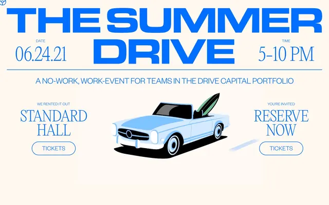
Drive Capital uses a distinct print-inspired visual style, featuring bold, condensed typography and subtle parchment-like backgrounds. The visual system is built around a single, vibrant blue accent color against a warm, off-white canvas, lending a retro yet impactful feel. Visuals are intentionally sparse, relying on strong typographic hierarchy and clean, outlined component styling to convey information. The overall impression is one of purposeful simplicity and understated confidence.
The page enforces a centered, contained layout for most content, with a max-width likely controlled by the prominent 144px left/right padding. The hero section often combines a large, centered headline with a relevant line-art illustration. Sections are separated by simple horizontal lines and generous vertical spacing, creating an airy rhythm. Content blocks appear to be stacked vertically, often with smaller sub-sections using a two-column distribution for dates and times, or left-right alignment for text and prompts. Navigation is minimal, likely restricted to a top header with limited links or implied by the page structure itself rather than a persistent nav bar.
The site uses minimal, simple, and clean line-art style illustrations, as seen with the car graphic. These illustrations are typically brand-colored with slight shading, serving a decorative and thematic role rather than conveying complex information. Icons are outlined, simple, and mono-color (Drive Blue). The imagery is sparse, allowing text and typography to dominate the visual hierarchy. Density is text-heavy.
Reminiscent of AIGA, Figma - Config events, Verge.
# Drive Capital — Style Reference
> Type-driven retro blueprint

**Theme:** light

**Site:** https://www.thesummerdrive.com

Drive Capital uses a distinct print-inspired visual style, featuring bold, condensed typography and subtle parchment-like backgrounds. The visual system is built around a single, vibrant blue accent color against a warm, off-white canvas, lending a retro yet impactful feel. Visuals are intentionally sparse, relying on strong typographic hierarchy and clean, outlined component styling to convey information. The overall impression is one of purposeful simplicity and understated confidence.

## Tokens — Colors

| Name | Value | Token | Role |
|------|------|------|------|
| Drive Blue | `#006eff` | `--color-drive-blue` | Primary headings, interactive elements, button borders, decorative strokes — the single splash of vivid color in an otherwise subdued palette |
| Parchment | `#fff8f1` | `--color-parchment` | Page background, text for contrast, faint accents |
| Steel Blue | `#e2e8f0` | `--color-steel-blue` | Decorative dividers, subtle borders |
| Midnight Ink | `#000000` | `--color-midnight-ink` | Primary text, strong borders |

## Tokens — Typography

### Founders Grotesk
- **Substitute:** Inter
- **Weights:** 300, 400
- **Sizes:** 16px, 18px, 21px, 28px, 38px
- **Line height:** 0.95, 1, 1.2, 1.25, 1.5
- **Letter spacing:** -0.0200em
- **Role:** Body copy, captions, buttons, and subheadings. Its condensed width and precise tracking keep text compact and intentional.

### Editorial New
- **Substitute:** Lora
- **Weights:** 100, 300
- **Sizes:** 62px, 77px, 120px
- **Line height:** 0.95, 1
- **Letter spacing:** -0.0200em
- **Role:** Dominant display headlines. Its delicate thin weights and generous sizing create a bold yet elegant statement, contrasting with the dense body copy.

## Tokens — Type Scale

Augmented Fourth (1.414) from 18px base.

| Role | Size | Line height | Letter spacing |
|------|------|------|------|
| caption | 16px | 1.5 | -0.32px |
| body | 18px | 1.25 | -0.36px |
| subheading | 21px | 1.2 | -0.42px |
| heading-sm | 28px | 1 | -0.56px |
| heading | 38px | 0.95 | -0.76px |
| heading-lg | 62px | 1 | -1.24px |
| display | 120px | 0.95 | -2.4px |

## Tokens — Spacing

- **Section gap:** 29px
- **Card padding:** 14px
- **Element gap:** 20px

## Tokens — Radius

- **Buttons:** 60.0048px

## Layout

The page enforces a centered, contained layout for most content, with a max-width likely controlled by the prominent 144px left/right padding. The hero section often combines a large, centered headline with a relevant line-art illustration. Sections are separated by simple horizontal lines and generous vertical spacing, creating an airy rhythm. Content blocks appear to be stacked vertically, often with smaller sub-sections using a two-column distribution for dates and times, or left-right alignment for text and prompts. Navigation is minimal, likely restricted to a top header with limited links or implied by the page structure itself rather than a persistent nav bar.

## Imagery

The site uses minimal, simple, and clean line-art style illustrations, as seen with the car graphic. These illustrations are typically brand-colored with slight shading, serving a decorative and thematic role rather than conveying complex information. Icons are outlined, simple, and mono-color (Drive Blue). The imagery is sparse, allowing text and typography to dominate the visual hierarchy. Density is text-heavy.

## Components

### Outline Button - Tickets
*Primary interactive element for calls to action.*

An outlined button with text in Drive Blue (#006eff) and a 1px border in Drive Blue (#006eff). It features a very high border-radius of 60.0048px, giving it a pill shape. Padding is 10.8px top/bottom and 43.2px left/right. Uses Founders Grotesk typography.

### Section Divider
*Visual separation between content blocks.*

A thin 1px horizontal line in Steel Blue (#e2e8f0), used to delineate sections or information groups without heavy visual interruption. Often paired with generous vertical spacing above and below.

## Guidelines

### Do

- Prioritize Founders Grotesk for all functional text, bodies, and button labels at its specified weights and letter-spacing.
- Use Editorial New only for large, impactful headlines, adhering to its thin weights and precise letter-spacing for maximum effect.
- Maintain the Parchment (#fff8f1) background for most surfaces to preserve the light, minimal aesthetic.
- Employ Drive Blue (#006eff) sparingly as the primary accent for interactive elements, headlines, and key visual markers.
- Use the pill-shaped button style with a 60.0048px radius for all interactive buttons to maintain consistency.
- Apply generous vertical spacing, primarily 29px for sections and 20px between elements, to create a spacious layout.
- Delineate content with thin Steel Blue (#e2e8f0) lines rather than heavy boxes or shadows.

### Don't

- Avoid using multiple chromatic colors; limit color accents strictly to Drive Blue (#006eff).
- Do not introduce shadows; the design relies on flat surfaces and outlines for depth.
- Do not deviate from the specified typefaces, Founders Grotesk and Editorial New, or their provided weights and letter-spacing.
- Avoid tight vertical spacing; allow elements and sections to breathe.
- Do not use solid background colors for buttons; stick to the outlined treatment with Drive Blue.
- Avoid using images or heavy graphics that detract from the type-driven aesthetic, unless they are simple, line-art illustrations.
- Do not use dark backgrounds; the system is designed exclusively for a light theme with the Parchment primary background.

## Agent Prompt Guide

Quick Color Reference:
text: #000000
background: #fff8f1
border: #e2e8f0
accent: #006eff
primary action: #006eff (outlined action border)

Example Component Prompts:
1. Create a hero banner: Parchment (#fff8f1) background. Centered headline 'THE SUMMER DRIVE' in Editorial New, size 120px, weight 300, Drive Blue (#006eff), letter-spacing -2.4px. Below it, a thin Steel Blue (#e2e8f0) divider line, followed by a lighter text 'A NO-WORK, WORK-EVENT...' in Founders Grotesk, size 21px, weight 300, Midnight Ink (#000000), letter-spacing -0.42px. Beneath, place a line-art illustration of a car.
2. Create an event detail block: Parchment (#fff8f1) background. Left-aligned date '06.24.21', Founders Grotesk, size 38px, weight 300, Drive Blue (#006eff), letter-spacing -0.76px. Above it, a small label 'DATE' in Founders Grotesk, size 16px, weight 400, Midnight Ink (#000000). To the right, a similar block for 'TIME' and '5-10 PM'. Use a thin Steel Blue (#e2e8f0) divider between these pairs and the main headline section.
3. Create an outlined button for 'Tickets': Background transparent, 1px border in Drive Blue (#006eff), text 'Tickets' in Founders Grotesk, size 18px, weight 400, Drive Blue (#006eff), letter-spacing -0.36px. Border radius 60.0048px. Padding 10.8px vertical, 43.2px horizontal. Place two, side-by-side: one under 'STANDARD HALL' and one under 'RESERVE NOW'.
More like this









Keep what you find
A free account saves references to boards and can send you a weekly email of picks based on what you save.
To see every result, go Pro.