Preview image. Unlock full-res
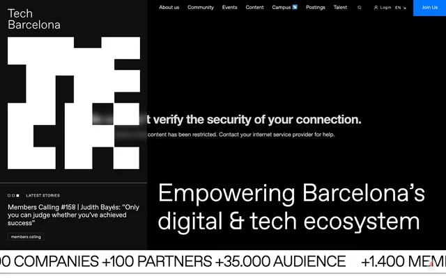
High-contrast geometric blueprint
Color palette
Primary action buttons, interactive highlights, navigational indicators — providing a vivid, singular point of interest
Primary text, deep surface backgrounds, strong borders — establishing a high-contrast foundation for content
Page backgrounds, surface accents, white text on dark backgrounds, ghost button borders
Secondary text, dark navigation links, default icon fills, default button borders
Subtle borders, dividers, ghost button borders in light contexts
Dominant headlines, large text blocks for brand emphasis
Subtle button shadow, hinting at minimal elevation
Typography
- Weights
- 400
- Sizes
- 10px, 12px, 13px, 14px, 16px, 18px, 20px, 22px, 50px, 80px
- Line height
- 1, 1.14, 1.15, 1.2, 1.3, 1.33, 1.5, 1.59
- Letter spacing
- -0.045em at 80px, -0.010em at 50px, 0.080em at 14px, 0.090em at 12px
- Fallback
- Open Sans, Arial
The primary typeface for all text elements. The consistently light weight (400) across all sizes creates a refined, understated authority, resisting the common tendency to use bold weights for emphasis.
Spacing & shape
Elevation
Components
Filled with Ice Blue Accent (#0075ff), text in Canvas White (#ffffff). Padding of 16px top, 27px right, 17px bottom, 28px left. No border radius.
Transparent background, text in Canvas White (#ffffff). Border is 1px solid Canvas White (#ffffff). Padding of 5px top, 10px right, 5px bottom, 10px left. No border radius.
Transparent background, text in Ink Text (#212529). Border is 1px solid Ink Text (#212529) only on the bottom. No padding or border radius.
Transparent background, text in Canvas White (#ffffff). No border or padding specified, implying inline link styling.
Transparent background, no shadow, no border radius. Implied padding is 0px.
Guidelines
- Prioritize high-contrast combinations using Midnight Ink (#000000), Canvas White (#ffffff), and Ink Text (#212529) for all textual content to maintain strong legibility.
- Utilize Ice Blue Accent (#0075ff) exclusively for primary calls to action or key interactive states, ensuring it remains a distinct highlight.
- Maintain sharp, 0px border radii for all components, including buttons and cards, to reinforce the geometric and precise aesthetic.
- Employ FavoritPro-Light (weight 400) for all typography, adjusting font size instead of weight for hierarchy, following the established type scale.
- Apply the subtle Shadow White (#eeeeee) box shadow (1px 1px 0px 0px) to interactive elements like buttons to provide slight depth without heavy elevation.
- Use Light Gray Divider (#cccccc) for hairline borders and subtle separations, offering visual breaks without introducing strong contrast.
- Avoid using multiple accent colors; Ice Blue Accent (#0075ff) is the sole chromatic highlight.
- Do not introduce rounded corners; all elements should adhere to the 0px border-radius.
- Refrain from using bold or heavy font weights for emphasis; leverage letter spacing and size from the type scale instead.
- Do not apply drop shadows to cards or general surfaces; reserve soft shadows for interactive elements as defined.
- Avoid decorative gradients or complex backgrounds; maintain a flat, high-contrast, black-and-white base.
- Do not use padding less than 10px for button content, unless it is a purely text-based link button.
About this system
ShowHide
Tech Barcelona uses a bold and graphic black-and-white canvas, punctuated by a single vibrant blue accent. The typography is compact and confident, primarily utilizing a light-weight sans-serif for both headings and body text, establishing an authoritative yet accessible tone. Components are sharp and unfussy, favoring crisp borders and minimal elevation over elaborate styling, with a strong emphasis on a clear, almost monochromatic visual hierarchy that directs attention to key information and interactive elements.
The page primarily uses a max-width contained layout, though the hero section can be full-bleed with a large, centered headline against a dark background or with an architectural image. Sections exhibit strong vertical rhythm with consistent spacing, often alternating between dark (Midnight Ink) and light (Canvas White) backgrounds. Content is organized in clear, stacked blocks and implicit two-column layouts where text and visuals interact. Navigation is confined to a persistent top bar featuring minimal links and a high-contrast 'Join Us' button.
This design system uses a minimalist approach to imagery, primarily employing the brand's geometric, QR-code-like logo as a decorative background element or prominent identifier. Photography is used sparingly and appears to be real-world architectural shots, acting as contextual backdrops rather than focal points. Icons are monochrome, simple, and functional, likely either filled or outlined with a fine stroke, adhering to the stark black-and-white aesthetic. Imagery serves primarily as atmospheric context or brand reinforcement, with a very high textual density across the site.
Reminiscent of Stripe, Linear, GitHub, Vercel.
# Tech Barcelona — Style Reference
> High-contrast geometric blueprint

**Theme:** light

**Site:** https://techbarcelona.com/en

Tech Barcelona uses a bold and graphic black-and-white canvas, punctuated by a single vibrant blue accent. The typography is compact and confident, primarily utilizing a light-weight sans-serif for both headings and body text, establishing an authoritative yet accessible tone. Components are sharp and unfussy, favoring crisp borders and minimal elevation over elaborate styling, with a strong emphasis on a clear, almost monochromatic visual hierarchy that directs attention to key information and interactive elements.

## Tokens — Colors

| Name | Value | Token | Role |
|------|------|------|------|
| Ice Blue Accent | `#0075ff` | `--color-ice-blue-accent` | Primary action buttons, interactive highlights, navigational indicators — providing a vivid, singular point of interest |
| Midnight Ink | `#000000` | `--color-midnight-ink` | Primary text, deep surface backgrounds, strong borders — establishing a high-contrast foundation for content |
| Canvas White | `#ffffff` | `--color-canvas-white` | Page backgrounds, surface accents, white text on dark backgrounds, ghost button borders |
| Ink Text | `#212529` | `--color-ink-text` | Secondary text, dark navigation links, default icon fills, default button borders |
| Light Gray Divider | `#cccccc` | `--color-light-gray-divider` | Subtle borders, dividers, ghost button borders in light contexts |
| Headline Black | `#090707` | `--color-headline-black` | Dominant headlines, large text blocks for brand emphasis |
| Shadow White | `#eeeeee` | `--color-shadow-white` | Subtle button shadow, hinting at minimal elevation |

## Tokens — Typography

### FavoritPro-Light
- **Substitute:** Open Sans, Arial
- **Weights:** 400
- **Sizes:** 10px, 12px, 13px, 14px, 16px, 18px, 20px, 22px, 50px, 80px
- **Line height:** 1, 1.14, 1.15, 1.2, 1.3, 1.33, 1.5, 1.59
- **Letter spacing:** -0.045em at 80px, -0.010em at 50px, 0.080em at 14px, 0.090em at 12px
- **Role:** The primary typeface for all text elements. The consistently light weight (400) across all sizes creates a refined, understated authority, resisting the common tendency to use bold weights for emphasis.

## Tokens — Type Scale

Augmented Fourth (1.414) from 14px base.

| Role | Size | Line height | Letter spacing |
|------|------|------|------|
| caption | 10px | 1.5 | 0.9px |
| body | 14px | 1.5 | 0.08em |
| heading-sm | 18px | 1.33 | — |
| heading | 20px | 1.2 | — |
| heading-lg | 22px | 1.15 | — |
| display | 50px | 1.14 | -0.01em |
| display-xl | 80px | 1 | -0.045em |

## Tokens — Spacing

- **Section gap:** 50px
- **Card padding:** 16px
- **Element gap:** 4px

## Tokens — Radius

- **Default:** 0px

## Tokens — Elevation

- **Button:** `rgb(238, 238, 238) 1px 1px 0px 0px`

## Layout

The page primarily uses a max-width contained layout, though the hero section can be full-bleed with a large, centered headline against a dark background or with an architectural image. Sections exhibit strong vertical rhythm with consistent spacing, often alternating between dark (Midnight Ink) and light (Canvas White) backgrounds. Content is organized in clear, stacked blocks and implicit two-column layouts where text and visuals interact. Navigation is confined to a persistent top bar featuring minimal links and a high-contrast 'Join Us' button.

## Imagery

This design system uses a minimalist approach to imagery, primarily employing the brand's geometric, QR-code-like logo as a decorative background element or prominent identifier. Photography is used sparingly and appears to be real-world architectural shots, acting as contextual backdrops rather than focal points. Icons are monochrome, simple, and functional, likely either filled or outlined with a fine stroke, adhering to the stark black-and-white aesthetic. Imagery serves primarily as atmospheric context or brand reinforcement, with a very high textual density across the site.

## Components

### Primary Action Button
*Filled button for main calls to action.*

Filled with Ice Blue Accent (#0075ff), text in Canvas White (#ffffff). Padding of 16px top, 27px right, 17px bottom, 28px left. No border radius.

### Ghost Bordered Button
*Secondary action button with a border and transparent background.*

Transparent background, text in Canvas White (#ffffff). Border is 1px solid Canvas White (#ffffff). Padding of 5px top, 10px right, 5px bottom, 10px left. No border radius.

### Text Link Button
*Tertiary action or navigational link styled as a button.*

Transparent background, text in Ink Text (#212529). Border is 1px solid Ink Text (#212529) only on the bottom. No padding or border radius.

### White Text Link Button
*Text link for navigation or small actions on dark backgrounds.*

Transparent background, text in Canvas White (#ffffff). No border or padding specified, implying inline link styling.

### Muted Card
*Container for content, particularly news items.*

Transparent background, no shadow, no border radius. Implied padding is 0px.

## Guidelines

### Do

- Prioritize high-contrast combinations using Midnight Ink (#000000), Canvas White (#ffffff), and Ink Text (#212529) for all textual content to maintain strong legibility.
- Utilize Ice Blue Accent (#0075ff) exclusively for primary calls to action or key interactive states, ensuring it remains a distinct highlight.
- Maintain sharp, 0px border radii for all components, including buttons and cards, to reinforce the geometric and precise aesthetic.
- Employ FavoritPro-Light (weight 400) for all typography, adjusting font size instead of weight for hierarchy, following the established type scale.
- Apply the subtle Shadow White (#eeeeee) box shadow (1px 1px 0px 0px) to interactive elements like buttons to provide slight depth without heavy elevation.
- Use Light Gray Divider (#cccccc) for hairline borders and subtle separations, offering visual breaks without introducing strong contrast.

### Don't

- Avoid using multiple accent colors; Ice Blue Accent (#0075ff) is the sole chromatic highlight.
- Do not introduce rounded corners; all elements should adhere to the 0px border-radius.
- Refrain from using bold or heavy font weights for emphasis; leverage letter spacing and size from the type scale instead.
- Do not apply drop shadows to cards or general surfaces; reserve soft shadows for interactive elements as defined.
- Avoid decorative gradients or complex backgrounds; maintain a flat, high-contrast, black-and-white base.
- Do not use padding less than 10px for button content, unless it is a purely text-based link button.

## Agent Prompt Guide

Quick Color Reference:
text: #212529
background: #ffffff
border: #cccccc
accent: #0075ff
primary action: #0075ff (filled action)

Example Component Prompts:
Create a Primary Action Button: #0075ff background, #ffffff text, 9999px radius, compact pill padding. Use this filled treatment for the main CTA.
Create a navigation item: White Text Link Button with text 'Community', Canvas White (#ffffff), 14px FavoritPro-Light, 0.08em letter spacing.
Create a content card for a featured story: Muted Card with a Midnight Ink (#000000) background. Heading at 22px FavoritPro-Light, Canvas White (#ffffff). Body text at 14px FavoritPro-Light, Canvas White (#ffffff). Add a Light Gray Divider (#cccccc) as a bottom border to separate from other elements.
More like this









Keep what you find
A free account saves references to boards and can send you a weekly email of picks based on what you save.
To see every result, go Pro.