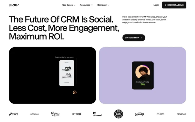
Preview image. Unlock full-res
High-contrast digital command center.
Color palette
Violet outline accent for tags, dividers, and focused UI edges. Do not promote it to the primary CTA color
Light background washes for card surfaces and subtle graphic accents
Highlight text, decorative graphic elements
Yellow outline accent for tags, dividers, and focused UI edges
Primary text, deep surface backgrounds, dark mode canvas, input borders
Page backgrounds, card surfaces, ghost button text and borders
Elevated card backgrounds
Subtle secondary background surface, often next to darker elements
Muted body text, secondary borders
Typography
- Weights
- 300, 400, 500
- Sizes
- 11px, 12px, 14px, 15px, 16px, 18px, 21px, 22px, 29px, 30px, 43px, 48px, 66px, 75px, 95px, 160px, 177px
- Line height
- 0.8, 0.86, 0.9, 0.95, 1, 1.1, 1.15, 1.2, 1.3, 1.33, 1.35
- Letter spacing
- -0.041em at 177px, -0.03em at 95px, -0.012em at 16px
- Fallback
- Inter
General UI text, body copy, navigation, and many smaller display elements. Its variable weights provide flexibility, but the overall tight tracking creates a compact, information-dense feel. Some large sizes use extremely tight tracking, which is unconventional but impactful for headlines.
- Weights
- 400
- Sizes
- 60px, 72px, 93px, 156px, 169px
- Line height
- 0.78, 0.9, 0.95, 1
- Letter spacing
- -0.043em at 169px, -0.031em at 72px
- Fallback
- Playfair Display
Dominant display headlines and large decorative type. Its singular weight and extremely tight letter-spacing create a bold, almost stencil-like appearance, emphasizing visual impact over traditional legibility at very large sizes. Used to create a dramatic, almost editorial feel for key messages.
Spacing & shape
Components
Text: Cloud Canvas (#ffffff), Border: 1px solid Cloud Canvas (#ffffff), Background: transparent, Padding: 13.5px vertical, 18.36px horizontal, Border-radius: 1440px.
Text: Absolute Zero (#101010), Border: 1px solid Absolute Zero (#101010), Background: transparent, Padding: 14.4px vertical, 16.2px horizontal, Border-radius: 1440px.
Text: Absolute Zero (#101010), Background: Cloud Canvas (#ffffff), Padding: 13.5px vertical, 18.36px horizontal, Border-radius: 1440px. Implicit border matches background color.
Background: transparent, Border-radius: 0px, no shadow or padding by default, allowing content to define its own space.
Background: transparent, Border-radius: 24.48px, no shadow or padding by default.
Background: Nightfall (#1a1a1a), Border-radius: 23.04px, no shadow or padding by default.
Background: Absolute Zero (#101010), Border-radius: 1440px (effectively a pill-shape for large elements), no shadow or padding.
Background: Soft Lilac (#b8afda), Border-radius: 1440px (effectively a pill-shape for large elements), no shadow or padding.
Guidelines
- Prioritize Absolute Zero (#101010) for primary text on Cloud Canvas (#ffffff) backgrounds, achieving AAA contrast.
- Use a 1440px border-radius for all interactive elements and prominent containers, creating a distinct pill shape.
- Employ ABC Normal (all weights) for general UI and body copy, but reserve Ivar Display (weight 400) specifically for impactful, oversized display headlines.
- Apply significant negative letter-spacing for large text sizes, particularly for Ivar Display, to create a dense, visually striking appearance.
- Use Ghost Buttons for most actions, with a transparent background and a 1px solid border matching the text color (Cloud Canvas on dark, Absolute Zero on light).
- Integrate Soft Lilac (#b8afda) and Mint Glaze (#c7d8c5) as graphic fill accents on otherwise monochrome UI elements.
- Maintain a compact spacing unit of `5px` for elements within components and `40px` for vertical section gaps to control content density.
- Avoid using multiple accent colors beyond Ignite Orange (#eb652b) and Electric Yellow (#f6f361) to maintain the limited, functional palette.
- Do not use box-shadows for elevation; rely on background color changes or border definitions to create surface hierarchy.
- Refrain from using traditional square or softly rounded (e.g., 4-8px) corners; the hyper-rounded `1440px` radius or distinct `24.48px` is a signature.
- Do not deviate from the specified font families; custom typefaces ABC Normal and Ivar Display are critical to brand identity.
- Avoid creating filled buttons with strong brand colors as primary actions; ghost and outlined buttons are the preferred interactive style.
- Do not use generic gray for helper text; instead, use Whisper Gray (#9b9b9b) for a more integrated, branded feel.
- Do not introduce gradients unless explicitly defined; the system relies on solid color blocks and sharp contrasts.
About this system
ShowHide
Drop's visual system evokes a stark, high-contrast, digital command center aesthetic. It pairs deep, almost black canvases with crisp white text and a limited palette of saturated, functional accents. Typography is a key differentiator, employing a wide range of sizes and extreme negative letter-spacing for headlines and display text, creating a visually dense but impactful presence. Components favor minimal backgrounds, outlined borders, and a signature hyper-rounded radius, suggesting a refined, modern utility.
The page employs a full-bleed top section that transitions into a largely full-width layout with internal content often centered and implicitly constrained by padding rather than an explicit `pageMaxWidth`. The hero section features a centered, oversized headline, immediately followed by two large, distinct panels acting as embedded UI examples, showcasing the product in context. Sections typically switch between dark backgrounds (Absolute Zero, similar to a 'dark mode' block) and lighter, parchment-like backgrounds, creating an alternating rhythm. Content is generally arranged in contrasting blocks, often with a large visual element dominating one side against textual content, or centered stacks for key messaging. There's an absence of traditional grids explicitly stated, but content within these large blocks often aligns logically. The navigation is a subtle top bar, featuring right-aligned 'Login' and 'Request a Demo' buttons against a white background, contrasting with the dark hero section.
Imagery on Drop's site is sparse and highly conceptual, focusing on product UI simulations rather than photography or explicit illustrations. Product UI elements are presented within large, rounded, solid-colored panels (Absolute Zero or Soft Lilac), mimicking device screens. These embedded UIs are clean, showcasing typical social media interfaces. There are abstract, geometric shapes (circles) used to convey data or concepts, often with solid fills or outlined. The icons are mostly simple, filled black or white glyphs, maintaining the high-contrast aesthetic. Overall, imagery functions as explanatory content or product showcases, maintaining a text-dominant layout with visual accents.
Reminiscent of Stripe, Linear, Figma, Vercel.
# Drop — Style Reference
> High-contrast digital command center.

**Theme:** light

**Site:** https://www.usedrop.io

Drop's visual system evokes a stark, high-contrast, digital command center aesthetic. It pairs deep, almost black canvases with crisp white text and a limited palette of saturated, functional accents. Typography is a key differentiator, employing a wide range of sizes and extreme negative letter-spacing for headlines and display text, creating a visually dense but impactful presence. Components favor minimal backgrounds, outlined borders, and a signature hyper-rounded radius, suggesting a refined, modern utility.

## Tokens — Colors

| Name | Value | Token | Role |
|------|------|------|------|
| Soft Lilac | `#b8afda` | `--color-soft-lilac` | Violet outline accent for tags, dividers, and focused UI edges. Do not promote it to the primary CTA color |
| Mint Glaze | `#c7d8c5` | `--color-mint-glaze` | Light background washes for card surfaces and subtle graphic accents |
| Ignite Orange | `#eb652b` | `--color-ignite-orange` | Highlight text, decorative graphic elements |
| Electric Yellow | `#f6f361` | `--color-electric-yellow` | Yellow outline accent for tags, dividers, and focused UI edges |
| Absolute Zero | `#101010` | `--color-absolute-zero` | Primary text, deep surface backgrounds, dark mode canvas, input borders |
| Cloud Canvas | `#ffffff` | `--color-cloud-canvas` | Page backgrounds, card surfaces, ghost button text and borders |
| Nightfall | `#1a1a1a` | `--color-nightfall` | Elevated card backgrounds |
| Parchment | `#e5ede4` | `--color-parchment` | Subtle secondary background surface, often next to darker elements |
| Whisper Gray | `#9b9b9b` | `--color-whisper-gray` | Muted body text, secondary borders |

## Tokens — Typography

### ABC Normal
- **Substitute:** Inter
- **Weights:** 300, 400, 500
- **Sizes:** 11px, 12px, 14px, 15px, 16px, 18px, 21px, 22px, 29px, 30px, 43px, 48px, 66px, 75px, 95px, 160px, 177px
- **Line height:** 0.8, 0.86, 0.9, 0.95, 1, 1.1, 1.15, 1.2, 1.3, 1.33, 1.35
- **Letter spacing:** -0.041em at 177px, -0.03em at 95px, -0.012em at 16px
- **Role:** General UI text, body copy, navigation, and many smaller display elements. Its variable weights provide flexibility, but the overall tight tracking creates a compact, information-dense feel. Some large sizes use extremely tight tracking, which is unconventional but impactful for headlines.

### Ivar Display
- **Substitute:** Playfair Display
- **Weights:** 400
- **Sizes:** 60px, 72px, 93px, 156px, 169px
- **Line height:** 0.78, 0.9, 0.95, 1
- **Letter spacing:** -0.043em at 169px, -0.031em at 72px
- **Role:** Dominant display headlines and large decorative type. Its singular weight and extremely tight letter-spacing create a bold, almost stencil-like appearance, emphasizing visual impact over traditional legibility at very large sizes. Used to create a dramatic, almost editorial feel for key messages.

## Tokens — Type Scale

Golden Ratio (1.618) from 14px base.

| Role | Size | Line height | Letter spacing |
|------|------|------|------|
| caption | 11px | 1.35 | — |
| body | 14px | 1.35 | — |
| subheading | 18px | 1.3 | -0.19px |
| heading-sm | 29px | 1.2 | -0.44px |
| heading | 43px | 1.15 | -0.6px |
| heading-lg | 66px | 0.95 | -1.98px |
| display | 177px | 0.78 | -7.26px |

## Tokens — Spacing

- **Section gap:** 40px
- **Card padding:** 14px
- **Element gap:** 5px

## Tokens — Radius

- **Cards:** 24.48px
- **all:** 1440px
- **input:** 7.92px

## Layout

The page employs a full-bleed top section that transitions into a largely full-width layout with internal content often centered and implicitly constrained by padding rather than an explicit `pageMaxWidth`. The hero section features a centered, oversized headline, immediately followed by two large, distinct panels acting as embedded UI examples, showcasing the product in context. Sections typically switch between dark backgrounds (Absolute Zero, similar to a 'dark mode' block) and lighter, parchment-like backgrounds, creating an alternating rhythm. Content is generally arranged in contrasting blocks, often with a large visual element dominating one side against textual content, or centered stacks for key messaging. There's an absence of traditional grids explicitly stated, but content within these large blocks often aligns logically. The navigation is a subtle top bar, featuring right-aligned 'Login' and 'Request a Demo' buttons against a white background, contrasting with the dark hero section.

## Imagery

Imagery on Drop's site is sparse and highly conceptual, focusing on product UI simulations rather than photography or explicit illustrations. Product UI elements are presented within large, rounded, solid-colored panels (Absolute Zero or Soft Lilac), mimicking device screens. These embedded UIs are clean, showcasing typical social media interfaces. There are abstract, geometric shapes (circles) used to convey data or concepts, often with solid fills or outlined. The icons are mostly simple, filled black or white glyphs, maintaining the high-contrast aesthetic. Overall, imagery functions as explanatory content or product showcases, maintaining a text-dominant layout with visual accents.

## Components

### Ghost Button (Dark)
*Secondary action button for dark backgrounds.*

Text: Cloud Canvas (#ffffff), Border: 1px solid Cloud Canvas (#ffffff), Background: transparent, Padding: 13.5px vertical, 18.36px horizontal, Border-radius: 1440px.

### Ghost Button (Light)
*Secondary action button for light backgrounds.*

Text: Absolute Zero (#101010), Border: 1px solid Absolute Zero (#101010), Background: transparent, Padding: 14.4px vertical, 16.2px horizontal, Border-radius: 1440px.

### Filled Button
*Primary action button.*

Text: Absolute Zero (#101010), Background: Cloud Canvas (#ffffff), Padding: 13.5px vertical, 18.36px horizontal, Border-radius: 1440px. Implicit border matches background color.

### Default Card
*Standard content container.*

Background: transparent, Border-radius: 0px, no shadow or padding by default, allowing content to define its own space.

### Rounded Card
*Rounded content container.*

Background: transparent, Border-radius: 24.48px, no shadow or padding by default.

### Dark Rounded Card
*Elevated and subtly distinct content container.*

Background: Nightfall (#1a1a1a), Border-radius: 23.04px, no shadow or padding by default.

### Absolute Zero Panel
*Prominent surface for featured content, often displaying embedded UI.*

Background: Absolute Zero (#101010), Border-radius: 1440px (effectively a pill-shape for large elements), no shadow or padding.

### Soft Lilac Panel
*Prominent surface for featured content, often displaying embedded UI.*

Background: Soft Lilac (#b8afda), Border-radius: 1440px (effectively a pill-shape for large elements), no shadow or padding.

## Guidelines

### Do

- Prioritize Absolute Zero (#101010) for primary text on Cloud Canvas (#ffffff) backgrounds, achieving AAA contrast.
- Use a 1440px border-radius for all interactive elements and prominent containers, creating a distinct pill shape.
- Employ ABC Normal (all weights) for general UI and body copy, but reserve Ivar Display (weight 400) specifically for impactful, oversized display headlines.
- Apply significant negative letter-spacing for large text sizes, particularly for Ivar Display, to create a dense, visually striking appearance.
- Use Ghost Buttons for most actions, with a transparent background and a 1px solid border matching the text color (Cloud Canvas on dark, Absolute Zero on light).
- Integrate Soft Lilac (#b8afda) and Mint Glaze (#c7d8c5) as graphic fill accents on otherwise monochrome UI elements.
- Maintain a compact spacing unit of `5px` for elements within components and `40px` for vertical section gaps to control content density.

### Don't

- Avoid using multiple accent colors beyond Ignite Orange (#eb652b) and Electric Yellow (#f6f361) to maintain the limited, functional palette.
- Do not use box-shadows for elevation; rely on background color changes or border definitions to create surface hierarchy.
- Refrain from using traditional square or softly rounded (e.g., 4-8px) corners; the hyper-rounded `1440px` radius or distinct `24.48px` is a signature.
- Do not deviate from the specified font families; custom typefaces ABC Normal and Ivar Display are critical to brand identity.
- Avoid creating filled buttons with strong brand colors as primary actions; ghost and outlined buttons are the preferred interactive style.
- Do not use generic gray for helper text; instead, use Whisper Gray (#9b9b9b) for a more integrated, branded feel.
- Do not introduce gradients unless explicitly defined; the system relies on solid color blocks and sharp contrasts.

## Agent Prompt Guide

Quick Color Reference:
text: #101010
background: #ffffff
border: #101010
accent: #eb652b
primary action: no distinct CTA color

Example Component Prompts:
Create a hero section with a large, centered headline 'The Future of CRM Is Social.' using Ivar Display weight 400 at 169px, Absolute Zero text, with a -7.26px letter-spacing. Below it, add a Ghost Button (Light) with the text 'Get Started Now'.
Create a product feature card: use Nightfall (#1a1a1a) background, Border-radius: 23.04px. Inside, include secondary text in Whisper Gray (#9b9b9b) using ABC Normal weight 400 at 14px, and a title in Cloud Canvas (#ffffff) using ABC Normal weight 500 at 22px.
Build a navigation link: 'Use Cases' using ABC Normal weight 400 at 15px, Absolute Zero text. On hover, change text color to Whisper Gray (#9b9b9b).
Create a large illustrative panel using Soft Lilac (#b8afda) as the background, with a 1440px border-radius, acting as a container for internal UI elements.
More like this









Keep what you find
A free account saves references to boards and can send you a weekly email of picks based on what you save.
To see every result, go Pro.